Week 1 - 2nd Assignment
For this week assignment, it was a fun experience but i still have less idea on how certain paramenters are selceted and the link i used to learn matplot is here
Imported all the required modules
import plotly.express as px
import plotly.io as pio # Required to define a renderer
import pandas as pd
import matplotlib.pyplot as plt
import seaborn as sns
import plotly.graph_objects as go # Used later for Sankey
Then i read my datset set and stored the data in the variable df
file_path = "datasets/enhanced_student_habits_performance_dataset.csv"
df = pd.read_csv(file_path)
the code below will display the first five row of the whole data set
df.head()
| student_id | age | gender | major | study_hours_per_day | social_media_hours | netflix_hours | part_time_job | attendance_percentage | sleep_hours | ... | screen_time | study_environment | access_to_tutoring | family_income_range | parental_support_level | motivation_level | exam_anxiety_score | learning_style | time_management_score | exam_score | |
|---|---|---|---|---|---|---|---|---|---|---|---|---|---|---|---|---|---|---|---|---|---|
| 0 | 100000 | 26 | Male | Computer Science | 7.645367 | 3.0 | 0.1 | Yes | 70.3 | 6.2 | ... | 10.9 | Co-Learning Group | Yes | High | 9 | 7 | 8 | Reading | 3.0 | 100 |
| 1 | 100001 | 28 | Male | Arts | 5.700000 | 0.5 | 0.4 | No | 88.4 | 7.2 | ... | 8.3 | Co-Learning Group | Yes | Low | 7 | 2 | 10 | Reading | 6.0 | 99 |
| 2 | 100002 | 17 | Male | Arts | 2.400000 | 4.2 | 0.7 | No | 82.1 | 9.2 | ... | 8.0 | Library | Yes | High | 3 | 9 | 6 | Kinesthetic | 7.6 | 98 |
| 3 | 100003 | 27 | Other | Psychology | 3.400000 | 4.6 | 2.3 | Yes | 79.3 | 4.2 | ... | 11.7 | Co-Learning Group | Yes | Low | 5 | 3 | 10 | Reading | 3.2 | 100 |
| 4 | 100004 | 25 | Female | Business | 4.700000 | 0.8 | 2.7 | Yes | 62.9 | 6.5 | ... | 9.4 | Quiet Room | Yes | Medium | 9 | 1 | 10 | Reading | 7.1 | 98 |
5 rows × 31 columns
When i started, i was not using plotty.io but then when trying to solve some issue then created this scatter plot
fig = px.scatter(df, x="motivation_level", y="exam_score", color="family_income_range")
fig.show()
I got this chart while trying to fix a friends code but in the process the output is interesting and therefore i decided to keep it. The issue was that it was not mentioned where to show the graph and there for by adding this two line code, it worked
import plotly.io as pio
pio.renderers.default = "notebook" # or notebook_connected
we have to enable plotly rendering by indicating where to plot the data. and i learned this using ChatGPT
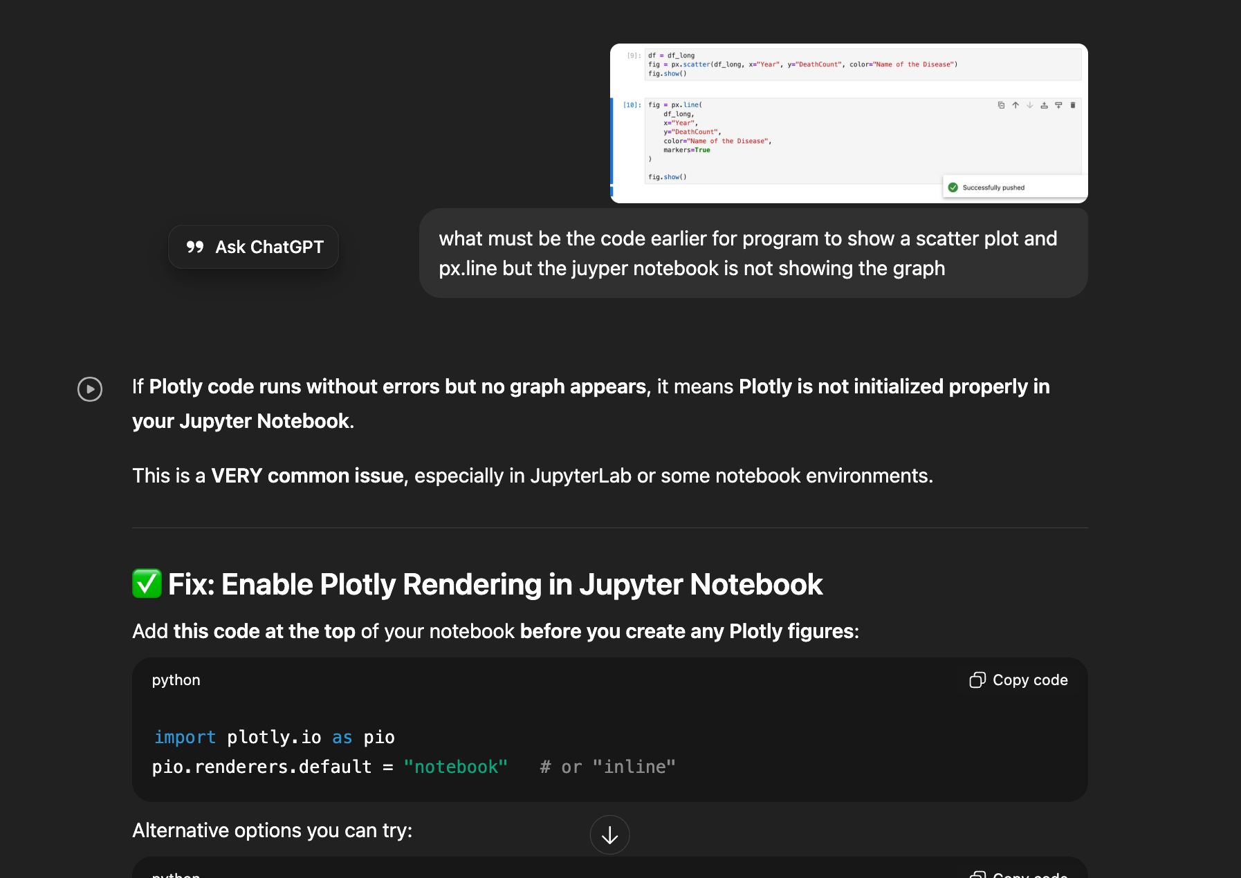
When i explored about the ploty.io, I understood about the renderer in plotty. 🔍 Why this works : You ONLY needed to set the right Plotly renderer Plotly needs to know where to show the chart:
- notebook → show inside Jupyter Notebook ✔
- notebook_connected → shows inside notebook + full JS support ✔
- browser → opens in browser
- none → shows nothing ❌ Your Jupyter environment was likely using "none" or "browser", so nothing appeared.
Then I wanted to explore more and for this link
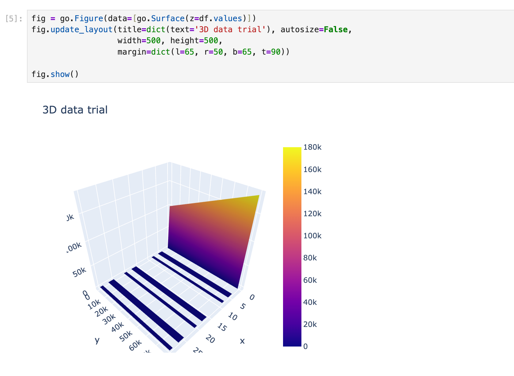
I also tried to learn to make 3D model graph as well but then i realise that my juypter notebook was slowing down, therefore I removed it and i am just adding the image aof the work i have done which can be learned form this link
Histogram Plot
sns.histplot(df['screen_time'], bins=20, kde=True, color='skyblue')
<Axes: xlabel='screen_time', ylabel='Count'>

sns.histplot(df['learning_style'], bins=20, color='skyblue')
using this line of code we can count number of students with some specific category, for the above graph right now am counting students based on their "screen_time", 20 bars and skyblue in color
import matplotlib.pyplot as plt

plt.hist(df["study_hours_per_day"], bins=30)
plt.xlabel("Study Hours Per Day")
plt.ylabel("Number of Students")
plt.title("Distribution of Daily Study Hours")
plt.show()

df["major"].value_counts().plot(kind='bar')

plt.xlabel("Major")
plt.ylabel("Number of Students")
plt.title("Distribution of Majors in Dataset")
plt.show()

plt.scatter(df["study_hours_per_day"], df["exam_score"], alpha=0.3)
plt.xlabel("Study Hours Per Day")
plt.ylabel("Exam Score")
plt.title("Study Time vs Exam Performance")
plt.show()

df.boxplot(column="previous_gpa", by="gender", figsize=(7,5))
plt.title("GPA by Gender")
plt.suptitle("")
plt.xlabel("Gender")
plt.ylabel("Previous GPA")
plt.show()

# Create categories
df["mh_cat"] = pd.cut(df["mental_health_rating"], bins=[0,3,7,10], labels=["Low","Medium","High"])
df["stress_cat"] = pd.cut(df["stress_level"], bins=[0,3,7,10], labels=["Low","Medium","High"])
df["score_cat"] = pd.cut(df["exam_score"], bins=[0,50,75,100], labels=["Low","Medium","High"])
df.head()
| student_id | age | gender | major | study_hours_per_day | social_media_hours | netflix_hours | part_time_job | attendance_percentage | sleep_hours | ... | family_income_range | parental_support_level | motivation_level | exam_anxiety_score | learning_style | time_management_score | exam_score | mh_cat | stress_cat | score_cat | |
|---|---|---|---|---|---|---|---|---|---|---|---|---|---|---|---|---|---|---|---|---|---|
| 0 | 100000 | 26 | Male | Computer Science | 7.645367 | 3.0 | 0.1 | Yes | 70.3 | 6.2 | ... | High | 9 | 7 | 8 | Reading | 3.0 | 100 | Medium | Medium | High |
| 1 | 100001 | 28 | Male | Arts | 5.700000 | 0.5 | 0.4 | No | 88.4 | 7.2 | ... | Low | 7 | 2 | 10 | Reading | 6.0 | 99 | Medium | Medium | High |
| 2 | 100002 | 17 | Male | Arts | 2.400000 | 4.2 | 0.7 | No | 82.1 | 9.2 | ... | High | 3 | 9 | 6 | Kinesthetic | 7.6 | 98 | Medium | High | High |
| 3 | 100003 | 27 | Other | Psychology | 3.400000 | 4.6 | 2.3 | Yes | 79.3 | 4.2 | ... | Low | 5 | 3 | 10 | Reading | 3.2 | 100 | High | Medium | High |
| 4 | 100004 | 25 | Female | Business | 4.700000 | 0.8 | 2.7 | Yes | 62.9 | 6.5 | ... | Medium | 9 | 1 | 10 | Reading | 7.1 | 98 | High | Medium | High |
5 rows × 34 columns
bins = [0, 2, 4, 6, 8, 10, 12]
labels = ['0-2', '2.1-4', '4.1-6', '6.1-8', '8.1-10', '10.1+']
df['Screen time'] = pd.cut(df['screen_time'], bins=bins, labels=labels, right=False)
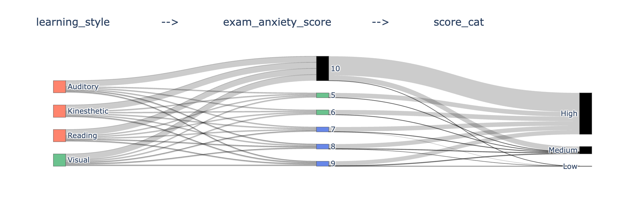
Sankey Diagram
I used an AI called manus and you can access my conversation and work in this link

A Sankey diagram is a type of flow diagram where the width of the arrows is proportional to the flow quantity. It is perfect for visualizing how a population moves through a series of stages.
Data Preparation for sankey diagram : I learned that to prepare sankey diagram we need to create three nodes
- Source
- Target
- Value
Flows (Source, Target, Value): You must define the flow from one stage to the next. Stage 1 to Stage 2: The flow from parental_education_level (Source) to family_income_range (Target). Stage 2 to Stage 3: The flow from family_income_range (Source) to dropout_risk (Target).
flow_df = df.groupby(
    ['parental_education_level', 'family_income_range', 'dropout_risk']
).size().reset_index(name='count')
Then, it maps all unique category names to numerical indices, as Plotly's Sankey function requires numerical indices for source and target.
The two most essential key of a sankey diagram is Nodes and Link. The missing part of your Plotly Sankey diagram code is the definition of the nodes and links. I have prepared a detailed explanation and a complete, runnable Python example for you.
The key is to define two dictionaries:
- node: Contains the label (names) of all your boxes.
- link: Contains the source, target (using the node indices), and value (flow amount) for every connection.
labels = [
    "Low Edu",      # 0 - Stage 1
    "Medium Edu",   # 1 - Stage 1
    "High Edu",     # 2 - Stage 1
    "Low Income",   # 3 - Stage 2
    "Medium Income",# 4 - Stage 2
    "High Income",  # 5 - Stage 2
    "Low Risk",     # 6 - Stage 3
    "Medium Risk",  # 7 - Stage 3
    "High Risk"     # 8 - Stage 3
]
nodes = dict(
    label=labels,
    # You can set a color for each stage for better visualization
    color=[
        "rgba(255, 99, 71, 0.8)", "rgba(255, 99, 71, 0.8)", "rgba(255, 99, 71, 0.8)", # Stage 1 (Reddish)
        "rgba(60, 179, 113, 0.8)", "rgba(60, 179, 113, 0.8)", "rgba(60, 179, 113, 0.8)", # Stage 2 (Greenish)
        "rgba(65, 105, 225, 0.8)", "rgba(65, 105, 225, 0.8)", "rgba(65, 105, 225, 0.8)"  # Stage 3 (Blueish)
    ]
)
links = dict(
    # Stage 1 -> Stage 2
    source=[0, 0, 0, 1, 1, 1, 2, 2, 2,
            # Stage 2 -> Stage 3
            3, 3, 3, 4, 4, 4, 5, 5, 5],
    target=[3, 4, 5, 3, 4, 5, 3, 4, 5,
            # Stage 2 -> Stage 3
            6, 7, 8, 6, 7, 8, 6, 7, 8],
    value=[10, 5, 2, 5, 15, 10, 2, 8, 25,
           # Stage 2 -> Stage 3
           5, 8, 2, 10, 10, 10, 15, 5, 5],
    # Link colors can be set to match the source node color for visual clarity
    color=[
        "rgba(255, 99, 71, 0.5)", "rgba(255, 99, 71, 0.5)", "rgba(255, 99, 71, 0.5)",
        "rgba(255, 99, 71, 0.5)", "rgba(255, 99, 71, 0.5)", "rgba(255, 99, 71, 0.5)",
        "rgba(255, 99, 71, 0.5)", "rgba(255, 99, 71, 0.5)", "rgba(255, 99, 71, 0.5)",
        "rgba(60, 179, 113, 0.5)", "rgba(60, 179, 113, 0.5)", "rgba(60, 179, 113, 0.5)",
        "rgba(60, 179, 113, 0.5)", "rgba(60, 179, 113, 0.5)", "rgba(60, 179, 113, 0.5)",
        "rgba(60, 179, 113, 0.5)", "rgba(60, 179, 113, 0.5)", "rgba(60, 179, 113, 0.5)"
    ]
)
fig = go.Figure(data=[go.Sankey(
    node=nodes,
    link=links,
    arrangement="snap",
    valueformat=".0f",
    valuesuffix=" students"
)])
# 4. Update Layout (Optional)
fig.update_layout(
    title_text="Sequential Flow: Parental Education → Family Income → Dropout Risk",
    font_size=10
)

# Example: 3 stages for Sankey: parental_support_level -> family_income_range -> score_cat
flow_df = df.groupby(
['parental_support_level', 'family_income_range', 'score_cat'] ).size().reset_index(name='count')
print(flow_df.head())
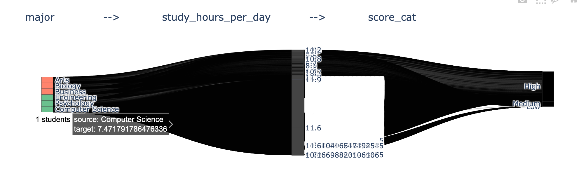
The above diagram is a dummy diagram as the data set of source, target and value was not actual data therefore i decided to work on working with my own dataset
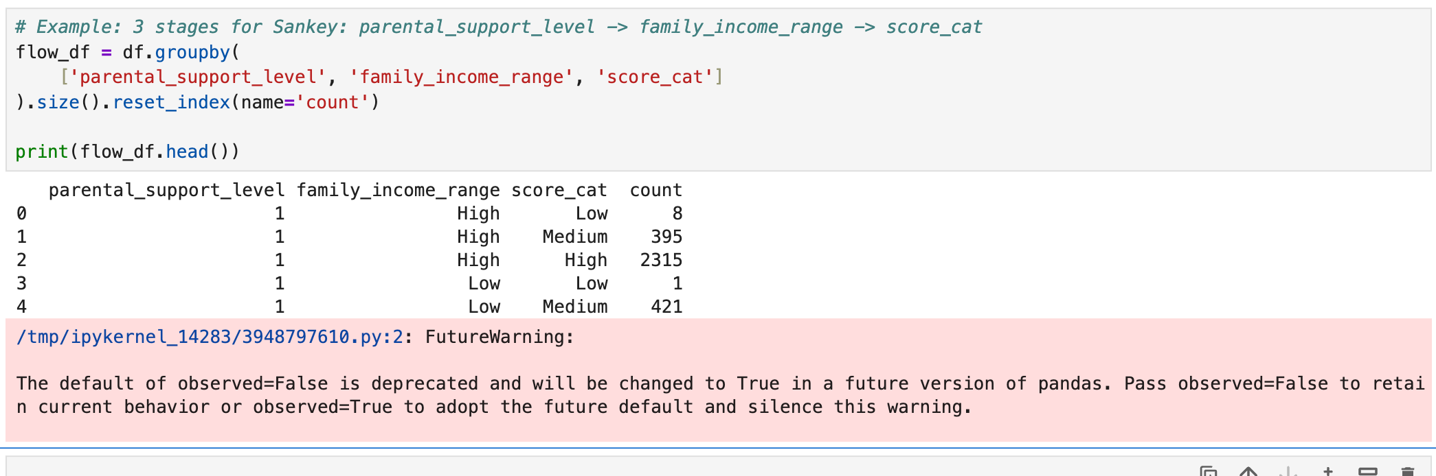
It’s not an error, just a warning about a future change in pandas default behavior.
- You can fix it by adding observed=True or observed=False in groupby().
- If you don’t want the warning cluttering your notebook, it’s good practice to explicitly set observed.
df.head()
| student_id | age | gender | major | study_hours_per_day | social_media_hours | netflix_hours | part_time_job | attendance_percentage | sleep_hours | ... | parental_support_level | motivation_level | exam_anxiety_score | learning_style | time_management_score | exam_score | mh_cat | stress_cat | score_cat | Screen time | |
|---|---|---|---|---|---|---|---|---|---|---|---|---|---|---|---|---|---|---|---|---|---|
| 0 | 100000 | 26 | Male | Computer Science | 7.645367 | 3.0 | 0.1 | Yes | 70.3 | 6.2 | ... | 9 | 7 | 8 | Reading | 3.0 | 100 | Medium | Medium | High | 10.1+ |
| 1 | 100001 | 28 | Male | Arts | 5.700000 | 0.5 | 0.4 | No | 88.4 | 7.2 | ... | 7 | 2 | 10 | Reading | 6.0 | 99 | Medium | Medium | High | 8.1-10 |
| 2 | 100002 | 17 | Male | Arts | 2.400000 | 4.2 | 0.7 | No | 82.1 | 9.2 | ... | 3 | 9 | 6 | Kinesthetic | 7.6 | 98 | Medium | High | High | 8.1-10 |
| 3 | 100003 | 27 | Other | Psychology | 3.400000 | 4.6 | 2.3 | Yes | 79.3 | 4.2 | ... | 5 | 3 | 10 | Reading | 3.2 | 100 | High | Medium | High | 10.1+ |
| 4 | 100004 | 25 | Female | Business | 4.700000 | 0.8 | 2.7 | Yes | 62.9 | 6.5 | ... | 9 | 1 | 10 | Reading | 7.1 | 98 | High | Medium | High | 8.1-10 |
5 rows × 35 columns
start_point = 'learning_style'
mid_point = 'major'
last_point = 'mh_cat'
flow_df = df.groupby(
    [start_point, mid_point, last_point],
    observed=True
).size().reset_index(name='count')
start_point = 'learning_style' mid_point = 'major' last_point = 'dropout_risk'
This three variable are the three level of data where the sankey data will flow
Mapping to Sankey source, target, value
Create nodes — all unique categories across all stages.
all_nodes = pd.concat([
    flow_df[start_point],
    flow_df[mid_point],
    flow_df[last_point]
]).unique().tolist()

node_index = {node: i for i, node in enumerate(all_nodes)}
print(node_index)
{'Auditory': 0, 'Kinesthetic': 1, 'Reading': 2, 'Visual': 3, 'Arts': 4, 'Biology': 5, 'Business': 6, 'Computer Science': 7, 'Engineering': 8, 'Psychology': 9, 'Low': 10, 'Medium': 11, 'High': 12}
Create source, target, value arrays for the Sankey diagram:
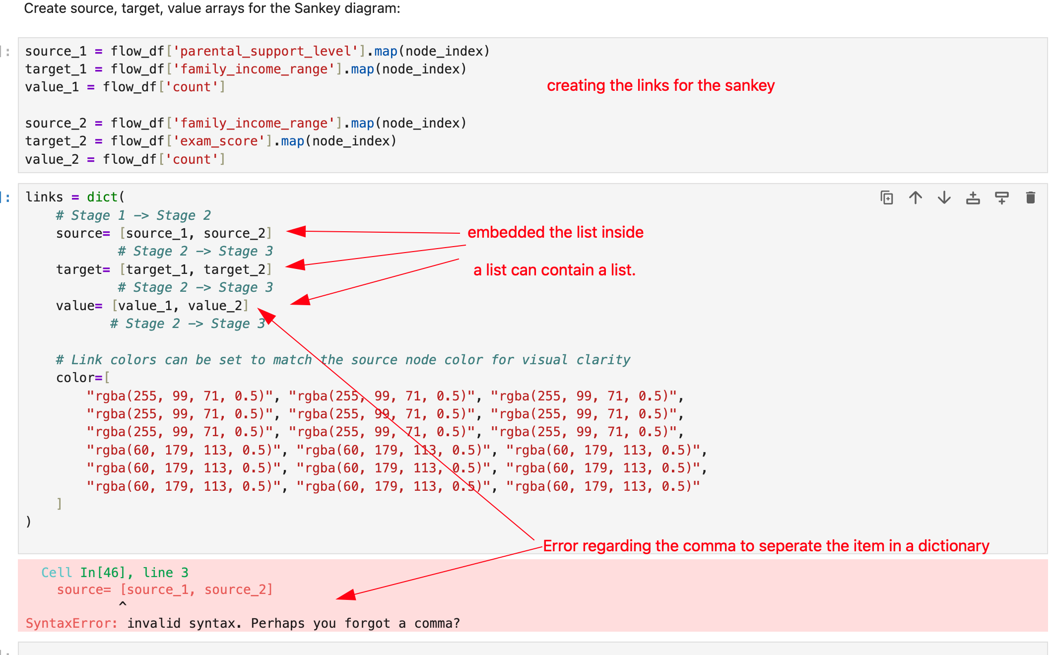
source_1 = flow_df[start_point].map(node_index)
target_1 = flow_df[mid_point].map(node_index)
value_1 = flow_df['count']

source_2 = flow_df[mid_point].map(node_index)
target_2 = flow_df[last_point].map(node_index)
value_2 = flow_df['count']
nodes = dict(
    label=all_nodes,
    # You can set a color for each stage for better visualization
    color=[
        "rgba(255, 99, 71, 0.8)", "rgba(255, 99, 71, 0.8)", "rgba(255, 99, 71, 0.8)", # Stage 1 (Reddish)
        "rgba(60, 179, 113, 0.8)", "rgba(60, 179, 113, 0.8)", "rgba(60, 179, 113, 0.8)", # Stage 2 (Greenish)
        "rgba(65, 105, 225, 0.8)", "rgba(65, 105, 225, 0.8)", "rgba(65, 105, 225, 0.8)"  # Stage 3 (Blueish)
    ]
)
final_source = []
ind = 0
for i in range(len(source_1)):
    final_source.append(source_1[i])
    ind = i
for k in range(len(source_2)):
    ind = ind + 1
    final_source.append(source_2[k])

final_target = []
ind = 0
for i in range(len(target_1)):
    final_target.append(target_1[i])
    ind = i
for k in range(len(target_2)):
    ind = ind + 1
    final_target.append(target_2[k])

final_value = []
ind = 0
for i in range(len(value_1)):
    final_value.append(value_1[i])
    ind = i
for k in range(len(value_2)):
    ind = ind + 1
    final_value.append(value_2[k])
Since i need to include the list seriese for sourece, target and value, therefore i use forloop to append data of two different list to a single list called final_source, final_target and final_value
links = dict(
    # Stage 1 -> Stage 2
    source= final_source,
            # Stage 2 -> Stage 3
    target= final_target,
            # Stage 2 -> Stage 3
    value= final_value,
           # Stage 2 -> Stage 3
)
fig = go.Figure(data=[go.Sankey(
    node=nodes,
    link=links,
    arrangement="snap",
    valueformat=".0f",
    valuesuffix=" students"
)])
# 4. Update Layout (Optional)
fig.update_layout(
    title_text= start_point + "              -->            " + mid_point + "           -->            " + last_point,
    font_size=12
)
Sankey Output
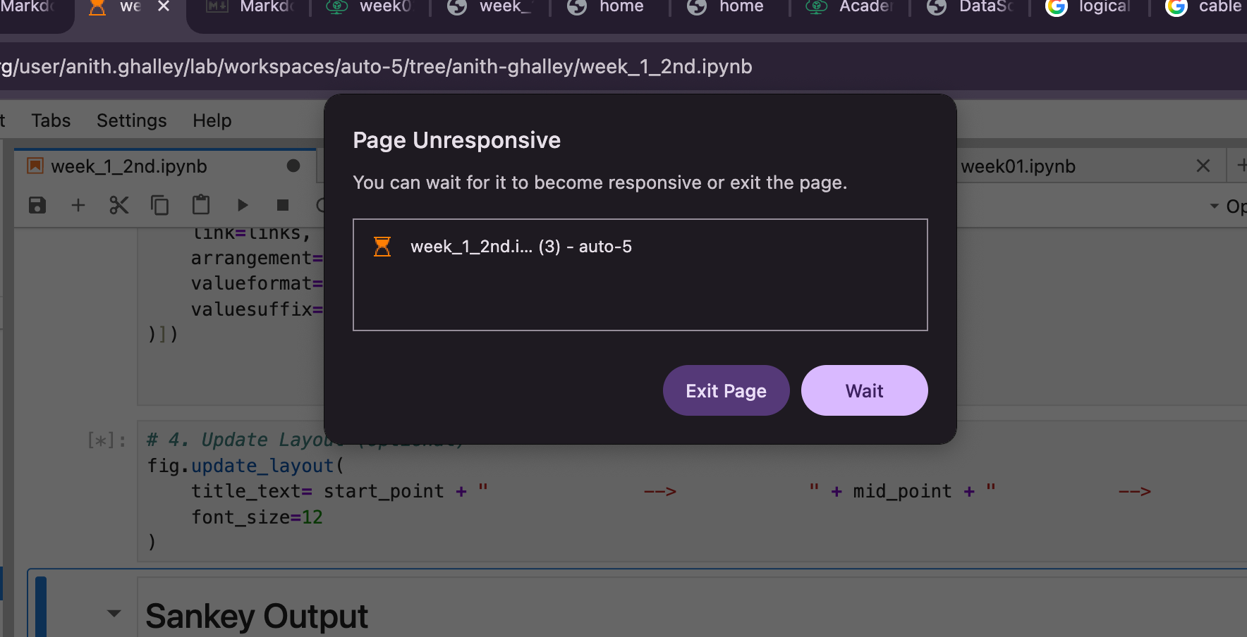
Juypter Page Unresponsive
When i was experimenting with different data set, the juypter was becoming unresponsive so maybe i thought it was because of the heavy dataset that i was selecting and hence it started showing the message below.
Browse about D3 as well