Data Visualization
➡️ Data visualization is the process of turning numbers and information into charts, graphs, and images so we can understand patterns, trends, and comparisons quickly.
Very easy example:
If you have fruit sales for 5 dzongkhags, instead of looking at a long table of numbers, you draw a bar graph. Just by looking, you can see which dzongkhag sold the most or the least.
Why data visualization is useful?
Makes complex data simple
Helps you see trends (increase/decrease)
Helps compare categories
Makes reports easy to explain
Helps in decision-making
Common types of visualizations:
Bar graph
Line graph
Pie chart
Histogram
Scatter plot
Maps

TOOLs:
-. They help us find patterns and trends
-They improve reports and presentations
-They allow interactive exploration
1 Excel
2. Google Sheets
3. Python Matplotlib & Seaborn in Jupyter Notebook


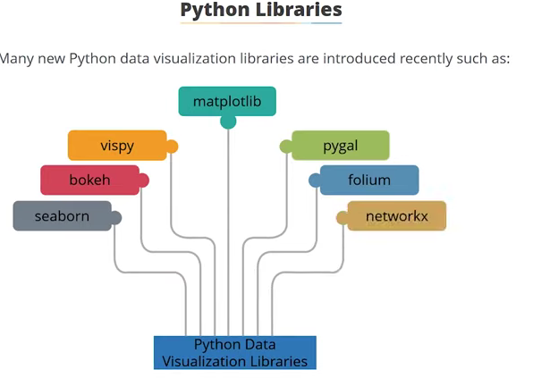
Python Libraies
I came to learned lots of python data visualization libraries , however i loved to explore the matplotlib sinch i saw many advantages of using iy. Not only that eveen our professor recommend and mostly made us familiar with this labrary. As i started exploring on it, i came to learn form tutorial and other platform that this libraries is benificial for the begginer learner like me.

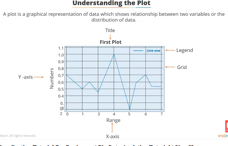
Anatomy of plot
First of all before we do any data visualization or use matplotlib to visualize our data we need to know the anatomy of plot. So that it will be eaisier for me to give label to my plot as follow
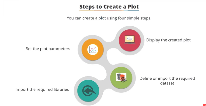
I have followed the following steps
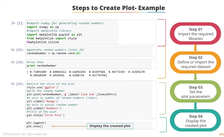
import matplotlib.pyplot as plt
from matplotlib import style
%matplotlib inline
import pandas as pd
import numpy as np
randomnumber = np.random.rand(10)
print (randomnumber)
[0.78759321 0.53782427 0.56924464 0.47910728 0.73808527 0.56013932
 0.56247922 0.3603106  0.02800028 0.5325992 ]
plt.style.use (`ggplot`)
plt. plot (randomnumber,(`gg`), label = `line one` linewidth=2)
plt.xlabel(`rang`)
plt.ylabel(`numbers`)
plt.title(First plot)
plt.legend()
plt.show()
  Cell In[1], line 1
    plt.style.use (`ggplot`)
                   ^
SyntaxError: invalid syntax
x = [1,2,3,4]
y = [4,5,6,7]
plt.plot(x,y)
plt.show
<function matplotlib.pyplot.show(close=None, block=None)>

pyplot Api
univariate - Numerical
dorji-tshezom/datasets/Job Posting.csv
import matplotlib.pyplot as plt
import seaborn as sns
dorji-tshezom/datasets/Job Posting.csv
df.head()
| Unnamed: 0 | Unnamed: 1 | Unnamed: 2 | Unnamed: 3 | Unnamed: 4 | Unnamed: 5 | Unnamed: 6 | Unnamed: 7 | Unnamed: 8 | Unnamed: 9 | ... | Unnamed: 15 | Unnamed: 16 | Unnamed: 17 | Unnamed: 18 | Unnamed: 19 | Unnamed: 20 | Unnamed: 21 | Unnamed: 22 | Unnamed: 23 | Unnamed: 24 | |
|---|---|---|---|---|---|---|---|---|---|---|---|---|---|---|---|---|---|---|---|---|---|
| 0 | NaN | Irrigated Paddy | NaN | NaN | Upland Paddy | NaN | NaN | Maize | NaN | NaN | ... | NaN | Barley | NaN | NaN | Millet | NaN | NaN | Quinoa | NaN | NaN |
| 1 | Dzongkhag | Sown Area (Acre) | Harvested Area (Acre) | Production (MT) | Sown Area (Acre) | Harvested Area (Acre) | Production (MT) | Sown Area (Acre) | Harvested Area (Acre) | Production (MT) | ... | Production (MT) | Sown Area (Acre) | Harvested Area (Acre) | Production (MT) | Sown Area (Acre) | Harvested Area (Acre) | Production (MT) | Sown Area (Acre) | Harvested Area (Acre) | Production (MT) |
| 2 | Bumthang | 112.732886 | 108.73793 | 164.98479 | 0 | 0 | 0 | 0.95405 | 0.477025 | 0.276172 | ... | 303.913949 | 322.13337 | 284.32811 | 148.17781 | 2.950391 | 1.229329 | 0.983464 | 0.318016 | 0.318016 | 0.19081 |
| 3 | Chukha | 1047.123288 | 907.49028 | 1539.711124 | 55.618929 | 45.462151 | 30.29093 | 1494.45484 | 1153.47943 | 1446.529806 | ... | 121.949055 | 47.090664 | 41.795427 | 20.235387 | 362.342557 | 323.000712 | 147.827759 | 4.241636 | 3.50086 | 1.423413 |
| 4 | Dagana | 2067.202705 | 1862.639608 | 2450.662581 | 30.711222 | 29.497675 | 7.568256 | 2364.611317 | 1717.412537 | 2001.271484 | ... | 86.097623 | 50.407894 | 44.798978 | 19.547031 | 181.607689 | 163.633424 | 79.192313 | 0.020625 | 0.020625 | 0.010313 |
5 rows × 25 columns
import pandas as pd
import pandas as pd
pd.set_option('display.max_rows',None)
pd.set_option('display.max_columns',None)
df.info()
<class 'pandas.core.frame.DataFrame'>
RangeIndex: 23 entries, 0 to 22
Data columns (total 25 columns):
 #   Column       Non-Null Count  Dtype
---  ------       --------------  -----
 0   Unnamed: 0   22 non-null     object
 1   Unnamed: 1   23 non-null     object
 2   Unnamed: 2   22 non-null     object
 3   Unnamed: 3   22 non-null     object
 4   Unnamed: 4   23 non-null     object
 5   Unnamed: 5   22 non-null     object
 6   Unnamed: 6   22 non-null     object
 7   Unnamed: 7   23 non-null     object
 8   Unnamed: 8   22 non-null     object
 9   Unnamed: 9   22 non-null     object
 10  Unnamed: 10  23 non-null     object
 11  Unnamed: 11  22 non-null     object
 12  Unnamed: 12  22 non-null     object
 13  Unnamed: 13  23 non-null     object
 14  Unnamed: 14  22 non-null     object
 15  Unnamed: 15  22 non-null     object
 16  Unnamed: 16  23 non-null     object
 17  Unnamed: 17  22 non-null     object
 18  Unnamed: 18  22 non-null     object
 19  Unnamed: 19  23 non-null     object
 20  Unnamed: 20  22 non-null     object
 21  Unnamed: 21  22 non-null     object
 22  Unnamed: 22  23 non-null     object
 23  Unnamed: 23  22 non-null     object
 24  Unnamed: 24  22 non-null     object
dtypes: object(25)
memory usage: 4.6+ KB
df.describe(include='all')
| Unnamed: 0 | Unnamed: 1 | Unnamed: 2 | Unnamed: 3 | Unnamed: 4 | Unnamed: 5 | Unnamed: 6 | Unnamed: 7 | Unnamed: 8 | Unnamed: 9 | ... | Unnamed: 15 | Unnamed: 16 | Unnamed: 17 | Unnamed: 18 | Unnamed: 19 | Unnamed: 20 | Unnamed: 21 | Unnamed: 22 | Unnamed: 23 | Unnamed: 24 | |
|---|---|---|---|---|---|---|---|---|---|---|---|---|---|---|---|---|---|---|---|---|---|
| count | 22 | 23 | 22 | 22 | 23 | 22 | 22 | 23 | 22 | 22 | ... | 22 | 23 | 22 | 22 | 23 | 22 | 22 | 23 | 22 | 22 |
| unique | 22 | 23 | 22 | 22 | 22 | 21 | 19 | 23 | 22 | 22 | ... | 22 | 23 | 22 | 22 | 23 | 22 | 22 | 21 | 20 | 19 |
| top | Dzongkhag | Irrigated Paddy | Harvested Area (Acre) | Production (MT) | 0 | 0 | 0 | Maize | Harvested Area (Acre) | Production (MT) | ... | Production (MT) | Barley | Harvested Area (Acre) | Production (MT) | Millet | Harvested Area (Acre) | Production (MT) | 0 | 0 | 0 |
| freq | 1 | 1 | 1 | 1 | 2 | 2 | 4 | 1 | 1 | 1 | ... | 1 | 1 | 1 | 1 | 1 | 1 | 1 | 3 | 3 | 4 |
4 rows × 25 columns
plt.title("fruits production")
plt.plot(df['Apple, Arecanut,Mandarin,Watermelon,Dragonfruit,kiwi'], df['Bumthang,chukha,Dagana,Gasa,Haa'])
plt.xlabel("plt.plot(df['Column25'], df['Column25'])
Text(0.5, 1.0, 'fruits production')

My work
import matplotlib.pyplot as plt
from matplotlib import style
%matplotlib inline
import pandas as pd
import numpy as np
Data import
import pandas as pd

# Load the dataset
datasets = pd.read_excel("datasets/data 1.xlsx")

# Check the shape
print("Data shape:", datasets.shape)

# Display the first 5 rows
datasets.head()
Data shape: (11, 7)
| Unnamed: 0 | Name | Subject | Unnamed: 3 | Unnamed: 4 | Unnamed: 5 | Unnamed: 6 | |
|---|---|---|---|---|---|---|---|
| 0 | Sl.No | NaN | Math | sci | Eng | Dzo | Total |
| 1 | 1 | Dorji | 20 | 54 | 67 | 93 | 234 |
| 2 | 2 | Tashi | 35 | 60 | 76 | 59 | 230 |
| 3 | 3 | Pema | 70 | 54 | 55 | 76 | 255 |
| 4 | 4 | Dawa | 40 | 34 | 45 | 77 | 196 |
display all the rows and columns
pd.set_option('display.max_rows',None)
pd.set_option('display.max_columns',None)
datasets
| Unnamed: 0 | Name | Subject | Unnamed: 3 | Unnamed: 4 | Unnamed: 5 | Unnamed: 6 | |
|---|---|---|---|---|---|---|---|
| 0 | Sl.No | NaN | Math | sci | Eng | Dzo | Total |
| 1 | 1 | Dorji | 20 | 54 | 67 | 93 | 234 |
| 2 | 2 | Tashi | 35 | 60 | 76 | 59 | 230 |
| 3 | 3 | Pema | 70 | 54 | 55 | 76 | 255 |
| 4 | 4 | Dawa | 40 | 34 | 45 | 77 | 196 |
| 5 | 5 | Nima | 50 | 36 | 34 | 59 | 179 |
| 6 | 6 | Karma | 67 | 67 | 25 | 47 | 206 |
| 7 | 7 | Dema | 88 | 89 | 78 | 29 | 284 |
| 8 | 8 | Dechen | 46 | 90 | 47 | 39 | 222 |
| 9 | 9 | Kelzang | 67 | 57 | 67 | 71 | 262 |
| 10 | 10 | Zam | 46 | 67 | 76 | 62 | 251 |
Data Visualizaton
import pandas as pd
import matplotlib.pyplot as plt
import seaborn as sns
df.head()
| Unnamed: 0 | Name | Subject | Unnamed: 3 | Unnamed: 4 | Unnamed: 5 | Unnamed: 6 | |
|---|---|---|---|---|---|---|---|
| 0 | Sl.No | NaN | Math | sci | Eng | Dzo | Total |
| 1 | 1 | Dorji | 20 | 54 | 67 | 93 | 234 |
| 2 | 2 | Tashi | 35 | 60 | 76 | 59 | 230 |
| 3 | 3 | Pema | 70 | 54 | 55 | 76 | 255 |
| 4 | 4 | Dawa | 40 | 34 | 45 | 77 | 196 |
# Check column names
print(df.columns.tolist())

# Clean column names (remove spaces)
df.columns = df.columns.str.strip()

# Check again after cleaning
print(df.columns.tolist())
['Unnamed: 0', 'Name ', 'Subject', 'Unnamed: 3', 'Unnamed: 4', 'Unnamed: 5', 'Unnamed: 6']
['Unnamed: 0', 'Name', 'Subject', 'Unnamed: 3', 'Unnamed: 4', 'Unnamed: 5', 'Unnamed: 6']
# Check the shape
print("Data shape:", df.shape)

# Check for missing values
print(df.isnull().sum())
Data shape: (11, 7)
Unnamed: 0    0
Name          1
Subject       0
Unnamed: 3    0
Unnamed: 4    0
Unnamed: 5    0
Unnamed: 6    0
dtype: int64
numeric_cols = df.select_dtypes(include='number').columns.tolist()
print("Numeric columns:", numeric_cols)
Numeric columns: []
# Example: compare first numeric column with first column (like student names)
plt.figure(figsize=(12,6))
sns.barplot(x=df[df.columns[0]], y=df[numeric_cols[0]])
plt.xticks(rotation=45)
plt.title(f'{numeric_cols[0]} by {df.columns[0]}')
plt.show()
import pandas as pd
import matplotlib.pyplot as plt

# ---------- Step 1: Create the Dataset ----------
data = {
    "Sl.No": [1,2,3,4,5,6,7,8,9,10],
    "Name": ["Dorji","Tashi","Pema","Dawa","Nima","Karma","Dema","Dechen","Kelzang","Zam"],
    "Math": [20,35,70,40,50,67,88,46,67,46],
    "Sci":  [54,60,54,34,36,67,89,90,57,67],
    "Eng":  [67,76,55,45,34,25,78,47,67,76],
    "Dzo":  [93,59,76,77,59,47,29,39,71,62],
    "Total":[234,230,255,196,179,206,284,222,262,251]
}

df = pd.DataFrame(data)

# ---------- Step 2: Display the Data ----------
print("Dataset:")
df
Dataset:
| Sl.No | Name | Math | Sci | Eng | Dzo | Total | |
|---|---|---|---|---|---|---|---|
| 0 | 1 | Dorji | 20 | 54 | 67 | 93 | 234 |
| 1 | 2 | Tashi | 35 | 60 | 76 | 59 | 230 |
| 2 | 3 | Pema | 70 | 54 | 55 | 76 | 255 |
| 3 | 4 | Dawa | 40 | 34 | 45 | 77 | 196 |
| 4 | 5 | Nima | 50 | 36 | 34 | 59 | 179 |
| 5 | 6 | Karma | 67 | 67 | 25 | 47 | 206 |
| 6 | 7 | Dema | 88 | 89 | 78 | 29 | 284 |
| 7 | 8 | Dechen | 46 | 90 | 47 | 39 | 222 |
| 8 | 9 | Kelzang | 67 | 57 | 67 | 71 | 262 |
| 9 | 10 | Zam | 46 | 67 | 76 | 62 | 251 |
import matplotlib.pyplot as plt
import seaborn as sns

plt.style.use("ggplot")
plt.figure(figsize=(14,6))
for subject in ["Math", "Sci", "Eng", "Dzo"]:
    plt.plot(df["Name"], df[subject], marker="o", label=subject)

plt.title("Subject-wise Score Comparison")
plt.xlabel("Student Name")
plt.ylabel("Marks")
plt.xticks(rotation=45)
plt.legend()
plt.show()

Sangky Graph
import plotly.graph_objects as go

# Data
students = ["Dorji", "Tashi", "Pema", "Dawa", "Nima", "Karma", "Dema", "Dechen", "Kelzang", "Zam"]
math_scores = [20, 35, 70, 40, 50, 67, 88, 46, 67, 46]
sci_scores = [54, 60, 54, 34, 36, 67, 89, 90, 57, 67]
eng_scores = [67, 76, 55, 45, 34, 25, 78, 47, 67, 76]
dzo_scores = [93, 59, 76, 77, 59, 47, 29, 39, 71, 62]

# Nodes (students + subjects)
labels = students + ["Math", "Science", "English", "Dzongkha"]

# Links for Sankey diagram
source = []
target = []
value = []

# Connect each student to each subject with the score as value
for i, student in enumerate(students):
    source.extend([i, i, i, i])             # student index
    target.extend([10, 11, 12, 13])         # subject indices
    value.extend([math_scores[i], sci_scores[i], eng_scores[i], dzo_scores[i]])

# Create Sankey diagram
fig = go.Figure(data=[go.Sankey(
    node=dict(
        pad=15,
        thickness=20,
        line=dict(color="black", width=0.5),
        label=labels,
        color="blue"
    ),
    link=dict(
        source=source,
        target=target,
        value=value,
        color="lightblue"
    )
)])

fig.update_layout(title_text="Student Scores Sankey Diagram", font_size=10)
fig.show()

import numpy as np
from sklearn.linear_model import LinearRegression

# Data
Math = np.array([20, 35, 70, 40, 50, 67, 88, 46, 67, 46])
Sci  = np.array([54, 60, 54, 34, 36, 67, 89, 90, 57, 67])
Eng  = np.array([67, 76, 55, 45, 34, 25, 78, 47, 67, 76])
Dzo  = np.array([93, 59, 76, 77, 59, 47, 29, 39, 71, 62])
Total = np.array([234, 230, 255, 196, 179, 206, 284, 222, 262, 251])

# Combine independent variables
X = np.column_stack((Math, Sci, Eng, Dzo))
y = Total

# Create linear regression model
model = LinearRegression()
model.fit(X, y)

# Get coefficients
coefficients = model.coef_
intercept = model.intercept_

print("Fitted function:")
print(f"Total = {intercept:.2f} + ({coefficients[0]:.2f}*Math) + ({coefficients[1]:.2f}*Sci) + ({coefficients[2]:.2f}*Eng) + ({coefficients[3]:.2f}*Dzo)")

# Predict Total using the model
Total_pred = model.predict(X)
print("\nPredicted Total:", Total_pred)