Presentation

BCSE 2025 Data Analysis
The Bhutan Civil Service Examination (BCSE) 2025 is a key national examination for recruiting qualified candidates into the civil service. This data analysis examines the examination results to identify overall performance trends, score distributions, and key patterns among candidates. The purpose is to gain clear insights that can support decision-making, improve preparation strategies, and enhance the effectiveness of future civil service recruitment processes.
In [51]:
import matplotlib.pyplot as plt
import numpy as np
import pandas as pd
import seaborn as sns

# Load the dataset
df = pd.read_csv("datasets/PGDE-2025-Ranking.csv")

df.head()
Out[51]:
| Registration Number | Citizenship ID | Degree | Subject | Rank | |
|---|---|---|---|---|---|
| 0 | BCSE-2025-191099 | 11502002356 | B.Sc | Mathematics | 1 |
| 1 | BCSE-2025-191275 | 10104000513 | BA | Geography & Economics | 2 |
| 2 | BCSE-2025-192505 | 11411001379 | B.Sc. | Mathematics | 3 |
| 3 | BCSE-2025-192327 | 11705002292 | B.Sc | Mathematics | 4 |
| 4 | BCSE-2025-190340 | 11513005263 | BA | English | 5 |
Data Analysis
In [52]:
df.tail()
Out[52]:
| Registration Number | Citizenship ID | Degree | Subject | Rank | |
|---|---|---|---|---|---|
| 142 | BCSE-2025-193139 | 11309001487 | BA | English | 143 |
| 143 | BCSE-2025-194255 | 10811002858 | BA | Dzongkha & English | 144 |
| 144 | BCSE-2025-194627 | 10209000187 | B.Com | Accounting | 145 |
| 145 | BCSE-2025-192896 | 11803003039 | B.Sc | Chemistry & Mathematics | 146 |
| 146 | BCSE-2025-190923 | 11303003563 | B.Sc | Mathematics | 147 |
Candidates by Degree and Subjects
In [71]:
import matplotlib.pyplot as plt
import seaborn as sns
import pandas as pd

# Load and clean data
df = pd.read_csv("datasets/PGDE-2025-Ranking.csv")
df['Degree'] = df['Degree'].replace({'B.Sc.': 'B.Sc'})  # Standardize degree names

# Create the plot
plt.figure(figsize=(10, 6))
ax = sns.countplot(data=df, x="Degree", hue="Subject")

# Add labels on top of bars
for container in ax.containers:
    ax.bar_label(container, fmt='%d', fontsize=9)

# Customize
plt.title("Candidates by Degree and Subject", fontsize=14, fontweight='bold')
plt.xlabel("Degree Type", fontsize=12)
plt.ylabel("Number of Candidates", fontsize=12)
plt.legend(title="Subject", bbox_to_anchor=(1.05, 1), loc='upper left')
plt.grid(axis='y', alpha=0.3)

plt.tight_layout()
plt.show()

# Show summary statistics
print(f"Total Candidates: {len(df)}")
print("\nCandidates by Degree:")
print(df['Degree'].value_counts())

Total Candidates: 147

Candidates by Degree:
Degree
B.Sc     68
B.Com    40
BA       39
Name: count, dtype: int64
This shows how many candidates there are for each subject within each degree using grouped bars.
In [65]:
import matplotlib.pyplot as plt
import numpy as np
import pandas as pd
import seaborn as sns

df = pd.read_csv("datasets/PGDE-2025-Ranking.csv", index_col=False)
df = df.reset_index(drop=True)

# 1) Aggregate: one row per Subject with its mean Rank
df_subject = df.groupby("Subject", as_index=False)["Rank"].mean()

plt.figure(figsize=(12, 6))

sns.barplot(
    data=df_subject,
    x="Subject",
    y="Rank",
    errorbar=None,
    palette="tab20"
)

plt.title("Average Rank by Subject")
plt.xticks(rotation=60, ha="right")  # rotate and right-align labels
plt.xlabel("Subject", fontsize = 15)
plt.ylabel("Average Rank (lower is better)",fontsize = 15)
plt.tight_layout()
plt.show()
/tmp/ipykernel_121/2816931654.py:14: FutureWarning:

Passing `palette` without assigning `hue` is deprecated and will be removed in v0.14.0. Assign the `x` variable to `hue` and set `legend=False` for the same effect.

  sns.barplot(

This summarizes performance by plotting the average rank for each subject as a barplot.
In [4]:
import matplotlib.pyplot as plt
import pandas as pd
import seaborn as sns
import numpy as np
from mpl_toolkits.mplot3d import Axes3D

# Load data
df = pd.read_csv("datasets/PGDE-2025-Ranking.csv")

# Create features
df['Subject_Length'] = df['Subject'].astype(str).str.len()
df['Subject_Complexity'] = df['Subject'].astype(str).str.count('[&,]')

# 1. 3D SCATTER PLOT
fig = plt.figure(figsize=(10, 8))
ax = fig.add_subplot(111, projection='3d')
scatter = ax.scatter(df['Rank'], df['Subject_Length'], df['Subject_Complexity'],
                     c=pd.factorize(df['Degree'])[0], cmap='viridis', s=50)
ax.set_xlabel('Rank (Lower=Better)')
ax.set_ylabel('Subject Length')
ax.set_zlabel('Subject Complexity')
plt.title('3D: Rank vs Subject Length vs Complexity', fontweight='bold')
plt.show()

# 2. VOLUMETRIC / HEATMAP (Gridded Data)
plt.figure(figsize=(10, 6))
heatmap_data = df.pivot_table(index='Degree', columns='Subject',
                              values='Rank', aggfunc='mean')
sns.heatmap(heatmap_data, cmap='YlOrRd', cbar_kws={'label': 'Average Rank'})
plt.title('Volumetric/Gridded: Average Rank Heatmap', fontweight='bold')
plt.tight_layout()
plt.show()

# 3. 2D HISTOGRAM (Statistical Distribution)
plt.figure(figsize=(10, 6))
plt.hist2d(df['Rank'], df['Subject_Length'], bins=20, cmap='Blues')
plt.colorbar(label='Frequency')
plt.xlabel('Rank (Lower=Better)')
plt.ylabel('Subject Length')
plt.title('2D Histogram: Rank vs Subject Length Distribution', fontweight='bold')
plt.grid(alpha=0.3)
plt.show()

# 4. PAIRWISE SCATTER
plt.figure(figsize=(10, 6))
colors = {'B.Sc':'blue', 'B.Sc.':'lightblue', 'BA':'red', 'B.Com':'green'}
for degree, color in colors.items():
    subset = df[df['Degree'] == degree]
    plt.scatter(subset['Rank'], subset['Subject_Length'],
                color=color, alpha=0.7, s=50, label=degree)
plt.xlabel('Rank (Lower=Better)')
plt.ylabel('Subject Length')
plt.title('Pairwise Scatter: Rank vs Subject Length', fontweight='bold')
plt.legend(title='Degree')
plt.grid(alpha=0.3)
plt.show()

# 5. VIOLIN PLOT (Alternative Statistical Distribution)
plt.figure(figsize=(10, 6))
sns.violinplot(x='Degree', y='Rank', data=df, inner='quartile')
plt.title('Rank Distribution by Degree', fontweight='bold')
plt.xlabel('Degree Type')
plt.ylabel('Rank (Lower=Better)')
plt.grid(alpha=0.3)
plt.show()


Summary of My Finding
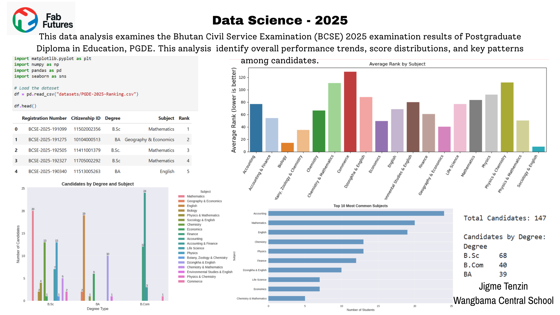
Fig 1.0 Data Analysis on BCSE 2025 result