Session 3: Data Science: Fitting
Attending the Data Science Fitting class was not as I had expected, as the lessons involved many mathematical concepts and coding. I will try to keep track of my learning experiences with the help of my colleagues and online resources.
Coaching from Mr. Anith
Mr. Anith Ghalley has organized more than one an half hour sessions to familiazrize us with the data visualizations, code help from Chatgpt etc.
I could not really make out the graph plotting without any basic knowledge. However, I used Chapgpt to generate the required code after ulpoading my csv file.
Error committed in first try.
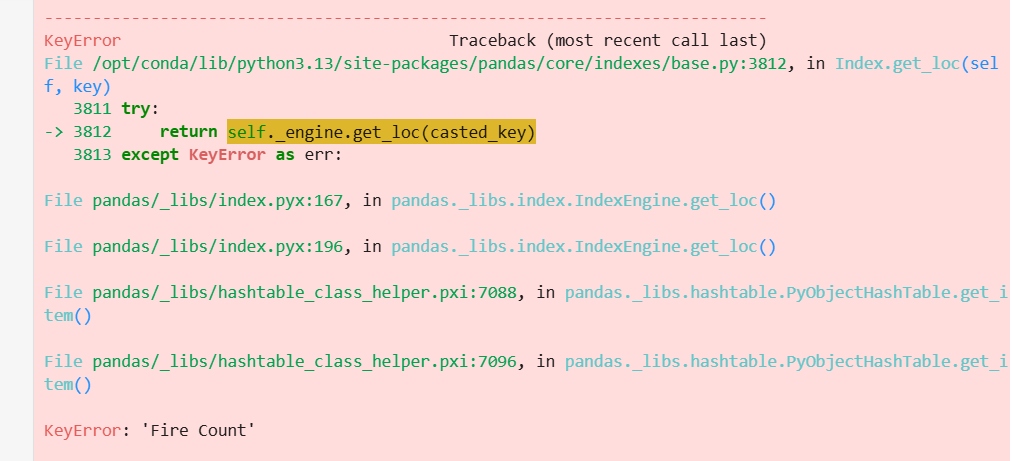
After this, I uploaded the error message image in the chat and got the redefined code to rus.
In [18]:
import pandas as pd
import numpy as np
import matplotlib.pyplot as plt

# Load your CSV file
df = pd.read_csv("datasets/firecounts.csv")

# Extract columns
x = df["Year"].values
y = df["Fire Counts"].values   # exact column name

# Polynomial fitting
xmin = x.min()
xmax = x.max()
npts = 200

coeff1 = np.polyfit(x, y, 1)   # Overall Trend
coeff2 = np.polyfit(x, y, 2)   # Rise & Fall
coeff3 = np.polyfit(x, y, 3)   # Turning Points

xfit = np.linspace(xmin, xmax, npts)

yfit1 = np.poly1d(coeff1)(xfit)
yfit2 = np.poly1d(coeff2)(xfit)
yfit3 = np.poly1d(coeff3)(xfit)

# Plot
plt.figure(figsize=(12,8))
plt.plot(x, y, 'o', label="Actual Data", markersize=8)
plt.plot(xfit, yfit1, label="Overall Trend")
plt.plot(xfit, yfit2, label="Rise & Fall")
plt.plot(xfit, yfit3, label="Turning Points")

plt.xlabel("Year")
plt.ylabel("Fire Counts")
plt.title("Fire Count Data (2001–2024)")
plt.grid(True)
plt.legend()
plt.show()

In [20]:
import pandas as pd
import numpy as np
import matplotlib.pyplot as plt

# Load your CSV file
df = pd.read_csv("datasets/firecounts.csv")

# Extract columns
x = df["Year"].values
y = df["Fire Counts"].values

# Polynomial fitting
xmin = x.min()
xmax = x.max()
npts = 200

coeff1 = np.polyfit(x, y, 1)
coeff2 = np.polyfit(x, y, 2)
coeff3 = np.polyfit(x, y, 3)

xfit = np.linspace(xmin, xmax, npts)

yfit1 = np.poly1d(coeff1)(xfit)
yfit2 = np.poly1d(coeff2)(xfit)
yfit3 = np.poly1d(coeff3)(xfit)

# -------- FIREBALL STYLE EFFECT --------
sizes = (y - y.min()) / (y.max() - y.min()) * 800 + 200   # bigger = brighter fire
colors = plt.cm.autumn((y - y.min()) / (y.max() - y.min()))  # yellow→orange→red

plt.figure(figsize=(14,7))

# Fireball scatter
plt.scatter(x, y, s=sizes, c=colors, alpha=0.8, edgecolor="black",
            linewidth=0.5, label="Fire Count Data")

# Polynomial lines
plt.plot(xfit, yfit1, label="Overall Trend", linewidth=2)
plt.plot(xfit, yfit2, label="Rise & Fall", linewidth=2)
plt.plot(xfit, yfit3, label="Turning Points", linewidth=2)

# Labels, grid, legend
plt.xlabel("Year")
plt.ylabel("Fire Counts")
plt.title("Fire Count Trends (2001–2024)")
plt.grid(True)
plt.legend()

plt.show()
