The second week of Professor Neil's data science course focused on essential tools for data analysis. The class introduced various tools, including programming languages like Python, JavaScript, and Rust.
The main goal was to get students familiar with several key Python modules (packages), which are:
Matplotlib: For creating static, interactive, and animated visualizations in Python.
Pandas: For data manipulation and analysis, especially with structured data like tables.
Seaborn: For creating attractive and informative statistical graphics (it's built on Matplotlib).
ipywidgets: For adding interactive controls (like sliders and buttons) to Jupyter notebooks.
Numpy, Scipy, and others: Numpy is vital for numerical computing (especially arrays and matrices), and Scipy is used for more advanced scientific and technical computing.In short, the second week was a hands-on introduction to the programming languages and specific Python libraries needed to efficiently handle, analyze, and visualize data.
Assignment objectives: To visualize the dataset chosen in the first assignment using data visualization tools
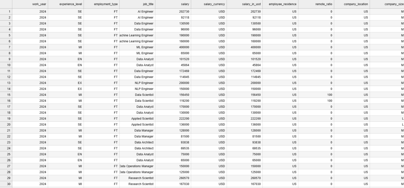
Sample Data
Exploration that I have done on Data Visualization
For this assignment I have explored the Mathplotlib library of Python Programming Language. The followigns were the points and information i have searched for while doing this presenation.
- What is Mathplotlib
- What are the features of the Mathplotlib library.
- Example codings and applications using Mathplotlib After reading the docmumentation and infomration from various sources, I have learnt that Mathplotlib library is a third-party library.The primary purpose of Mathplotlib is to create static, animated, and interactive plots and figures to help analysts and scientists understand and communicate data insights.
Features I have explored
- It has extensive plotting capabilities like 2D,3D and specailized plot.
- Highly customizable meaning, the library creates a visualization and gives you the flexibility to fine tune each visual elements.
- Generates a publication quality output meaning the visualization generated by mathplotlib could be of top notch quality that could be used in academic writings too.
- Integration with other data science library meaning that mathplotlib library can work seamlessly with other data science libraries such as Panda,seaborn and Numpy
- Dual Interface meaning it provides two main ways of creating plots. (Pylot interface and Object Oriented Interface)
Coding concpets exlpored
- Importing of the library and modules to current workspace--> from mathplotlib import pyplot(plotting interface) as pyt(namespace to be used in the code)
- Loading the external data to the code --> I have understood that Panda modules are used for loading the data to the Pandas Data Frame.
Using Panda to load the data files to panda data frame
 The above inforamtion has been retrieved from Gemenie. The importing of CSV files and other extensioned files are also quite same.
Using CSV to Load the file and converting each rows into dictionary format
example code learnt import csv with open("filepath") as csv_file: csv_reader = csv.DictReader(csv_file)
Methods Explored on Pyplot interface as of 2nd week
- Plot Method : Plots the datapoints in the form a line chart by default.
- Bar Method: Plots the datapoints in the form of a bar graph.
- title: Methods used for naming the visualiztion
- xlabel: Naming the X-Axis
- YLabel: Nameing the Y-Axis
- Legend: setting the legend for clear visualization
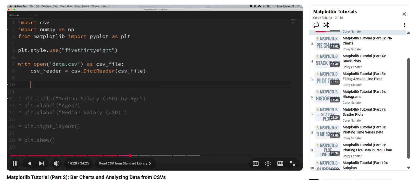
Video Tutorial I have refered to learn about Mathplotlib Library.
'''
For the completion of this assignment and learning purpose, i have worked with CSV file dataset titled "Salary insights job role" before moving with my real dataset
I have retrieved this data set from Kaggle, for this data viaualization i have just used worked with one field of the dataset
i.e Job title
The analysis i have done here is to find out the most popular jobs in USA
For the completion of this assignment i have used the following libraries and modules
csv, matplotlib and counter
csv for loading the dataset in the program, matplotlib for visualizing and counter for counting the occurence of a value.

From this analyis i have found out that Data engineer is the most popular jobs in USA.
'''
import csv # importing csv module
import matplotlib.pyplot as pt # importing the matplotlib library
from collections import Counter # importing the counter module

jobs_list = [] # empty list for storing the jobs name retrieved form csv_reader
with open("datasets/test_data.csv") as csv_file: # opening the CSV file
    csv_reader = csv.DictReader(csv_file) #Creating a dictionary for each rows.
    data_list = list(csv_reader) # Converting it to list data structure
for row in data_list:
    jobs_list.append(row["job_title"])
    #Iterating though the list where each element is an independent dict

count_of_jobs = Counter(jobs_list) # Counting the occurence of the particual jobs which returns dict packed inside a tuple
jobs = []
popularity = []
for item in count_of_jobs.most_common(5): # extracting elements from the tuple and appending it with the two empty list
    jobs.append(item[0])
    popularity.append(item[1])

#Data visualization part
pt.barh(jobs,popularity)
pt.title("Populatiry of Technical Jobs in USA")
pt.xlabel("Popularity")
pt.ylabel("Jobs")
pt.grid(True)

Challenges Faced
- Difficulty in understading the codning concept, however i was able to soldier through that
- Due to huge collection of data points, there was challenges while displaying the raw datas.