Week 3: Probablility and Statistics
This is an overall takeaway from the session.
This session highlighted that probability and statistics are indispensable tools for deriving meaning from data; probability is crucial for quantifying uncertainty and modeling the likelihood of events, thereby providing a foundation for understanding the randomness in our environment, while statistics employs systematic methods for interpreting and analyzing data, enabling us to identify trends and patterns, test hypotheses, and ultimately translate raw numerical information into actionable insights that inform decision-making processes.Statistics
Teminology and Equations explored and it's application in understanding the data distribution.(Before doing the assignment)
For this assignment i have explored information on almost all statistical fromula needed in understanding the dataset and it's application on what tells about the data distribution.
- Measurement of central tendencies.(MEAN,MEDIAN,MODE)
- Measure of asymmmetry.(NORMAL,POSTIVE,NEGATIVE)
- Measure of variability(Dispersion). (RANGE,VARIANCE and STANDARD DEVIATION)
- Measure of Relationship. (COVARIANCE, CORELATION)
- Expectations and Variance.
Measurement of central tendecies: A summary Staticstics or Measure of central location.
- MEAN: Mean is calculated by dividing the sum of all data points by total number of data. The calculation of mean provides a single, representative value for the entire dataset, giving a quick idea of the "typical" magnitude or central location of the observations. However, it's weakness lies in being affected by the outliers and skewed distribution.
- MEDIAN: It is the middle value in a set of data that has been sorted in ascending order. It's strenght lies in being alternate for the mean since it is less affected by the outliers and skewness.
- The mode represents the common value in the datasets and is not at all affected by extreme observations. Moreover, it is the best measure of central tendency for highly skewed of non-normal distributions.
Measurement of Asymmetry
The measure of asymmetry, called skewness, quantifies the degree to which a data distribution deviates from a symmetrical bell (normal distribution) shape and has a longer tail on one side.
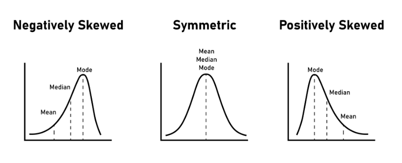
- A negatively skewed tells us that the mean is less than the median and the mode which means the outliers are on the negative directions.
- A symmetric skewness (a skewness value of or near zero) implies that outliers, if they exist, are generally balanced on both the high and low sides of the mean.
- A positively skewed tell us that the mean is greater that the median and mode and the outliers are on the positive direstion.
Measurement of variability: Dispersion
The measurement of dispersion helps us in focusing on the inconsitency in the data spread.
- RANGE: The reange is calclulated by finding the difference between the highest and lowest data. The reange helps in focusing on the most schoking aspects and ignores data that aren't considered critical.
- VARIANCE: A variance is the average of all squared deviations. And it helps us in understanding the dispersion of the data around the mean.
- STANDARD DEVIATION: A standard deviation is a square root of a variance. And it helps us in understanding the concentration of data around the mean.
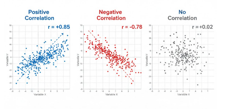
Measure of Relationships
- Covariance: Covariance is a measure of joint variablility of two variables. It determines if one variable will cause other to alter in the same way. The value of a covariance ranges from - $\infty$ to + $\infty$
- Corelation: Corelation is a normalized covariance. It measures the strength of the association between two variables.The value of correlation can range from -1 to +1.
- Meaning the correlation values.
- Correlation =1: It implies a positvive relationship between two varibales representing a direct proportionality.
- Correlation =-1: It implies negative relationship between two varibales representing a negative prportionality.
- Correlation =0: It implies the variables are independent of one another.
Image representation of differnet correlation
Expectaiton and Variance
- Expectation is an average value of random variables or in a simpler term it is what we would expect an outcome of an experiment to be on an avg. E(X) = $\sum(PX)$.
- Variance is the measurement of dispersion of data VAR(X) = E(X)2-m2
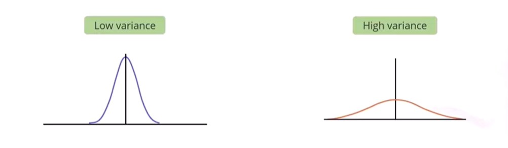
A model that has high variance means the model has learn too much from the training data. However is doesn't generalizes well with the unseen dataset. Consequently, such a model gives good result with training data but not with testing data. And moreover since a high variant model learns too much from the dataset, it leads to the overfitting of the model.
Probability
This week's session provided a comprehensive and incredibly insightful overview of foundational probability and statistical concepts, which are clearly the bedrock of data science and machine learning. The intuitive breakdown of probability types and the introduction to the philosophical differences between Frequentist and Bayesian approaches have particularly clarified how we interpret and use data.
What I have lerant and explored on Probability
Unconditional, Joint, and Conditional Probability: These concepts formalize how we handle multiple events. The simple definitions—Unconditional (probability of seeing $A$), Joint (probability of seeing $A$ and $B$ together), and Conditional (probability of seeing $A$ given $B$)—make it clear how dependence influences likelihood. Conditional probability, in particular, is the core mechanism behind inference and model prediction.
Frequentist and Bayseian Approach
The discussion contrasting the Frequentist and Bayesian perspectives highlighted the philosophical divide in probability:
Frequentist Approach: This view defines probability based on the long-run frequency of an event from a large number of trials. It relies purely on the observed data.
Bayesian Approach: This is a much more powerful framework for incorporating existing knowledge. The key takeaway is the concept of priors—our initial beliefs about a parameter. As noted, priors are almost always present, even if not specified, and are essential for generalization from limited observations. They allow us to update our beliefs as new data comes in, which feels much more aligned with how we learn in the real world.
Log likelihood and BAyesian Prior
The goal of maximizing log likelihood is essentially finding the parameters that make the observed data most probable. The fact that maximizing the log likelihood under a Gaussian (Normal) distribution is mathematically equivalent to solving a least-squares problem in linear regression demonstrates the deep mathematical links between probability and modeling.
Crucially, the Bayesian prior serves as a penalty term in the optimization process. When you combine the log likelihood (from the data) with the prior (our belief), you get the posterior probability. In practical terms, this prior prevents the model from overfitting by heavily penalizing parameter values that deviate too far from our prior belief, thus improving the model's ability to generalize to new, unseen samples. This mechanism is central to regularization techniques, like ridge regression, and shows how Bayesian principles directly lead to robust, well-generalized models
Video refered for understading Probabilty and Statistics and their applications in data science
Assignment5: Invetigating the probability distribution of the data
Task 1 Analysis: Plotting a histogram plot of salary_in_usd to visualize its probability distribution and checking for characteristics like skewness and the presence of outliers.
# code generated by Gemeni

import pandas as pd
import numpy as np
import matplotlib.pyplot as plt
import seaborn as sns

# --- 1. Load the Dataset ---
# Ensure the file 'Dataset salary 2024.csv' is in the current working directory
df = pd.read_csv("datasets/test_data.csv")

# --- 2. Define the Custom Bins (Intervals) ---
# We use numpy.arange to create boundary points every 25,000,
# starting at 0 and going slightly past the maximum salary of $800,000.
# This array defines the limits of each $25,000 interval (bin).
custom_bins = np.arange(start=0, stop=825001, step=25000)

# --- 3. Create the Histogram with Custom Bins ---
plt.figure(figsize=(12, 6))

sns.histplot(
    data=df,
    x='salary_in_usd',
    bins=custom_bins,  # Pass the array of custom boundary points
    kde=True,          # Overlay the Kernel Density Estimate (the smooth probability curve)
    color='blue',
    edgecolor='black'
)

# --- 4. Customize and Save the Plot ---
plt.title('Distribution of Salary in USD with Custom $25k Bins', fontsize=16)
plt.xlabel('Salary in USD (Bin Interval)', fontsize=14)
plt.ylabel('Frequency (Count)', fontsize=14)

# Adjust x-axis labels for better readability
plt.xticks(
    custom_bins[::2], # Display tick marks only for every other bin boundary
    rotation=45,
    ha='right'
)

plt.grid(axis='y', alpha=0.5)
plt.tight_layout()
plt.show()

Analysis
Skewness
The histogram shows a clear case of positive skewness (or right-skewness).
The majority of the data (salaries) is concentrated on the left side of the distribution, forming a high peak at the lower income brackets (around 100k - 150k).
The plot has a long, drawn-out tail extending far to the right towards the highest values (400k - 800k).
Implication for Central Tendency
- The Mean (average salary) will be significantly greater than the Median salary.
- This happens because the few extremely high salaries on the right side of the tail pull the Mean upward, making the Median a more accurate representation of the typical salary for this dataset.
Outliers Analysis
Outliers are present exclusively on the high (right) end of the distribution.
- The body of the data largely ends well below 300,000, but the tail shows isolated counts for salaries extending all the way up to 800,000.
- These salaries, which are far removed from the primary cluster, are the outliers driving the positive skewness.
Overall Conclusion
The outliers represent a small number of data scientists and AI professionals who earn exceptionally high wages (likely executive, specialized, or Big Tech roles).
Analysis 2: I wanted to check the correlation between salary and work year
Prompt used, can you generate a code for finding the correlation between the salary and the work year.
#Code is generated by Gemenie to carry out my analysis.
import pandas as pd
import matplotlib.pyplot as plt
import seaborn as sns

# --- 1. Load the Dataset ---
df = pd.read_csv("datasets/test_data.csv")

# --- 2. Define the Plot Order ---
# Define the logical order for the experience levels (EN < MI < SE < EX)
experience_order = ['EN', 'MI', 'SE', 'EX']

# --- 3. Create the VIOLIN PLOT ---
plt.figure(figsize=(10, 6))
sns.violinplot(
    x='experience_level',
    y='salary_in_usd',
    data=df,
    order=experience_order,
    palette='viridis'
)

# --- 4. Customize and Save the Plot ---
plt.title('Distribution of Salary (USD) by Experience Level', fontsize=14)
plt.xlabel('Experience Level (EN: Entry, MI: Mid, SE: Senior, EX: Executive)', fontsize=12)
plt.ylabel('Salary in USD', fontsize=12)
plt.grid(axis='y', alpha=0.5)
plt.tight_layout()
plt.show()
/tmp/ipykernel_1779/2422492780.py:15: FutureWarning:

Passing `palette` without assigning `hue` is deprecated and will be removed in v0.14.0. Assign the `x` variable to `hue` and set `legend=False` for the same effect.

  sns.violinplot(

Analysis
The correlation between salary_in_usd and experience_level is: Strong and Positive: The entire distribution shifts significantly upwards as you move from Entry-level (EN) to Executive-level (EX). This indicates a powerful relationship where increased experience strongly predicts higher salary potential.
Challenges Faced
- It was quite challenging for me to learn all those theoretical concpets of statistics and probability and applying it in the analysis of the datasets. It consumes a lot of time. Having to understand what we are actually doing and how will it affect my visualization overall.
- Even if i am having the foundation of Python Coding it takes quite a while to go through all the mehtods, classes and functions avaiblabe in the Libraries like seaborn, matplotlib, pandas, numpy, scipy and tensorflow. However, i have now become quite familiar with those libraries.And hoping to master as we progess gradually.