Data Analysis Notebook
Data Analysis Summary Slide
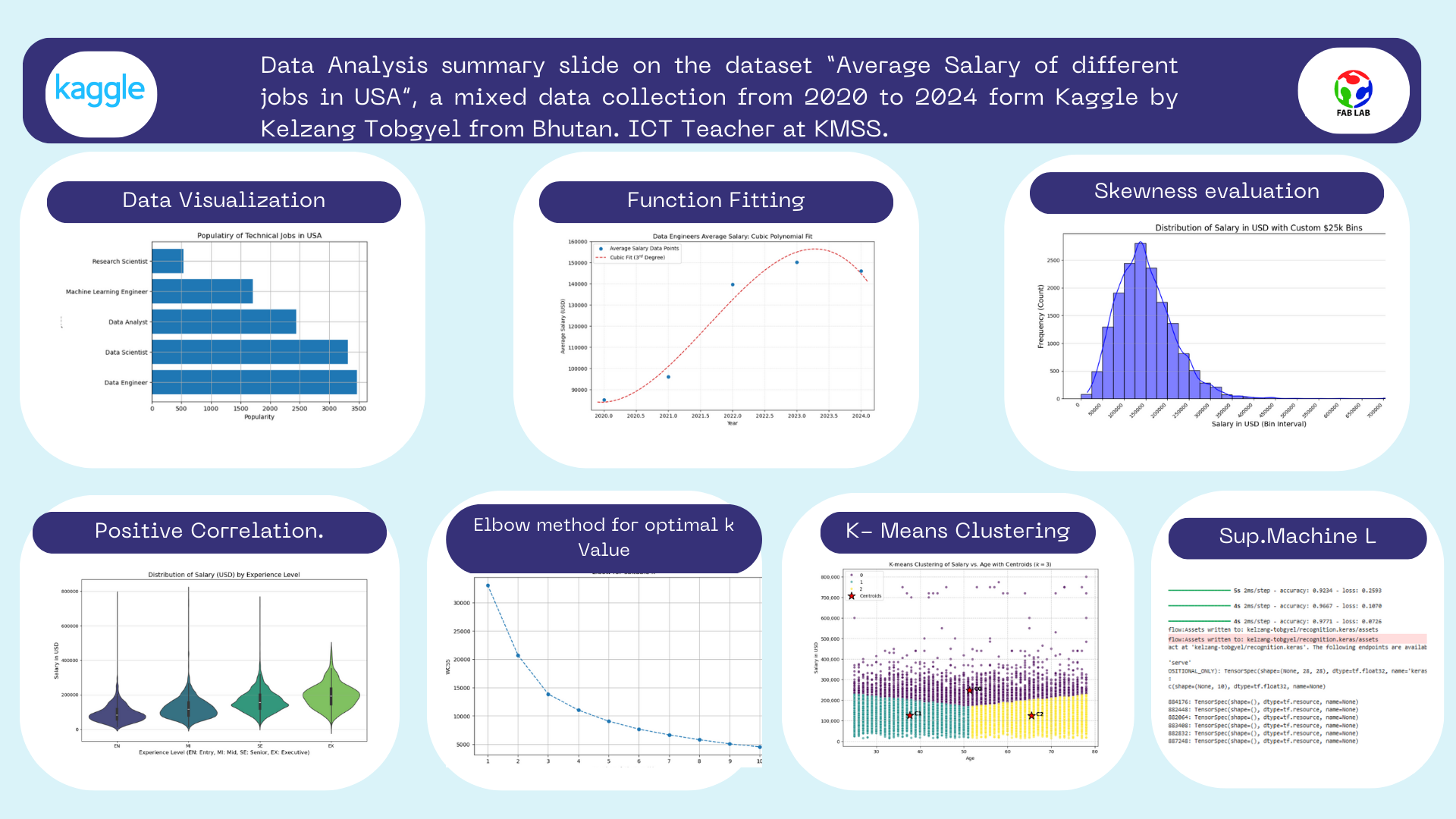
Analysis 1 from data visualization. Visualizing the Popular Jobs in USA
'''
For the completion of this assignment and learning purpose, i have worked with CSV file dataset titled "Salary insights job role" before moving with my real dataset
I have retrieved this data set from Kaggle, for this data viaualization i have just used worked with one field of the dataset
i.e Job title
The analysis i have done here is to find out the most popular jobs in USA
For the completion of this assignment i have used the following libraries and modules
csv, matplotlib and counter
csv for loading the dataset in the program, matplotlib for visualizing and counter for counting the occurence of a value.

From this analyis i have found out that Data engineer is the most popular jobs in USA.
'''
import csv # importing csv module
import matplotlib.pyplot as pt # importing the matplotlib library
from collections import Counter # importing the counter module

jobs_list = [] # empty list for storing the jobs name retrieved form csv_reader
with open("datasets/test_data.csv") as csv_file: # opening the CSV file
    csv_reader = csv.DictReader(csv_file) #Creating a dictionary for each rows.
    data_list = list(csv_reader) # Converting it to list data structure
for row in data_list:
    jobs_list.append(row["job_title"])
    #Iterating though the list where each element is an independent dict

count_of_jobs = Counter(jobs_list) # Counting the occurence of the particual jobs which returns dict packed inside a tuple
jobs = []
popularity = []
for item in count_of_jobs.most_common(5): # extracting elements from the tuple and appending it with the two empty list
    jobs.append(item[0])
    popularity.append(item[1])

#Data visualization part
pt.barh(jobs,popularity)
pt.title("Populatiry of Technical Jobs in USA")
pt.xlabel("Popularity")
pt.ylabel("Jobs")
pt.grid(True)

Analysis 1: Conclusion
Data Engineer is the most popular job in USA.
Analysis 2 from the function fitting part.
import pandas as pd
import numpy as np
import matplotlib.pyplot as plt

# Load the dataset
try:
    df_full = pd.read_csv("datasets/test_data.csv")
except FileNotFoundError:
    print("Error: 'datasets/test_data.csv' not found.")
    exit()

# Filter for Data Engineers and required columns
df_filtered = df_full[['work_year', 'salary_in_usd', 'job_title']]
df_de = df_filtered[df_filtered['job_title'] == 'Data Engineer']

# Calculate average salaries per year
avg_salaries_df = df_de.groupby('work_year')['salary_in_usd'].mean().reset_index()

# Ensure we have the required years (2020-2024)
# If a year is missing, the group by method will exclude it, which is fine for the plot.
year = avg_salaries_df['work_year'].to_numpy()
avg_salaries = avg_salaries_df['salary_in_usd'].to_numpy()

# Fitting a cubic polynomial of third degree
coefficients = np.polyfit(year, avg_salaries, 3)
poly_function = np.poly1d(coefficients)

# Creating a smooth x-range for the fitted curve
x_fit = np.linspace(year.min() - 0.1, year.max() + 0.1, 100)
y_fit = poly_function(x_fit)

# Plotting the results
plt.figure(figsize=(10, 6))

# Plotting the original data points
plt.scatter(year, avg_salaries, label='Average Salary Data Points', color='C0', zorder=5)

# Plot the fitted cubic function
plt.plot(x_fit, y_fit, label='Cubic Fit ($3^{rd}$ Degree)', color='C3', linestyle='--')

# Set titles and labels
plt.title("Data Engineers Average Salary: Cubic Polynomial Fit")
plt.xlabel("Year")
plt.ylabel("Average Salary (USD)")
plt.legend()
plt.grid(True, linestyle=':', alpha=0.6)
plt.gca().ticklabel_format(style='plain', axis='y') # Prevent scientific notation on Y-axis
plt.xlim(year.min() - 0.2, year.max() + 0.2) # Set x-limits to slightly hug the data

plt.savefig('data_engineer_salary_cubic_fit.png')
print("Polynomial coefficients (Cubic function $ax^3 + bx^2 + cx + d$):")
print(f"a: {coefficients[0]:.4f}")
print(f"b: {coefficients[1]:.4f}")
print(f"c: {coefficients[2]:.4f}")
print(f"d: {coefficients[3]:.4f}")
Polynomial coefficients (Cubic function $ax^3 + bx^2 + cx + d$):
a: -3948.5170
b: 23947204.9986
c: -48412120011.4833
d: 32623595550884.8320

Analysis Part 2
- The overall trend shows a significant increase in the average salary for Data Engineers over the period displayed (2020-2024), but with a clear pattern of diminishing returns and a subsequent predicted decline.
- The overall inverted U-shape of the cubic fit suggests that the market for Data Engineer compensation may be maturing or correcting. The rapid salary increases of the previous years are slowing, and salaries may be stabilizing or adjusting downwards after the peak demand phase.
import pandas as pd
import numpy as np
import matplotlib.pyplot as plt

# Load the dataset
try:
    df_full = pd.read_csv("datasets/test_data.csv")
except FileNotFoundError:
    print("Error: 'datasets/test_data.csv' not found.")
    exit()

# Filter for Data Engineers and required columns
df_filtered = df_full[['work_year', 'salary_in_usd', 'job_title']]
df_de = df_filtered[df_filtered['job_title'] == 'Data Engineer']

# Calculate average salaries per year
avg_salaries_df = df_de.groupby('work_year')['salary_in_usd'].mean().reset_index()

# Ensure we have the required years (2020-2024)
# If a year is missing, the group by method will exclude it, which is fine for the plot.
year = avg_salaries_df['work_year'].to_numpy()
avg_salaries = avg_salaries_df['salary_in_usd'].to_numpy()

# Fitting a cubic polynomial of third degree
coefficients = np.polyfit(year, avg_salaries, 3)
poly_function = np.poly1d(coefficients)

# Creating a smooth x-range for the fitted curve
x_fit = np.linspace(year.min() - 0.1, year.max() + 0.1, 100)
y_fit = poly_function(x_fit)

# Plotting the results
plt.figure(figsize=(10, 6))

# Plotting the original data points
plt.scatter(year, avg_salaries, label='Average Salary Data Points', color='C0', zorder=5)

# Plot the fitted cubic function
plt.plot(x_fit, y_fit, label='Cubic Fit ($3^{rd}$ Degree)', color='C3', linestyle='--')

# Set titles and labels
plt.title("Data Engineers Average Salary: Cubic Polynomial Fit")
plt.xlabel("Year")
plt.ylabel("Average Salary (USD)")
plt.legend()
plt.grid(True, linestyle=':', alpha=0.6)
plt.gca().ticklabel_format(style='plain', axis='y') # Prevent scientific notation on Y-axis
plt.xlim(year.min() - 0.2, year.max() + 0.2) # Set x-limits to slightly hug the data

plt.savefig('data_engineer_salary_cubic_fit.png')
print("Polynomial coefficients (Cubic function $ax^3 + bx^2 + cx + d$):")
print(f"a: {coefficients[0]:.4f}")
print(f"b: {coefficients[1]:.4f}")
print(f"c: {coefficients[2]:.4f}")
print(f"d: {coefficients[3]:.4f}")
Invetigating the probability distribution of the data
Task 1 Analysis: Plotting a histogram plot of salary_in_usd to visualize its probability distribution and checking for characteristics like skewness and the presence of outliers.
# code generated by Gemeni

import pandas as pd
import numpy as np
import matplotlib.pyplot as plt
import seaborn as sns

# --- 1. Load the Dataset ---
# Ensure the file 'Dataset salary 2024.csv' is in the current working directory
df = pd.read_csv("datasets/test_data.csv")

# --- 2. Define the Custom Bins (Intervals) ---
# We use numpy.arange to create boundary points every 25,000,
# starting at 0 and going slightly past the maximum salary of $800,000.
# This array defines the limits of each $25,000 interval (bin).
custom_bins = np.arange(start=0, stop=825001, step=25000)

# --- 3. Create the Histogram with Custom Bins ---
plt.figure(figsize=(12, 6))

sns.histplot(
    data=df,
    x='salary_in_usd',
    bins=custom_bins,  # Pass the array of custom boundary points
    kde=True,          # Overlay the Kernel Density Estimate (the smooth probability curve)
    color='blue',
    edgecolor='black'
)

# --- 4. Customize and Save the Plot ---
plt.title('Distribution of Salary in USD with Custom $25k Bins', fontsize=16)
plt.xlabel('Salary in USD (Bin Interval)', fontsize=14)
plt.ylabel('Frequency (Count)', fontsize=14)

# Adjust x-axis labels for better readability
plt.xticks(
    custom_bins[::2], # Display tick marks only for every other bin boundary
    rotation=45,
    ha='right'
)

plt.grid(axis='y', alpha=0.5)
plt.tight_layout()
plt.show()

Analysis
Skewness
The histogram shows a clear case of positive skewness (or right-skewness).
The majority of the data (salaries) is concentrated on the left side of the distribution, forming a high peak at the lower income brackets (around 100k - 150k).
The plot has a long, drawn-out tail extending far to the right towards the highest values (400k - 800k).
Implication for Central Tendency
- The Mean (average salary) will be significantly greater than the Median salary.
- This happens because the few extremely high salaries on the right side of the tail pull the Mean upward, making the Median a more accurate representation of the typical salary for this dataset.
Outliers Analysis
Outliers are present exclusively on the high (right) end of the distribution.
- The body of the data largely ends well below 300,000, but the tail shows isolated counts for salaries extending all the way up to 800,000.
- These salaries, which are far removed from the primary cluster, are the outliers driving the positive skewness.
Overall Conclusion
The outliers represent a small number of data scientists and AI professionals who earn exceptionally high wages (likely executive, specialized, or Big Tech roles).
Analysis 2: I wanted to check the correlation between salary and work year
Prompt used, can you generate a code for finding the correlation between the salary and the work year.
#Code is generated by Gemenie to carry out my analysis.
import pandas as pd
import matplotlib.pyplot as plt
import seaborn as sns

# --- 1. Load the Dataset ---
df = pd.read_csv("datasets/test_data.csv")

# --- 2. Define the Plot Order ---
# Define the logical order for the experience levels (EN < MI < SE < EX)
experience_order = ['EN', 'MI', 'SE', 'EX']

# --- 3. Create the VIOLIN PLOT ---
plt.figure(figsize=(10, 6))
sns.violinplot(
    x='experience_level',
    y='salary_in_usd',
    data=df,
    order=experience_order,
    palette='viridis'
)

# --- 4. Customize and Save the Plot ---
plt.title('Distribution of Salary (USD) by Experience Level', fontsize=14)
plt.xlabel('Experience Level (EN: Entry, MI: Mid, SE: Senior, EX: Executive)', fontsize=12)
plt.ylabel('Salary in USD', fontsize=12)
plt.grid(axis='y', alpha=0.5)
plt.tight_layout()
plt.show()
/tmp/ipykernel_1779/2422492780.py:15: FutureWarning:

Passing `palette` without assigning `hue` is deprecated and will be removed in v0.14.0. Assign the `x` variable to `hue` and set `legend=False` for the same effect.

  sns.violinplot(

Analysis
The correlation between salary_in_usd and experience_level is: Strong and Positive: The entire distribution shifts significantly upwards as you move from Entry-level (EN) to Executive-level (EX). This indicates a powerful relationship where increased experience strongly predicts higher salary potential.
Challenges Faced
- It was quite challenging for me to learn all those theoretical concpets of statistics and probability and applying it in the analysis of the datasets. It consumes a lot of time. Having to understand what we are actually doing and how will it affect my visualization overall.
- Even if i am having the foundation of Python Coding it takes quite a while to go through all the mehtods, classes and functions avaiblabe in the Libraries like seaborn, matplotlib, pandas, numpy, scipy and tensorflow. However, i have now become quite familiar with those libraries.And hoping to master as we progess gradually.
import pandas as pd
import numpy as np
from sklearn.preprocessing import StandardScaler
from sklearn.cluster import KMeans
import matplotlib.pyplot as plt
import seaborn as sns

# Load the dataset
df = pd.read_csv("datasets/Dataset salary 2024.csv")
df['Age'] = pd.to_numeric(df['Age'], errors='coerce')

# Drop rows with NaN in 'Age' or 'salary_in_usd' (only 'Age' is expected to have NaNs now)
df_cleaned = df.dropna(subset=['Age', 'salary_in_usd']).copy()

# Select features
X = df_cleaned[['Age', 'salary_in_usd']]

# Scale the features
scaler = StandardScaler()
X_scaled = scaler.fit_transform(X)

# -----------------
# 1. Elbow Method
# -----------------
wcss = []
# Test k from 1 to 10
for i in range(1, 11):
    kmeans = KMeans(n_clusters=i, init='k-means++', random_state=42, n_init=10)
    kmeans.fit(X_scaled)
    wcss.append(kmeans.inertia_)

# Plot the Elbow Method
plt.figure(figsize=(10, 6))
plt.plot(range(1, 11), wcss, marker='o', linestyle='--')
plt.title('Elbow for suitable $k$')
plt.xlabel('Number of Clusters ($k$)')
plt.ylabel('WCSS') # Within-Cluster Sum of Squares
plt.grid(True)
plt.xticks(range(1, 11))
plt.show()

K Mean cluster with optimal value as 3
from sklearn.preprocessing import StandardScaler
from sklearn.cluster import KMeans
import matplotlib.pyplot as plt
import seaborn as sns
import pandas as pd

# --- Re-run Data Preparation and Clustering to ensure data is available ---
df = pd.read_csv("datasets/Dataset salary 2024.csv")
df['Age'] = pd.to_numeric(df['Age'], errors='coerce')
df_cleaned = df.dropna(subset=['Age', 'salary_in_usd']).copy()
X = df_cleaned[['Age', 'salary_in_usd']]
scaler = StandardScaler()
X_scaled = scaler.fit_transform(X)

optimal_k = 3
kmeans = KMeans(n_clusters=optimal_k, init='k-means++', random_state=42, n_init=10)
cluster_labels = kmeans.fit_predict(X_scaled)
df_cleaned['Cluster'] = cluster_labels
original_centroids = scaler.inverse_transform(kmeans.cluster_centers_)

# Create DataFrame for Centroids
centroids_df = pd.DataFrame(
    original_centroids,
    columns=['Age', 'salary_in_usd']
)

plt.figure(figsize=(10, 7))

sns.scatterplot(
    x='Age',
    y='salary_in_usd',
    hue='Cluster',
    data=df_cleaned,
    palette='viridis',
    s=30, # Smaller size for data points
    legend='full',
    alpha=0.6
)

# 2. Scatter plot of the Centroids
# Use 'viridis' palette with hue matching the cluster labels (0, 1, 2)
# Using a larger marker size (s=200) and shape ('*') for visibility
sns.scatterplot(
    x='Age',
    y='salary_in_usd',
    data=centroids_df,
    marker='*',
    s=300, # Large size for centroids
    color='red', # Using a distinct color like red or black is common, but let's try to match the hue for better association
    edgecolor='black',
    label='Centroids',
    zorder=5 # Ensure centroids are plotted on top
)

# Customize plot
plt.title(f'K-means Clustering of Salary vs. Age with Centroids ($k={optimal_k}$)')
plt.xlabel('Age')
plt.ylabel('Salary in USD')

# Format y-axis to be more readable for salary
plt.ticklabel_format(style='plain', axis='y')
plt.gca().get_yaxis().set_major_formatter(
    plt.FuncFormatter(lambda x, p: format(int(x), ','))
)

plt.grid(True, linestyle='--', alpha=0.7)

# Add centroid coordinates to the plot for clarity
for i in range(len(centroids_df)):
    plt.text(
        centroids_df.iloc[i]['Age'] + 1,
        centroids_df.iloc[i]['salary_in_usd'],
        f'C{i}',
        fontsize=12,
        weight='bold',
        color='black'
    )

plt.show()

Analysis
The centroids clearly show the central tendency for the three distinct groups:
- C0 (Cluster 0): High Salary / Moderate Age (Approx. 247k at 51 years)
- C1 (Cluster 1): Moderate Salary / Young Age (Approx. 126k at 38 years)
- C2 (Cluster 2): Moderate Salary / High Age (Approx. 124k at 65 years)