< Home
Week 1: Introduction to Datascience and Jupyter
In the first session, we explored the concept of data, including its definition and historical context. We also discussed the significance of data in various fields and provided an overview of the key topics and objectives that will be covered throughout this course, setting the foundation for the lessons to come.
Assignment 1: Dataset
I the Selected the Data collated by Govtech. (Greenhouse gas inventory). It has data from 2019 to 2022 Greenhouse Gas Inventory
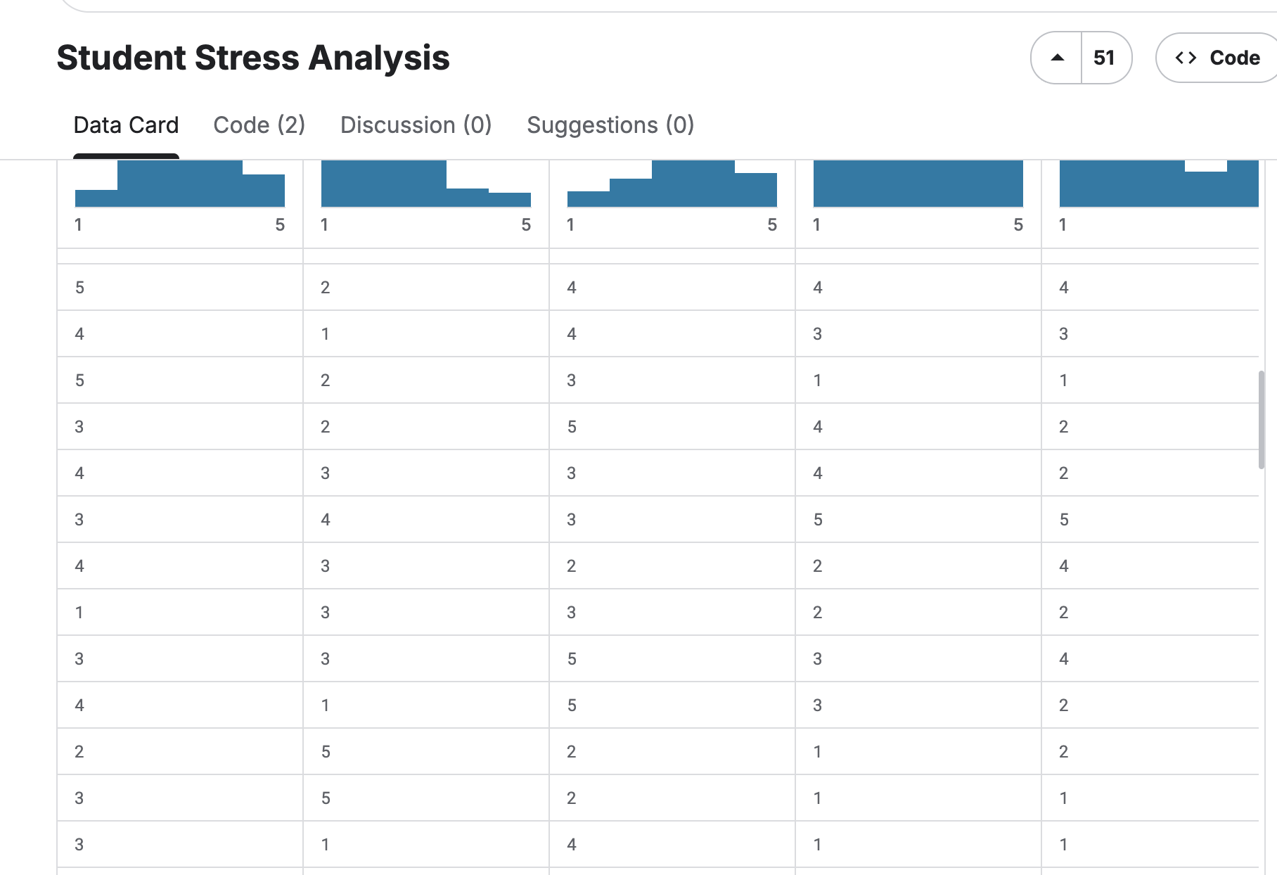
Student Stress Anlysis
Description
This dataset was developed to analyze student stress levels. It includes responses from 53 students who rated their sleep quality, headaches, academic performance, study load, and involvement in extracurricular activities. The goal is to understand how these factors influence stress levels and determine which ones have the greatest impact.
Content
Each of the seven columns in this dataset, which consists of 53 student replies, represents a rating or frequency about headaches, academic performance, study load, sleep quality, extracurricular activities, and general stress levels. A straightforward self-rating survey form is used to gather all of the data.
Context
The dataset focuses on the mental health and well-being of students. It aids in the analysis of how students' stress levels are influenced by lifestyle choices (such as hobbies and sleep patterns) and academic pressure. Researchers or data analysts can use it to investigate correlations and stress patterns, as well as to make recommendations for enhancing the mental health of students.
Navigate through Jupyter Interface
With many trials, I was able to comprehend the components of Jupyter
Mistakes:
- I was unable to push my commits because I made changes directly on GitLab and created another branch. When I later reverted the changes on GitLab, all the changes were deleted.
- I created a Merge branch in GitLab
Solution:
- I reverted to the original file and made sure the file in Gitlab and Jupyter notebook are the same. I learned to stage, commit, push and Pull
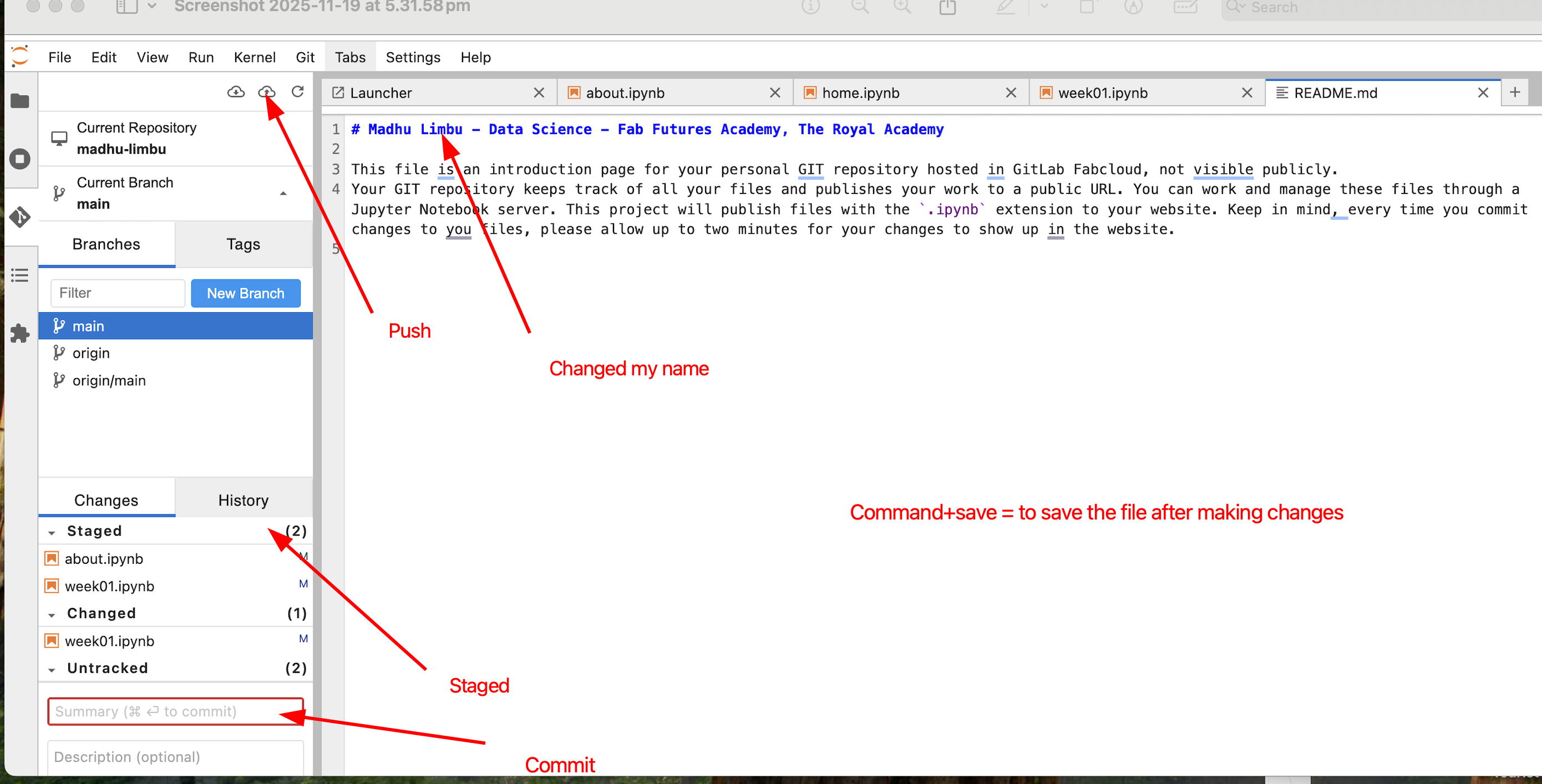
Change Nav bar
Opened README.md file, changed my name Save the file by clicking on the save icon Click on Git icon Click on + sign near the staged Write a description and click on commit The cloud icon will turn orange and push the data to display on the webpage
Upload images

Installed Flameshot
References:
Data Visualisation
Bar Graph
import matplotlib.pyplot as plt
import pandas as pd
# Load dataset
df = pd.read_csv("datasets/data.csv")
# Select columns to plot
x = df["Kindly Rate your Sleep Quality 😴"]
y = df["How would you rate your stress levels?"]
# Plot bar chart
plt.bar(x, y)
plt.title("Sleep Quality vs Stress Levels")
plt.xlabel("Sleep Quality")
plt.ylabel("Stress Levels")
plt.show()
# Display dataset information
print("Dataset shape:", df.shape)
print(df.info())

Dataset shape: (53, 7) <class 'pandas.core.frame.DataFrame'> RangeIndex: 53 entries, 0 to 52 Data columns (total 7 columns): # Column Non-Null Count Dtype --- ------ -------------- ----- 0 Timestamp 53 non-null object 1 Kindly Rate your Sleep Quality 😴 53 non-null int64 2 How many times a week do you suffer headaches 🤕? 53 non-null int64 3 How would you rate you academic performance 👩🎓? 53 non-null int64 4 how would you rate your study load? 53 non-null int64 5 How many times a week you practice extracurricular activities 🎾? 53 non-null int64 6 How would you rate your stress levels? 53 non-null int64 dtypes: int64(6), object(1) memory usage: 3.0+ KB None
Bubble Chart
import pandas as pd
import matplotlib.pyplot as plt
# Load dataset
df = pd.read_csv("datasets/data.csv")
# Choose columns
x = df["Kindly Rate your Sleep Quality 😴"]
y = df["How would you rate your stress levels?"]
size = df["How many times a week do you suffer headaches 🤕?"] * 50 # scale bubble size
# Create bubble chart
plt.figure(figsize=(10,6))
scatter = plt.scatter(x, y, s=size, alpha=0.6, c=size, cmap='viridis', edgecolors='w', linewidth=0.5)
plt.title("Bubble Chart: Sleep Quality vs Stress Levels")
plt.xlabel("Sleep Quality")
plt.ylabel("Stress Levels")
plt.colorbar(scatter, label="Number of headaches per week")
plt.grid(True)
plt.show()

Description
X-axis (horizontal) → Sleep Quality (1 = low, 5 = high)
Y-axis (vertical) → Stress Levels (1 = low, 5 = high)
Bubble size → How many times a week someone has headaches (bigger bubble = more headaches)
Bubble color → Also shows headache frequency (darker/lighter color = more/fewer headaches)
What you can see from the chart:
People with low sleep quality and high stress often have bigger bubbles, meaning they get headaches more often.
People with better sleep quality usually have smaller bubbles, meaning fewer headaches.
This chart helps you see the relationship between sleep, stress, and headaches in one picture.
About the New Dataset
This dataset offers five years (2020–2024) of daily synthetic observations that combine global climate variables with country-level energy consumption metrics for 50 nations spanning all continents. It is designed for AI researchers, data scientists, and sustainability analysts who want to investigate how factors such as weather conditions, industrial operations, CO₂ emissions, and energy usage interact over time.
The dataset models realistic global patterns using simulated seasonal behaviour, industrial fluctuations, and regional differences. All values are algorithmically generated and smoothed to resemble plausible country-level statistics while remaining fully synthetic and clean.
Main Features
Time Period: January 2020 to December 2024
Coverage: 50 countries worldwide
Resolution: Daily records (~91k rows)
Nature: Synthetic but statistically realistic
Intended Uses: Forecasting, regression, exploratory analysis, correlation studies, sustainability modeling
Purpose
Because climate conditions and energy systems are closely connected, this dataset provides a reliable foundation for exploring research questions such as:
How do temperature and humidity variations shape energy demand?
Is renewable energy usage associated with reductions in CO₂ emissions?
How does industrial activity affect national energy consumption and pricing?
Can machine-learning models predict energy usage from climate and economic indicators?
The fully synthetic design eliminates typical real-world issues like missing data, access restrictions, or inconsistent reporting, making it ideal for experimentation and model development.
Reference
Data Visualisation
# %% [markdown]
# # Climate & Energy: Bubble Plots
# Daily Avg Temperature, Daily CO2 Emission, Yearly Energy Consumption
# %%
import pandas as pd
import matplotlib.pyplot as plt
import seaborn as sns
sns.set_theme(style="whitegrid")
plt.rcParams["figure.figsize"] = (16,8)
# %%
# 1. Load dataset
df = pd.read_csv("datasets/climate.csv")
# Convert date to datetime
df['date'] = pd.to_datetime(df['date'])
df = df.sort_values('date')
# %%
# 2. Bubble plot: Daily Average Temperature
plt.figure(figsize=(16,8))
sns.scatterplot(
data=df,
x='date',
y='avg_temperature',
hue='country',
size='energy_consumption', # bubble size
sizes=(20, 200), # min and max bubble size
alpha=0.6,
palette='tab20'
)
plt.title("Daily Average Temperature by Country (Bubble size = Energy Consumption)")
plt.xlabel("Date")
plt.ylabel("Avg Temperature (°C)")
plt.legend(loc='upper right', bbox_to_anchor=(1.3,1), title="Country")
plt.show()
# %%
# 3. Bubble plot: Daily CO2 Emission
plt.figure(figsize=(16,8))
sns.scatterplot(
data=df,
x='date',
y='co2_emission',
hue='country',
size='energy_consumption', # bubble size
sizes=(20, 200),
alpha=0.6,
palette='tab20'
)
plt.title("Daily CO2 Emission by Country (Bubble size = Energy Consumption)")
plt.xlabel("Date")
plt.ylabel("CO2 Emission")
plt.legend(loc='upper right', bbox_to_anchor=(1.3,1), title="Country")
plt.show()
# %%
# 4. Yearly Average Energy Consumption per Country
df_yearly = df.groupby(['country', pd.Grouper(key='date', freq='YE')])['energy_consumption'].mean().reset_index()
plt.figure(figsize=(16,6))
sns.lineplot(
data=df_yearly,
x='date',
y='energy_consumption',
hue='country',
marker='o',
palette='tab20'
)
plt.title("Yearly Average Energy Consumption by Country")
plt.xlabel("Year")
plt.ylabel("Energy Consumption (kWh)")
plt.legend(loc='upper right', bbox_to_anchor=(1.15,1))
plt.show()


Daily average temperature and Daily CO₂ emission for China
# %% [markdown]
# # Climate & Energy: China Bubble Plots
# Daily Avg Temperature and CO2 Emission (Bubble size = Energy Consumption)
# %%
import pandas as pd
import matplotlib.pyplot as plt
import seaborn as sns
sns.set_theme(style="whitegrid")
plt.rcParams["figure.figsize"] = (14,6)
# %%
# 1. Load dataset
df = pd.read_csv("datasets/climate.csv")
# Convert date to datetime
df['date'] = pd.to_datetime(df['date'])
# Filter for China only
df_china = df[df['country'] == "China"].sort_values('date')
# %%
# 2. Bubble plot: Daily Average Temperature
plt.figure(figsize=(14,6))
sns.scatterplot(
data=df_china,
x='date',
y='avg_temperature',
size='energy_consumption', # bubble size
sizes=(20, 200),
color='red',
alpha=0.6
)
plt.title("Daily Average Temperature in China (Bubble size = Energy Consumption)")
plt.xlabel("Date")
plt.ylabel("Avg Temperature (°C)")
plt.show()
# %%
# 3. Bubble plot: Daily CO2 Emission
plt.figure(figsize=(14,6))
sns.scatterplot(
data=df_china,
x='date',
y='co2_emission',
size='energy_consumption', # bubble size
sizes=(20, 200),
color='green',
alpha=0.6
)
plt.title("Daily CO2 Emission in China (Bubble size = Energy Consumption)")
plt.xlabel("Date")
plt.ylabel("CO2 Emission")
plt.show()


References
Daily Average Temperature Bubble Plot
X-axis (horizontal): Date (shows days from 2020 to 2024).
Y-axis (vertical): Average temperature in China for each day.
Bubbles: Each bubble represents one day.
Bubble size: Shows how much energy was consumed on that day. Bigger bubbles = higher energy consumption.
Colour: Red (just to distinguish the temperature plot).
What you can see from this graph:
Days with high temperatures are higher on the Y-axis.
Bigger bubbles show days when energy consumption was higher.
You can spot patterns like hotter months vs cooler months, and see if energy consumption tends to increase on hotter days.
Daily CO₂ Emission Bubble Plot
X-axis (horizontal): Date (days from 2020 to 2024).
Y-axis (vertical): Daily CO₂ emissions in China.
Bubbles: Each bubble represents one day.
Bubble size: Shows energy consumption again. Bigger bubbles = more energy used.
Colour: Green (just to distinguish CO₂ emissions).
What you can see from this graph:
Days with high CO₂ emissions are higher on the Y-axis.
Bigger bubbles indicate higher energy use, which often contributes to CO₂ emissions.
You can see trends such as spikes in CO₂ emissions on certain dates or periods of the year.
Key insights you can get from both graphs
Energy consumption is connected to both temperature and CO₂ emissions (shown by bubble size).
Hot days may coincide with higher energy use (air conditioning, etc.) → bigger bubbles.
Peaks in CO₂ emissions may also match high energy consumption days.
Seasonal patterns are easy to spot: summer/winter temperature changes, or months with higher emissions.
Bubble Plots in Seaborn / Matplotlib
Seaborn: Scatter Plot with Variable Sizes (Bubble Plot)
Matplotlib Scatter Plot (Bubble Plot)
Time-Series Visualization
Seaborn Relational Plots (Line & Scatter for Time Series)
Facet Plots / Multi-Panel Plots
Seaborn FacetGrid Documentation
Seaborn Example: Faceted Scatter Plots
Data Visualization Best Practices
Bubble Chart is difficult for me to comprehend so I tried using bar chart
# %% [markdown]
# # Yearly Average CO2 Emission of China - Pastel Bar Graph
# %%
import pandas as pd
import matplotlib.pyplot as plt
import seaborn as sns
sns.set_theme(style="whitegrid")
plt.rcParams["figure.figsize"] = (12,6)
# %%
# Load dataset
df = pd.read_csv("datasetsclimate.csv")
df['date'] = pd.to_datetime(df['date'])
# Filter for China
df_china = df[df['country'] == "China"]
# Yearly aggregation
df_china_yearly = df_china.groupby(pd.Grouper(key='date', freq='YE'))['co2_emission'].mean().reset_index()
# %%
# Pastel color palette
colors = sns.color_palette("pastel", len(df_china_yearly))
plt.figure(figsize=(10,6))
bars = plt.bar(df_china_yearly['date'].dt.year.astype(str),
df_china_yearly['co2_emission'],
color=colors,
edgecolor='black',
width=0.5) # thinner bars
# Add value labels on top
for bar in bars:
height = bar.get_height()
plt.text(bar.get_x() + bar.get_width()/2, height + 5, f'{height:.1f}',
ha='center', va='bottom', fontsize=10)
plt.title("Yearly Average CO2 Emission of China", fontsize=16, fontweight='bold')
plt.xlabel("Year", fontsize=12)
plt.ylabel("CO2 Emission", fontsize=12)
plt.xticks(rotation=45)
plt.tight_layout()
plt.show()

Here I can clearly see the the emission for each year
Chatgpt prompts
- Time-Series Visualization of Multiple Countries
Prompt: "Visualize the daily trends of avg_temperature, humidity, co2_emission, energy_consumption, and energy_price for all countries in the dataset. Use line plots with different colors for each country and include a legend. Ensure the x-axis is the date, and the y-axis shows the variable values."
- Yearly Aggregation
Prompt: "Aggregate the climate and energy data yearly for each country. Then, plot the yearly average avg_temperature and energy_consumption using line plots with markers. Make the plots readable with clear labels, legends, and rotated x-axis labels."