Probability
I was unable to attend the lesson because I wasn’t feeling well. I will go through the tutorial shared by Mr. Rico and work on understanding the concepts that were covered. Probability has always been a challenging topic for me, so I plan to use ChatGPT for additional explanations; especially when it comes to understanding the code examples. I will also review all the topics and subtopics listed in the course outline to make sure I catch up thoroughly.
YouTube Tutorial
Assignment
Investigate the probability distribution of your data
Set up template notebooks and slides for your data set analysis
Template notebook and slide
Steps:
- Create a notebook inside the folder
- Rename the notebook as presentation.ipynb
- Create a 1920x1080 summary slide that highlights who you are, your data, and your analysis. Save the slide in your repository’s images folder and name it presentation.png.
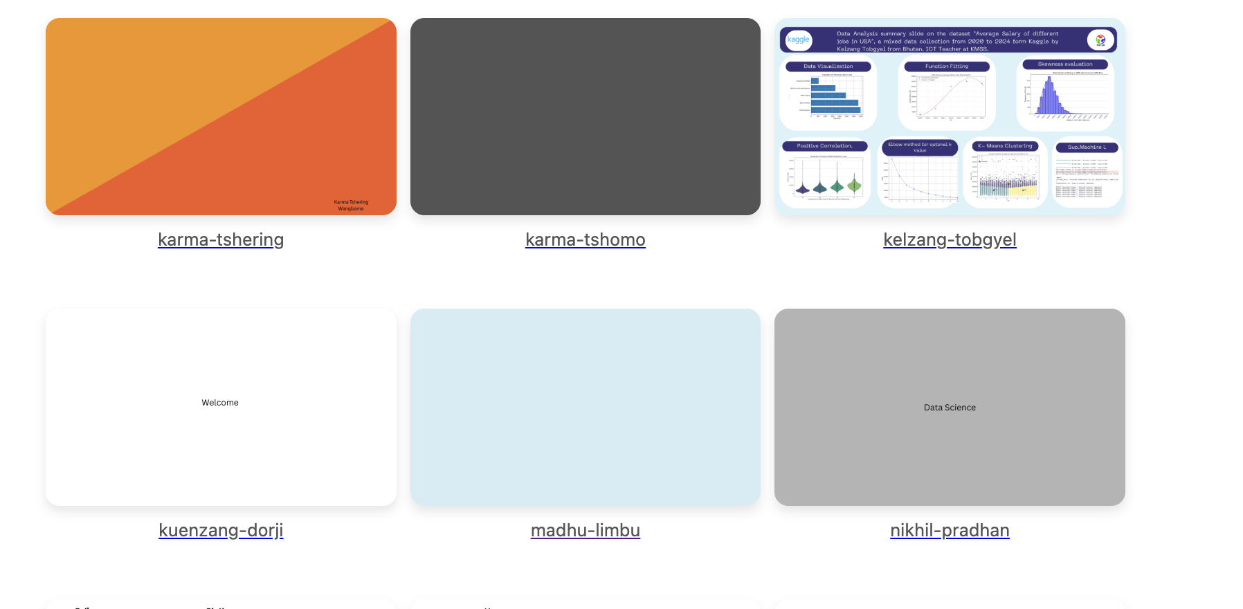
- Then, to create a dummy presentation slide, I will be using Canva as suggested by Anith
- Create a dummy slide and download it
- Save the presentation inside the folder named images
- The presentation is added to the presentation.ipynb file
- And the notebook is also linked to my home page.

Investigate the probability distribution of your data
Histogram
density estimation - fit a function to the distribution
I am leanring code in the curriculum by using Chatgpt, and trying to use my dataset using Neil's code Prompt: Explain the code line by line
import pandas as pd
import numpy as np
import matplotlib.pyplot as plt
from scipy.stats import norm

# Load dataset
df = pd.read_csv('datasets/climate.csv')

# PRINT COLUMNS so you can see the exact names
print(df.columns)

# I choose avearge temperature of different countries
col = 'avg_temperature'


# Drop missing / NaN values
x = df[col].dropna().values

# Fit Gaussian parameters
mean = np.mean(x)
stddev = np.std(x)
npts = len(x)

# Plot histogram and data-point ticks
plt.hist(x, bins=max(10, npts//50), density=True, alpha=0.6, color='skyblue', label='Histogram')
plt.plot(x, np.zeros_like(x), '|', ms=5, color='black', label='Data points')

# Overlay Gaussian curve
xi = np.linspace(mean - 3*stddev, mean + 3*stddev, 200)
yi = norm.pdf(xi, loc=mean, scale=stddev)
plt.plot(xi, yi, 'r', label='Gaussian fit')

plt.xlabel(col)
plt.ylabel('Density')
plt.title(f'Histogram + Gaussian fit: {col}')
plt.legend()
plt.show()
Index(['date', 'country', 'avg_temperature', 'humidity', 'co2_emission',
       'energy_consumption', 'renewable_share', 'urban_population',
       'industrial_activity_index', 'energy_price'],
      dtype='object')
Histogram (Blue bar)
The blue bars in the histogram show how the average temperatures are distributed across all countries in your dataset. Taller bars indicate that many countries have average temperatures within that specific range, while shorter bars indicate fewer countries in that range. The bars together span the full range of temperatures in the dataset, from the coldest countries to the hottest. Because the histogram was plotted with density=True, the heights of the bars represent probability density rather than raw counts. This means the total area under all the bars equals 1, and a taller bar corresponds to a higher probability that a randomly chosen country has an average temperature in that range. In summary, the histogram visualizes the overall real-world distribution of average temperatures across countries.
Black Vertical Ticks (Small Marks on the X-axis)
Each black tick | represents one country. They show exactly where each data point (temperature) lies. If the ticks are crowded in one region, that means many countries have similar temperatures. These ticks are helpful because they show the raw data directly.
Red Curve (Gaussian / Normal Distribution Curve)
The red smooth line is the best-fitting Gaussian (bell curve) for your temperature data. It is calculated using:
- The mean of your data
- The standard deviation of your data
Explaination of the graph
The blue bars reveal that most countries have average temperatures roughly between 10°C and 25°C, meaning Earth’s climate is mostly mild to warm.
There are fewer very cold (< 0°C) or very hot (> 35°C) countries.
The red Gaussian curve shows the general trend and shape of the temperature distribution, which appears somewhat bell-shaped but not perfectly smooth, meaning real-world climate does not follow a perfect normal distribution.
The black ticks show how each individual temperature value contributes to the overall distribution.
References
StatQuest with Josh Starmer – “Histograms, Clearly Explained!!!”
- Excellent beginner-friendly explanation of histograms, bins, and how to interpret bar heights.
StatQuest – “Normal Distribution, Clearly Explained!!!”
- Explains Gaussian curves like the red line in your graph.
StatQuest – “Probability Density Functions (PDFs)”
- Shows why density=True makes the total area under the histogram equal to 1.