Assignment
Density Estimation
Learned about the Density Estimation from youtube, asked Rico some questions.
My Understanding of Density Estimation: Kernel Density Estimation (KDE) is a core data science tool used to estimate a population’s probability density from a small sample, helping analysts understand patterns and make predictions. Instead of relying only on histograms, KDE places smooth curves, often Gaussian kernels—around each data point and averages them to infer where values are most likely, even for unobserved points. The method highlights how nearby data points contribute more to density than distant ones. Choosing the bandwidth (H), which controls how wide each kernel is, is crucial: too small makes the estimate too noisy, and too large smooths out important structure. Because the true population distribution is unknown, finding the ideal bandwidth is challenging, leading to practical approaches like rules of thumb, plug-in methods, cross-validation, and visual inspection. Overall, KDE provides a flexible, intuitive way to visualise and understand the underlying shape of data distributions.
Chapgpt prompt: Why use small data for estimation when you have a big data?
Speed and Efficiency: Working with millions or billions of rows can be slow and costly. A small, well-chosen sample can give you nearly the same insights much faster.
Exploration and Prototyping: Data scientists often explore patterns, build quick models, or test ideas on a small subset first. It helps them iterate rapidly before scaling up.
Memory and Computation Limits: Some algorithms (like certain density estimators, clustering methods, or simulations) become extremely slow with huge datasets. Sampling solves this.
Noise Reduction: More data isn't always better. Massive datasets often contain duplicates, errors, or highly correlated data points. A smaller cleaned sample can represent the true underlying distribution just as well.
Statistical Sufficiency: Many statistical patterns (means, distributions, correlations) stabilise with surprisingly little data. After a point, adding more data changes nothing but increases cost.
Streaming or Real-Time Settings: Sometimes data arrives continuously (e.g., sensors, clicks). You can't store everything, so you estimate from a sampled window.
Privacy and Governance: Large datasets might include sensitive information. Using a small anonymised sample reduces risk and is often required by policy.
Visualisation Limits: Plots (like KDEs) become unreadable with millions of points. Sampling produces clearer visualisations.
Clustering
This is what I understood from the code shared by professor Neil:
- Generate fake data that forms 3 clusters
The code first creates 3 groups of points. Each group has 1000 points, drawn from a normal distribution centered at:
(0, 0)

(5, 10)

(10, 5)
So the data looks like three “clouds” of points scattered around these centers.
- Define a custom K-means algorithm
The function kmeans() does the following:
Randomly pick starting centers for the clusters.
For a fixed number of steps (1000):
Compute the distance from every point to every cluster center.
Assign each point to the closest cluster.
Recalculate each cluster center as the average of the points assigned to it.
When finished, it computes the total distance from all points to their assigned cluster centers.
This is the basic K-means clustering process.
- Plot the K-means results
There are two plotting functions:
- plot_kmeans()
- Plots data points and cluster centers as red dots.
- plot_Voronoi()
- Plots data points and also draws Voronoi regions, which visually show which cluster center owns which area.
- Run K-means with 1, 2, 3, 4, and 5 clusters
For each number of clusters:
Run the K-means algorithm
Store the total distance (how well the clusters fit)
Plot the clusters
For 1 and 2 clusters: simple plots
For 3–5 clusters: Voronoi diagrams
- Plot how the total distance changes with number of clusters
Finally, the code makes a plot where:
The x-axis = number of clusters (1 to 5)
The y-axis = total distance from points to their cluster centers
This helps you see how adding more clusters makes the clustering "tighter."
I tried on my own but couldn't fix the error, so I asked ChatGPT to fix my errors. Prompt: Fix my error
import pandas as pd
import numpy as np
import matplotlib.pyplot as plt

df = pd.read_csv('datasets/climate.csv')

# Take only the 'avg_temperature' column
x = df['avg_temperature'].values

# Remove missing values
x = x[~np.isnan(x)]


# 1D K-means function

def kmeans_1d(x, nclusters=3, nsteps=100):
    # Random initial cluster centers
    centers = np.random.choice(x, size=nclusters, replace=False).astype(float)

    for _ in range(nsteps):
        # Assign points to nearest center
        distances = np.abs(np.outer(x, np.ones(nclusters)) - np.outer(np.ones(len(x)), centers))
        labels = np.argmin(distances, axis=1)

        # Update centers
        for i in range(nclusters):
            idx = np.where(labels == i)[0]
            if len(idx) > 0:
                centers[i] = np.mean(x[idx])

    # Compute total distance
    total_dist = sum(np.abs(x - centers[labels]))
    return centers, labels, total_dist


# Plot 1D clusters

def plot_clusters_1d(x, centers, labels, title=''):
    plt.figure(figsize=(8,2))
    plt.scatter(x, np.zeros_like(x), c=labels, cmap='tab10', s=10)
    plt.scatter(centers, np.zeros_like(centers), c='red', s=50, label='Centers')
    for c in centers:
        plt.axvline(c, color='red', linestyle='--', alpha=0.5)
    plt.title(title)
    plt.xlabel('avg_temperature')
    plt.yticks([])
    plt.show()


# Run K-means for different numbers of clusters

results = []
for k in [1,2,3,4,5]:
    centers, labels, total_dist = kmeans_1d(x, nclusters=k, nsteps=200)
    results.append((k, total_dist))
    plot_clusters_1d(x, centers, labels, title=f'{k} clusters')


# Plot total distance vs number of clusters (Elbow method)

ks, dists = zip(*results)
plt.figure()
plt.plot(ks, dists, 'o-')
plt.xlabel('Number of clusters (k)')
plt.ylabel('Total distance')
plt.title('Elbow plot for avg_temperature')
plt.xticks(ks)
plt.show()


- Load your temperature data
Take only the column avg_temperature from the dataset.
Remove missing values so we have clean numbers to work with.
- Pick a few random starting points
These are guesses for where the "centers" of temperature clusters might be.
Assign each temperature to the nearest centre
Every temperature value is checked to see which center it’s closest to.
- Update the centers
For each cluster, calculate the average of all temperatures assigned to it.
Move the center to that average.
Repeat steps 3 and 4 many times
Keep assigning points and updating centers until the centers stop moving much (or after a fixed number of steps).
- Plot the results
Show temperatures on a line.
Points are colored by cluster.
Cluster centers are shown as red dots and vertical lines.
- Check how well clustering worked
For each number of clusters (1–5), calculate the total distance of points from their cluster center. Plot these distances to see how adding more. The code groups your temperatures into clusters and shows visually where the main groups are. The Elbow plot tells you how many clusters make sense for your data. clusters improve the fit.
Kernel Density Estimation
import pandas as pd
import numpy as np
import matplotlib.pyplot as plt
import seaborn as sns
# Load your data
df = pd.read_csv('datasets/climate.csv')
x = df['avg_temperature'].values
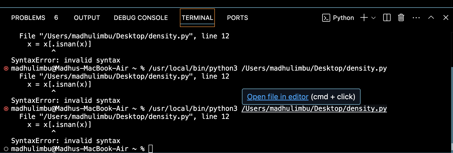
x = x[~np.isnan(x)] # remove missing values
# Plot KDE
plt.figure(figsize=(8,4))
sns.kdeplot(x, bw_adjust=1, fill=True) # bw_adjust controls smoothness
plt.title('Kernel Density Estimation of avg_temperature')
plt.xlabel('avg_temperature')
plt.ylabel('Density')
plt.show()

This code visualises how temperatures are distributed in my dataset.
Instead of showing bars like a histogram, it draws a smooth curve showing where temperatures are more frequent.
Peaks in the curve: temperatures that occur more often.
Valleys: temperatures that occur less often.