Fitting
import pandas as pd
import numpy as np
import matplotlib.pyplot as plt
from scipy import stats
from sklearn.linear_model import LinearRegression
from sklearn.metrics import r2_score

# Create sample CSV data (you can skip this if you have your own CSV)
sample_data = {
    'x': [1, 2, 3, 4, 5, 6, 7, 8, 9, 10],
    'y': [2.1, 3.9, 6.2, 8.1, 9.8, 12.1, 14.2, 16.1, 18.3, 20.2]
}
df = pd.DataFrame(sample_data)
df.to_csv('ahv_2023.csv', index=False)
print("ahv_2023.csv")

# Read CSV file
df = pd.read_csv('ahv_2023.csv')
print("ahv_2023.csv")
print(df.head())

# Method 1: Using scipy.stats for simple linear regression
x = df['x']
y = df['y']

# Perform linear regression
slope, intercept, r_value, p_value, std_err = stats.linregress(x, y)

print(f"\n--- Linear Regression Results (scipy) ---")
print(f"Slope: {slope:.4f}")
print(f"Intercept: {intercept:.4f}")
print(f"R-squared: {r_value**2:.4f}")
print(f"P-value: {p_value:.4f}")

# Create fitted line
y_pred = slope * x + intercept

# Plot results
plt.figure(figsize=(10, 6))
plt.scatter(x, y, color='blue', label='ahv_2023.csv', alpha=0.7)
plt.plot(x, y_pred, color='red', linewidth=2, label=f'Fitted line: y = {slope:.2f}x + {intercept:.2f}')
plt.xlabel('X')
plt.ylabel('Y')
plt.title('Linear Regression Fit')
plt.legend()
plt.grid(True, alpha=0.3)
plt.show()
ahv_2023.csv
ahv_2023.csv
   x    y
0  1  2.1
1  2  3.9
2  3  6.2
3  4  8.1
4  5  9.8

--- Linear Regression Results (scipy) ---
Slope: 2.0230
Intercept: -0.0267
R-squared: 0.9995
P-value: 0.0000

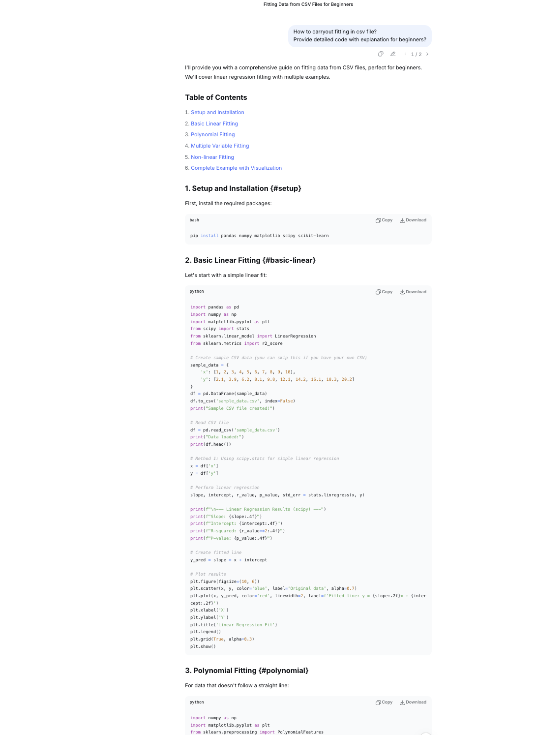
How was fitting carried out?
Since i have minimal ideas, i asked deepseek with following prompts.
1. How to carryout fitting in csv file?

2. Provide detailed code with explanation for beginners?
Problem
Since i have just started learnig about code i was not able to do it myself. The fitting given on this page are done by copying codes from deepseek.i Just wrote my csv file name whereever it was mentioned. However i am learning each code given by AI and i will make sure i learn everthing and do fitting myself.
Screenshot of AI used
Code explanation for me to understand Linear Regression Fit.
Part 1: Data Preparation and Saving df = pd.DataFrame(sample_data)
- Creates a pandas DataFrame from
sample_data(assumed to be defined earlier). - DataFrames are 2D table-like structures with labeled columns. df.to_csv('ahv_2023.csv', index=False)
- Saves the DataFrame to a CSV file named 'ahv_2023.csv'
- index=False prevents pandas from saving the row index as a separate column print("ahv_2023.csv")
- Prints the filename to confirm the file was saved Part 2: Reading and Inspecting Data** df = pd.read_csv('ahv_2023.csv')
- Reads the CSV file back into a DataFrame.
- Assumes the file has column headers. print("ahv_2023.csv")
- Prints the filename again (redundant, but shows what data is being used) print(df.head())
- Displays the first 5 rows of the DataFrame
- head() is useful for quick data inspection Part 3: Linear Regression Analysis x = df['x'] y = df['y']
- Extracts two columns from the DataFrame:
xbecomes the independent variable (predictor)ybecomes the dependent variable (response) slope, intercept, r_value, p_value, std_err = stats.linregress(x, y)
- Performs linear regressionusing SciPy's
linregress()function - Returns 5 values:
slope: The coefficient (β₁) - change in y per unit change in xintercept: The constant term (β₀) - y when x = 0r_value: Correlation coefficient (-1 to 1)p_value: Statistical significance of the relationshipstd_err: Standard error of the slope estimate print(f"\n--- Linear Regression Results (scipy) ---")
- Prints a header for the regression results print(f"Slope: {slope:.4f}")
- Displays the slope with 4 decimal places print(f"Intercept: {intercept:.4f}")
- Displays the intercept with 4 decimal places print(f"R-squared: {r_value**2:.4f}")
- Calculates and displays R-squared (coefficient of determination)
- R-squared = (correlation coefficient)²
- Represents proportion of variance in y explained by x (0 to 1) print(f"P-value: {p_value:.4f}")
- Displays the p-value with 4 decimal places
- Tests null hypothesis: "slope = 0" (no relationship)
- Typically, p < 0.05 indicates statistical significance Part 4: Prediction and Visualization** y_pred = slope * x + intercept
- Calculates predicted y-values using the regression equation:
ŷ = slope × x + intercept - Creates array of fitted values for plotting plt.figure(figsize=(10, 6))
- Creates a new matplotlib figure
- Sets figure size to 10 inches wide × 6 inches tall plt.scatter(x, y, color='blue', label='ahv_2023.csv', alpha=0.7)
- Creates scatter plot of original data
- Blue points with 70% opacity (
alpha=0.7) - Adds legend label for the data points plt.plot(x, y_pred, color='red', linewidth=2, label=f'Fitted line: y = {slope:.2f}x + {intercept:.2f}')
- Plots the regression line in red
- Line width of 2 pixels
- Legend shows the regression equation with 2 decimal places plt.xlabel('X')
- Labels the x-axis as 'X' plt.ylabel('Y')
- Labels the y-axis as 'Y' plt.title('Linear Regression Fit')
- Sets the plot title plt.legend()
- Displays the legend (shows labels for scatter points and line) plt.grid(True, alpha=0.3)
- Adds grid lines with 30% opacity for better readability plt.show()
- Displays the complete plot
import numpy as np
import matplotlib.pyplot as plt
from sklearn.preprocessing import PolynomialFeatures
from sklearn.metrics import mean_squared_error

# Create sample non-linear data
sample_nonlinear = {
    'x': [1, 2, 3, 4, 5, 6, 7, 8, 9, 10],
    'y': [2, 8, 18, 32, 50, 72, 98, 128, 162, 200]  # Roughly follows y = 2x^2
}
df_poly = pd.DataFrame(sample_nonlinear)
df_poly.to_csv('ahv_2023.csv', index=False)

# Read the data
df_poly = pd.read_csv('ahv_2023.csv')
x = df_poly['x'].values.reshape(-1, 1)
y = df_poly['y'].values

# Polynomial regression (degree 2 - quadratic)
poly = PolynomialFeatures(degree=2)
x_poly = poly.fit_transform(x)

# Fit the model
model = LinearRegression()
model.fit(x_poly, y)

# Predictions
y_pred = model.predict(x_poly)

# Get coefficients
coefficients = model.coef_
intercept = model.intercept_

print(f"\n--- Polynomial Regression Results (degree 2) ---")
print(f"Coefficients: {coefficients}")
print(f"Intercept: {intercept:.4f}")
print(f"R-squared: {r2_score(y, y_pred):.4f}")
print(f"Equation: y = {coefficients[2]:.2f}x² + {coefficients[1]:.2f}x + {intercept:.2f}")

# Plot
plt.figure(figsize=(10, 6))
plt.scatter(x, y, color='green', label='ahv_2023.csv', s=50)
x_continuous = np.linspace(min(x), max(x), 100).reshape(-1, 1)
x_continuous_poly = poly.transform(x_continuous)
y_continuous = model.predict(x_continuous_poly)
plt.plot(x_continuous, y_continuous, color='orange', linewidth=2, label='Polynomial fit')
plt.xlabel('X')
plt.ylabel('Y')
plt.title('Polynomial Regression (Degree 2)')
plt.legend()
plt.grid(True, alpha=0.3)
plt.show()
--- Polynomial Regression Results (degree 2) ---
Coefficients: [ 0.00000000e+00 -1.13242749e-14  2.00000000e+00]
Intercept: 0.0000
R-squared: 1.0000
Equation: y = 2.00x² + -0.00x + 0.00

Watching tutorials on youtube
Another wholistic youtube videos watched.
Also wanted to go through this link
Code explanation for Polynomial regression fit
- Creating Sample Non-linear Data sample_nonlinear = { 'x': [1, 2, 3, 4, 5, 6, 7, 8, 9, 10], 'y': [2, 8, 18, 32, 50, 72, 98, 128, 162, 200] # Roughly follows y = 2x^2 }
- Creates a dictionary with two keys: 'x' and 'y'
- 'x' contains integers from 1 to 10
- 'y' contains values roughly following the quadratic equation y = 2x² (e.g., when x=3, y=18 ≈ 2×3²)
- Creating DataFrame and Saving to CSV df_poly = pd.DataFrame(sample_nonlinear)
- Converts the dictionary into a pandas DataFrame
- Creates a 2D tabular data structure with columns 'x' and 'y' df_poly.to_csv('ahv_2023.csv', index=False)
- Saves the DataFrame to a CSV file named 'ahv_2023.csv'
index=Falsemeans row indices won't be saved to the file
- Reading the Data Back df_poly = pd.read_csv('ahv_2023.csv')
- Reads the CSV file back into a new DataFrame
- This simulates working with a real dataset from a file
- Preparing Data for Modeling x = df_poly['x'].values.reshape(-1, 1)
- Extracts the 'x' column as a NumPy array
.reshape(-1, 1)converts it from 1D to 2D array (required by scikit-learn)- Example: [1,2,3] becomes [[1],[2],[3]] y = df_poly['y'].values
- Extracts the 'y' column as a 1D NumPy array
- Polynomial Feature Transformation poly = PolynomialFeatures(degree=2)
- Creates a PolynomialFeatures transformer object
degree=2means it will generate features up to x² x_poly = poly.fit_transform(x)- Transforms the original x values into polynomial features
- Example: For x=3, it creates [1, 3, 9] (1 for intercept, x, x²)
- The transformed matrix has shape (10, 3)
- Training the Linear Regression Model** model = LinearRegression()
- Creates a LinearRegression model object model.fit(x_poly, y)
- Trains the model using the polynomial features (x_poly) and target values (y)
- Finds the best coefficients for: y = b₀ + b₁x + b₂x²
- Making Predictions y_pred = model.predict(x_poly)
- Uses the trained model to predict y values for the training data
- These predictions are based on the polynomial regression equation
- Extracting Model Parameters python coefficients = model.coef_
- Gets the model coefficients (weights) for each feature
- For polynomial degree 2: [coefficient for x⁰, coefficient for x¹, coefficient for x²]
- Note:
coef_[0]is actually for x¹ since x⁰ is handled by intercept intercept = model.intercept_ - Gets the intercept term (b₀ or constant term)
- Printing Results print(f"\n--- Polynomial Regression Results (degree 2) ---")
- Prints a header for the results section print(f"Coefficients: {coefficients}") print(f"Intercept: {intercept:.4f}")
- Displays the coefficients and intercept with 4 decimal places print(f"R-squared: {r2_score(y, y_pred):.4f}")
- Calculates and prints R² score (coefficient of determination)
- Measures how well the model fits the data (1.0 = perfect fit) print(f"Equation: y = {coefficients[2]:.2f}x² + {coefficients[1]:.2f}x + {intercept:.2f}")
- Prints the final regression equation in readable format
- Note:
coefficients[2]is for x²,coefficients[1]is for x¹
- Visualization plt.figure(figsize=(10, 6))
- Creates a new matplotlib figure with size 10×6 inches plt.scatter(x, y, color='green', label='ahv_2023.csv', s=50)
- Plots the original data points as green dots
s=50sets the marker size- Adds a label for the legend x_continuous = np.linspace(min(x), max(x), 100).reshape(-1, 1)
- Creates 100 evenly spaced x values from min to max x
- Reshapes to 2D array for transformation x_continuous_poly = poly.transform(x_continuous)
- Transforms continuous x values to polynomial features y_continuous = model.predict(x_continuous_poly)
- Predicts y values for the continuous x range
plt.plot(x_continuous, y_continuous, color='orange', linewidth=2, label='Polynomial fit')
- Plots the smooth polynomial regression curve in orange plt.xlabel('X') plt.ylabel('Y') plt.title('Polynomial Regression (Degree 2)') plt.legend() plt.grid(True, alpha=0.3
- Adds axis labels, title, legend, and semi-transparent grid plt.show()
- Displays the final plot Summary This code demonstrates polynomial regression - a technique that fits a curved line to data by adding polynomial terms (x², x³, etc.) to linear regression. It's useful when relationships between variables are non-linear, as in this quadratic (degree 2) example where y ≈ 2x².
Learning Professor Neil code for fitting
import numpy as np
import matplotlib.pyplot as plt
xmin = 0
xmax = 2
noise = 0.05
npts = 100
np.set_printoptions(precision=3)
np.random.seed(10)
c = [-.3,1,0.5]
print(f"data generation coefficients: {c}")
x = xmin+(xmax-xmin)*np.random.rand(npts) # generate random x
y = c[2]+c[1]*x+c[0]*x*x+np.random.normal(0,noise,npts) # evaluate polynomial at x and add noise
coeff1 = np.polyfit(x,y,1) # fit first-order polynomial
coeff2 = np.polyfit(x,y,2) # fit second-order polynomial
xfit = np.linspace(xmin,xmax,npts)
pfit1 = np.poly1d(coeff1)
yfit1 = pfit1(xfit) # evaluate first-order fit
print(f"first-order fit coefficients: {coeff1}")
pfit2 = np.poly1d(coeff2)
yfit2 = pfit2(xfit) # evaluate second-order fit
print(f"second-order fit coefficients: {coeff2}")
plt.figure()
plt.plot(x,y,'o')
plt.plot(xfit,yfit1,'g-',label='linear')
plt.plot(xfit,yfit2,'r-',label='quadratic')
plt.legend()
plt.show()
data generation coefficients: [-0.3, 1, 0.5]
first-order fit coefficients: [0.402 0.711]
second-order fit coefficients: [-0.308  1.006  0.507]

import numpy as np
import matplotlib.pyplot as plt
xmin = 0
xmax = 2
noise = 0.05
npts = 100
np.set_printoptions(precision=3)
np.random.seed(10)
c = [-.3,1,0.5]
print(f"data generation coefficients: {c}")
data generation coefficients: [-0.3, 1, 0.5]
x = xmin+(xmax-xmin)*np.random.rand(npts) # generate random x
y = c[2]+c[1]*x+c[0]*x*x+np.random.normal(0,noise,npts) # evaluate polynomial at x and add noise
coeff1 = np.polyfit(x,y,1) # fit first-order polynomial
coeff2 = np.polyfit(x,y,2) # fit second-order polynomial
xfit = np.linspace(xmin,xmax,npts)
pfit1 = np.poly1d(coeff1)
yfit1 = pfit1(xfit) # evaluate first-order fit
print(f"first-order fit coefficients: {coeff1}")
first-order fit coefficients: [0.40152718 0.7111448 ]
pfit2 = np.poly1d(coeff2)
yfit2 = pfit2(xfit) # evaluate second-order fit
print(f"second-order fit coefficients: {coeff2}")
second-order fit coefficients: [-0.30779691 1.00618689 0.5073186 ]
plt.figure()
plt.plot(x,y,'o')
[<matplotlib.lines.Line2D at 0xe0651fe45090>]

plt.plot(xfit,yfit2,'r-',label='quadratic')
[<matplotlib.lines.Line2D at 0xe0651fe7fd90>]

plt.plot(xfit,yfit1,'g-',label='linear')
[<matplotlib.lines.Line2D at 0xe0651ff8aad0>]

plt.plot(x,y,'o')
plt.plot(xfit,yfit1,'g-',label='linear')
plt.plot(xfit,yfit2,'r-',label='quadratic')
plt.legend()
plt.show()
Disclaimer
This content is all generated with the assistance of artificial intelligence. While efforts have been made to ensure learning and understanding, it may require eons of time for me to do it myself.
import numpy as np
import matplotlib.pyplot as plt

# Data for different health indicators
years = np.array([2017, 2018, 2019, 2020, 2021, 2022])

# Doctor densities
doctor_densities = np.array([4.3, 4.6, 4.32, 4.62, 4.64, 4.64])

# Nurse densities
nurse_densities = np.array([16.2, 16.5, 18.6, 20.9, 21.07, 19.71])

# Pharmacist densities
pharmacist_densities = np.array([0.5, 0.6, 0.6, 0.6, 0.6, 0.6])

# Select data to analyze
data_to_analyze = doctor_densities  # Change this to analyze different indicators
indicator_name = "Doctor Density"   # Update this accordingly

# Prepare data for fitting
x = years - 2017  # Normalize years to start at 0
y = data_to_analyze

# Fit polynomials
coeff1 = np.polyfit(x, y, 1)  # linear fit
coeff2 = np.polyfit(x, y, 2)  # quadratic fit

print(f"{indicator_name} Analysis:")
print(f"Linear fit coefficients: {coeff1}")
print(f"Quadratic fit coefficients: {coeff2}")

# Generate points for smooth curves
x_fit = np.linspace(min(x), max(x), 100)
pfit1 = np.poly1d(coeff1)
y_fit1 = pfit1(x_fit)
pfit2 = np.poly1d(coeff2)
y_fit2 = pfit2(x_fit)

# Create plot similar to your screenshot
plt.figure(figsize=(10, 6))

# Plot the data points
plt.plot(x, y, 'o', color='blue', markersize=8, label='Actual Data')

# Plot the fitted curves
plt.plot(x_fit, y_fit1, 'g-', linewidth=2, label='Linear')
plt.plot(x_fit, y_fit2, 'r-', linewidth=2, label='Quadratic')

# Add labels and title
plt.xlabel('Year', fontsize=12)
plt.ylabel(f'{indicator_name} (per 10,000 population)', fontsize=12)
plt.title(f'{indicator_name}: Linear vs Quadratic Fitting', fontsize=14)

# Add legend
plt.legend(loc='best', fontsize=12)

# Set x-ticks to show actual years
plt.xticks(x, [str(year) for year in years])

# Add grid
plt.grid(True, alpha=0.3, linestyle='--')

# Show plot
plt.tight_layout()
plt.show()

# Calculate and print statistics
residuals_linear = y - pfit1(x)
residuals_quad = y - pfit2(x)
rss_linear = np.sum(residuals_linear**2)
rss_quad = np.sum(residuals_quad**2)

print(f"\nResidual Sum of Squares (RSS):")
print(f"  Linear fit: {rss_linear:.4f}")
print(f"  Quadratic fit: {rss_quad:.4f}")

# Predict for 2023
x_2023 = 2023 - 2017
pred_linear = pfit1(x_2023)
pred_quad = pfit2(x_2023)
print(f"\nPredicted {indicator_name} for 2023:")
print(f"  Linear prediction: {pred_linear:.3f}")
print(f"  Quadratic prediction: {pred_quad:.3f}")
Doctor Density Analysis:
Linear fit coefficients: [0.06057143 4.36857143]
Quadratic fit coefficients: [-0.00535714  0.08735714  4.35071429]

Residual Sum of Squares (RSS):
  Linear fit: 0.0694
  Quadratic fit: 0.0683

Predicted Doctor Density for 2023:
  Linear prediction: 4.732
  Quadratic prediction: 4.682
Extrapolation:
import numpy as np
import matplotlib.pyplot as plt
from scipy import stats

# Historical data
years_hist = np.array([2017, 2018, 2019, 2020, 2021, 2022])
densities_hist = np.array([4.3, 4.6, 4.32, 4.62, 4.64, 4.64])

# Predictions
year_2023 = 2023
linear_pred = 4.732
quad_pred = 4.682

# WHO/International Benchmarks
who_benchmark = 10.0  # WHO recommended minimum
developed_avg = 32.0   # Developed countries average
bhutan_target = 8.0    # Potential national target

# Create comprehensive visualization
fig, ((ax1, ax2), (ax3, ax4)) = plt.subplots(2, 2, figsize=(15, 12))

# 1. Trend with Predictions
ax1.plot(years_hist, densities_hist, 'bo-', linewidth=2, markersize=8, label='Historical Data')
ax1.plot([2022, 2023], [4.64, linear_pred], 'g--', linewidth=2, label='Linear Prediction')
ax1.plot([2022, 2023], [4.64, quad_pred], 'r--', linewidth=2, label='Quadratic Prediction')
ax1.scatter([2023, 2023], [linear_pred, quad_pred], color=['green', 'red'], s=100, zorder=5)
ax1.axhline(y=4.64, color='gray', linestyle=':', alpha=0.5, label='2022 Level')
ax1.set_xlabel('Year', fontsize=12)
ax1.set_ylabel('Doctor Density (per 10,000)', fontsize=12)
ax1.set_title('Doctor Density: Historical Trend & 2023 Predictions', fontsize=14)
ax1.legend(loc='lower right')
ax1.grid(True, alpha=0.3)
ax1.set_xticks(list(years_hist) + [2023])

# 2. Comparison with Benchmarks
benchmarks = {
    '2022 Actual': 4.64,
    '2023 Linear': linear_pred,
    '2023 Quadratic': quad_pred,
    'WHO Minimum': who_benchmark,
    'National Target': bhutan_target,
    'Developed Avg': developed_avg
}

colors = ['blue', 'green', 'red', 'orange', 'purple', 'gray']
bars = ax2.bar(range(len(benchmarks)), list(benchmarks.values()), color=colors, alpha=0.7)
ax2.set_xticks(range(len(benchmarks)))
ax2.set_xticklabels(list(benchmarks.keys()), rotation=45, ha='right')
ax2.set_ylabel('Density (per 10,000)', fontsize=12)
ax2.set_title('Comparison with International Benchmarks', fontsize=14)
ax2.grid(True, alpha=0.3, axis='y')

# Add value labels on bars
for i, (bar, val) in enumerate(zip(bars, benchmarks.values())):
    ax2.text(bar.get_x() + bar.get_width()/2, bar.get_height() + 0.1,
             f'{val:.2f}', ha='center', va='bottom', fontsize=10)

# 3. Gap Analysis
current = 4.64
targets = {
    'Linear Prediction': linear_pred - current,
    'Quadratic Prediction': quad_pred - current,
    'WHO Gap': who_benchmark - current,
    'National Target Gap': bhutan_target - current
}

ax3.bar(targets.keys(), targets.values(), color=['green', 'red', 'orange', 'purple'], alpha=0.7)
ax3.axhline(y=0, color='black', linewidth=0.5)
ax3.set_ylabel('Additional Density Needed', fontsize=12)
ax3.set_title('Gap Analysis: How Much More is Needed?', fontsize=14)
ax3.tick_params(axis='x', rotation=45)
ax3.grid(True, alpha=0.3, axis='y')

# 4. Implied Doctor Numbers
population = 763429
ax4.bar(['2022 Actual', '2023 Linear', '2023 Quadratic', 'WHO Target'],
        [current*population/10000, linear_pred*population/10000,
         quad_pred*population/10000, who_benchmark*population/10000],
        color=['blue', 'green', 'red', 'orange'], alpha=0.7)
ax4.set_ylabel('Number of Doctors', fontsize=12)
ax4.set_title(f'Implied Number of Doctors (Population: {population:,})', fontsize=14)
ax4.tick_params(axis='x', rotation=45)
ax4.grid(True, alpha=0.3, axis='y')

# Add value labels
for i, val in enumerate([current*population/10000, linear_pred*population/10000,
                         quad_pred*population/10000, who_benchmark*population/10000]):
    ax4.text(i, val + 5, f'{int(val)}', ha='center', va='bottom', fontsize=10)

plt.tight_layout()
plt.show()

# 5. Calculate what this means in practical terms
print("="*70)
print("PRACTICAL INTERPRETATION OF 2023 PREDICTIONS")
print("="*70)

print(f"\nCURRENT STATUS (2022):")
print(f"• Density: {current:.2f} doctors per 10,000 population")
print(f"• Total doctors: {int(current*population/10000):,}")
print(f"• Gap to WHO minimum: {who_benchmark - current:.2f} density units")
print(f"  → Need {int((who_benchmark - current)*population/10000):,} more doctors")

print(f"\nLINEAR PREDICTION FOR 2023 ({linear_pred:.3f}):")
print(f"• Year-over-year growth: {((linear_pred/current)-1)*100:.1f}%")
print(f"• Additional doctors needed: {int((linear_pred - current)*population/10000):,}")
print(f"• At this rate, reach WHO target in {int((who_benchmark - linear_pred)/(linear_pred - current))} years")

print(f"\nQUADRATIC PREDICTION FOR 2023 ({quad_pred:.3f}):")
print(f"• Year-over-year growth: {((quad_pred/current)-1)*100:.1f}%")
print(f"• Additional doctors needed: {int((quad_pred - current)*population/10000):,}")
print(f"• At this rate, reach WHO target in {int((who_benchmark - quad_pred)/(quad_pred - current))} years")

print(f"\nKEY POLICY INSIGHTS:")
print("1. Both models predict CONTINUED GROWTH in doctor density")
print("2. The difference (0.05) suggests UNCERTAINTY in growth rate")
print("3. Current trajectory is FAR BELOW WHO recommendations")
print("4. Need ACCELERATED GROWTH to meet international standards")

print(f"\nRECOMMENDATIONS:")
print("✓ Monitor actual 2023 data to see which model was more accurate")
print("✓ If growth slows (quadratic trend), consider policy interventions:")
print("  - Increase medical school enrollment")
print("  - Improve doctor retention programs")
print("  - Attract doctors from abroad")
print("✓ Set ambitious but realistic national targets")

======================================================================
PRACTICAL INTERPRETATION OF 2023 PREDICTIONS
======================================================================

CURRENT STATUS (2022):
• Density: 4.64 doctors per 10,000 population
• Total doctors: 354
• Gap to WHO minimum: 5.36 density units
  → Need 409 more doctors

LINEAR PREDICTION FOR 2023 (4.732):
• Year-over-year growth: 2.0%
• Additional doctors needed: 7
• At this rate, reach WHO target in 57 years

QUADRATIC PREDICTION FOR 2023 (4.682):
• Year-over-year growth: 0.9%
• Additional doctors needed: 3
• At this rate, reach WHO target in 126 years

KEY POLICY INSIGHTS:
1. Both models predict CONTINUED GROWTH in doctor density
2. The difference (0.05) suggests UNCERTAINTY in growth rate
3. Current trajectory is FAR BELOW WHO recommendations
4. Need ACCELERATED GROWTH to meet international standards

RECOMMENDATIONS:
✓ Monitor actual 2023 data to see which model was more accurate
✓ If growth slows (quadratic trend), consider policy interventions:
  - Increase medical school enrollment
  - Improve doctor retention programs
  - Attract doctors from abroad
✓ Set ambitious but realistic national targets
Trying Neil's complex plot in my notebook.
- Took several minutes to copy and write the code.Maybe oneday i will also reach that data point to write all these codes.
import numpy as np
import matplotlib.pyplot as plt
xmin = 0
xmax = 10
npts = 100
x = np.linspace(xmin,xmax,npts)
y = np.heaviside(-1+2*(x-xmin)/(xmax-xmin),0.5) # generate step to fit
xplot = np.linspace(xmin-0.2,xmax+0.2,npts)
coeff1 = np.polyfit(x,y,1) # fit and evaluate order 1 polynomial
pfit1 = np.poly1d(coeff1)
yfit1 = pfit1(xplot)
coeff2 = np.polyfit(x,y,4) # fit and evaluate order 2 polynomial
pfit2 = np.poly1d(coeff2)
yfit2 = pfit2(xplot)
coeff15 = np.polyfit(x,y,15) # fit and evaluate order 15 polynomial
pfit15 = np.poly1d(coeff15)
yfit15 = pfit15(xplot)
fig = plt.figure()
fig.canvas.header_visible = False
plt.plot(x,y,'bo',label='data')
plt.plot(xplot,yfit1,'g-',label='order 1')
plt.plot(xplot,yfit2,'c-',label='order 2')
plt.plot(xplot,yfit15,'r-',label='order 15')
plt.legend()
plt.show()