< Home
Presentation
During the Fab Futures Data Science class, I used data from the Spanish railway company Renfe.
For example, I used the Folium tool to map the coordinates of all Spanish train stations. I also used commuter rail data from Asturias to track passengers boarding and alighting at major stations using Plotly. Then I started working with another database, this one for commuter trains in Barcelona. This allowed me to see the number of passengers boarding and alighting at each station. Using overfitting techniques, I could estimate the potential number of passengers. With Machine Learning and JAX, I was able to create passenger forecasting models.
During the Probability week, I also used histogram representation with a covariance matrix. Finally, I used Principal Component Analysis (PCA) to analyze passengers boarding and alighting, filtering for the period between 1 AM and 5 AM because there were no passengers during those times.
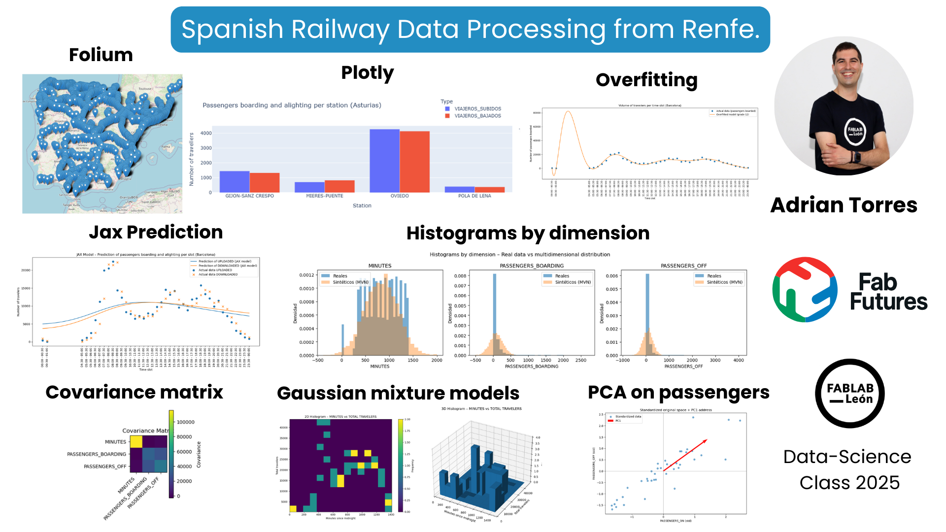
This was the video of the presentation, starting at minute 54:50.
Folium
Use the Folium tool to represent that data on a map of Spain.
!pip install folium
/opt/conda/lib/python3.13/pty.py:95: RuntimeWarning: os.fork() was called. os.fork() is incompatible with multithreaded code, and JAX is multithreaded, so this will likely lead to a deadlock.
  pid, fd = os.forkpty()
Requirement already satisfied: folium in /opt/conda/lib/python3.13/site-packages (0.20.0)
Requirement already satisfied: branca>=0.6.0 in /opt/conda/lib/python3.13/site-packages (from folium) (0.8.2)
Requirement already satisfied: jinja2>=2.9 in /opt/conda/lib/python3.13/site-packages (from folium) (3.1.6)
Requirement already satisfied: numpy in /opt/conda/lib/python3.13/site-packages (from folium) (2.3.3)
Requirement already satisfied: requests in /opt/conda/lib/python3.13/site-packages (from folium) (2.32.5)
Requirement already satisfied: xyzservices in /opt/conda/lib/python3.13/site-packages (from folium) (2025.4.0)
Requirement already satisfied: MarkupSafe>=2.0 in /opt/conda/lib/python3.13/site-packages (from jinja2>=2.9->folium) (3.0.3)
Requirement already satisfied: charset_normalizer<4,>=2 in /opt/conda/lib/python3.13/site-packages (from requests->folium) (3.4.4)
Requirement already satisfied: idna<4,>=2.5 in /opt/conda/lib/python3.13/site-packages (from requests->folium) (3.11)
Requirement already satisfied: urllib3<3,>=1.21.1 in /opt/conda/lib/python3.13/site-packages (from requests->folium) (2.5.0)
Requirement already satisfied: certifi>=2017.4.17 in /opt/conda/lib/python3.13/site-packages (from requests->folium) (2025.10.5)
import pandas as pd
import folium

# 1. Upload the CSV
df = pd.read_csv("datasets/estaciones.csv", encoding="latin-1", sep=";")

# 2. We only keep the necessary columns
df = df[["DESCRIPCION", "LATITUD", "LONGITUD"]]

# 3. Delete rows without coordinates
df = df.dropna(subset=["LATITUD", "LONGITUD"])

# 4. Create the map centered on Spain
mapa = folium.Map(location=[40.0, -3.7], zoom_start=6)

# 5. Add a marker for each station
for _, fila in df.iterrows():
    folium.Marker(
        location=[fila["LATITUD"], fila["LONGITUD"]],
        popup=fila["DESCRIPCION"]
    ).add_to(mapa)

# 6. Display the map in Jupyter
mapa
Plotly
Another tool I used was Plotly to quickly represent data using a bar chart.
!pip install plotly
/opt/conda/lib/python3.13/pty.py:95: RuntimeWarning: os.fork() was called. os.fork() is incompatible with multithreaded code, and JAX is multithreaded, so this will likely lead to a deadlock.
  pid, fd = os.forkpty()
Requirement already satisfied: plotly in /opt/conda/lib/python3.13/site-packages (6.5.0)
Requirement already satisfied: narwhals>=1.15.1 in /opt/conda/lib/python3.13/site-packages (from plotly) (2.9.0)
Requirement already satisfied: packaging in /opt/conda/lib/python3.13/site-packages (from plotly) (25.0)
import pandas as pd
import plotly.express as px

# Upload CSV
df = pd.read_csv("datasets/asturias_viajeros_por_franja_csv.csv",
                 encoding="latin-1", sep=";")

# Filter stations
estaciones_objetivo = [
    "GIJON-SANZ CRESPO",
    "OVIEDO",
    "POLA DE LENA",
    "MIERES-PUENTE"
]

df_filtrado = df[df["NOMBRE_ESTACION"].isin(estaciones_objetivo)]

# Group by station
resumen = df_filtrado.groupby("NOMBRE_ESTACION")[
    ["VIAJEROS_SUBIDOS", "VIAJEROS_BAJADOS"]
].sum().reset_index()

# Interactive graphic
fig = px.bar(
    resumen,
    x="NOMBRE_ESTACION",
    y=["VIAJEROS_SUBIDOS", "VIAJEROS_BAJADOS"],
    barmode="group",
    title="Passengers boarding and alighting per station (Asturias)",
    labels={
        "NOMBRE_ESTACION": "Station",
        "value": "Number of travellers",
        "variable": "Type"
    }
)

fig.show()
Overfitting
Overfitting occurs when a model learns the training data too well, capturing not only the underlying pattern but also the noise and random fluctuations present in the data. As a result, the model shows:
- Very low error on the training data
- Poor performance on new, unseen data
In other words, the model memorizes the training set instead of generalizing from it.
To do this, use data on passengers getting on and off in the center of Barcelona.
import pandas as pd
import matplotlib.pyplot as plt
import numpy as np

# 1. Upload the CSV
df = pd.read_csv(
    "datasets/barcelona_viajeros_por_franja_csv.csv",
    encoding="latin-1",
    sep=";"
)

# 2. We ensure that the time range is text and we order
df["TRAMO_HORARIO"] = df["TRAMO_HORARIO"].astype(str)
df_sorted = df.sort_values("TRAMO_HORARIO")

# 3. Add travelers by time slot (total across the entire hub)
agg = df_sorted.groupby("TRAMO_HORARIO")[["VIAJEROS_SUBIDOS", "VIAJEROS_BAJADOS"]].sum().reset_index()

# 4. Convert "HH:MM - HH:MM" → minutes since midnight (we use the start of the segment)
def time_to_min(tramo):
    inicio = tramo.split("-")[0].strip()  # "HH:MM "
    h, m = map(int, inicio.split(":"))
    return h * 60 + m

agg["minutos"] = agg["TRAMO_HORARIO"].apply(time_to_min)

# 5. Data for the adjustment (we use PASSENGERS_ON as an example)
x = agg["minutos"].values
y = agg["VIAJEROS_SUBIDOS"].values

# 6. High-degree polynomial fitting (overfitting)
grado = 12  # You can play with this value
coef = np.polyfit(x, y, grado)
poly = np.poly1d(coef)

x_fit = np.linspace(x.min(), x.max(), 300)
y_fit = poly(x_fit)

# 7. Representation
plt.figure(figsize=(14, 6))

# Real data
plt.plot(x, y, "o", label="Actual data (passengers boarded)")

# Overfitted curve
plt.plot(x_fit, y_fit, label=f"Overfitted model (grade {grado})")

# X-axis with time slot labels
plt.xticks(
    ticks=agg["minutos"],
    labels=agg["TRAMO_HORARIO"],
    rotation=90
)

plt.xlabel("Time slot")
plt.ylabel("Number of passengers boarded")
plt.title("Volume of travelers per time slot (Barcelona)")
plt.legend()
plt.tight_layout()
plt.show()

JAX
During Machine Learning week, use JAX.
Machine Learning is the process of building models that learn patterns from data and improve their performance through experience rather than explicit programming.
JAX is a high-performance numerical computing library that enables machine learning by combining:
- Automatic differentiation (for computing gradients),
- Just-In-Time (JIT) compilation (for speed),
- Vectorization and GPU/TPU acceleration.
Using JAX, machine learning models are expressed as pure mathematical functions, and training is done by efficiently computing gradients and updating model parameters.
To do this, I again used data from passengers getting on and off in the Barcelona commuter rail network.
import pandas as pd
import numpy as np
import matplotlib.pyplot as plt

import jax
import jax.numpy as jnp
from jax import random
# Upload CSV
df = pd.read_csv(
    "datasets/barcelona_viajeros_por_franja_csv.csv",
    encoding="latin-1",
    sep=";"
)

# We make sure to work only with the Barcelona core (in case there are more in the file)
df = df[df["NUCLEO_CERCANIAS"] == "BARCELONA"]

# Add by time slot (we add all stations)
agg = df.groupby("TRAMO_HORARIO")[["VIAJEROS_SUBIDOS", "VIAJEROS_BAJADOS"]].sum().reset_index()

# Convert "HH:MM - HH:MM" → minutes since midnight (using the start of the segment)
def time_to_min(tramo):
    inicio = tramo.split("-")[0].strip()
    h, m = map(int, inicio.split(":"))
    return h * 60 + m

agg["minutos"] = agg["TRAMO_HORARIO"].apply(time_to_min)
agg = agg.sort_values("minutos").reset_index(drop=True)

agg.head()
| TRAMO_HORARIO | VIAJEROS_SUBIDOS | VIAJEROS_BAJADOS | minutos | |
|---|---|---|---|---|
| 0 | 00:00 - 00:30 | 377 | 916 | 0 |
| 1 | 00:30 - 01:00 | 10 | 246 | 30 |
| 2 | 04:30 - 05:00 | 424 | 24 | 270 |
| 3 | 05:00 - 05:30 | 1120 | 584 | 300 |
| 4 | 05:30 - 06:00 | 2473 | 1049 | 330 |
Construct input/output tensors for JAX
X: minutes since midnight (normalized) Y: passengers boarded and alighted (normalized)
# Data in numpy
X_raw = agg["minutos"].values.astype(np.float32).reshape(-1, 1)
Y_raw = agg[["VIAJEROS_SUBIDOS", "VIAJEROS_BAJADOS"]].values.astype(np.float32)

# Standardization (very important for the network to learn well)
X_mean = X_raw.mean(axis=0)
X_std  = X_raw.std(axis=0) + 1e-8
X = (X_raw - X_mean) / X_std   # (N, 1)

Y_mean = Y_raw.mean(axis=0)
Y_std  = Y_raw.std(axis=0) + 1e-8
Y = (Y_raw - Y_mean) / Y_std   # (N, 2)

# Switch to jax.numpy
X_jax = jnp.array(X)
Y_jax = jnp.array(Y)

X_raw.shape, Y_raw.shape
((41, 1), (41, 2))
Define a minimal neural network in JAX (MLP 1 hidden layer)
input_dim = 1     # just one minute of the day
hidden_dim = 32
output_dim = 2    # [uploaded, downloaded]

key = random.PRNGKey(0)

def init_params(key):
    k1, k2 = random.split(key)
    params = {
        "W1": random.normal(k1, (input_dim, hidden_dim)) * 0.1,
        "b1": jnp.zeros((hidden_dim,)),
        "W2": random.normal(k2, (hidden_dim, output_dim)) * 0.1,
        "b2": jnp.zeros((output_dim,)),
    }
    return params

def forward(params, x):
    # x: (N, 1)
    h = jnp.dot(x, params["W1"]) + params["b1"]   # (N, hidden)
    h = jnp.tanh(h)
    y_hat = jnp.dot(h, params["W2"]) + params["b2"]  # (N, 2)
    return y_hat

def loss_fn(params, x, y_true):
    y_pred = forward(params, x)
    return jnp.mean((y_pred - y_true) ** 2)

def r2_score(params, x, y_true):
    y_pred = forward(params, x)
    ss_res = jnp.sum((y_true - y_pred)**2)
    ss_tot = jnp.sum((y_true - jnp.mean(y_true, axis=0))**2)
    return 1.0 - ss_res / ss_tot
Single gradient downhill training
learning_rate = 0.01
num_epochs = 5000

params = init_params(key)
loss_history = []

@jax.jit
def train_step(params, x, y):
    loss, grads = jax.value_and_grad(loss_fn)(params, x, y)
    new_params = {k: params[k] - learning_rate * grads[k] for k in params}
    return new_params, loss

for epoch in range(num_epochs):
    params, loss = train_step(params, X_jax, Y_jax)
    loss_history.append(float(loss))

    if (epoch + 1) % 500 == 0:
        r2 = float(r2_score(params, X_jax, Y_jax))
        print(f"Época {epoch+1}/{num_epochs} - Loss: {loss:.5f}  R² (train): {r2:.4f}")
Época 500/5000 - Loss: 0.99239  R² (train): 0.0076
Época 1000/5000 - Loss: 0.99193  R² (train): 0.0081
Época 1500/5000 - Loss: 0.99133  R² (train): 0.0087
Época 2000/5000 - Loss: 0.99024  R² (train): 0.0098
Época 2500/5000 - Loss: 0.98766  R² (train): 0.0123
Época 3000/5000 - Loss: 0.97997  R² (train): 0.0201
Época 3500/5000 - Loss: 0.95585  R² (train): 0.0442
Época 4000/5000 - Loss: 0.90069  R² (train): 0.0994
Época 4500/5000 - Loss: 0.82314  R² (train): 0.1770
Época 5000/5000 - Loss: 0.75034  R² (train): 0.2498
View the loss curve (model fit)
plt.figure(figsize=(6,4))
plt.plot(loss_history)
plt.xlabel("Time")
plt.ylabel("Loss MSE (normalized)")
plt.title("Evolution of the loss – JAX Network (Barcelona travelers)")
plt.grid(True)
plt.tight_layout()
plt.show()

Compare prediction vs. actual data (up and down)
Here we generate a smooth curve over the entire day and denormalize it to recover actual travelers:
# Points to smoothly represent the curve (from 00:00 to 24:00)
x_plot_min = np.linspace(agg["minutos"].min(), agg["minutos"].max(), 300).astype(np.float32).reshape(-1,1)
x_plot_norm = (x_plot_min - X_mean) / X_std
x_plot_norm_jax = jnp.array(x_plot_norm)

# Normalized prediction
y_pred_norm = forward(params, x_plot_norm_jax)
y_pred_norm_np = np.array(y_pred_norm)

# Denormalize back to real travelers
y_pred = y_pred_norm_np * Y_std + Y_mean   # (300, 2)

# To overlay real data
minutos_real = agg["minutos"].values
subidos_real = agg["VIAJEROS_SUBIDOS"].values
bajados_real = agg["VIAJEROS_BAJADOS"].values

plt.figure(figsize=(12,6))

# Predicted curves
plt.plot(x_plot_min, y_pred[:,0], label="Prediction of UPLOADED (JAX model)")
plt.plot(x_plot_min, y_pred[:,1], label="Prediction of DOWNLOADED (JAX model)")

# Real data as points
plt.scatter(minutos_real, subidos_real, marker="o", s=40, label="Actual data UPLOADED")
plt.scatter(minutos_real, bajados_real, marker="x", s=40, label="Actual data DOWNLOADED")

# X-axis with time slot labels (as before)
plt.xticks(
    ticks=agg["minutos"],
    labels=agg["TRAMO_HORARIO"],
    rotation=90
)

plt.xlabel("Time slot")
plt.ylabel("Number of travelers")
plt.title("JAX Model – Prediction of passengers boarding and alighting per slot (Barcelona)")
plt.legend()
plt.tight_layout()
plt.show()

Covariance matrix
A covariance matrix is a mathematical representation that describes how multiple variables vary together.
- The diagonal elements represent the variance of each variable.
- The off-diagonal elements represent the covariance between pairs of variables, indicating whether they increase or decrease together.
It is commonly used to:
- measure relationships between variables,
- remove correlations (e.g., in PCA),
- model data distributions (e.g., Gaussian models),
- and understand the structure of multivariate data.
To do this, I again used data from passengers getting on and off in the Barcelona commuter rail network.
import pandas as pd
import numpy as np
import matplotlib.pyplot as plt

# ============================================
# 1. Load data
# ============================================
df = pd.read_csv(
    "datasets/barcelona_viajeros_por_franja_csv.csv",
    encoding="latin-1",
    sep=";"
)

# Optional: we make sure to work only with the Barcelona core
df = df[df["NUCLEO_CERCANIAS"] == "BARCELONA"].copy()

# ============================================
# 2. Convert TIME_SECTION to minutes from midnight
# ============================================
def time_to_min(tramo):
    """
    Convierte "HH:MM - HH:MM" en minutos desde medianoche usando el inicio del tramo.
    """
    inicio = tramo.split("-")[0].strip()
    h, m = map(int, inicio.split(":"))
    return h * 60 + m

df["MINUTOS"] = df["TRAMO_HORARIO"].apply(time_to_min)

# ============================================
# 3. Select numerical variables for the multidimensional model
# ============================================
# Feature vector: [MINUTES, PASSENGERS_BOARDING, PASSENGERS_OFF]
cols_feat = ["MINUTOS", "VIAJEROS_SUBIDOS", "VIAJEROS_BAJADOS"]

# We removed rows with NaN just in case
df_clean = df[cols_feat].dropna().copy()

X = df_clean.values.astype(float)   # shape (N, 3)

# ============================================
# 4. Calculate mean and covariance matrix
# ============================================
# Mean (3-dimensional vector)
mean_vec = X.mean(axis=0)

# Covariance matrix (3x3): rows = observations, columns = variables -> rowvar=False
cov_mat = np.cov(X, rowvar=False)

print("Media (MINUTOS, SUBIDOS, BAJADOS):")
print(mean_vec)
print("\nMatriz de covarianza:")
print(cov_mat)

# ============================================
# 5. Generate synthetic samples from the multivariate normal distribution
# ============================================
num_samples = 5000  # puedes cambiar este número

X_synth = np.random.multivariate_normal(
    mean=mean_vec,
    cov=cov_mat,
    size=num_samples
)  # shape (num_samples, 3)

# ============================================
# 6. Histograms: real vs simulated data
# ============================================
labels = ["MINUTES", "PASSENGERS_BOARDING", "PASSENGERS_OFF"]

fig, axes = plt.subplots(1, 3, figsize=(15, 4))

for i, ax in enumerate(axes):
    # Histograma datos reales
    ax.hist(X[:, i], bins=30, alpha=0.6, label="Reales", density=True)
 # Histogram of synthetic data
    ax.hist(X_synth[:, i], bins=30, alpha=0.4, label="Sintéticos (MVN)", density=True)
    ax.set_title(labels[i])
    ax.set_xlabel(labels[i])
    ax.set_ylabel("Densidad")
    ax.legend()

plt.suptitle("Histograms by dimension – Real data vs multidimensional distribution")
plt.tight_layout()
plt.show()

# ============================================
# 7. Visualize the covariance matrix as a heat map
# ============================================
fig, ax = plt.subplots(figsize=(4, 4))
im = ax.imshow(cov_mat)

# Axis labels
ax.set_xticks(range(len(labels)))
ax.set_yticks(range(len(labels)))
ax.set_xticklabels(labels, rotation=45, ha="right")
ax.set_yticklabels(labels)

# We added a color bar
cbar = plt.colorbar(im, ax=ax)
cbar.set_label("Covariance")

plt.title("Covariance Matrix")
plt.tight_layout()
plt.show()
Media (MINUTOS, SUBIDOS, BAJADOS):
[836.40085187  87.42948415  87.42948415]

Matriz de covarianza:
[[115821.19691288  -2823.9142121    -737.45504051]
 [ -2823.9142121   34545.56011509  27361.6121861 ]
 [  -737.45504051  27361.6121861   43711.01999675]]


Gaussian Mixture Models
A Gaussian Mixture Model is a probabilistic model that represents data as a combination of multiple Gaussian distributions.
Each Gaussian captures a different underlying pattern or cluster in the data, and data points are assigned to clusters softly, using probabilities rather than hard labels.
GMMs are widely used for:
- density estimation,
- soft clustering,
- pattern discovery,
- and modeling complex, multi-modal data distributions.
To do this, I again used data from passengers getting on and off in the Barcelona commuter rail network.
# =========================================================
# 0. IMPORTS
# =========================================================
import pandas as pd
import numpy as np
import matplotlib.pyplot as plt

from mpl_toolkits.mplot3d import Axes3D # for 3D histograms

# If you don't have scikit-learn, run the following first:
# !pip install scikit-learn

from sklearn.mixture import GaussianMixture


# =========================================================
# 1. LOAD AND PREPARE DATA
# =========================================================
df = pd.read_csv(
    "datasets/barcelona_viajeros_por_franja_csv.csv",
    encoding="latin-1",
    sep=";"
)

# We're keeping only the core of Barcelona
df = df[df["NUCLEO_CERCANIAS"] == "BARCELONA"].copy()

# We converted TIME_SECTION to minutes starting at midnight
def time_to_min(tramo):
    inicio = tramo.split("-")[0].strip()
    h, m = map(int, inicio.split(":"))
    return h * 60 + m

df["MINUTOS"] = df["TRAMO_HORARIO"].apply(time_to_min)

# We add by time slot (the entire core)
df_agg = df.groupby("MINUTOS")[["VIAJEROS_SUBIDOS", "VIAJEROS_BAJADOS"]].sum()
df_agg["VIAJEROS_TOTALES"] = df_agg["VIAJEROS_SUBIDOS"] + df_agg["VIAJEROS_BAJADOS"]
df_agg = df_agg.reset_index().sort_values("MINUTOS")

# Variables for the model
# We use 2D: [MINUTES, TOTAL_TRAVELERS]
X = df_agg[["MINUTOS", "VIAJEROS_TOTALES"]].values.astype(float)

# We normalized (better for GMM)
X_mean = X.mean(axis=0)
X_std  = X.std(axis=0) + 1e-8
X_norm = (X - X_mean) / X_std


# =========================================================
#2. FITTING GAUSSIAN MIXTURE MODEL (GMM) WITH EM
# =========================================================
n_components = 3  # For example: morning / noon / afternoon

gmm = GaussianMixture(
    n_components=n_components,
    covariance_type="full",
    random_state=0
)

gmm.fit(X_norm)  # EM soft clustering

# Weights of each component (to prune unlikely clusters)
weights = gmm.weights_   # size K
print("Pesos de mezcla de los clusters:", weights)

# Pruning: we keep clusters whose weight > threshold
weight_threshold = 0.05
mask_clusters = weights > weight_threshold
idx_clusters_validos = np.where(mask_clusters)[0]

print("Clusters válidos (no podados):", idx_clusters_validos)


# Membership probabilities (soft EM clustering)
responsabilidades = gmm.predict_proba(X_norm)  # shape (N, K)
cluster_suave = responsabilidades[:, idx_clusters_validos].argmax(axis=1)


# =========================================================
# 3. 2D HISTOGRAM (MINUTES vs TOTAL TRAVELERS)
# =========================================================
plt.figure(figsize=(8, 6))

plt.hist2d(
    df_agg["MINUTOS"],
    df_agg["VIAJEROS_TOTALES"],
    bins=15
)

plt.colorbar(label="Frequency")
plt.xlabel("Minutes since midnight")
plt.ylabel("Total travelers")
plt.title("2D Histogram – MINUTES vs TOTAL TRAVELERS")
plt.tight_layout()
plt.show()


# =========================================================
# 4. 3D HISTOGRAM (MINUTES vs TOTAL TRAVELERS)
# =========================================================
# We used a 2D histogram and extruded it as 3D bars
x = df_agg["MINUTOS"].values
y = df_agg["VIAJEROS_TOTALES"].values

# We define bin grid
xbins = 10
ybins = 10

H, xedges, yedges = np.histogram2d(x, y, bins=[xbins, ybins])

# We construct the coordinates of the bars
xpos, ypos = np.meshgrid(
    (xedges[:-1] + xedges[1:]) / 2,
    (yedges[:-1] + yedges[1:]) / 2,
    indexing="ij"
)

xpos = xpos.ravel()
ypos = ypos.ravel()
zpos = np.zeros_like(xpos)

dx = (xedges[1] - xedges[0]) * np.ones_like(zpos)
dy = (yedges[1] - yedges[0]) * np.ones_like(zpos)
dz = H.ravel()

fig = plt.figure(figsize=(10, 6))
ax = fig.add_subplot(111, projection="3d")

ax.bar3d(xpos, ypos, zpos, dx, dy, dz)

ax.set_xlabel("Minutes since midnight")
ax.set_ylabel("Total travelers")
ax.set_zlabel("Frequency")
ax.set_title("3D Histogram – MINUTES vs TOTAL TRAVELERS")
plt.tight_layout()
plt.show()


# =========================================================
# 5. VISUALIZE GMM CLUSTERS IN 2D
# =========================================================
plt.figure(figsize=(8, 6))

scatter = plt.scatter(
    X[:, 0],   # MINUTES
    X[:, 1],   # TOTAL_TRAVELERS
    c=cluster_suave,
    cmap="viridis"
)

plt.xlabel("Minutes since midnight")
plt.ylabel("Total travelers")
plt.title("Gaussian Mixture Model – soft clustering (valid clusters)")
plt.colorbar(scatter, label="Cluster")
plt.tight_layout()
plt.show()
Principal Components Analysis (PCA)
Principal Components Analysis (PCA) is a mathematical technique that finds a linear transformation of the data that:
✅ 1. Minimizes correlation between the transformed variables
The principal components are orthogonal, meaning they are uncorrelated. This removes redundancy.
✅ 2. Maximizes explained variance
The first principal component captures the largest variance in the data.
The second captures the next largest amount, and so on.
The more variance a component explains, the more “information” it contains.
🎯 What is PCA used for?
Dimensionality reduction → reducing many variables into just a few.
Feature extraction → identifying meaningful directions in the data.
Low-dimensional visualization of high-dimensional datasets → projecting data into 2D or 3D for interpretation.
Preprocessing and denoising → removing noise and correlations, improving ML performance.
Complete example of PCA applied to my Barcelona data, filtering the time slots between 00:30 and 04:30 because there are no travelers.
import pandas as pd
import numpy as np
import matplotlib.pyplot as plt

# =========================================================
# 1. Load data and prepare MINUTES
# =========================================================
df = pd.read_csv(
    "datasets/barcelona_viajeros_por_franja_csv.csv",
    encoding="latin-1",
    sep=";"
)

# Barcelona core only
df = df[df["NUCLEO_CERCANIAS"] == "BARCELONA"].copy()

# Convert TIME_SECTION to minutes from midnight (we use the start of the segment)
def time_to_min(tramo):
    inicio = tramo.split("-")[0].strip()
    h, m = map(int, inicio.split(":"))
    return h * 60 + m

df["MINUTOS"] = df["TRAMO_HORARIO"].apply(time_to_min)

# =========================================================
# 2. Remove time slots between 00:30 and 04:30
# 00:30 -> 30 min, 04:30 -> 270 min
# =========================================================
df = df[(df["MINUTOS"] < 30) | (df["MINUTOS"] >= 270)].copy()

# =========================================================
# 3. Add by time slot (MINUTES) across the entire core
# =========================================================
df_agg = df.groupby("MINUTOS")[["VIAJEROS_SUBIDOS", "VIAJEROS_BAJADOS"]].sum()
df_agg = df_agg.sort_index().reset_index()

print("Primeras filas después del filtrado y la agregación:")
print(df_agg.head())

# =========================================================
# 4. Build a data matrix for PCA
# We use two variables: UPLOADED and DOWNLOADED
# =========================================================
X = df_agg[["VIAJEROS_SUBIDOS", "VIAJEROS_BAJADOS"]].values.astype(float)

# Standardization (very important for PCA)
X_mean = X.mean(axis=0)
X_std  = X.std(axis=0) + 1e-8
X_stdzd = (X - X_mean) / X_std

# =========================================================
# 5. PCA "by hand": covariance + eigenvectors
# =========================================================
# Covariance matrix of the standardized data
cov_mat = np.cov(X_stdzd, rowvar=False)

# Eigenvalues and eigenvectors
eig_vals, eig_vecs = np.linalg.eigh(cov_mat)  #eigh because it is symmetrical

# Sort from largest to smallest eigenvalue
idx = np.argsort(eig_vals)[::-1]
eig_vals = eig_vals[idx]
eig_vecs = eig_vecs[:, idx]

# Variance explained
explained_variance = eig_vals
explained_variance_ratio = eig_vals / eig_vals.sum()

print("\nAutovalores (varianza por componente):", explained_variance)
print("Varianza explicada (%):", explained_variance_ratio * 100)

# Projection of the data in the principal component space
X_pca = X_stdzd @ eig_vecs  # each column = PC1, PC2, ...

# =========================================================
# 6. Explained variance graph
# =========================================================
plt.figure(figsize=(5,4))
components = np.arange(1, len(eig_vals)+1)
plt.bar(components, explained_variance_ratio * 100)
plt.xticks(components, [f"PC{i}" for i in components])
plt.ylabel("Variance explained (%)")
plt.title("PCA – Component-explained variance")
plt.tight_layout()
plt.show()

# =========================================================
# 7. Visualizing Data in PCA Space
# ==========================================================
# PC1 vs PC2, Colored by Time of Day
minutos = df_agg["MINUTOS"].values

plt.figure(figsize=(8,6))
scatter = plt.scatter(
    X_pca[:, 0],  # PC1
    X_pca[:, 1],  # PC2
    c=minutos,
    cmap="viridis"
)
plt.colorbar(scatter, label="Minutes since midnight")
plt.xlabel("PC1")
plt.ylabel("PC2")
plt.title("PCA on passengers (boarding / alighting)\n(segments 00:30–04:30 removed)")
plt.tight_layout()
plt.show()

# =========================================================
# 8. Compare original space vs first component
# =========================================================
plt.figure(figsize=(8,6))
plt.scatter(
    X_stdzd[:, 0],
    X_stdzd[:, 1],
    alpha=0.6,
    label="Standardized data"
)

# We draw the direction of the first main component
origin = np.array([[0, 0]])
pc1_dir = eig_vecs[:, 0] * 2  # Scale for better viewing
plt.quiver(
    origin[0,0], origin[0,1],
    pc1_dir[0], pc1_dir[1],
    angles='xy', scale_units='xy', scale=1,
    color='r',
    label="PC1"
)

plt.axhline(0, color="grey", linewidth=0.5)
plt.axvline(0, color="grey", linewidth=0.5)
plt.xlabel("PASSENGERS_ON (std)")
plt.ylabel("PASSENGERS_OFF (std)")
plt.title("Standardized original space + PC1 address")
plt.legend()
plt.tight_layout()
plt.show()
Conclusion
With this course, I've learned different data processing tools and how to display the data on a website using a Jupyter server.
Thank you.