< Home
Week 1: Tools
November 20, 2025
In this second session, Neil talked to us about how we can visualize our datasets on a web page.
To do this, we will use Programming Languages such as:
- Javascript
- Rust -> Web assembly
- Python -> Highly recommended. It has a loop function. Version 3.13
For the Documentation & Coding Platform we will use:
- Jupyter -> notebooks -> cells -> kernel -> result
- Jupyter widgets -> charts
For Package Management
- Conda
- Miniconda
And to manage all distributed Version Control
- Git
Assignment:
- Visualize your data set(s)
In my case, I want to visualize data from the Renfe Data:. I need to save the data in a folder (datasets). It can be CSV or XML files, and I'll use Pandas, for example, which is a data extension for Python.
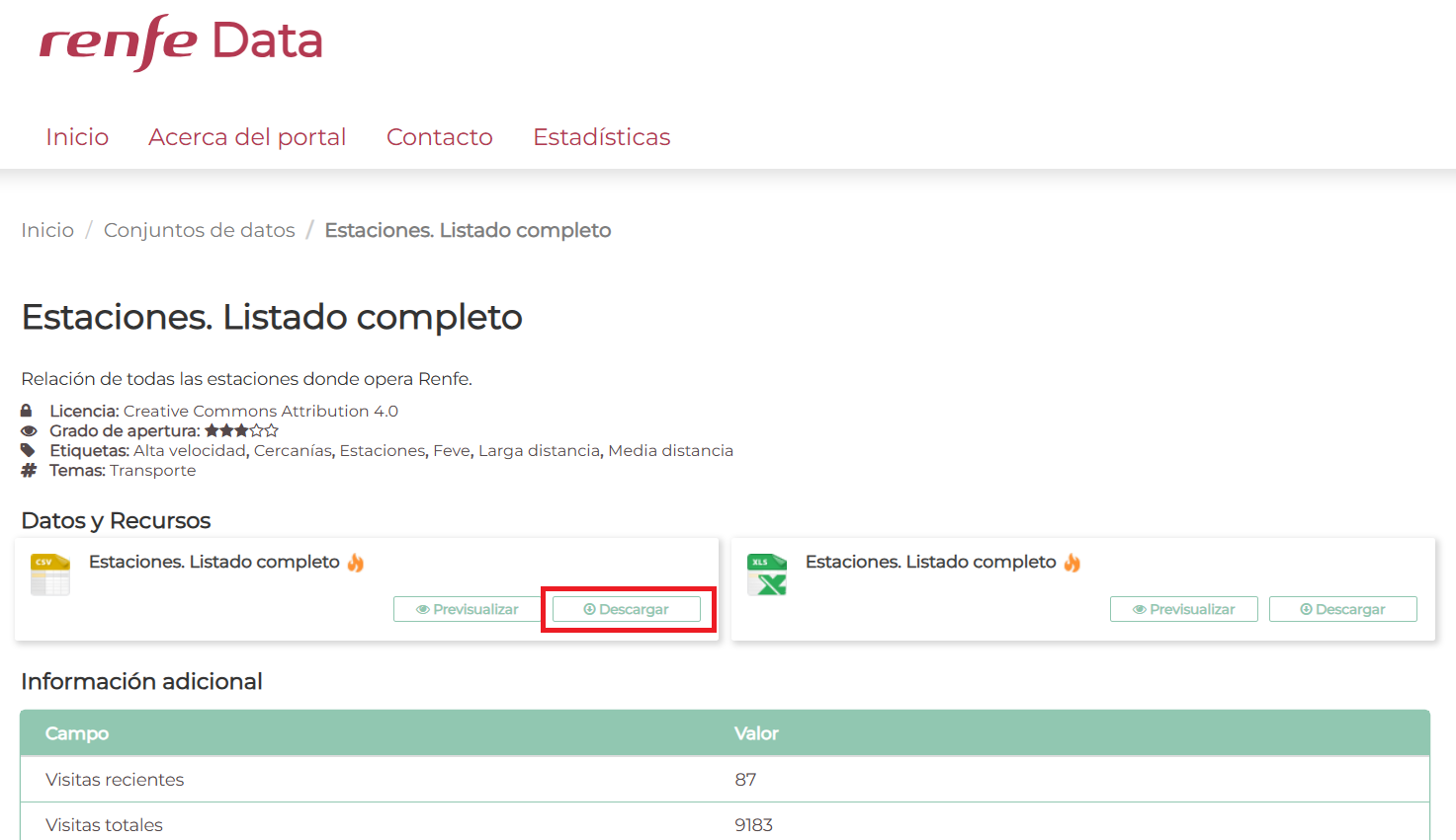
I'm going to start with a simple file: a list of stations throughout Spain. I have a CSV or XLS file; I download the CSV that contains more information.
Pandas for CSV
Next, I need Pandas to analyze the data. (I'm a bit lost, so I'm using ChatGPT 5.1 to help me with the Python code. The prompt I'm using is that I have a CSV file inside a Jupyter server, and I want to display a table containing the station code, name, longitude, and latitude.)
import pandas as pd

# Upload the CSV (adjust the path if your file is in a different folder)
df = pd.read_csv("datasets/estaciones.csv", encoding="latin-1", sep=";")

# Select only the necessary columns
selected = df[["CODIGO", "DESCRIPCION", "LATITUD", "LONGITUD"]]

# Show the table
selected
| CODIGO | DESCRIPCION | LATITUD | LONGITUD | |
|---|---|---|---|---|
| 0 | 1003 | ARAHAL | 37.268081 | -5.548514 |
| 1 | 1005 | MARCHENA | 37.334282 | -5.425519 |
| 2 | 1007 | OSUNA | 37.233899 | -5.115026 |
| 3 | 1009 | PEDRERA | 37.222396 | -4.893519 |
| 4 | 2002 | PUENTE GENIL-HERRERA | 37.357900 | -4.821638 |
| ... | ... | ... | ... | ... |
| 1675 | 99501 | ANDORRA | NaN | NaN |
| 1676 | 99800 | CERCEDILLA TURÍSTICO | NaN | NaN |
| 1677 | 99801 | PUERTO NAVACERRADA | NaN | NaN |
| 1678 | 99802 | COTOS | NaN | NaN |
| 1679 | 99853 | VIELHA-BUS | 42.702661 | 0.794352 |
1680 rows × 4 columns
Folium
Now I want to try to represent that data on a map of Spain. I'm going to use Folium, which is an interface for creating maps in Python.
!pip install folium
Collecting folium
  Downloading folium-0.20.0-py2.py3-none-any.whl.metadata (4.2 kB)
Collecting branca>=0.6.0 (from folium)
  Downloading branca-0.8.2-py3-none-any.whl.metadata (1.7 kB)
Requirement already satisfied: jinja2>=2.9 in /opt/conda/lib/python3.13/site-packages (from folium) (3.1.6)
Requirement already satisfied: numpy in /opt/conda/lib/python3.13/site-packages (from folium) (2.3.3)
Requirement already satisfied: requests in /opt/conda/lib/python3.13/site-packages (from folium) (2.32.5)
Requirement already satisfied: xyzservices in /opt/conda/lib/python3.13/site-packages (from folium) (2025.4.0)
Requirement already satisfied: MarkupSafe>=2.0 in /opt/conda/lib/python3.13/site-packages (from jinja2>=2.9->folium) (3.0.3)
Requirement already satisfied: charset_normalizer<4,>=2 in /opt/conda/lib/python3.13/site-packages (from requests->folium) (3.4.4)
Requirement already satisfied: idna<4,>=2.5 in /opt/conda/lib/python3.13/site-packages (from requests->folium) (3.11)
Requirement already satisfied: urllib3<3,>=1.21.1 in /opt/conda/lib/python3.13/site-packages (from requests->folium) (2.5.0)
Requirement already satisfied: certifi>=2017.4.17 in /opt/conda/lib/python3.13/site-packages (from requests->folium) (2025.10.5)
Downloading folium-0.20.0-py2.py3-none-any.whl (113 kB)
Downloading branca-0.8.2-py3-none-any.whl (26 kB)
Installing collected packages: branca, folium
   ━━━━━━━━━━━━━━━━━━━━━━━━━━━━━━━━━━━━━━━━ 2/2 [folium]
Successfully installed branca-0.8.2 folium-0.20.0
import pandas as pd
import folium

# 1. Upload the CSV
df = pd.read_csv("datasets/estaciones.csv", encoding="latin-1", sep=";")

# 2. We only keep the necessary columns
df = df[["DESCRIPCION", "LATITUD", "LONGITUD"]]

# 3. Delete rows without coordinates
df = df.dropna(subset=["LATITUD", "LONGITUD"])

# 4. Create the map centered on Spain
mapa = folium.Map(location=[40.0, -3.7], zoom_start=6)

# 5. Add a marker for each station
for _, fila in df.iterrows():
    folium.Marker(
        location=[fila["LATITUD"], fila["LONGITUD"]],
        popup=fila["DESCRIPCION"]
    ).add_to(mapa)

# 6. Display the map in Jupyter
mapa
mapa.save("mapa_estaciones.html")
Matplotlib
While investigating, I also found data on passenger boarding and alighting at stations, in this case for the Asturias region (there is data for León on the Narrow Gauge line, but the figures are very poor...). In this case, use Matplotlib.
import pandas as pd
import matplotlib.pyplot as plt

# Load CSV
df = pd.read_csv("datasets/asturias_viajeros_por_franja_csv.csv", encoding="latin-1", sep=";")

# Filter target stations
estaciones_objetivo = [
    "GIJON-SANZ CRESPO",
    "OVIEDO",
    "POLA DE LENA",
    "MIERES-PUENTE"
]

df_filtrado = df[df["NOMBRE_ESTACION"].isin(estaciones_objetivo)]

# Group by station and sum travellers
resumen = df_filtrado.groupby("NOMBRE_ESTACION")[["VIAJEROS_SUBIDOS", "VIAJEROS_BAJADOS"]].sum()

# Custom Colored Bar Chart
plt.figure(figsize=(10, 6))
ax = resumen.plot(
    kind="bar",
    color=["green", "red"]   # SUBIDOS, BAJADOS
)

plt.xlabel("Station")
plt.ylabel("Number of travelers")
plt.title("Passengers boarding and alighting per station (Asturias)")
plt.tight_layout()
plt.show()
<Figure size 1000x600 with 0 Axes>

Plotly
Represent the same thing with Plotly (interactive graph)
!pip install plotly
Requirement already satisfied: plotly in /opt/conda/lib/python3.13/site-packages (6.5.0)
Requirement already satisfied: narwhals>=1.15.1 in /opt/conda/lib/python3.13/site-packages (from plotly) (2.9.0)
Requirement already satisfied: packaging in /opt/conda/lib/python3.13/site-packages (from plotly) (25.0)
import pandas as pd
import plotly.express as px

# Upload CSV
df = pd.read_csv("datasets/asturias_viajeros_por_franja_csv.csv",
                 encoding="latin-1", sep=";")

# Filter stations
estaciones_objetivo = [
    "GIJON-SANZ CRESPO",
    "OVIEDO",
    "POLA DE LENA",
    "MIERES-PUENTE"
]

df_filtrado = df[df["NOMBRE_ESTACION"].isin(estaciones_objetivo)]

# Group by station
resumen = df_filtrado.groupby("NOMBRE_ESTACION")[
    ["VIAJEROS_SUBIDOS", "VIAJEROS_BAJADOS"]
].sum().reset_index()

# Interactive graphic
fig = px.bar(
    resumen,
    x="NOMBRE_ESTACION",
    y=["VIAJEROS_SUBIDOS", "VIAJEROS_BAJADOS"],
    barmode="group",
    title="Passengers boarding and alighting per station (Asturias)",
    labels={
        "NOMBRE_ESTACION": "Station",
        "value": "Number of travellers",
        "variable": "Type"
    }
)

fig.show()

Sankey diagram
I don't have much information in my data to create a Sankey diagram, but I was curious to see how it works. In this case, I used ChatGPT 5.1 (the prompt I used was, "With this CSV file, I want you to generate a Sankey diagram showing the flow of passengers getting on and off"). Ideally, I would have information about the passenger and where they get on and off; then it would be a very nice diagram (but I only have the total for each station, and it's the same number for both getting on and off).
!pip install plotly
Requirement already satisfied: plotly in /opt/conda/lib/python3.13/site-packages (6.5.0)
Requirement already satisfied: narwhals>=1.15.1 in /opt/conda/lib/python3.13/site-packages (from plotly) (2.9.0)
Requirement already satisfied: packaging in /opt/conda/lib/python3.13/site-packages (from plotly) (25.0)
import pandas as pd
import plotly.graph_objects as go

# 1. Upload CSV
df = pd.read_csv("datasets/asturias_viajeros_por_franja_csv.csv",
                 encoding="latin-1", sep=";")

# (Optional) Filter for Asturias only, in case there are others
df = df[df["NUCLEO_CERCANIAS"] == "ASTURIAS"]

# 2. Group by station and add up travelers
resumen = df.groupby("NOMBRE_ESTACION")[["VIAJEROS_SUBIDOS", "VIAJEROS_BAJADOS"]].sum()

# 3. Crear lista de nodos:
#    0 -> "Viajeros que SUBEN"
#    1 -> "Viajeros que BAJAN"
#    2..n -> estaciones
nombres_estaciones = resumen.index.tolist()

labels = ["Travelers UP", "Travelers GET OFF"] + nombres_estaciones

# Node indices
idx_suben = 0
idx_bajan = 1
idx_estaciones = {est: i + 2 for i, est in enumerate(nombres_estaciones)}

# 4. Build the Sankey links

source = []
target = []
value  = []

# Flow: "Passengers BOARD" -> Stations (VIAJEROS_SUBIDOS)
for est, row in resumen.iterrows():
    source.append(idx_suben)
    target.append(idx_estaciones[est])
    value.append(row["VIAJEROS_SUBIDOS"])

# Flow: Stations -> "Passengers GET OFF" (VIAJEROS_BAJADOS)
for est, row in resumen.iterrows():
    source.append(idx_estaciones[est])
    target.append(idx_bajan)
    value.append(row["VIAJEROS_BAJADOS"])

# 5. Create the Sankey diagram
fig = go.Figure(data=[go.Sankey(
    node=dict(
        pad=20,
        thickness=20,
        label=labels
    ),
    link=dict(
        source=source,
        target=target,
        value=value
    )
)])

fig.update_layout(
    title_text="Passenger flows boarding and alighting at each station (Asturias)",
    font_size=10
)

fig.show()
