Data Science 2025 / Final Project
Studiying the borns and deaths os my country, Spain, takins several data from the Intituto Nacional de Estadistica (nacional agency os statistics) and see how well our country is developing in keeping the population and life expectancy. Data from here: https://www.epdata.es/datos/nacimientos-muertes-estadisticas-graficos-datos-ine/67/espana/106
THE DATA
#first of all lets see what we have in the file
import pandas as pd

df = pd.read_json('datasets/nacimientos_espana_1975_2024.json')

print(df)
    year  births
0   1975  677456
1   1976  657828
2   1977  640494
3   1978  634226
4   1979  618654
5   1980  571018
6   1981  545530
7   1982  531463
8   1983  518163
9   1984  502426
10  1985  494314
11  1986  482891
12  1987  474624
13  1988  475421
14  1989  401108
15  1990  403386
16  1991  396747
17  1992  384830
18  1993  362626
19  1994  360471
20  1995  363469
21  1996  362626
22  1997  362193
23  1998  365193
24  1999  389357
25  2000  396626
26  2001  405313
27  2002  417688
28  2003  440531
29  2004  453172
30  2005  464811
31  2006  482954
32  2007  518032
33  2008  519779
34  2009  494997
35  2010  485252
36  2011  471999
37  2012  454648
38  2013  425715
39  2014  426303
40  2015  419109
41  2016  408384
42  2017  391930
43  2018  372777
44  2019  360617
45  2020  339206
46  2021  338532
47  2022  329251
48  2023  322075
49  2024  321500
i find two data columns: year and births. Lets make a Graph about the births in the country os spain, by number. Just a simple scatter and plotting the data:
import pandas as pd
import matplotlib.pyplot as plt

df = pd.read_json('datasets/nacimientos_espana_1975_2024.json')

df.plot(kind = 'scatter', x = 'year', y = 'births')

plt.show()

I can see there is a enourmous number of borns in the 75 years (we call here Baby boom) because of the end of the dictatorship era. After this boom the borns goes down until year 98, the a little rise up until year 2008 (when the lehman brothers affaire) and then going down.
df['births'].plot.kde()
<Axes: ylabel='Density'>

I also want to check the data of deaths in Spain in the same time split. You can find the data here: https://www.epdata.es/defunciones-ocurridas-espana-1900/d1fec921-3674-4e24-895c-7251f8f9cb10
df2 = pd.read_csv('datasets/deaths_year.csv')

print(df2)
    year  deaths
0   1975  298192
1   1976  299007
2   1977  294324
3   1978  296781
4   1979  291213
5   1980  289344
6   1981  293386
7   1982  286655
8   1983  302569
9   1984  299409
10  1985  312532
11  1986  310413
12  1987  310073
13  1988  319437
14  1989  324796
15  1990  333142
16  1991  337691
17  1992  331515
18  1993  339661
19  1994  338242
20  1995  346227
21  1996  351449
22  1997  349521
23  1998  360511
24  1999  371102
25  2000  360391
26  2001  360131
27  2002  368618
28  2003  384828
29  2004  371934
30  2005  387355
31  2006  371478
32  2007  385361
33  2008  386324
34  2009  384933
35  2010  382047
36  2011  387911
37  2012  402950
38  2013  390419
39  2014  395830
40  2015  422568
41  2016  410611
42  2017  424523
43  2018  427721
44  2019  418703
45  2020  493776
46  2021  450744
47  2022  463133
48  2023  436124
49  2024  433547
Now i have to do the same with the death by year. Be careful that all data are the same at both datafiles. Unoe column for the year, and the other column with data without dots
df2.plot(kind = 'scatter', x = 'year', y = 'deaths')

plt.show()

df2['deaths'].plot.kde()
<Axes: ylabel='Density'>

Now i want to mix both data (births and deaths) in the same graphic:
plt.plot(df["year"], df["births"], label="Births")
plt.plot(df2["year"], df2["deaths"], label="Deaths")
plt.legend()
plt.show()

THE FITTING
Now, having this two data in the plot, lets try to find the best fitting form to this data. As i see the deaths will be easy, because it slightly grow up in time. But the births has a more complex form, goes down, then rise a little bit and then goes down again .So it seems that the deaths has a deg 2 polinomial and the births are deg3.
Using numpy to find this polinoms:
import numpy as np
# load data
year_b, births = df["year"].values, df["births"].values
year_d, deaths = df2["year"].values, df2["deaths"].values

# adjusting polinomies
coef_births = np.polyfit(year_b, births, deg=3)
coef_deaths = np.polyfit(year_d, deaths, deg=2)

poly_births = np.poly1d(coef_births)
poly_deaths = np.poly1d(coef_deaths)

# common range
years = np.linspace(1975, max(year_b.max(), year_d.max()), 300)

plt.plot(year_b, births, "o", alpha=0.4, label="Births (data)")
plt.plot(years, poly_births(years), "-", label="Births fit (deg 3)")

plt.plot(year_d, deaths, "o", alpha=0.4, label="Deaths (data)")
plt.plot(years, poly_deaths(years), "-", label="Deaths fit (deg 2)")

plt.legend()
plt.xlabel("Year")
plt.ylabel("Count")
plt.title("Polynomial fitting: births vs deaths (Spain)")
plt.show()

Overall, this fitting approach provides a reasonable approximation of the long-term demographic trends and allows for a clear comparison between both series.
import numpy as np
import matplotlib.pyplot as plt
from sklearn.pipeline import make_pipeline
from sklearn.preprocessing import PolynomialFeatures
from sklearn.linear_model import LinearRegression

# load data
X = df["year"].values.reshape(-1, 1)
y = df["births"].values

# ML model: polinomial regression
degree = 3  # same deg that i find in the fitting

model = make_pipeline(
    PolynomialFeatures(degree=degree),
    LinearRegression()
)

# train model
model.fit(X, y)

#prediction
years = np.linspace(X.min(), X.max(), 300).reshape(-1, 1)
y_pred = model.predict(years)

#visualization
plt.figure(figsize=(8,5))
plt.scatter(X, y, label="Births (data)", alpha=0.6)
plt.plot(years, y_pred, color="red", label=f"Polynomial regression (deg {degree})")
plt.xlabel("Year")
plt.ylabel("Births")
plt.title("Polynomial Regression with scikit-learn")
plt.legend()
plt.grid(True)
plt.show()

THE MACHINE LEARNING
Checking the resoluts in the ML approximation data:
from sklearn.metrics import mean_squared_error, r2_score

y_fit = model.predict(X)

mse = mean_squared_error(y, y_fit)
r2 = r2_score(y, y_fit)

print(f"MSE: {mse:.2e}")
print(f"R²: {r2:.4f}")
MSE: 1.03e+09
R²: 0.8742
The results its not great (must be closer to 1) but there are not so much data to work on. Pretty close to a nice result. Im going to use the same approximation with deaths data:
import numpy as np
import matplotlib.pyplot as plt
from sklearn.pipeline import make_pipeline
from sklearn.preprocessing import PolynomialFeatures
from sklearn.linear_model import LinearRegression

# load data
X = df2["year"].values.reshape(-1, 1)
y = df2["deaths"].values

# ML model: polinomial regression
degree = 2  # same deg that i find in the fitting

model = make_pipeline(
    PolynomialFeatures(degree=degree),
    LinearRegression()
)

# train model
model.fit(X, y)

#prediction
years = np.linspace(X.min(), X.max(), 300).reshape(-1, 1)
y_pred = model.predict(years)

#visualization
plt.figure(figsize=(8,5))
plt.scatter(X, y, label="Deaths (data)", alpha=0.6)
plt.plot(years, y_pred, color="red", label=f"Polynomial regression (deg {degree})")
plt.xlabel("Year")
plt.ylabel("Deaths")
plt.title("Polynomial Regression with scikit-learn")
plt.legend()
plt.grid(True)
plt.show()

THE PROBABILITY
Now lets find the probability distribution of births and deaths:
import numpy as np
import matplotlib.pyplot as plt
from scipy.stats import norm

births = df["births"].values
deaths = df2["deaths"].values

# probability of born
plt.figure(figsize=(8,5))
plt.hist(births, bins=15, density=True, alpha=0.5, label="Births (data)")

mu_b, sigma_b = norm.fit(births)
x = np.linspace(births.min(), births.max(), 300)
plt.plot(x, norm.pdf(x, mu_b, sigma_b), "r-",
         label=f"Normal fit μ={mu_b:.0f}, σ={sigma_b:.0f}")

plt.title("Probability distribution of annual births (Spain)")
plt.xlabel("Number of births per year")
plt.ylabel("Probability density")
plt.legend()
plt.grid(True)
plt.show()

plt.figure(figsize=(8,5))
plt.hist(deaths, bins=15, density=True, alpha=0.5, label="Deaths (data)")

mu_d, sigma_d = norm.fit(deaths)
x = np.linspace(deaths.min(), deaths.max(), 300)
plt.plot(x, norm.pdf(x, mu_d, sigma_d), "g-",
         label=f"Normal fit μ={mu_d:.0f}, σ={sigma_d:.0f}")

plt.title("Probability distribution of annual deaths (Spain)")
plt.xlabel("Number of deaths per year")
plt.ylabel("Probability density")
plt.legend()
plt.grid(True)
plt.show()

With that we can see some probability data realted with this numbers:
threshold = 350_000
prob = norm.cdf(threshold, mu_b, sigma_b)

print(f"Probability(births < {threshold}) = {prob:.2f}")
Probability(births < 350000) = 0.14
threshold = 450_000
prob = 1 - norm.cdf(threshold, mu_d, sigma_d)

print(f"Probability(deaths > {threshold}) = {prob:.2f}")
P(deaths > 450000) = 0.04
THE DENSITY ESTIMATION
Analyzing the probability distribution of annual births and deaths in Spain by treating the yearly values as realizations of random variables. Histograms and kernel density estimates were used to visualize the empirical distributions, and normal distributions were fitted to each dataset. The fitted parameters provide an estimate of the typical annual values and their variability, while extreme years appear as low-probability events in the tails of the distributions.
import numpy as np
import matplotlib.pyplot as plt
from scipy.stats import norm
from sklearn.mixture import GaussianMixture
import seaborn as sns

births = df["births"].values
deaths = df2["deaths"].values

#KDE vs normal
plt.figure(figsize=(8,5))

# Histogram
plt.hist(births, bins=15, density=True, alpha=0.4, label="Births (data)")

# KDE
sns.kdeplot(births, linewidth=2, label="KDE")

# Normal
mu_b, sigma_b = norm.fit(births)
x = np.linspace(births.min(), births.max(), 300)
plt.plot(x, norm.pdf(x, mu_b, sigma_b), "r--", label="Normal fit")

plt.title("Density estimation of annual births (Spain)")
plt.xlabel("Number of births per year")
plt.ylabel("Density")
plt.legend()
plt.grid(True)
plt.show()

KDE follows better the asymetry of data in this case, and the normal soften too much tha data.
plt.figure(figsize=(8,5))

plt.hist(deaths, bins=15, density=True, alpha=0.4, label="Deaths (data)")
sns.kdeplot(deaths, linewidth=2, label="KDE")

mu_d, sigma_d = norm.fit(deaths)
x = np.linspace(deaths.min(), deaths.max(), 300)
plt.plot(x, norm.pdf(x, mu_d, sigma_d), "g--", label="Normal fit")

plt.title("Density estimation of annual deaths (Spain)")
plt.xlabel("Number of deaths per year")
plt.ylabel("Density")
plt.legend()
plt.grid(True)
plt.show()

births_reshaped = births.reshape(-1, 1)

gmm_b = GaussianMixture(n_components=2, random_state=0)
gmm_b.fit(births_reshaped)

means_b = gmm_b.means_.flatten()
stds_b = np.sqrt(gmm_b.covariances_.flatten())
weights_b = gmm_b.weights_.flatten()

print("GMM Births:")
for i in range(2):
    print(f"Component {i+1}: μ={means_b[i]:.0f}, σ={stds_b[i]:.0f}, weight={weights_b[i]:.2f}")
GMM Births:
Component 1: μ=381361, σ=36732, weight=0.46
Component 2: μ=506313, σ=82932, weight=0.54
x = np.linspace(births.min(), births.max(), 300)
logprob = gmm_b.score_samples(x.reshape(-1,1))
pdf_gmm = np.exp(logprob)

plt.figure(figsize=(8,5))
plt.hist(births, bins=15, density=True, alpha=0.4, label="Data")
plt.plot(x, pdf_gmm, "k-", label="GMM total")

for i in range(2):
    plt.plot(
        x,
        weights_b[i] * norm.pdf(x, means_b[i], stds_b[i]),
        "--",
        label=f"Component {i+1}"
    )

plt.title("GMM density estimation – Births")
plt.legend()
plt.grid(True)
plt.show()

Detects two components: one component is the years where there are a lot of newborns and the other component are the years with low births
CONCLUSION
In this project, i analyzed long-term demographic data for Spain, focusing on annual births and deaths since 1975.
We first explored the data visually and applied polynomial fitting to model the underlying trends. A third-degree polynomial captured the strong non-linear decline in births, while a second-degree polynomial was sufficient to describe the smoother increase in deaths.
I then applied supervised machine learning techniques, using polynomial regression implemented with scikit-learn. The machine learning model produced results comparable to classical fitting while providing a more flexible and extensible framework, including standard evaluation metrics and pipeline-based transformations.
From a probabilistic perspective, i treated the annual values as realizations of random variables and investigated their probability distributions. Density estimation techniques such as Kernel Density Estimation (KDE) and Gaussian Mixture Models (GMM) were used to characterize the variability of the data and to identify different demographic regimes, particularly in the births series.
Overall, the combination of classical fitting, machine learning regression, and density estimation provides a coherent and complementary view of the data. These methods allow me to model long-term trends, assess variability, and identify structural changes in demographic behavior, demonstrating the usefulness of data science techniques for analyzing real-world societal data.
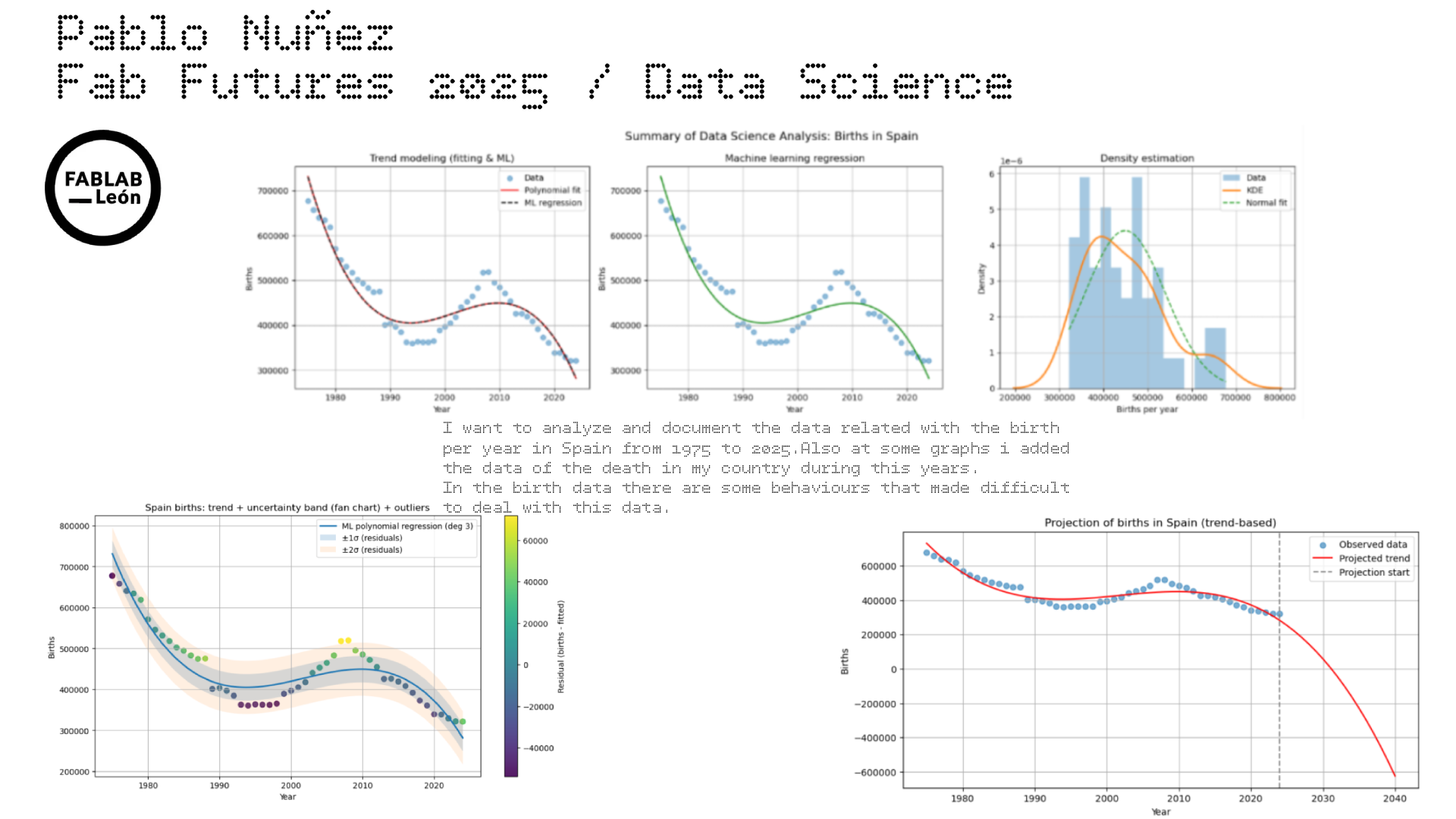
Since the most critical dataset used here is the borns in spain from 75 to 2025, im going to make a resume of the project with three plot seeing the three steps of the investigation: fitting, ML and density estimation
import numpy as np
import matplotlib.pyplot as plt
from scipy.stats import norm
from sklearn.pipeline import make_pipeline
from sklearn.preprocessing import PolynomialFeatures
from sklearn.linear_model import LinearRegression
import seaborn as sns

# data load
years = df["year"].values
births = df["births"].values

X = years.reshape(-1, 1)
y = births

x_plot = np.linspace(years.min(), years.max(), 300).reshape(-1, 1)

# fitting
poly_coef = np.polyfit(years, births, deg=3)
poly_fit = np.poly1d(poly_coef)

# Machine learning with polinomial regression
ml_model = make_pipeline(
    PolynomialFeatures(degree=3),
    LinearRegression()
)
ml_model.fit(X, y)
y_ml = ml_model.predict(x_plot)

# Density estiamtion
mu, sigma = norm.fit(births)

#resume ploting
fig, axs = plt.subplots(1, 3, figsize=(18, 5))

# --- Subplot 1: Fitting clásico + ML
axs[0].scatter(years, births, alpha=0.5, label="Data")
axs[0].plot(x_plot, poly_fit(x_plot), label="Polynomial fit", color="red")
axs[0].plot(x_plot, y_ml, "--", label="ML regression", color="black")
axs[0].set_title("Trend modeling (fitting & ML)")
axs[0].set_xlabel("Year")
axs[0].set_ylabel("Births")
axs[0].legend()
axs[0].grid(True)

# plot2: ML model only
axs[1].scatter(years, births, alpha=0.5)
axs[1].plot(x_plot, y_ml, color="green")
axs[1].set_title("Machine learning regression")
axs[1].set_xlabel("Year")
axs[1].set_ylabel("Births")
axs[1].grid(True)

# plot3: Density estimation
axs[2].hist(births, bins=15, density=True, alpha=0.4, label="Data")
sns.kdeplot(births, ax=axs[2], linewidth=2, label="KDE")
x = np.linspace(births.min(), births.max(), 300)
axs[2].plot(x, norm.pdf(x, mu, sigma), "--", label="Normal fit")
axs[2].set_title("Density estimation")
axs[2].set_xlabel("Births per year")
axs[2].set_ylabel("Density")
axs[2].legend()
axs[2].grid(True)

plt.suptitle("Summary of Data Science Analysis: Births in Spain", fontsize=14)
plt.tight_layout()
plt.show()

Now lets try to make a more fancy example of the data visualization:
import numpy as np
import matplotlib.pyplot as plt
from sklearn.pipeline import make_pipeline
from sklearn.preprocessing import PolynomialFeatures
from sklearn.linear_model import LinearRegression

# Datos
years = df["year"].values
births = df["births"].values
X = years.reshape(-1, 1)

# ML polynomial regression (grado 3, como ya usabas)
degree = 3
model = make_pipeline(PolynomialFeatures(degree=degree), LinearRegression())
model.fit(X, births)

# Predicción en años originales y cálculo de residuos
y_hat = model.predict(X)
residuals = births - y_hat

# Estimar "incertidumbre" con la desviación típica de los residuos
sigma = residuals.std(ddof=1)

# Eje suave para la curva
x_plot = np.linspace(years.min(), years.max(), 400)
X_plot = x_plot.reshape(-1, 1)
y_plot = model.predict(X_plot)

# Colorear puntos por residuo (outliers destacan)
plt.figure(figsize=(11,6))
sc = plt.scatter(years, births, c=residuals, s=45, alpha=0.9)

# Curva del modelo
plt.plot(x_plot, y_plot, linewidth=2, label=f"ML polynomial regression (deg {degree})")

# Bandas tipo fan chart: ±1σ y ±2σ
plt.fill_between(x_plot, y_plot - sigma, y_plot + sigma, alpha=0.2, label="±1σ (residuals)")
plt.fill_between(x_plot, y_plot - 2*sigma, y_plot + 2*sigma, alpha=0.12, label="±2σ (residuals)")

plt.colorbar(sc, label="Residual (births - fitted)")
plt.title("Spain births: trend + uncertainty band (fan chart) + outliers")
plt.xlabel("Year")
plt.ylabel("Births")
plt.grid(True)
plt.legend()
plt.show()

Interanual graphic:
import numpy as np
import matplotlib.pyplot as plt

years = df["year"].values
births = df["births"].values

pct_change = 100 * (births[1:] - births[:-1]) / births[:-1]
years_change = years[1:]

plt.figure(figsize=(11,4))
plt.axhline(0, linewidth=1)
plt.bar(years_change, pct_change)
plt.title("Spain births: year-over-year change (%)")
plt.xlabel("Year")
plt.ylabel("% change")
plt.grid(True, axis="y", alpha=0.3)
plt.show()

Adding the deaths by year to this graphic:
import numpy as np
import matplotlib.pyplot as plt

# data load
years_b = df["year"].values
births = df["births"].values

years_d = df2["year"].values
deaths = df2["deaths"].values

# Asegurar mismo rango temporal
years = np.intersect1d(years_b, years_d)

births = df[df["year"].isin(years)]["births"].values
deaths = df2[df2["year"].isin(years)]["deaths"].values

# internaual variation %
births_pct = 100 * (births[1:] - births[:-1]) / births[:-1]
deaths_pct = 100 * (deaths[1:] - deaths[:-1]) / deaths[:-1]
years_pct = years[1:]

#combined graphic
plt.figure(figsize=(11,5))

plt.axhline(0, color="black", linewidth=1)

plt.plot(years_pct, births_pct, label="Births (% change)", linewidth=2)
plt.plot(years_pct, deaths_pct, label="Deaths (% change)", linewidth=2)

plt.title("Year-over-year variation (%) of births and deaths in Spain")
plt.xlabel("Year")
plt.ylabel("Annual change (%)")
plt.legend()
plt.grid(True, axis="y", alpha=0.3)
plt.show()

The future
I want to know, based in this data and in the analysis, which could be the next years prediction in the birth of newborns in Spain. The following results should be interpreted as exploratory projections based on historical trends, not as precise forecasts.
import numpy as np
import matplotlib.pyplot as plt
from sklearn.pipeline import make_pipeline
from sklearn.preprocessing import PolynomialFeatures
from sklearn.linear_model import LinearRegression

# Datos
years = df["year"].values
births = df["births"].values

X = years.reshape(-1, 1)
y = births

# Modelo ML
degree = 3
model = make_pipeline(
    PolynomialFeatures(degree=degree),
    LinearRegression()
)
model.fit(X, y)

# Proyection until 2040
future_years = np.arange(years.min(), 2041)
X_future = future_years.reshape(-1, 1)
y_future = model.predict(X_future)

#visualization
plt.figure(figsize=(10,5))

plt.scatter(years, births, label="Observed data", alpha=0.6)
plt.plot(future_years, y_future, color="red", label="Projected trend")

#vertical line
plt.axvline(years.max(), linestyle="--", color="gray", label="Projection start")

plt.xlabel("Year")
plt.ylabel("Births")
plt.title("Projection of births in Spain (trend-based)")
plt.legend()
plt.grid(True)
plt.show()

Since the data could be ok, i think this is not taking some consideration (like that will never be negative borns hehe). So maybe this is not a great way to predict the future of birth in Spain