Fab Academy as a Living Global Network
Key Insights
Global expansion continues, but student participation plateaus
Fab Academy has grown geographically, yet annual student numbers have gradually declined after peaking around 2017.
Engagement is multi-dimensional and cannot be explained by commit volume alone
CWM reveals five distinct engagement patterns, indicating a non-linear relationship in which higher activity does not necessarily lead to higher graduation rates.
Sustainability signals resonate most strongly with Fab Academy
SDGs show the highest Mutual Information with Fab Academy (2019–2025), suggesting that global sustainability interests are more closely synchronized with Fab Academy activity than other maker-related trends.
Visualization enables new understanding and supports motivation
The integrated Globe—combining labs, students, commit activity, and social trends—frames Fab Academy as an evolving global ecosystem.
Extending this visualization to real-time data could provide learners with immediate awareness of worldwide peer activity, offering a new form of feedback that enhances engagement and motivation.
from IPython.display import HTML
HTML(""" <iframe title="vimeo-player" src="https://player.vimeo.com/video/1145456129?h=5f6f8e0006" width="960" height="540" frameborder="0" referrerpolicy="strict-origin-when-cross-origin" allow="autoplay; fullscreen; picture-in-picture; clipboard-write; encrypted-media; web-share"   allowfullscreen></iframe> """)
1. What This Visualization Shows
As a Fab Academy and Fabricademy instructor, I am deeply interested in how these powerful educational programs can grow, sustain themselves, and support students better.
This led me to analyze and visualize Fab Academy’s global data—labs, students, commits, and social trends—to look for insights that might help strengthen the community and improve student outcomes.
Visualization Goals
This visualization aims to:
Provide a global overview of Fab Academy’s activity.
Reveal differences in student engagement patterns.
Understand how Fab Academy relates to broader social trends.
Highlight structural challenges, such as plateauing enrollment.
Explore how visualization itself can support motivation and action within the community.
2. Data Sets
Fab Academy Labs / Students / Graduates (2019–2025) : Collected through web scraping from Fab Academy pages
Student Git Commit timestamps : Retrieved using the GitLab REST API
Google Trends Data : Fab Academy & related keywords
3. Basic Analysis of Fab Academy
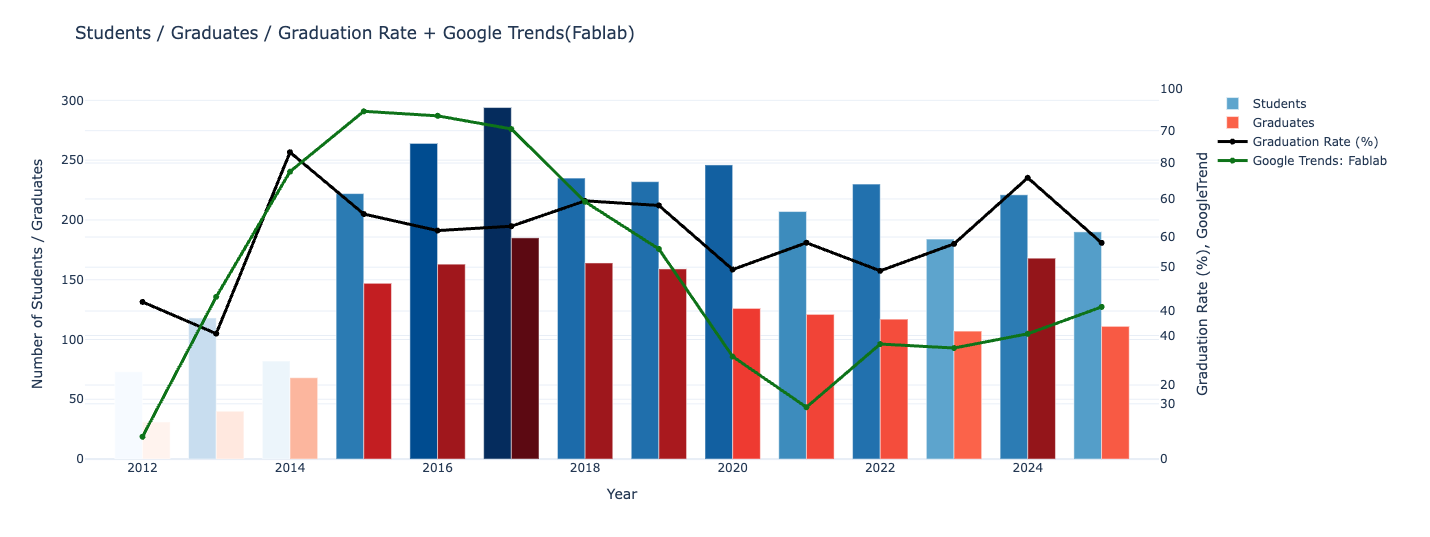
Long-Term Trends in Student Numbers, Graduates, Graduation Rates, and Google Trends (2012–2025)
- The peak appears around 2017, which aligns closely with Google Trends.
- After that, the trend stabilizes or slightly declines.
- Even as Google Trends declines, the number of students has stayed relatively stable.
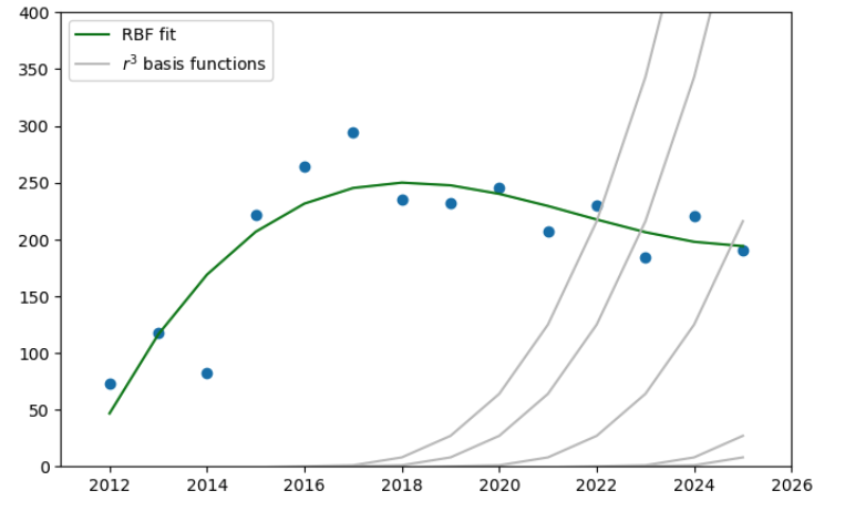
 Different fitting methods were tested to model the transition of Fab Academy student counts over time, but many either overfitted (polynomials, MLP) or failed to reproduce the gradual post-peak decline (Gaussian, tanh).
The RBF fit captured both the broad peak and the smooth decrease most effectively, making it the most suitable model for this dataset.
Different fitting methods were tested to model the transition of Fab Academy student counts over time, but many either overfitted (polynomials, MLP) or failed to reproduce the gradual post-peak decline (Gaussian, tanh).
The RBF fit captured both the broad peak and the smooth decrease most effectively, making it the most suitable model for this dataset.
Geographical Trends of FabAcademy Labs (2019–2025)
- There are clear regional concentrations and gaps.
- Europe has relatively high density.
- Africa has fewer labs overall, but there are strong hubs in places like Rwanda.
- Asia shows significant regional variation.
- The number of students per lab is not consistent.
- Many labs show unstable patterns — student numbers rise sharply or drop depending on the year.
4. Student Behavior Analysis 
To understand how different engagement styles relate to graduation outcomes, I applied Cluster-Weighted Modeling (CWM) using:
- total Git commits
- active weeks
- graduation state (0/1)
as input variables.
CWM simultaneously clusters students based on their behavioral patterns and models the probability of graduation within each region of the feature space.
This approach produced five meaningful behavioral clusters:
- Cluster 0 – Minimal Participants
- Cluster 1 – Low Volume, Steady Progressors
- Cluster 2 – High-Commit Burst Workers
- Cluster 3 – Moderate, Consistent Contributors
- Cluster 4 – High-Activity Multi-Taskers
The resulting Graduation Probability Surface is a direct output of the CWM model. It shows how the likelihood of graduating varies smoothly across the space defined by commit volume and engagement consistency.
An interesting pattern emerged from this analysis:
students with both high commit counts and high activity levels did not necessarily exhibit the highest graduation rates.
This non-linear relationship would be difficult to capture with simple linear models,
highlighting the strength of CWM in representing complex and heterogeneous behavioral patterns in the data.
5. Social Trend Analysis
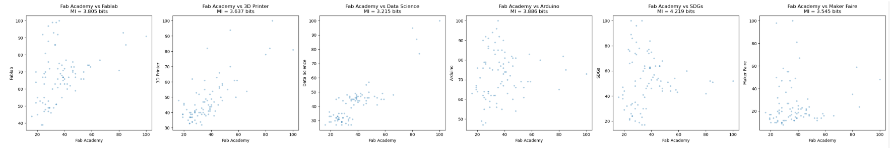
To understand how Fab Academy relates to broader societal interest, I examined Google Trends data for Fab Academy and several related keywords (Fablab, 3D Printer, Data Science, Arduino, SDGs).
Long-term Trend (2012–2025)
The historical data shows a clear pattern: both Fab Academy enrollment and the Fablab search trend peaked around 2016, followed by a gradual decline or stabilization. This suggests that Fab Academy’s visibility in global search interest has been closely coupled with the broader maker movement.
Mutual Information (MI) Across Keywords
Using Fab Academy as the reference signal, I computed Mutual Information for each keyword. MI reveals how strongly each trend moves together with Fab Academy:
- High MI (e.g., SDGs, Arduino, Fablab) indicates synchronized movements.
- Lower MI suggests weaker or more independent fluctuations.
These MI values were used as distortion parameters in the ring visualization.
Trend Rings around the Globe (2019–2025)
The ring visualizations show how Fab Academy relates to each keyword from 2019–2025:
- Ring diameter reflects the Google Trends value for Fablab, 3D Printer, Data Science, SDGs, Makerfaire in that year.
- Ring distortion (waviness) is proportional to the MI between Fab Academy and each keyword.
- High MI → stronger oscillation
- Low MI → smoother ring
The sequence of rings (2019 → 2025) illustrates how Fab Academy’s social alignment shifts from year to year. Some years show tight synchrony with related topics, while others appear more isolated, indicating weaker connection to surrounding social trends.
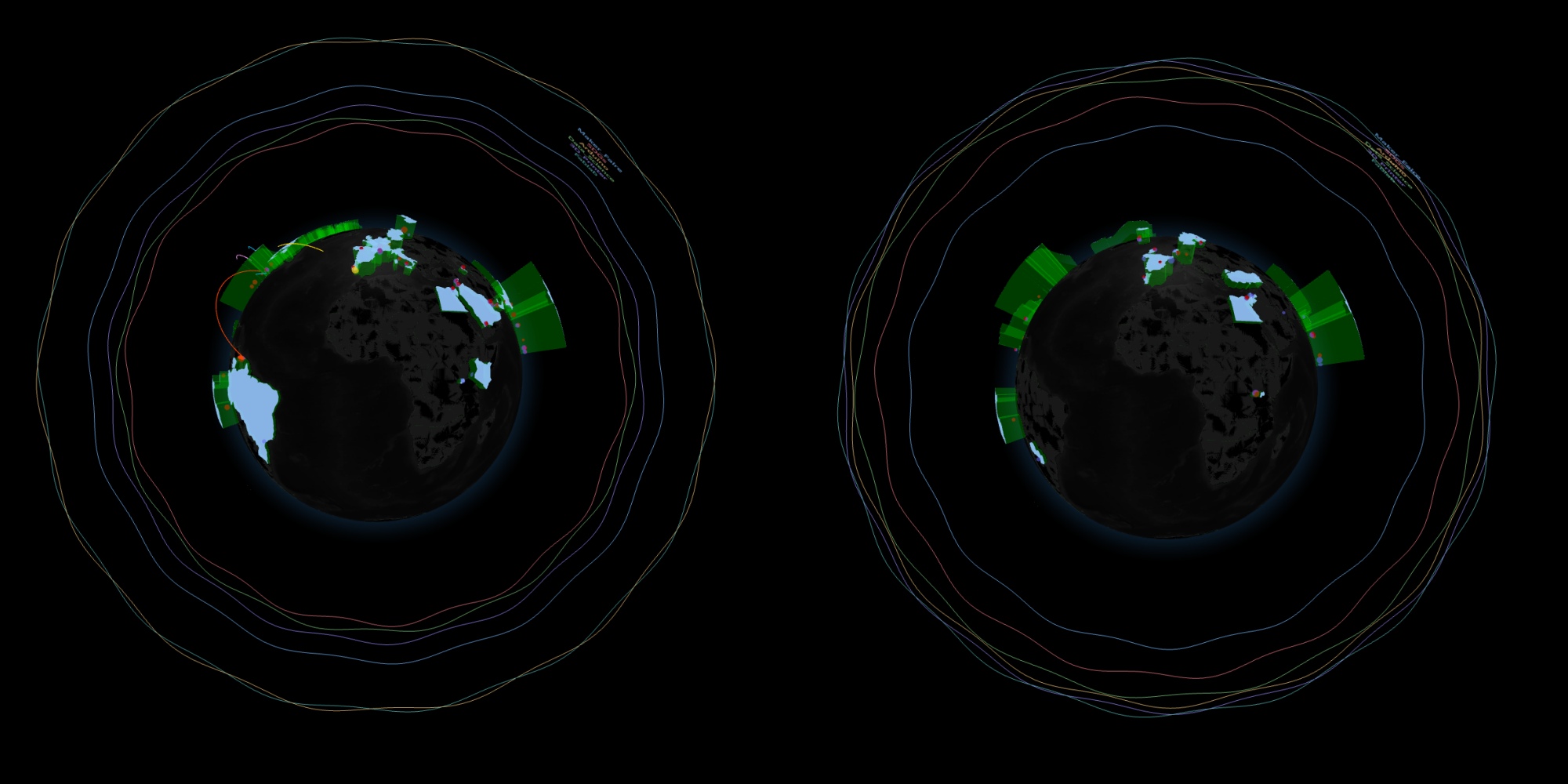
Left:2019 trend, Right: 2025 trend - Key Insightn Fab Academy does not exist in isolation. Its visibility and perceived relevance vary depending on how closely it tracks with broader themes such as SDGs, digital fabrication, or maker culture. This analysis helps reveal which societal movements Fab Academy resonates with—and when.
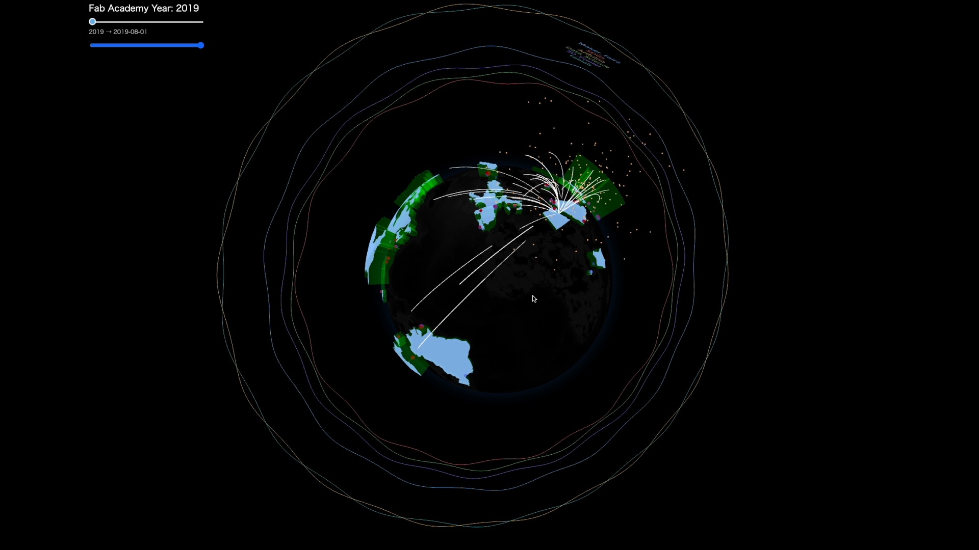
6. Integrated Visualization: The Globe
- Interactive Visualization : it takes 10 sec for first loading
The globe integrates all datasets into a single living view of Fab Academy. Every visual element corresponds to a real part of the Fab Academy ecosystem:
Country heights → Total students from each country
Dual-layer lab spheres -Outer sphere: number of students -Inner sphere: number of graduates
Student activity arcs Git commits appear as shooting-star arcs toward MIT (assumed server location). Each arc’s color represents one of the five engagement clusters identified by CWM.
Trend rings (from #5) Surrounding rings encode public interest in topics like Fablab, Arduino, SDGs. Radius = yearly search volume Oscillation = mutual information with Fab Academy
Annual graduation flow Each year, arcs gather toward the Fab Lab Conference host city, forming a moment of collective celebration — visualized as a burst of light.
Together, these layers reveal Fab Academy not as separate statistics, but as a global, evolving, interconnected learning network.
- Globe document: Link
7. Expected Effects of This Visualization 
Expected Effects
Makes global activity and growth patterns visible.
Reveals non-linear engagement and graduation behaviors.
Enhances student motivation through real-time, network-wide feedback.
Helps instructors detect engagement risks early.
Connects Fab Academy trends with broader social interest.
Communicates Fab Academy as a living, interconnected global ecosystem.