Week 1_2: Playground
Class
Assignment 
Visualize your data set(s)
It’s not just about plotting a graph — need to visualize the dataset(s).
My Plan
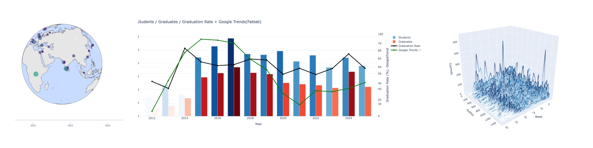
- Interactive map visualization of Fab Academy labs(nodes) and their student counts for 2021–2025
- Visualization of the relationships among Fab Academy student numbers, graduation rates, and trends from 2012–2025
- Visualization of changes in student commit activity on GitLab
Results
Findings & Insights
Geographical Trends of FabAcademy Labs (2019–2025)
There are clear regional concentrations and gaps.
Europe has relatively high density.
Africa has fewer labs overall, but there are strong hubs in places like Rwanda.
Asia shows significant regional variation.
The number of students per lab is not consistent.
Many labs show unstable patterns — student numbers rise sharply or drop depending on the year.
Questions that arise:
- How much collaboration exists within each region?
- Is there any correlation with national socioeconomic factors or education expenditure?
- Is Fab Academy’s growth dependent on specific regions?
- Which regions show potential for future development?
Long-Term Trends in Student Numbers, Graduates, Graduation Rates, and Google Trends (2012–2025)
- The peak appears around 2017, which aligns closely with Google Trends.
- After that, the trend stabilizes or slightly declines.
- Even as Google Trends declines, the number of students has stayed relatively stable.
GitLab Time Series of Student Commits (2019)
The commit count increases significantly in the later weeks (around Week 20–27), matching the final project rush.
Commit activity generally decreases in the middle of the timeline.
There are diverse commit patterns, suggesting the possibility of clustering analysis.
This time I analyzed only 2019, but I also have commit data for all students from 2019 to 2025, so I plan to use it in future analyses.
Questions that arise:
- Can the data be clustered?
- Are there regional differences, such as cultural or national characteristics?
- Is there any correlation between commit activity and graduation outcomes?
Plotly
- bubble-maps
- Scatter Plots on Maps in Python
- plotly express: Transform any dataset into an interactive data application in minutes with AI
Data Structure
{
    "year": 2021,
    "labs": [
      {
        "lab_name_raw": "Aalto (Espoo, Finland)",
        "lab_name": "Aalto",
        "lab_url": "https://fabacademy.org/2021/labs/aalto-(espoo,-finland).html",
        "students": [
          {
            "name": "Kitija Kuduma",
            "url": "https://fabacademy.org/2021/labs/aalto/students/kitija-kuduma/"
          },
          {
            "name": "Ranjit Menon",
            "url": "https://fabacademy.org/2020/labs/kochi/students/ranjit-menon/"
          },
          {
            "name": "Ruo-Xuan Wu",
            "url": "https://fabacademy.org/2021/labs/aalto/students/russianwu/"
          },
          {
            "name": "Solomon Embafrash",
            "url": "https://fabacademy.org/2019/labs/aalto/students/solomon-embafrash/"
          }
        ],
        "geo": {
          "city": "Espoo",
          "country": "Finland",
          "latitude": 60.2049651,
          "longitude": 24.6559808
        }
      },
# Simple Json read

import json

with open("fabacademy_2021_2025_with_geolatlon.json","r", encoding="utf-8" )as f:
    data = json.load(f)

for year in data:
    if year.get("year") == 2021:
        for lab in year.get("labs", []):
            name = lab.get("lab_name")
            geo = lab.get("geo", {})
            lat = geo.get("latitude")
            lon = geo.get("longitude")
            print(name, lat, lon)
Aalto 60.2049651 24.6559808
AgriLab 49.4300997 2.0823355
Amsterdam - Waag 52.3730796 4.8924534
Bangalore 12.9767936 77.590082
Barcelona 41.3825802 2.177073
Benfica 38.7077507 -9.1365919
Berytech 33.8892265 35.5025585
Bhubaneswar STPI 20.2602964 85.8394521
Chandigarh 30.7334421 76.7797143
Charlotte Latin 35.2272086 -80.8430827
Ciudad de México 19.4326296 -99.1331785
Dassault Systemes Lab 27.9447891 -80.6344924
Digiscope 48.7018823 2.134529
Dilijan 40.7417126 44.872221
ECAE 24.4538352 54.3774014
ESAN -12.0459808 -77.0305912
Egypt 30.0443879 31.2357257
FCT FabLab 38.653741 -9.2089637
HRW Bottrop 51.521581 6.929204
Incite Focus 42.3315509 -83.0466403
Ingegno Maker Space 51.0473433 3.6544322
Insper -23.5506507 -46.6333824
Ioannina 39.6639818 20.8522784
Irbid 32.4010093 35.5607928
KAUST 22.2833454 39.1128145
Kamakura 35.3192808 139.5469627
Kamp-Lintfort 51.5017981 6.547923
Kannai 35.4503381 139.6343802
Khairpur 27.5204873 68.7383149
Kochi - Kerala 9.9679032 76.2444378
La Machinerie 49.8941708 2.2956951
Leon 42.6112327 -5.6168662
Libya 32.1200168 20.0812174
Lima -12.0459808 -77.0305912
Lorain County Community College 41.3673191 -82.1073583
Napoli 40.8358846 14.2487679
O Shanghai 31.2312707 121.4700152
Opendot 45.4641943 9.1896346
Oulu 65.0117869 25.4701983
PlusX Brighton Fablab 50.8214626 -0.1400561
Puebla 19.010716 -98.2947911
Rwanda -1.8859597 30.1296751
SEDI-Cup-ct 37.6152488 -0.9876857
Santa Chiara 43.167206 11.467561
Singapore Polytechnic 1.357107 103.8194992
TECSUP -12.0459808 -77.0305912
Taipei 25.0375198 121.5636796
Talents 26.3302611 50.2127984
Techworks Amman 31.9515694 35.9239625
UAE 25.0742823 55.1885387
ULB 50.8465573 4.351697
Ulima - Laboratorio de manufactura Fablab -12.0459808 -77.0305912
Vancouver 49.2608724 -123.113952
Vigyan Ashram 18.5213738 73.8545071
Wheaton Fab Lab 39.7944702 -99.9100033
Yucatan 20.6845957 -88.8755669
ZOI -0.2201641 -78.5123274
!pip install --user plotly
Requirement already satisfied: plotly in /home/jovyan/.local/lib/python3.13/site-packages (6.5.0)
Requirement already satisfied: narwhals>=1.15.1 in /opt/conda/lib/python3.13/site-packages (from plotly) (2.9.0)
Requirement already satisfied: packaging in /opt/conda/lib/python3.13/site-packages (from plotly) (25.0)
Plotly @ local 
I tried running Plotly in Jupyter Notebook, but nothing was displayed.
However, when I run the same code locally, the map appears as shown below.
# Run @ local environment

import json
import plotly.express as px

with open("FA2019_2025_geo_completed.json", "r", encoding="utf-8") as f:
    data = json.load(f)

labs_2021 = []
for year in data:
    if year.get("year") == 2021:
        for lab in year.get("labs", []):
            labs_2021.append({
                 "lab_name": lab["lab_name"],
                "lat": lab["geo"]["latitude"],
                "lon": lab["geo"]["longitude"]
            })

fig = px.scatter_geo(
    labs_2021,
    lat="lat",
    lon="lon",
    hover_name="lab_name",
)

fig.update_layout(
    title="FabAcademy Labs (2021)",
    geo=dict(
        scope="world",
        projection_type="natural earth"
    )
)

fig.show()
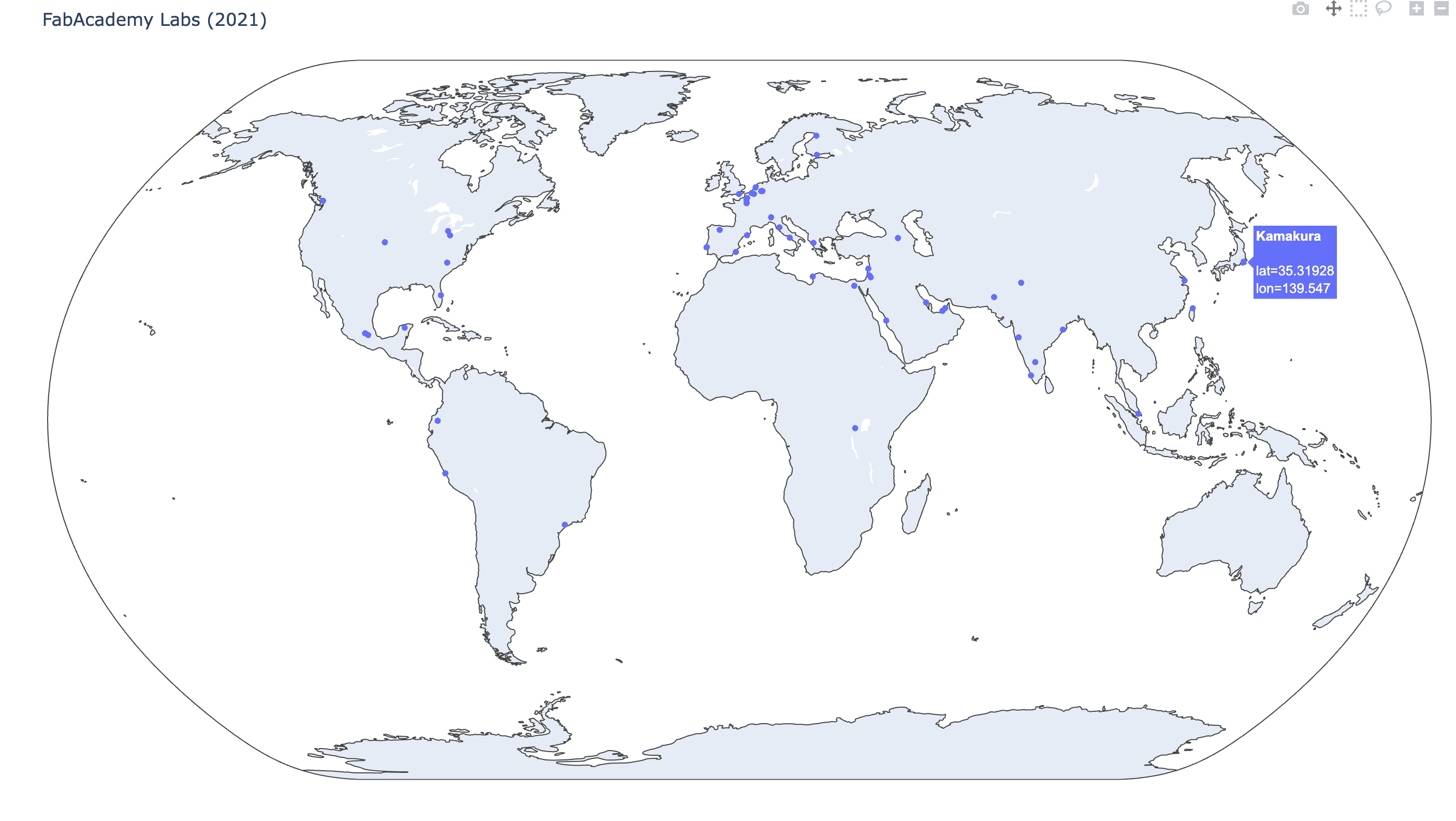
I asked ChatGPT how to display Plotly in Jupyter Notebook, and it explained a method for converting Plotly figures into HTML and displaying that HTML directly in the notebook.
- Convert the Plotly figure to HTML
- Load the JavaScript libraries from a CDN (to keep the notebook lightweight)
- Display the HTML as rich output inside Jupyter Notebook
import json
import plotly.express as px
from IPython.display import HTML

with open("fabacademy_2021_2025_with_geolatlon.json", "r", encoding="utf-8") as f:
    data = json.load(f)

labs_2021 = []
for year in data:
    if year.get("year") == 2021:
        for lab in year.get("labs", []):
            labs_2021.append({
                "lab_name": lab["lab_name"],
                "lat": lab["geo"]["latitude"],
                "lon": lab["geo"]["longitude"]
            })

# Plotly
fig = px.scatter_geo(
    labs_2021,
    lat="lat",
    lon="lon",
    hover_name="lab_name",
    width=1200,
    height=700
)

fig.update_layout(
    title="FabAcademy Labs (2021)",
    geo=dict(scope="world")
)

# convert to html
html = fig.to_html(include_plotlyjs='cdn')
HTML(html)
#new2

import json
import plotly.express as px
from IPython.display import HTML

with open("fabacademy_2021_2025_with_geolatlon.json", "r", encoding="utf-8") as f:
    data = json.load(f)

labs = []
for year in data:
    for lab in year.get("labs", []):
        geo= lab.get("geo", [])
        labs.append({
            "lab_name": lab["lab_name"],
            "lat":geo.get("latitude"),
            "lon": geo.get("longitude")
        })

# Plotly
fig = px.scatter_geo(
    labs,
    lat="lat",
    lon="lon",
    hover_name="lab_name",
    width=1200,
    height=700
)

fig.update_layout(
    title="FabAcademy Labs 2021-2025  ",
    geo=dict(scope="world")
)

# convert tohtml
html = fig.to_html(include_plotlyjs='cdn')
HTML(html)
Interactive Visualization
import json
import plotly.express as px
from IPython.display import HTML

with open("fabacademy_2021_2025_with_geolatlon.json", "r", encoding="utf-8") as f:
    data = json.load(f)

labs = []
for year in data:
    year_val = year.get("year")
    for lab in year.get("labs", []):
        geo = lab.get("geo", {})
        labs.append({
            "year": year_val,               # slider
            "lab_name": lab["lab_name"],
            "lat": geo.get("latitude"),
            "lon": geo.get("longitude"),
            "count":len(lab.get("students",[]))*1
        })

# Plotly
fig = px.scatter_geo(
    labs,
    lat="lat",
    lon="lon",
    hover_name="lab_name",
    animation_frame="year",       # slider
    size="count",
    size_max=50,
    color="count",
    color_continuous_scale="Viridis",
    #color_continuous_scale="Inferno",
    #color_continuous_scale="Plasma",
    #color_continuous_scale="Blues",

    width=1200,
    height=700
)


fig.update_layout(
    title="FabAcademy Labs by Year",
    geo=dict(scope="world")
)

html = fig.to_html(include_plotlyjs='cdn')
HTML(html)
import json
import plotly.express as px
from IPython.display import HTML

with open("fabacademy_2021_2025_with_geolatlon.json", "r", encoding="utf-8") as f:
    data = json.load(f)

labs = []
for year in data:
    year_val = year.get("year")
    for lab in year.get("labs", []):
        geo = lab.get("geo", {})
        labs.append({
            "year": year_val,               # slider
            "lab_name": lab["lab_name"],
            "lat": geo.get("latitude"),
            "lon": geo.get("longitude"),
            "count":len(lab.get("students",[]))*1
        })

# Plotly
fig = px.scatter_geo(
    labs,
    lat="lat",
    lon="lon",
    hover_name="lab_name",
    animation_frame="year",       # slider
    size="count",
    size_max=50,
    color="count",
    color_continuous_scale="Viridis",
    #color_continuous_scale="Inferno",
    #color_continuous_scale="Plasma",
    #color_continuous_scale="Blues",

    width=1200,
    height=700
)

'''
fig.update_layout(
    title="FabAcademy Labs by Year",
    geo=dict(scope="world")
)
'''

fig.update_geos(
    projection_type="orthographic",    # 3D
    showland=True,
    landcolor="rgb(230, 230, 230)",
    showocean=True,
    oceancolor="rgb(200, 220, 255)",
)

html = fig.to_html(include_plotlyjs='cdn')
HTML(html)
2. Visualization of the relationships among Fab Academy student numbers, graduation rates, and trends from 2012–2025
Student count data integration: 2012 - 2025
import requests
from bs4 import BeautifulSoup
import pandas as pd
import json
import re
from io import StringIO

# 2012,2013
res = requests.get("https://fabacademy.org/archives/2012/students/index.html")
soup = BeautifulSoup(res.text, "html.parser")
a_tags = soup.select("p a")
students = [a for a in a_tags if a.get("href") and a.text.strip()]
students_2012 =len(students)

res = requests.get("https://fabacademy.org/archives/2013/students/index.html")
soup = BeautifulSoup(res.text, "html.parser")
scripts = soup.find_all("script")

pattern = r'add_page\("([^"]+)"\s*,\s*"([^"]+)"\)'
students = []

for s in scripts:
    if s.string:
        matches = re.findall(pattern, s.string)
        for _, name in matches:
            if name.strip():
                students.append(name.strip())
students_2013 = len(students)


# 2014
students_2014 = 82

# 2015
df2015 = pd.read_csv("https://fabacademy.org/archives/2015/students/studentListStat")
students_2015 = len(df2015)


# 2016-2018
with open("datasets/students2016.json","r") as f:
    students_2016 = len(json.load(f))

with open("datasets/students2017.json","r") as f:
    students_2017 = len(json.load(f))

with open("datasets/students2018.json","r") as f:
    students_2018 = len(json.load(f))

# 2019-2025
with open("datasets/fabacademy_with_projects_direct_2019_2025.json","r", encoding="utf-8") as f:
    data_2019_2025 = json.load(f)

students_2019_2025 = {}

for entry in data_2019_2025:
    year = entry["year"]
    labs = entry.get("labs", [])
    total = sum(len(lab.get("students", [])) for lab in labs)
    students_2019_2025[year] = total


# Graduates
url = "https://fabacademy.org/students/alumni-list.html"
res = requests.get(url)
soup = BeautifulSoup(res.text, "html.parser")

graduates = {}

for h2 in soup.find_all("h2"):
    match = re.search(r"\d{4}", h2.text)
    if not match:
        continue

    year = int(match.group())
    table = h2.find_next("table")
    if not table:
        continue

    rows = table.select("tbody tr")
    if not rows:
        rows = table.find_all("tr")

    graduates[year] = len(rows)


# Export
students_all = {
    2012: students_2012,
    2013: students_2013,
    2014: students_2014,
    2015: students_2015,
    2016: students_2016,
    2017: students_2017,
    2018: students_2018,
}
students_all.update(students_2019_2025)

# DataFrame
rows = []
for year in range(2012, 2026):
    rows.append({
        "year": year,
        "students": students_all.get(year),
        "graduates": graduates.get(year)
    })

df = pd.DataFrame(rows)
df.to_csv("datasets/FA_students_graduates_2012_2025.csv", index=False)

df
| year | students | graduates | |
|---|---|---|---|
| 0 | 2012 | 73 | 31 |
| 1 | 2013 | 118 | 40 |
| 2 | 2014 | 82 | 68 |
| 3 | 2015 | 222 | 147 |
| 4 | 2016 | 264 | 163 |
| 5 | 2017 | 294 | 185 |
| 6 | 2018 | 235 | 164 |
| 7 | 2019 | 232 | 159 |
| 8 | 2020 | 246 | 126 |
| 9 | 2021 | 207 | 121 |
| 10 | 2022 | 230 | 117 |
| 11 | 2023 | 184 | 107 |
| 12 | 2024 | 221 | 168 |
| 13 | 2025 | 190 | 111 |
Number of students and graduation rate
import pandas as pd
import plotly.graph_objects as go

df = pd.read_csv("datasets/FA_students_graduates_2012_2025.csv")

#  --- graduration rate ---
df["graduation_rate"] = df["graduates"] / df["students"] * 100


#  ---P lotly Figure  ---
fig = go.Figure()

# --- Students ---
fig.add_trace(go.Bar(
    x=df["year"],
    y=df["students"],
    name="Students",
    marker=dict(
        color=df["students"],
        colorscale="Blues",
        showscale=False
    )
))

# --- Graduates ---
fig.add_trace(go.Bar(
    x=df["year"],
    y=df["graduates"],
    name="Graduates",
    marker=dict(
        color=df["graduates"],
        colorscale="Reds",
        showscale=False
    )
))

# ---- Graduation rate ---
fig.add_trace(go.Scatter(
    x=df["year"],
    y=df["graduation_rate"],
    name="Graduation Rate (%)",
    mode="lines+markers",
    yaxis="y2",  # right axis
    line=dict(width=3)
))


fig.update_layout(
    title="FabAcademy Students, Graduates and Graduation Rate (2012–2025)",
    xaxis=dict(title="Year"),
    yaxis=dict(title="Number of Students / Graduates"),
    yaxis2=dict(
        title="Graduation Rate (%)",
        overlaying="y",
        side="right",
        range=[0, 100]
    ),
    barmode="group",
    bargap=0.2,
    template="plotly_white",
    width=1100,
    height=500
)

html = fig.to_html(include_plotlyjs='cdn')
HTML(html)
Multi-year Trends in Enrollment, Completion, Graduation Performance, and Fablab Trends
import pandas as pd
import plotly.graph_objects as go


# -- Fab Academy Data ---
df = pd.read_csv("datasets/FA_students_graduates_2012_2025.csv")
df["graduation_rate"] = df["graduates"] / df["students"] * 100

# -- Fab Academy Trend ---
trend = pd.read_csv("datasets/trend_Fablab_2012_2025.csv")
trend["date"] = pd.to_datetime(trend["month"])
trend["year"] = trend["date"].dt.year
trend_year = trend.groupby("year", as_index=False)["fablab_trends"].mean()
df = df.merge(trend_year, on="year", how="left")

# --- Plotly ---

fig = go.Figure()

# --- Students ---
fig.add_trace(go.Bar(
    x=df["year"],
    y=df["students"],
    name="Students",
    marker=dict(
        color=df["students"],
        #coloraxis="coloraxis"
        colorscale="Blues",
        showscale=False
    )
))

# --- Graduates ---
fig.add_trace(go.Bar(
    x=df["year"],
    y=df["graduates"],
    name="Graduates",
    marker=dict(
        color=df["graduates"],
        colorscale="Reds",
        showscale=False
        #coloraxis="coloraxis2"
    )
))

# ---- Graduation rate ---
fig.add_trace(go.Scatter(
    x=df["year"],
    y=df["graduation_rate"],
    name="Graduation Rate (%)",
    mode="lines+markers",
    yaxis="y2",  # 2nd axis
    line=dict(width=3,color="black")
))

# ---- Trend ---
fig.add_trace(go.Scatter(
    x=df["year"],
    y=df["fablab_trends"],
    name="Google Trends: Fablab",
    mode="lines+markers",
    yaxis="y3", # 3rd axis
    line=dict(width=3, color="green")
))


fig.update_layout(
    title="Students / Graduates / Graduation Rate + Google Trends(Fablab)",
    xaxis=dict(title="Year"),
    legend=dict(
        x=1.05,    # adjust the position
        y=1.00,    #
        xanchor="left",
        yanchor="top"
    ),

    yaxis=dict(title="Number of Students / Graduates"),
    yaxis2=dict(
        title="Graduation Rate (%), GoogleTrend",
        overlaying="y",
        side="right",
        range=[0, 100]
    ),

    yaxis3=dict(
        #title="Trend Index",
        overlaying="y",
        side="right",
        position=1,
        anchor="free"
    ),

    coloraxis=dict(
        colorscale="Blues",
        colorbar=dict(title="Students", x=1.10)
    ),

    coloraxis2=dict(
        colorscale="Reds",
        colorbar=dict(title="Graduates", x=1.20)
    ),

    barmode="group",
    bargap=0.25,

    template="plotly_white",
    width=1400,
    height=550
)

html = fig.to_html(include_plotlyjs='cdn')
HTML(html)
3. Visualization of changes in student commit activity on GitLab
I tried to draw graph from "commits_detail.csv" The data is as follows. In addition to myself, the author list also includes the IT staff who created the project.
To aggregate the weekly count, I researched pandas doc and found the method. pandas
-
- Data structure
- Series: one-dimensional labeled array capable of holding any data type (integers, strings, floating point numbers, Python objects, etc.). The axis labels are collectively referred to as the index.
- DataFrame:
- DataFrame is a 2-dimensional labeled data structure with columns of potentially different types.
- Data structure
import pandas as pd
df = pd.read_csv('commits_detail.csv')
count = df.groupby("week").size()
print(count) # Series
week
2018-W38    21
2019-W03     6
2019-W04     7
2019-W05     3
2019-W06     6
2019-W07     2
2019-W08     1
2019-W09     1
2019-W10     1
2019-W11     3
2019-W12     2
2019-W13     3
2019-W14     3
2019-W15     2
2019-W16     3
2019-W17     3
2019-W18     5
2019-W19     2
2019-W20     6
2019-W21     3
2019-W22     5
2019-W23     6
2019-W24     4
2019-W25    16
2019-W26     1
2019-W27     1
2025-W24     1
dtype: int64
import matplotlib.pyplot as plt
import numpy as np


plt.bar(count.index, count.values)
plt.xticks(rotation=90)
plt.title("Commits per Week (Matplotlib)")
plt.xlabel("Week")
plt.ylabel("Count")
plt.show()

Since the x-axis only included the weeks that had commits, I decided to plot all weeks first. Fab Academy final presentations take place at the end of June, so to be safe I plotted all weeks up to the end of August. To generate the list of weeks, I used isocalendar
from datetime import date
print(date(2019, 8, 31).isocalendar()) #
print(date(2019, 8, 31).isocalendar()[1]) #
datetime.IsoCalendarDate(year=2019, week=35, weekday=6)
35
Pandas’ Series.map can not only apply a function, but also map values using keys. Replace Series values with map()
import pandas as pd
import matplotlib.pyplot as plt

df = pd.read_csv("commits_detail.csv")
commitWeek = df.groupby("week").size()

# X axsis: 2019 1.1 - 8.31
lastWeek = date(2019, 8, 31).isocalendar()[1]
allWeeks = [f"2019-W{w:02d}" for w in range(1, lastWeek)]

s=pd.Series(full_weeks)
s_mapped = s.map(commitWeek).fillna(0)
#print(s, s_mapped)
import pandas as pd
import matplotlib.pyplot as plt

df = pd.read_csv("commits_detail.csv")
commitWeek = df.groupby("week").size()

# X axsis: 2019 1.1 - 8.31
lastWeek = date(2019, 8, 31).isocalendar()[1]
allWeeks = [f"2019-W{w:02d}" for w in range(1, lastWeek)]

s=pd.Series(full_weeks)
s_mapped = s.map(commitWeek).fillna(0)

x = allWeeks
y = s_mapped

plt.figure(figsize=(14,5))
plt.plot(x, y, marker="o")
plt.xticks(rotation=90)
plt.xlabel("Week")
plt.ylabel("Commit Count")
plt.title("KaeNagano — Weekly Commits (2019)")
plt.tight_layout()
plt.show()

As a trial, I looked up the project IDs of the Fab Academy 2019 Kamakura students and retrieved their commit data.
import requests
import csv
from datetime import datetime
from collections import defaultdict

GITLAB_URL = "https://gitlab.fabcloud.org/api/v4"
PRIVATE_TOKEN = "iLdz07in0z7Ww-bDn0S6dm86MQp1OjExNQk.01.0z0le7s92"   #
PROJECT_IDS = [1334, 1335, 1337]
DETAIL_CSV = "commits_detail_multi_flk2019.csv"

# Retrieve commits data
def fetch_all_commits(project_id):
    headers = {"PRIVATE-TOKEN": PRIVATE_TOKEN}
    page = 1
    per_page = 100
    all_commits = []

    while True:
        url = f"{GITLAB_URL}/projects/{project_id}/repository/commits"
        params = {"page": page, "per_page": per_page}

        r = requests.get(url, headers=headers, params=params)
        r.raise_for_status()

        commits = r.json()
        if not commits:
            break

        all_commits.extend(commits)
        page += 1

    return all_commits

def get_week_key(date_str):
    dt = datetime.fromisoformat(date_str.replace("Z",""))
    year, week, _ = dt.isocalendar()
    return f"{year}-W{week:02d}"


#commits = fetch_all_commits(PROJECT_ID)

weekly_count = defaultdict(int)
commit_details = []   # CSVで誰が何週にコミットしたか記録したい場合

for pid in PROJECT_IDS:
    commits = fetch_all_commits(pid)
    for c in commits:
        author = c.get("author_name")
        date = c.get("committed_date")
        week_key = get_week_key(date)

        weekly_count[week_key] += 1
        commit_details.append([pid, week_key, author, date])


with open(DETAIL_CSV, "w", newline="", encoding="utf-8") as f:
    writer = csv.writer(f)
    writer.writerow(["project_id","week", "author_name", "committed_date"])

    for pid, week, author, date in commit_details:
        writer.writerow([pid, week, author, date])

print(f"saved the individual commit details to {DETAIL_CSV}")
saved the individual commit details to commits_detail_multi_flk2019.csv
import pandas as pd
import matplotlib.pyplot as plt

df = pd.read_csv("commits_detail_multi_flk2019.csv")
lastWeek = date(2019, 8, 31).isocalendar()[1]
allWeeks = [f"2019-W{w:02d}" for w in range(1, lastWeek)]

commitWeek = df.groupby("week").size()

s=pd.Series(full_weeks)
s_mapped = s.map(commitWeek).fillna(0)

x = allWeeks
y = s_mapped

weekly_counts = (
    df.groupby(["author_name", "week"])
      .size()
      .reset_index(name="commit_count")
)

authors = weekly_counts["author_name"].unique()
plt.figure(figsize=(18, 5))
for author in authors:
    sub = weekly_counts[weekly_counts["author_name"] == author]
    #plt.bar(sub["week_date"], sub["commit_count"], label=author, alpha=0.7)
    plt.plot(sub["week"], sub["commit_count"], label=author, alpha=0.7)

plt.xlabel("Week")
plt.ylabel("Commit Count")
plt.title("Commits per Week by Author")
plt.legend()
plt.xticks(rotation=90)
plt.tight_layout() #layout optimization
plt.show()

From the output, I noticed variations in the names, so normalization is necessary.
plotly 3D: https://plotly.com/python/3d-line-plots/
import pandas as pd
import plotly.graph_objects as go
import numpy as np

df = pd.read_csv("datasets/fabacademy_commit_weekly_summary.csv")

# Week name
week_cols = [col for col in df.columns if col.startswith("week_")]
weeks = list(range(1, len(week_cols) + 1))

# --- 3D figure ----
fig = go.Figure()

for idx, row in df.iterrows():
    commits = row[week_cols].values
    student = row["student_name"]
    lab = row["lab_name"]

    fig.add_trace(go.Scatter3d(
        x=weeks,
        y=[idx] * len(weeks),
        z=commits,
        mode="lines",
        name=student,
    ))

fig.update_layout(
    title="3D Commit (2019 Weeks 01–30)",
    scene=dict(
        xaxis_title="Week",
        yaxis_title="Author",
        zaxis_title="Commits",
        camera=dict(
            eye=dict(x=1.8, y=2.2, z=1.2)
        )
    ),
    width=1500,
    height=1000,
    showlegend=False
)

#fig.show()
html = fig.to_html(include_plotlyjs='cdn')
HTML(html)
import pandas as pd
import plotly.graph_objects as go
import numpy as np

df = pd.read_csv("datasets/fabacademy_commit_weekly_summary.csv")

# Week name
week_cols = [col for col in df.columns if col.startswith("week_")]
weeks = list(range(1, len(week_cols) + 1))

# --- 3D figure ----
fig = go.Figure()

for idx, row in df.iterrows():
    commits = row[week_cols].values
    student = row["student_name"]
    lab = row["lab_name"]

    fig.add_trace(go.Scatter3d(
        x=weeks,
        y=[idx] * len(weeks),
        z=commits,
        mode="lines",
        name=student,
        line=dict(
        color=commits,      # ← Z値を渡す
        colorscale="Blues", # ← Blues でグラデーション
        width=4
        )
    ))

fig.update_layout(
    title="3D Commit (2019 Weeks 01–30)",
    scene=dict(
        xaxis_title="Week",
        yaxis_title="Author",
        zaxis_title="Commits",
        camera=dict(
            eye=dict(x=1.8, y=2.2, z=1.2)
        )
    ),
    width=1500,
    height=1000,
    showlegend=False
)

#fig.show()
html = fig.to_html(include_plotlyjs='cdn')
HTML(html)
Three.js Trial
I initially looked into using D3 to visualize the data on a globe and explored several examples of D3-based earth displays. However, since D3 is fundamentally 2D, I realized that Three.js might be more suitable for the type of visualization I ultimately want to create. So I’m going to try Three.js next. I tried running this example locally.
Original Code: index.html is as follows. To run the code:
- python3 -m http.server 8000 at terminal
- http://localhost:8000/ at browser ( sometimes cash clear is necessary CMD+Shifr+R )
<head>
<style> body { margin: 0; } </style>
<script type="importmap">{ "imports": {
"three": "https://esm.sh/three",
"three/": "https://esm.sh/three/"
}}</script>
<!-- <script type="module"> import * as THREE from 'three'; window.THREE = THREE;</script>-->
<!-- <script src="../../dist/three-globe.js" defer></script>-->
</head>
<body>
<div id="globeViz"></div>
<script type="module">
import ThreeGlobe from 'https://esm.sh/three-globe?external=three';
import * as THREE from 'https://esm.sh/three';
import { TrackballControls } from 'three/examples/jsm/controls/TrackballControls.js?external=three';
// Gen random data
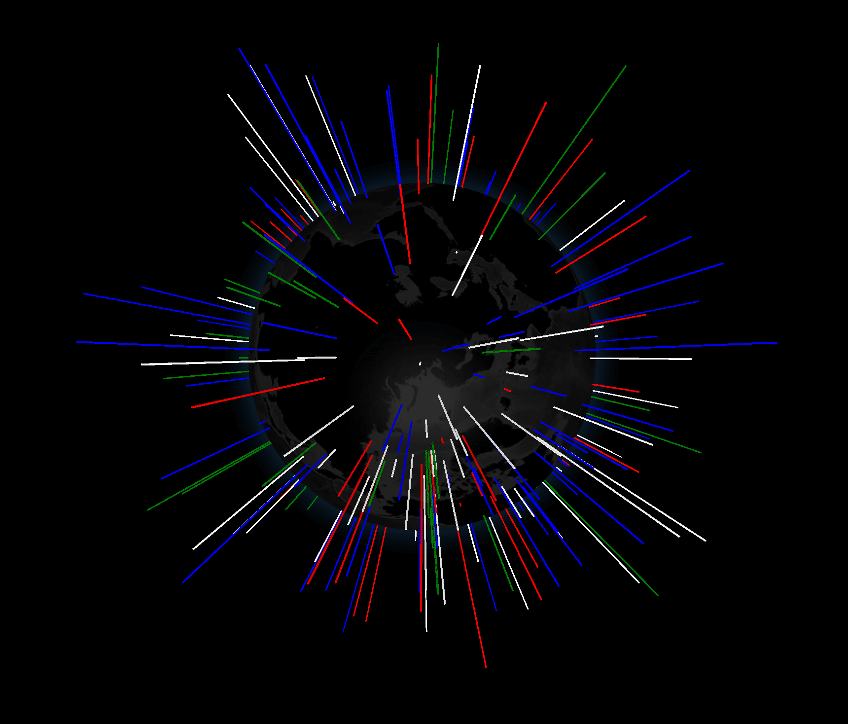
const N = 300;
const gData = [...Array(N).keys()].map(() => ({
lat: (Math.random() - 0.5) * 180,
lng: (Math.random() - 0.5) * 360,
size: Math.random() / 3,
color: ['red', 'white', 'blue', 'green'][Math.round(Math.random() * 3)]
}));
const Globe = new ThreeGlobe()
.globeImageUrl('//cdn.jsdelivr.net/npm/three-globe/example/img/earth-dark.jpg')
.bumpImageUrl('//cdn.jsdelivr.net/npm/three-globe/example/img/earth-topology.png')
.pointsData(gData)
.pointAltitude('size')
.pointColor('color');
setTimeout(() => {
gData.forEach(d => d.size = Math.random());
Globe.pointsData(gData);
}, 4000);
// Setup renderer
const renderer = new THREE.WebGLRenderer();
renderer.setSize(window.innerWidth, window.innerHeight);
renderer.setPixelRatio(Math.min(2, window.devicePixelRatio));
document.getElementById('globeViz').appendChild(renderer.domElement);
// Setup scene
const scene = new THREE.Scene();
scene.add(Globe);
scene.add(new THREE.AmbientLight(0xcccccc, Math.PI));
scene.add(new THREE.DirectionalLight(0xffffff, 0.6 * Math.PI));
// Setup camera
const camera = new THREE.PerspectiveCamera();
camera.aspect = window.innerWidth/window.innerHeight;
camera.updateProjectionMatrix();
camera.position.z = 500;
// Add camera controls
const tbControls = new TrackballControls(camera, renderer.domElement);
tbControls.minDistance = 101;
tbControls.rotateSpeed = 5;
tbControls.zoomSpeed = 0.8;
// Kick-off renderer
(function animate() { // IIFE
// Frame cycle
tbControls.update();
renderer.render(scene, camera);
requestAnimationFrame(animate);
})();
</script>
</body>
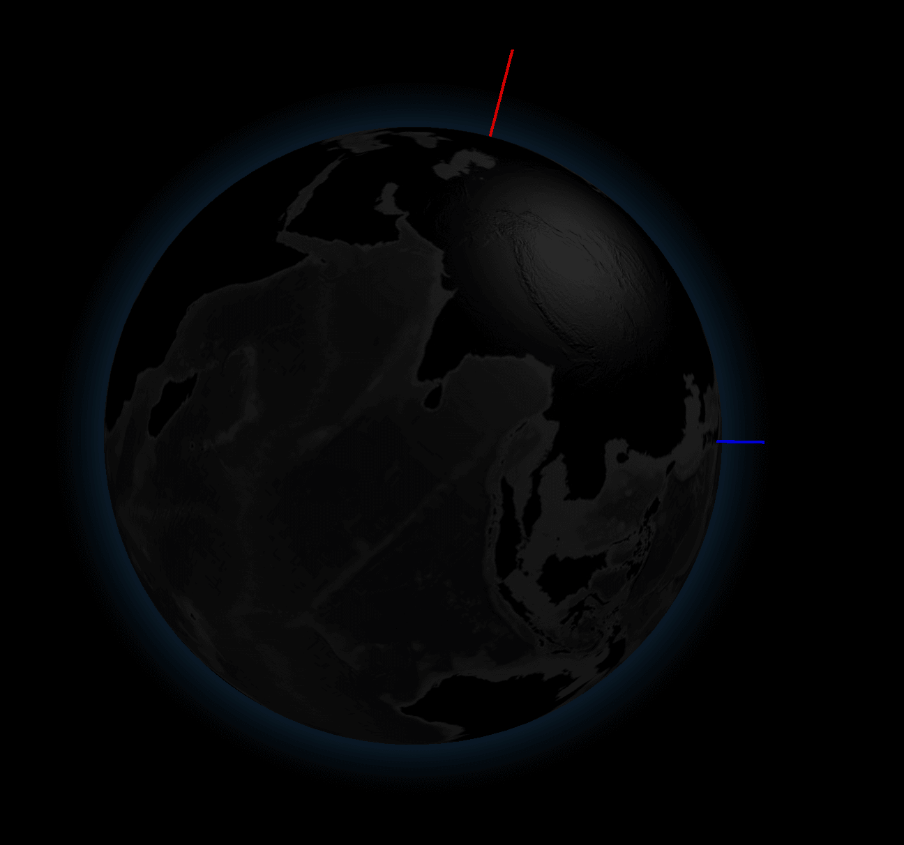
In this code, it seems that 300 random points are generated, each assigned random latitude and longitude values, and then stored in gData to be displayed via pointsData(gData). First, I removed these random points and instead added the latitude and longitude for Aalto and Kamakura.
const gData = [
      { lat: 60.2049651, lng: 24.6559808, size: 10, color: 'red' },
      { lat: 35.3192808, lng: 139.5469627, size: 10, color: 'blue' }

    ];
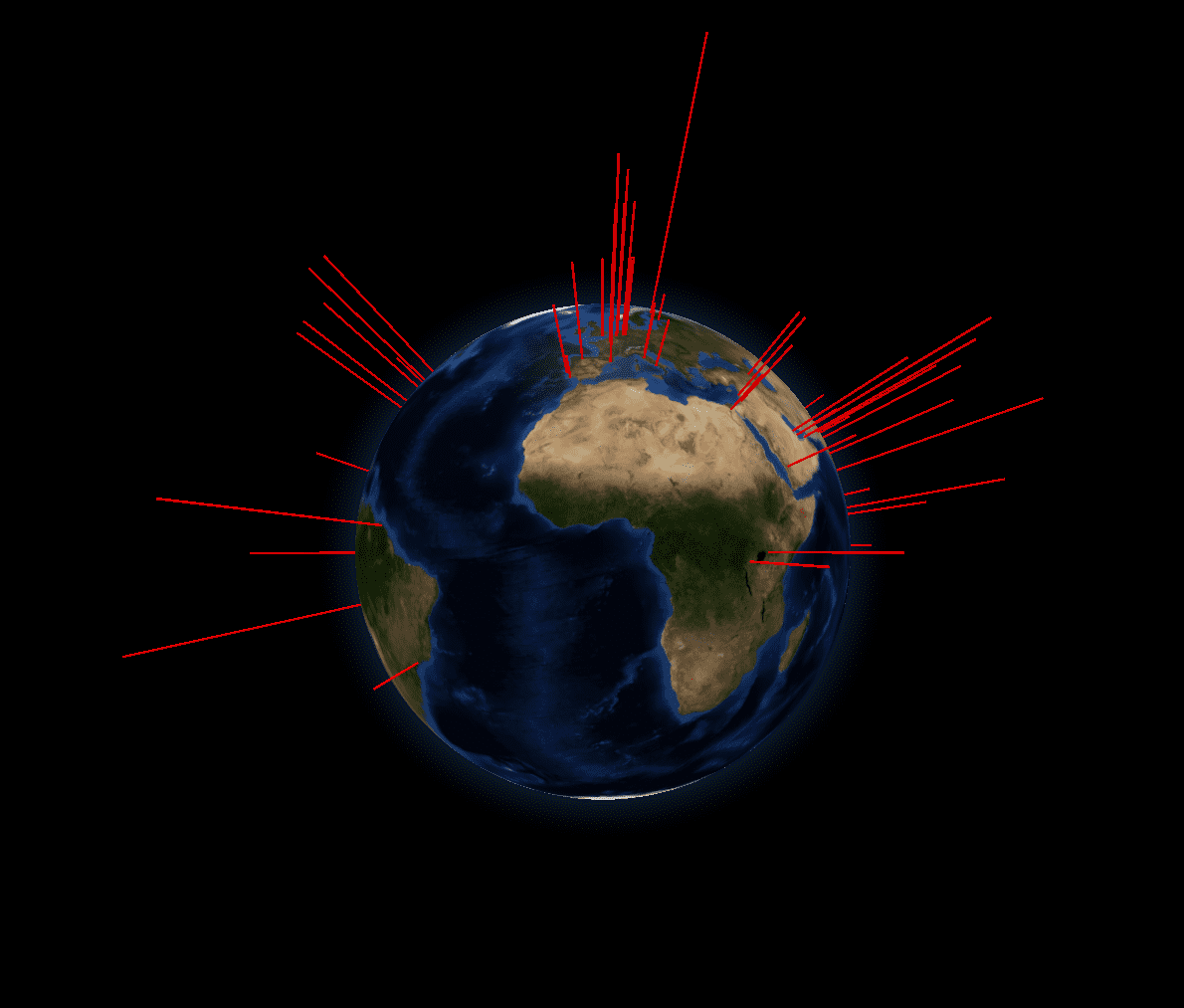
Mapping Fablab on the globe 
First, I load the JSON file containing the latitude and longitude of lab locations for 2019 and store it in gdata, then display it on the globe. The altitude (a vertical bar extending outward along the surface normal) is based on the number of students at each lab.
<head>
  <style> body { margin: 0; } </style>

  <script type="importmap">{ "imports": {
    "three": "https://esm.sh/three",
    "three/": "https://esm.sh/three/"
  }}</script>


  <!-- <script type="module"> import * as THREE from 'three'; window.THREE = THREE;</script> -->
  <!-- <script src="../../dist/three-globe.js" defer></script> -->
</head>

<body>
  <div id="globeViz"></div>

  <script type="module">
    import ThreeGlobe from 'https://esm.sh/three-globe?external=three';
    import * as THREE from 'https://esm.sh/three';
    import { TrackballControls } from 'three/examples/jsm/controls/TrackballControls.js?external=three';

    //
    // fetch data
    //
    let gData = [];

    fetch('./labs_2019.json')
      .then(res => res.json())
      .then(data => {

        gData = data.map(d => ({
          lat: d.latitude,
          lng: d.longitude,
          size: d.num_students/10,
          color: 'red'
        }));

        // データを Globe に設定
        Globe
          .pointsData(gData)
          .pointAltitude('size')
          .pointColor('color');
      });


    const Globe = new ThreeGlobe()
      //.globeImageUrl('//cdn.jsdelivr.net/npm/three-globe/example/img/earth-dark.jpg')
      //.globeImageUrl('//cdn.jsdelivr.net/npm/three-globe/example/img/earth-blue-marble.jpg')
      .globeImageUrl('/img/earth-blue-marble.jpg')
      .bumpImageUrl('/img/earth-topology.png');

    // ← ここでは .pointsData(gData) は呼ばない
    //    fetch 後に呼ぶので、構造は例とほぼ同じまま維持できる

    //
    // Setup renderer
    //
    const renderer = new THREE.WebGLRenderer();
    renderer.setSize(window.innerWidth, window.innerHeight);
    renderer.setPixelRatio(Math.min(2, window.devicePixelRatio));
    document.getElementById('globeViz').appendChild(renderer.domElement);

    // Setup scene
    const scene = new THREE.Scene();
    scene.add(Globe);
    scene.add(new THREE.AmbientLight(0xcccccc, Math.PI));
    scene.add(new THREE.DirectionalLight(0xffffff, 0.6 * Math.PI));

    // Setup camera
    const camera = new THREE.PerspectiveCamera();
    camera.aspect = window.innerWidth/window.innerHeight;
    camera.updateProjectionMatrix();
    camera.position.z = 500;

    // Add camera controls
    const tbControls = new TrackballControls(camera, renderer.domElement);
    tbControls.minDistance = 101;
    tbControls.rotateSpeed = 5;
    tbControls.zoomSpeed = 0.8;


    (function animate() { // IIFE
      tbControls.update();
      renderer.render(scene, camera);
      requestAnimationFrame(animate);
    })();
  </script>
</body>
Memo:
- Image Access error:
- Access to image at 'http://cdn.jsdelivr.net/npm/three-globe/example/img/earth-dark.jpg' from origin 'http://localhost:8000' has been blocked by CORS policy: No 'Access-Control-Allow-Origin' header is present on the requested resource.Understand this error
- So stored the image locally
Memo: Environment
At Mac terminal:

conda create -n fab_ds python=3.13
conda activate
At Mac terminal:

conda create -n fab_ds python=3.13
conda activate fab_ds
conda install -c conda-forge jax
conda install -c conda-forge numpy
conda install -c conda-forge scipy
conda install -c conda-forge numba
conda install -c conda-forge matplotlib
conda install -c conda-forge ipympl
conda install -c conda-forge ipywidgets
conda install -c conda-forge jupyterlab
conda install -c conda-forge pandas
conda install -c conda-forge scikit-learn