< Home
3. Fitting
Goal
- adjust a function to match data
Assignment
- Fit a function to your data
Liner least square
I write this python code telling example code and asking chatGPT to make python code by reading csv data.
polynomial fit
First, I put the code of reading dataset, as all the code need to execute first.
import pandas as pd

df = pd.read_csv('./datasets/Wine_dataset.csv')
1D
Find the least-squares fit for 1D polynominal.
I'd like to change Neil's sample code to using my dataset. So I asked chatGPT "How to change minimally to use my dataset?" Then I changed the code to fit with my dataset.
import numpy as np
import matplotlib.pyplot as plt

# Change data to my dataset
x = df["Alcohol"].values
#y = df["Color intensity"].values
y = df["Hue"].values

xmin = x.min()
xmax = x.max()
npts = len(x)

np.set_printoptions(precision=3)

coeff1 = np.polyfit(x,y,1) # fit first-order polynomial
coeff2 = np.polyfit(x,y,2) # fit second-order polynomial
xfit = np.linspace(xmin,xmax,npts)
pfit1 = np.poly1d(coeff1)
yfit1 = pfit1(xfit) # evaluate first-order fit
print(f"first-order fit coefficients: {coeff1}")
pfit2 = np.poly1d(coeff2)
yfit2 = pfit2(xfit) # evaluate second-order fit
print(f"second-order fit coefficients: {coeff2}")
plt.figure()
plt.plot(x,y,'o')
plt.plot(xfit,yfit1,'g-',label='linear')
plt.plot(xfit,yfit2,'r-',label='quadratic')
plt.legend()
plt.show()
first-order fit coefficients: [-0.02  1.22]
second-order fit coefficients: [ 0.092 -2.397 16.583]

Though Neil's data were more clusterd fit to the function, my data were more scattered and quandratic doesn't fit so much.
2D
To find the least-squares fit for a linear matrix equation.
Then I checked 2D version code with my dataset. I also asked the changing point to chatGPT.
%matplotlib ipympl
import numpy as np
import matplotlib.pyplot as plt

#chatGPT advised to put the real data as follows
x = df["Alcohol"].values
y = df["Malic acid"].values
#z = df["Color intensity"].values
z = df["Hue"].values

xmin, xmax = x.min(), x.max()
ymin, ymax = y.min(), y.max()
npts = len(x)

M = np.c_[np.ones(npts),x,y,x*y,x*x,y*y] # construct Vandermonde matrix
cfit,residuals,rank,values = np.linalg.lstsq(M,z) # do least-squares fit
print(f"fit coefficients: {cfit}")
fig = plt.figure()
fig.canvas.header_visible = False
ax = fig.add_subplot(projection='3d') # add 3D axes
ax.scatter(x,y,z)
xfit = np.linspace(xmin,xmax,npts)
yfit = np.linspace(ymin,ymax,npts)
Xfit,Yfit = np.meshgrid(xfit,yfit)
Zfit = cfit[0]+cfit[1]*Xfit+cfit[2]*Yfit+cfit[3]*Xfit*Yfit+cfit[4]*Xfit*Xfit+cfit[5]*Yfit*Yfit # evaluate fit surface
ax.plot_surface(Xfit,Yfit,Zfit,cmap='gray',alpha=0.5) # plot fit surface
plt.show()
fit coefficients: [-58.15890365   8.16230637   0.16976354   0.13161999  -0.26866713
  -0.25651824]

I found it has still several distribution around the surface.
I'm not sure this surface function covers the most of data points.
Radial basis function(RBF) fit
expand with a sum over functions that depend on distance from anchor points
Using sample code at the text, I modify a bit for my use.
plt.clf()
Firstly, I put this function because as executing several times, The data points and lines are added in a graph. Therefore I want to clear the graph and draw the new version.
import numpy as np
import matplotlib.pyplot as plt
import pandas as pd

fname ='./datasets/Wine_dataset.csv'
df = pd.read_csv(fname)

x = df['Alcohol'].values
y = df['Hue'].values
print(x.shape, y.shape)
xmin = x.min()
xmax = x.max()
npts = len(x)

ncenters = 5
np.random.seed(0)
indices = np.random.uniform(low=0,high=len(x),size=ncenters).astype(int) # choose random RBF centers from data
centers = np.sort(x[indices])
M = (np.outer(x,np.ones(ncenters)) # construct matrix of basis terms
   -np.outer(np.ones(npts),centers))**3
b,residuals,rank,values = np.linalg.lstsq(M,y, rcond=None) # do SVD fit
xfit = np.linspace(xmin,xmax,npts)
yfit = ((np.outer(xfit,np.ones(ncenters))-np.outer(np.ones(npts),centers))**3)@b # evaluate fit
plt.plot(x,y,'o')
plt.plot(xfit,yfit,'g-',label='RBF fit')
plt.plot(xfit,(xfit-centers[0])**3,color=(0.75,0.75,0.75),label='$r^3$ basis functions')
for i in range(1,ncenters):
    plt.plot(xfit,(xfit-centers[i])**3,color=(0.75,0.75,0.75))
plt.ylim(-0.25,1.5)
plt.legend()
plt.show()
(178,) (178,)

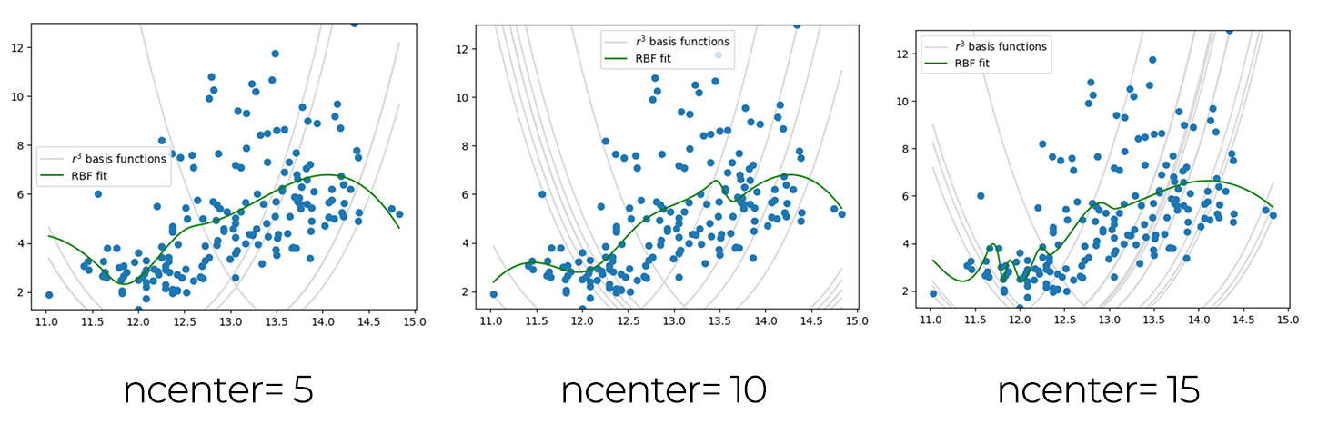
As I understood the function changes by the number of ncenters, I draws several graphs changing the ncenter numbers.
nonlinear least squares
I put my dataset into Neil's sample code again.
import numpy as np
from scipy.optimize import least_squares
import matplotlib.pyplot as plt
import pandas as pd

df = pd.read_csv('./datasets/Wine_dataset.csv')

x = df['Alcohol'].to_numpy()
y = df['Hue'].to_numpy()

#
# generate step function data to fit
#
xmin = x.min()
xmax= x.max()
npts = len(x)
coeff = np.array([1, 0.5, 5, np.mean(x)])
#
# define tanh function and residuals
#
def f(coeff,x):
    return (coeff[0]*(coeff[1]+np.tanh(coeff[2]*(x-coeff[3]))))
def residuals(coeff,x,y):
    return f(coeff,x)-y
#
# fit
#
result2 = least_squares(residuals,coeff,args=(x,y),max_nfev=2)
result10 = least_squares(residuals,coeff,args=(x,y),max_nfev=10)
resultend = least_squares(residuals,coeff,args=(x,y))
#
# plot
#
plt.plot(x,y,'bo',label='data')
plt.plot(x,f(coeff,x),'b-',label='start')
plt.plot(x,f(result2.x,x),'c-',label='2 evaluations')
plt.plot(x,f(result10.x,x),'g-',label='10 evaluation')
plt.plot(x,f(resultend.x,x),'r-',label='end')
plt.legend()
plt.show()

Overfitting
import numpy as np
import matplotlib.pyplot as plt
import pandas as pd

df = pd.read_csv('./datasets/Wine_dataset.csv')

x = df['Alcohol'].values
y = df['Hue'].values

xmin = x.min()
xmax = x.max()
npts = len(x)
order = 7
np.random.seed(0)

coeff2 = np.polyfit(x,y,2) # fit first-order polynomial
coeffN = np.polyfit(x,y,order) # fit Nth order polynomial
xfit = np.linspace(xmin,xmax,npts)
pfit2 = np.poly1d(coeff2)
yfit2 = pfit2(xfit) # evaluate first-order fit
pfitN = np.poly1d(coeffN)
yfitN = pfitN(xfit) # evaluate Nth order fit
plt.plot(x,y,'o')
plt.plot(xfit,yfit2,'g-',label='order 2')
plt.plot(xfit,yfitN,'r-',label=f"order {order}")
plt.legend()
plt.show()

I found the red line is wiggling for corresponding the datapoint and this would be a overfitting condition.
cross-validation
import numpy as np
import matplotlib.pyplot as plt
import pandas as pd

df = pd.read_csv('./datasets/Wine_dataset.csv')

x_all = df['Alcohol'].values
y_all = df['Color intensity'].values

np.random.seed(10)

perm = np.random.permutation(len(x_all))
split = int(0.8 * len(x_all))

x = x_all[perm[:split]]
y = y_all[perm[:split]]
#
# generate training data
#
xtest = x_all[perm[split:]]
ytest = y_all[perm[split:]]

xmin = x_all.min()
xmax = x_all.max()
npts = len(x)

#
# loop over number of centers, fit, and save
#
errors = []
coeffs = []
centers = []
ncenters = np.arange(1,101,1)
for ncenter in ncenters:
    indices = np.random.uniform(low=0,high=len(x),size=ncenter).astype(int)
    center = x[indices]
    M = np.abs(np.outer(x,np.ones(ncenter))
       -np.outer(np.ones(npts),center))**3
    coeff,residuals,rank,values = np.linalg.lstsq(M,y)
    yfit = (np.abs(np.outer(xtest,np.ones(ncenter))-np.outer(np.ones(len(xtest)),center))**3)@coeff
    errors.append(np.mean(np.abs(yfit-ytest)))
    coeffs.append(coeff)
    centers.append(center)
#
# plot data, fits, and errors
#
fig,axs = plt.subplots(2,1)
fig.canvas.header_visible = False
axs[0].plot(x,y,'o',alpha=0.5)
xplot = np.linspace(xmin,xmax,npts)
n = 1
yplot = (np.abs(np.outer(xplot,np.ones(n))-
    np.outer(np.ones(npts),centers[n-1]))**3)@coeffs[n-1]
axs[0].plot(xplot,yplot,'g-',label='1 anchor')
n = 10
yplot = (np.abs(np.outer(xplot,np.ones(n))-
    np.outer(np.ones(npts),centers[n-1]))**3)@coeffs[n-1]
axs[0].plot(xplot,yplot,'k-',label='10 anchors')
n = 100
yplot = (np.abs(np.outer(xplot,np.ones(n))-
    np.outer(np.ones(npts),centers[n-1]))**3)@coeffs[n-1]
axs[0].plot(xplot,yplot,'r-',label='100 anchors')
axs[0].legend()
axs[1].plot(ncenters,errors)
axs[1].set_ylabel('error')
axs[1].set_xlabel('number of centers')
plt.show()

regularization
import numpy as np
import matplotlib.pyplot as plt
import pandas as pd

df = pd.read_csv('./datasets/Wine_dataset.csv')
#
#  data from Wine dataset
#
x = df['Alcohol'].values
y = df['Hue'].values

xmin = x.min()
xmax = x.max()
npts = len(x)

np.random.seed(10)
#
# generate Vandermonde matrix
#
ncenters = 100
indices = np.random.uniform(low=0,high=len(x),size=ncenters).astype(int)
centers = x[indices]
M = np.abs(np.outer(x,np.ones(ncenters))
   -np.outer(np.ones(npts),centers))**3
#
# invert matrices to find weight-regularized coefficients
#
Lambda = 1
left = (M.T)@M+Lambda*np.eye(ncenters)
right = (M.T)@y
coeff1 = np.linalg.pinv(left)@right
Lambda = 0
left = (M.T)@M+Lambda*np.eye(ncenters)
right = (M.T)@y
coeff0 = np.linalg.pinv(left)@right
#
# plot fits
#
xfit = np.linspace(xmin,xmax,npts)
yfit0 = (np.abs(np.outer(xfit,np.ones(ncenters))-np.outer(np.ones(npts),centers))**3)@coeff0
yfit1 = (np.abs(np.outer(xfit,np.ones(ncenters))-np.outer(np.ones(npts),centers))**3)@coeff1
plt.figure()
plt.plot(x,y,'o',alpha=0.5)
plt.plot(xfit,yfit0,'y-',label=r'$\lambda=0$')
plt.plot(xfit,yfit1,'r-',label=r'$\lambda=1$')
plt.legend()
plt.show()

This graph is clear to see the difference the λ value of 0 and 1. I found that regularization is really important to see the data not only focusing the data points but seeing the trend of data points.