Final Presentation
1. Dataset
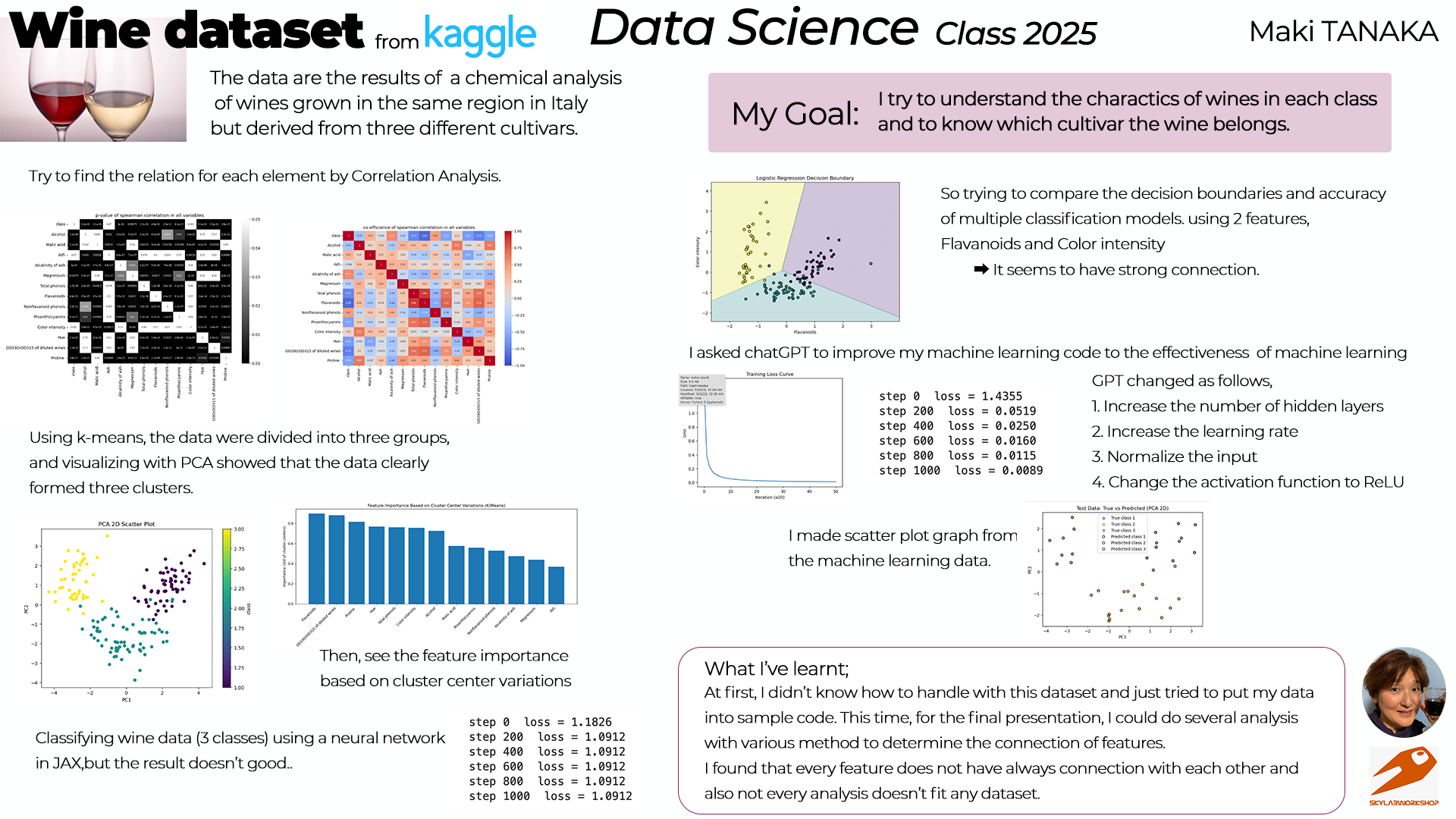
I chose my dataset, "Wine dataset" from kaggle.
This dataset is the results of a chemical analysis of wines grown in the same region in Italy but derived from three different cultivars.
The reason I chose this is;
- I like wine(it's really easy to know)
- Data are so interesting because we can analyse the ground difference.
2. My goal
My goal for this course is;
- To know the basis of data science
- To know how to analysis the data
- To know how to use python
I try to find the charactor of the dataset through experiencing the many analysis process.
3. Analysis the dataset
(My python codes are basically made by chatGPT as asking)
(1) Basic data check
First, I load the dataset and displayed each attribute.
Then displayed the table.
(It was really first step to use this dataset)
import pandas as pd
import numpy as np
import matplotlib.pyplot as plt

# === 1. Load dataset ===
df = pd.read_csv('./datasets/Wine_dataset.csv')
print(df.columns)
df
Index(['class', 'Alcohol', 'Malic acid', 'Ash', 'Alcalinity of ash',
       'Magnesium', 'Total phenols', 'Flavanoids', 'Nonflavanoid phenols',
       'Proanthocyanins', 'Color intensity', 'Hue',
       'OD280/OD315 of diluted wines', 'Proline '],
      dtype='object')
| class | Alcohol | Malic acid | Ash | Alcalinity of ash | Magnesium | Total phenols | Flavanoids | Nonflavanoid phenols | Proanthocyanins | Color intensity | Hue | OD280/OD315 of diluted wines | Proline | |
|---|---|---|---|---|---|---|---|---|---|---|---|---|---|---|
| 0 | 1 | 14.23 | 1.71 | 2.43 | 15.6 | 127 | 2.80 | 3.06 | 0.28 | 2.29 | 5.64 | 1.04 | 3.92 | 1065 |
| 1 | 1 | 13.20 | 1.78 | 2.14 | 11.2 | 100 | 2.65 | 2.76 | 0.26 | 1.28 | 4.38 | 1.05 | 3.40 | 1050 |
| 2 | 1 | 13.16 | 2.36 | 2.67 | 18.6 | 101 | 2.80 | 3.24 | 0.30 | 2.81 | 5.68 | 1.03 | 3.17 | 1185 |
| 3 | 1 | 14.37 | 1.95 | 2.50 | 16.8 | 113 | 3.85 | 3.49 | 0.24 | 2.18 | 7.80 | 0.86 | 3.45 | 1480 |
| 4 | 1 | 13.24 | 2.59 | 2.87 | 21.0 | 118 | 2.80 | 2.69 | 0.39 | 1.82 | 4.32 | 1.04 | 2.93 | 735 |
| ... | ... | ... | ... | ... | ... | ... | ... | ... | ... | ... | ... | ... | ... | ... |
| 173 | 3 | 13.71 | 5.65 | 2.45 | 20.5 | 95 | 1.68 | 0.61 | 0.52 | 1.06 | 7.70 | 0.64 | 1.74 | 740 |
| 174 | 3 | 13.40 | 3.91 | 2.48 | 23.0 | 102 | 1.80 | 0.75 | 0.43 | 1.41 | 7.30 | 0.70 | 1.56 | 750 |
| 175 | 3 | 13.27 | 4.28 | 2.26 | 20.0 | 120 | 1.59 | 0.69 | 0.43 | 1.35 | 10.20 | 0.59 | 1.56 | 835 |
| 176 | 3 | 13.17 | 2.59 | 2.37 | 20.0 | 120 | 1.65 | 0.68 | 0.53 | 1.46 | 9.30 | 0.60 | 1.62 | 840 |
| 177 | 3 | 14.13 | 4.10 | 2.74 | 24.5 | 96 | 2.05 | 0.76 | 0.56 | 1.35 | 9.20 | 0.61 | 1.60 | 560 |
178 rows × 14 columns
(2) Correlation among attributes
Then checked correlation among each attribute using heatmap.
from scipy.stats import spearmanr
import numpy as np
import seaborn as sns

cols = df.columns

cormatrix = pd.DataFrame(index=cols,columns=cols,dtype=float)
p_val_matrix = pd.DataFrame(index=cols,columns=cols,dtype=float)

for colx in cols:
    for coly in cols:
        if colx == coly:
            cormatrix.loc[colx,coly] = 1.0
            p_val_matrix.loc[colx,coly] = 1.0
        elif(pd.isna(cormatrix.loc[colx,coly])):
            corr_coef,p_value = spearmanr(df[colx],df[coly])

            cormatrix.loc[colx,coly] = corr_coef
            cormatrix.loc[coly,colx] = corr_coef
            p_val_matrix.loc[colx,coly] = p_value
            p_val_matrix.loc[coly,colx] = p_value

plt.figure(figsize=(10,8))
sns.heatmap(p_val_matrix,annot=True,annot_kws={"size": 6},cmap="binary_r",vmin=0.0,vmax=0.05)
plt.title("p-value of spearman correlation in all variables")
plt.tight_layout()
#plt.savefig('./notupload/sp-pval.png')
plt.show()

plt.figure(figsize=(10,8))
sns.heatmap(cormatrix,annot=True,annot_kws={"size": 6}, cmap="coolwarm",vmin=-1.0,vmax=1.0)
plt.title("co-efficience of spearman correlation in all variables")
plt.tight_layout()
#plt.savefig('./notupload/spearman.png')
plt.show()


(3) Check the correlation by k-means and PCA
Next, data are divided into three groups using k-means.
Then, visualizing with PCA showed the data clearly formed three clusters.
I asked chatGPT to make those graphs.
At first, I checked the correlation between class and each feature.
import numpy as np
import pandas as pd
import matplotlib.pyplot as plt
import seaborn as sns
from sklearn.preprocessing import StandardScaler
from sklearn.decomposition import PCA

# First attribute:class
target_col = df.columns[0]
print("Target column:", target_col)

# ---------------------------------------------
# ④ pairplot(散布図の組み合わせ)
# ※ 全部やると時間がかかるので最初の6特徴だけ使用
# ---------------------------------------------
sns.pairplot(df.iloc[:, :7], hue=target_col)
plt.show()
Target column: class

Then checked the correlation by using k-means and PCA.
import numpy as np
from sklearn.preprocessing import StandardScaler
from sklearn.cluster import KMeans
from sklearn.decomposition import PCA
import matplotlib.pyplot as plt

# Class は除外して 13特徴量のみ使う
X = df.drop(columns=["class"])

# -----------------------------
# 2. 標準化(大事!)
# -----------------------------
scaler = StandardScaler()
X_scaled = scaler.fit_transform(X)

# -----------------------------
# 3. PCAで2次元に圧縮
# -----------------------------
pca = PCA(n_components=2)
X_pca = pca.fit_transform(X_scaled)

# -----------------------------
# 4. K-meansでクラスタリング
# -----------------------------
kmeans = KMeans(n_clusters=3, random_state=0)
clusters = kmeans.fit_predict(X_pca)

# -----------------------------
# 5. 結果プロット
# -----------------------------
plt.figure(figsize=(8, 6))
plt.scatter(X_pca[:,0], X_pca[:,1], c=clusters, cmap="viridis", s=40)

# クラスタ中心も描画
centers = kmeans.cluster_centers_
plt.scatter(centers[:,0], centers[:,1], c="red", s=200, marker="X")

scatter = plt.scatter(pca_data[:,0], pca_data[:,1], c=df[target_col], cmap='viridis')
plt.title("K-means Clustering on Wine Dataset (PCA 2D)")
plt.xlabel("PC1")
plt.ylabel("PC2")
plt.grid(True)
plt.colorbar(scatter, label='class')
plt.show()

It became clear that there are 3 distributions among classes. So I want to know which features affect to the data. I checked it by the bar graph.
import pandas as pd
import numpy as np
from sklearn.preprocessing import StandardScaler
from sklearn.cluster import KMeans
import matplotlib.pyplot as plt

# ----------------------------------------
# 1. データ読み込み
# ----------------------------------------
df = pd.read_csv('./datasets/Wine_dataset.csv')

# 目的変数以外の特徴量
X = df.drop(columns=['class'])

# 標準化
scaler = StandardScaler()
X_scaled = scaler.fit_transform(X)

# ----------------------------------------
# 2. k-means クラスタリング
# ----------------------------------------
kmeans = KMeans(n_clusters=3, random_state=0)
clusters = kmeans.fit_predict(X_scaled)

# クラスタ中心
centers = kmeans.cluster_centers_

# ----------------------------------------
# 3. クラスタごとの差分を計算
# ----------------------------------------
# 各特徴量のクラスタ中心の標準偏差(変動量の大きさ)
importance = np.std(centers, axis=0)

# データフレーム化
importance_df = pd.DataFrame({
    'feature': X.columns,
    'importance': importance
}).sort_values(by='importance', ascending=False)

# ----------------------------------------
# 4. 棒グラフで可視化
# ----------------------------------------
plt.figure(figsize=(12, 6))
plt.bar(importance_df['feature'], importance_df['importance'])
plt.xticks(rotation=45, ha='right')
plt.title('Feature Importance Based on Cluster Center Variations (K-Means)')
plt.ylabel('Importance (std of cluster centers)')
plt.tight_layout()
plt.show()

(4) Machine Learning
I tried to classify the wine data into 3 classes and machine learning using a neural network in JAX. It seems that "Alcohol" and "Color intensity" have correlation by heatmap. So I tried to do machine learning with those parameters.
import jax
import jax.numpy as jnp
from jax import random, grad, jit
import pandas as pd
import matplotlib.pyplot as plt
from sklearn.model_selection import train_test_split
from sklearn.preprocessing import MinMaxScaler

# Alcohol → X, Color intensity → y
X_np = df[['Alcohol']].to_numpy()
y_np = df[['Color intensity']].to_numpy()

# -----------------------------
# ② 正規化(Min-Max)
# -----------------------------
scaler_x = MinMaxScaler()
scaler_y = MinMaxScaler()

X_np = scaler_x.fit_transform(X_np)
y_np = scaler_y.fit_transform(y_np)

X = jnp.array(X_np)
y = jnp.array(y_np)

# -----------------------------
# ③ train/test 分割
# -----------------------------
X_train, X_test, y_train, y_test = train_test_split(
    X, y, test_size=0.2, random_state=0
)

# -----------------------------
# ④ パラメータ初期化(Xavier)
# -----------------------------
def init_params(key):
    key1, key2 = random.split(key)

    in_dim = 1
    hidden_dim = 4
    out_dim = 1

    # Xavier/He 初期化
    W1 = random.normal(key1, (in_dim, hidden_dim)) * jnp.sqrt(2/in_dim)
    b1 = jnp.zeros(hidden_dim)

    W2 = random.normal(key2, (hidden_dim, out_dim)) * jnp.sqrt(2/hidden_dim)
    b2 = jnp.zeros(out_dim)

    return (W1, b1, W2, b2)

key = random.PRNGKey(0)
params = init_params(key)

# -----------------------------
# ⑤ forward
# -----------------------------
@jit
def forward(params, x):
    W1, b1, W2, b2 = params
    h = jnp.tanh(x @ W1 + b1)
    out = h @ W2 + b2  # ← 回帰なので線形
    return out

# -----------------------------
# ⑥ loss (MSE)
# -----------------------------
@jit
def loss(params, X, y):
    ypred = forward(params, X)
    return jnp.mean((ypred - y) ** 2)

# -----------------------------
# ⑦ update
# -----------------------------
@jit
def update(params, X, y, lr=0.01):
    grads = grad(loss)(params, X, y)
    return jax.tree.map(lambda p, g: p - lr * g, params, grads)

# -----------------------------
# ⑧ 学習ループ
# -----------------------------
loss_list = []

for step in range(2000):
    params = update(params, X_train, y_train, lr=0.01)
    if step % 100 == 0:
        L = loss(params, X_train, y_train)
        loss_list.append(float(L))
        print(f"step {step} / loss={L:.6f}")

# -----------------------------
# ⑨ テストデータで評価
# -----------------------------
test_loss = loss(params, X_test, y_test)
print("\n=== Test Loss ===")
print(float(test_loss))

# -----------------------------
# ⑩ 学習曲線のプロット
# -----------------------------
plt.figure(figsize=(6,4))
plt.plot(loss_list)
plt.title("Training Loss Curve (every 100 steps)")
plt.xlabel("Checkpoint")
plt.ylabel("Loss")
plt.show()

# -----------------------------
# ⑪ 回帰曲線のプロット
# -----------------------------
plt.figure(figsize=(7,5))

# 実データ
plt.scatter(X_train, y_train, label="train data", alpha=0.6)
plt.scatter(X_test, y_test, label="test data", alpha=0.6)

# モデル予測(曲線として描く)
X_line = jnp.linspace(0, 1, 200).reshape(-1, 1)
y_line = forward(params, X_line)

plt.plot(X_line, y_line, linewidth=3, label="NN prediction")

plt.title("Alcohol → Color intensity (Neural Network Regression)")
plt.xlabel("Alcohol (normalized)")
plt.ylabel("Color intensity (normalized)")
plt.legend()
plt.show()
step 0 / loss=0.221567
step 100 / loss=0.034887
step 200 / loss=0.029292
step 300 / loss=0.027851
step 400 / loss=0.027481
step 500 / loss=0.027387
step 600 / loss=0.027362
step 700 / loss=0.027356
step 800 / loss=0.027354
step 900 / loss=0.027353
step 1000 / loss=0.027353
step 1100 / loss=0.027353
step 1200 / loss=0.027352
step 1300 / loss=0.027352
step 1400 / loss=0.027352
step 1500 / loss=0.027351
step 1600 / loss=0.027351
step 1700 / loss=0.027351
step 1800 / loss=0.027350
step 1900 / loss=0.027350

=== Test Loss ===
0.024792863056063652


It seems ok. So I did a minimal neural network with the whole wine dataset(13 features and 3 classes).
import jax
import jax.numpy as jnp
from jax import random, grad, jit
import numpy as np
import matplotlib.pyplot as plt


# All 13 features
X_np = df.drop(columns=['class']).to_numpy()

# Convert class labels (1,2,3) → (0,1,2)
y_np = df['class'].to_numpy() - 1

# One-hot encoding
y_onehot = np.eye(3)[y_np]   # shape (178, 3)

# Convert to jax arrays
X = jnp.array(X_np, dtype=jnp.float32)
y = jnp.array(y_onehot, dtype=jnp.float32)

# --------------------------------------
# 2. Train/Test split (80/20)
# --------------------------------------
num_data = X.shape[0]
num_train = int(num_data * 0.8)

key = random.PRNGKey(0)
perm = random.permutation(key, num_data)

X_train = X[perm[:num_train]]
y_train = y[perm[:num_train]]

X_test = X[perm[num_train:]]
y_test = y[perm[num_train:]]

# --------------------------------------
# 3. Neural network architecture
# --------------------------------------
in_dim = 13        # input features
hidden_dim = 8     # hidden layer size
out_dim = 3        # wine classes

# Xavier initialization
def init_params(key):
    k1, k2 = random.split(key)
    W1 = random.normal(k1, (in_dim, hidden_dim)) * jnp.sqrt(2/in_dim)
    b1 = jnp.zeros(hidden_dim)

    W2 = random.normal(k2, (hidden_dim, out_dim)) * jnp.sqrt(2/hidden_dim)
    b2 = jnp.zeros(out_dim)

    return (W1, b1, W2, b2)

params = init_params(key)

# --------------------------------------
# 4. Forward pass
# --------------------------------------
@jit
def forward(params, x):
    W1, b1, W2, b2 = params
    h = jnp.tanh(x @ W1 + b1)
    logits = h @ W2 + b2
    return logits

# --------------------------------------
# 5. Loss (softmax cross entropy)
# --------------------------------------
@jit
def loss(params, x, t):
    logits = forward(params, x)
    log_probs = logits - jax.nn.logsumexp(logits, axis=1, keepdims=True)
    return -jnp.mean(jnp.sum(t * log_probs, axis=1))

# --------------------------------------
# 6. Update function (SGD)
# --------------------------------------
@jit
def update(params, x, t, lr=0.01):
    grads = grad(loss)(params, x, t)
    return jax.tree.map(lambda p, g: p - lr * g, params, grads)

# --------------------------------------
# 7. Training loop
# --------------------------------------
loss_history = []

for step in range(1001):
    params = update(params, X_train, y_train, lr=0.01)

    if step % 20 == 0:
        L = loss(params, X_train, y_train)
        loss_history.append(L)
    if step % 200 == 0:
        print(f"step {step}  loss = {float(L):.4f}")

# --------------------------------------
# 8. Plot training loss curve
# --------------------------------------
plt.plot(loss_history)
plt.title("Training Loss Curve")
plt.xlabel("Iteration (x20)")
plt.ylabel("Loss")
plt.show()

# --------------------------------------
# 9. Evaluate test accuracy
# --------------------------------------
@jit
def predict(params, x):
    return jnp.argmax(forward(params, x), axis=1)

y_pred = predict(params, X_test)
y_true = jnp.argmax(y_test, axis=1)

accuracy = jnp.mean(y_pred == y_true)
print(f"\nTest Accuracy: {float(accuracy)*100:.2f}%")
step 0  loss = 1.1826
step 200  loss = 1.0912
step 400  loss = 1.0912
step 600  loss = 1.0912
step 800  loss = 1.0912
step 1000  loss = 1.0912

Test Accuracy: 47.22%
The result is not good as expected. So I asked chatGPT to modify the code as follows to make the learning effects observable.
import jax
import jax.numpy as jnp
from jax import random, grad, jit
import pandas as pd
from sklearn.preprocessing import StandardScaler
import matplotlib.pyplot as plt
import numpy as np

# -----------------------------
# ① データ準備
# -----------------------------
df = pd.read_csv('./datasets/Wine_dataset.csv')
X_np = df.drop(columns=['class']).to_numpy()
y_np = df['class'].to_numpy() - 1
y_onehot = np.eye(3)[y_np]

# 標準化
X_np = StandardScaler().fit_transform(X_np)

# JAX配列に変換
X = jnp.array(X_np, dtype=jnp.float32)
y = jnp.array(y_onehot, dtype=jnp.float32)

# -----------------------------
# ② train/test split
# -----------------------------
num_data = X.shape[0]
num_train = int(num_data * 0.8)
key = random.PRNGKey(0)
perm = random.permutation(key, num_data)

X_train = X[perm[:num_train]]
y_train = y[perm[:num_train]]
X_test = X[perm[num_train:]]
y_test = y[perm[num_train:]]

# -----------------------------
# ③ NN構造
# -----------------------------
in_dim = 13
hidden_dim = 16   # 増加
out_dim = 3

def init_params(key):
    k1, k2 = random.split(key)
    W1 = random.normal(k1, (in_dim, hidden_dim)) * jnp.sqrt(2/in_dim)
    b1 = jnp.zeros(hidden_dim)
    W2 = random.normal(k2, (hidden_dim, out_dim)) * jnp.sqrt(2/hidden_dim)
    b2 = jnp.zeros(out_dim)
    return (W1, b1, W2, b2)

params = init_params(key)

# -----------------------------
# ④ forward
# -----------------------------
@jit
def forward(params, x):
    W1, b1, W2, b2 = params
    h = jax.nn.relu(x @ W1 + b1)   # tanh → relu
    logits = h @ W2 + b2
    return logits

# -----------------------------
# ⑤ loss
# -----------------------------
@jit
def loss(params, x, t):
    logits = forward(params, x)
    log_probs = logits - jax.nn.logsumexp(logits, axis=1, keepdims=True)
    return -jnp.mean(jnp.sum(t * log_probs, axis=1))

# -----------------------------
# ⑥ update
# -----------------------------
@jit
def update(params, x, t, lr=0.05):   # 学習率を上げる
    grads = grad(loss)(params, x, t)
    return jax.tree.map(lambda p, g: p - lr * g, params, grads)

# -----------------------------
# ⑦ 学習ループ
# -----------------------------
loss_history = []

for step in range(1001):
    params = update(params, X_train, y_train, lr=0.05)
    if step % 20 == 0:
        L = loss(params, X_train, y_train)
        loss_history.append(float(L))
    if step % 200 == 0:
        print(f"step {step}  loss = {float(L):.4f}")

# -----------------------------
# ⑧ 学習曲線
# -----------------------------
plt.plot(loss_history)
plt.title("Training Loss Curve")
plt.xlabel("Iteration (x20)")
plt.ylabel("Loss")
plt.show()

# -----------------------------
# ⑨ テスト精度
# -----------------------------
@jit
def predict(params, x):
    return jnp.argmax(forward(params, x), axis=1)

y_pred = predict(params, X_test)
y_true = jnp.argmax(y_test, axis=1)
accuracy = jnp.mean(y_pred == y_true)
print(f"\nTest Accuracy: {float(accuracy)*100:.2f}%")
step 0  loss = 1.4355
step 200  loss = 0.0519
step 400  loss = 0.0250
step 600  loss = 0.0160
step 800  loss = 0.0115
step 1000  loss = 0.0089

Test Accuracy: 100.00%
4. Find Characters
Since I could find the different charactors for each class. I'd like to know it. So I asked chatGPT how to get to know the charactors in each class.
(1) Working Flow
chatGPT answered the working flow for this analysis;
- Separate the data by class
- Examine basic statistics (mean and variance)
- Visualize differences between classes
- Analyze correlations and feature contributions
- Use dimensionality reduction (PCA) to observe the overall structure
- Identify important features from a model-based perspective
- Summarize class characteristics in words
(2) Analyse and see
- & 2. Separate data and check the means and standard deviation.
# Check the means by class
class_mean = df.groupby('class').mean()
print(class_mean)
         Alcohol  Malic acid       Ash  Alcalinity of ash   Magnesium  \
class
1      13.744746    2.010678  2.455593          17.037288  106.338983
2      12.278732    1.932676  2.244789          20.238028   94.549296
3      13.153750    3.333750  2.437083          21.416667   99.312500

       Total phenols  Flavanoids  Nonflavanoid phenols  Proanthocyanins  \
class
1           2.840169    2.982373              0.290000         1.899322
2           2.258873    2.080845              0.363662         1.630282
3           1.678750    0.781458              0.447500         1.153542

       Color intensity       Hue  OD280/OD315 of diluted wines     Proline
class
1             5.528305  1.062034                      3.157797  1115.711864
2             3.086620  1.056282                      2.785352   519.507042
3             7.396250  0.682708                      1.683542   629.895833
# クラスごとの平均と標準偏差
class_stats = df.groupby('class').agg(['mean', 'std'])
print(class_stats)
         Alcohol           Malic acid                 Ash            \
            mean       std       mean       std      mean       std
class
1      13.744746  0.462125   2.010678  0.688549  2.455593  0.227166
2      12.278732  0.537964   1.932676  1.015569  2.244789  0.315467
3      13.153750  0.530241   3.333750  1.087906  2.437083  0.184690

      Alcalinity of ash             Magnesium             ... Proanthocyanins  \
                   mean       std        mean        std  ...            mean
class                                                     ...
1             17.037288  2.546322  106.338983  10.498949  ...        1.899322
2             20.238028  3.349770   94.549296  16.753497  ...        1.630282
3             21.416667  2.258161   99.312500  10.890473  ...        1.153542

                Color intensity                 Hue            \
            std            mean       std      mean       std
class
1      0.412109        5.528305  1.238573  1.062034  0.116483
2      0.602068        3.086620  0.924929  1.056282  0.202937
3      0.408836        7.396250  2.310942  0.682708  0.114441

      OD280/OD315 of diluted wines               Proline
                              mean       std         mean         std
class
1                         3.157797  0.357077  1115.711864  221.520767
2                         2.785352  0.496573   519.507042  157.211220
3                         1.683542  0.272111   629.895833  115.097043

[3 rows x 26 columns]
Then check 3.(Visualize the difference) using Alcohol feature.
import seaborn as sns
import matplotlib.pyplot as plt

sns.boxplot(x='class', y='Alcohol', data=df)
plt.title("Alcohol by Class")
plt.show()

Next, all the features are displayed.
target_col = 'class'
feature_cols = df.drop(columns=target_col).columns
classes = sorted(df[target_col].unique())  # [1,2,3]
import matplotlib.pyplot as plt
import seaborn as sns
import math

n_features = len(feature_cols)
ncols = 3
nrows = math.ceil(n_features / ncols)

plt.figure(figsize=(15, 4 * nrows))

for i, col in enumerate(feature_cols):
    ax = plt.subplot(nrows, ncols, i + 1)

    sns.boxplot(
        x=df[target_col],
        y=df[col],
        ax=ax
    )

    ax.set_title(col)
    ax.set_xlabel("class")
    ax.set_ylabel("")

plt.tight_layout()
plt.show()

- check the correlation.
corr = df.corr(method='spearman')
print(corr['class'].sort_values(ascending=False))
class                           1.000000
Alcalinity of ash               0.569792
Nonflavanoid phenols            0.474205
Malic acid                      0.346913
Color intensity                 0.131170
Ash                            -0.053988
Magnesium                      -0.250498
Alcohol                        -0.354167
Proanthocyanins                -0.570648
Proline                        -0.576383
Hue                            -0.616570
Total phenols                  -0.726544
OD280/OD315 of diluted wines   -0.743787
Flavanoids                     -0.854908
Name: class, dtype: float64
I've learnt that if the number is larger such as "Alcalinity of ash", it effects strongly to the 'class 3',
and if the number is low such as "Flavanoids", it effects 'class 1'.
I asked chatGPT to make PCA and neural networking graphs for understanding the charactors.
# ============================================================
# PCA と JAX Neural Network の対応づけ(1本のコード)
# ============================================================

import numpy as np
import pandas as pd
import matplotlib.pyplot as plt
import jax
import jax.numpy as jnp
from jax import random, grad, jit

from sklearn.preprocessing import StandardScaler
from sklearn.decomposition import PCA

X = df.drop(columns="class")
y = df["class"].values - 1   # 0,1,2 に変換

# 標準化
X_std = StandardScaler().fit_transform(X)

# ------------------------------------------------------------
# 2. PCA on input features (for visualization)
# ------------------------------------------------------------
X_pca = PCA(n_components=2).fit_transform(X_std)

plt.figure(figsize=(5,4))
plt.scatter(X_pca[:,0], X_pca[:,1], c=y, cmap="viridis")
plt.title("PCA of input features")
plt.xlabel("PC1")
plt.ylabel("PC2")
plt.colorbar(label="class")
plt.tight_layout()
plt.show()

# ------------------------------------------------------------
# 3. Prepare JAX arrays
# ------------------------------------------------------------
X_jax = jnp.array(X_std, dtype=jnp.float32)
y_onehot = jnp.array(np.eye(3)[y], dtype=jnp.float32)

# ------------------------------------------------------------
# 4. Define a simple JAX neural network
# ------------------------------------------------------------
key = random.PRNGKey(0)

in_dim = X_jax.shape[1]
hidden_dim = 8
out_dim = 3

def init_params(key):
    k1, k2 = random.split(key)
    W1 = random.normal(k1, (in_dim, hidden_dim)) * jnp.sqrt(2 / in_dim)
    b1 = jnp.zeros(hidden_dim)
    W2 = random.normal(k2, (hidden_dim, out_dim)) * jnp.sqrt(2 / hidden_dim)
    b2 = jnp.zeros(out_dim)
    return W1, b1, W2, b2

params = init_params(key)

@jit
def forward(params, x):
    W1, b1, W2, b2 = params
    h = jnp.tanh(x @ W1 + b1)
    logits = h @ W2 + b2
    return logits

@jit
def loss(params, x, t):
    logits = forward(params, x)
    log_probs = logits - jax.nn.logsumexp(logits, axis=1, keepdims=True)
    return -jnp.mean(jnp.sum(t * log_probs, axis=1))

@jit
def update(params, x, t, lr=0.01):
    grads = grad(loss)(params, x, t)
    return jax.tree.map(lambda p, g: p - lr * g, params, grads)

# ------------------------------------------------------------
# 5. Train the neural network
# ------------------------------------------------------------
for step in range(1000):
    params = update(params, X_jax, y_onehot)

# ------------------------------------------------------------
# 6. Extract hidden layer representation
# ------------------------------------------------------------
@jit
def hidden_representation(params, x):
    W1, b1, _, _ = params
    return jnp.tanh(x @ W1 + b1)

H = hidden_representation(params, X_jax)
H_np = np.array(H)

# ------------------------------------------------------------
# 7. PCA on hidden layer output
# ------------------------------------------------------------
H_pca = PCA(n_components=2).fit_transform(H_np)

plt.figure(figsize=(5,4))
plt.scatter(H_pca[:,0], H_pca[:,1], c=y, cmap="viridis")
plt.title("PCA of hidden layer representation")
plt.xlabel("Hidden PC1")
plt.ylabel("Hidden PC2")
plt.colorbar(label="class")
plt.tight_layout()
plt.show()


I got an idea that PCA graph shows the real data points in the dataset. However, the 2nd graph(PCA of hidden layer represntation) visualises the internal representation, where the neural network captures trends effective for class discrimination through learning and reconstructs the input features.
5. What I've learnt
I have learnt the basics of how to analyse data consisting solely of raw datasets, extract “information” from them and then analysing that. First, I realised it is crucial to understand each characteristic and consider how to analyse it. The journey has only just begun, but I wish to deepen my understanding of data science while learning along the way.