Data Science/Session 1 > Introductions
The inaugural Fab Futures class...Neil Gershenfeld's Data Science course begins.

The majority of the first half of the class, Neil goes over information about the Fablab Network and the Academany programs that I am already aware of. In the second half of the session, we are introduced to the course proper.
Data Science > Summary
Data Science describes the process of gleening "insight from data"...says Neil.
The first thing we were introduced to was an image of what is perhaps the birth of Data Science as a procedure...a geo-spatial mapping of data associated with London's Cholera Outbreak of 1854 created by the English physician John Snow.

By superimposing data points of Cholera infection cases over a city map, ground zero for the outbreak (the largest concentration of data points) was indentified near a public utility pump. With this data-driven visual aid, the Cholera outbreak situation was able to be contained and changes to London's water and waste system were made to prevent such outbreaks in the future.
The example illustrates the value of data collection, data analysis and especially data visualization to generate important insights.
Neil's next example was of a series of unidentified plots of data...
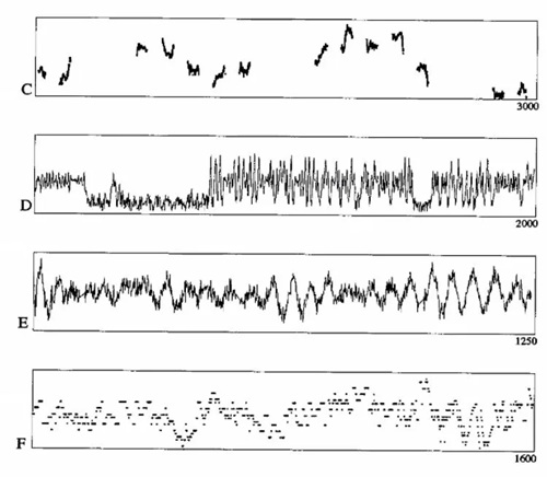
It was explained these charts were processed by algorithms for pattern or significance identification and simultaneously reviewed by hand by insightful experts. The result was that the conclusions arrived at by the human experts outperformed those of the machine algorithm.
This example illustrates the importance of 'wisdom' or human insights, in addition to algorithmic analysis, to successful Data Science analysis
Both examples also illustrated the usefulness of data visualization techniques.
As I listed to Neil, a couple of thoughts occurred to me...
- More data points is better...easier to identify significant anomalies, changes or trends when there are thousands of data points
- The quality of the data is probably also critical...was the method of data gathering consistent throughout the series?
Data Science > Taxonomy
Neil then went over some important terminology required to properly communicate the language of Data Science as follows...
- Data are plural
- Regression > drawing a line function described by data points (a trend line?)
- data point = datum > a single unit of data
- interpolation > fill in missing values to make a dataset more complete (how much of this can be done before data quality suffers?)
- extrapolation > projecting/predicting data (based on historical trends or suggested algorithmic predictions)
- parametric fitting > parameters meaningful in data fitting
- non-parametric fitting > fitting a function to data (regardless of parameters)
- hyperparameters > parameters that describes a model
- if model too simple it cant describe data
- if model too complex it generates non-sensical anomalies (?)
- choosing model architecture…is difficult…requires insignt and experience
- supervised learning > input /output relationships, you train the model
- unsupervised learning > finding structure (a model) for unlabeled data…training LLM
- (important to ask the right question…or you will get non-sensical answers)
- find interest things in the data
- reinforcement learning > training a model to get better by telling it when it is wrong…good vs bad outcomes (ex: AlphaGo…win or lose)
- training > make a model better...better able to generate useful conclusions
- inference > use a model (ex: to pick a stock)
- big data > datasets requiring super-computers to process (will break a laptop)
- kernel > "the computational engine for executing code" by Visual Studio Code
Getting Started with Jupyter Notebook
A new interface to get to know.
I have documented using Git/Markdown, Notion and Google Docs.The general process is not new to me. Basically, it is the process to build webpages...with text, photos, diagrams, videos, etc.
So looking at the Jupyter Notebook...the question is, where to start. I have used Jupyter Notebook before for a programming project, but have no idea how to use it to do documentation. It turned out that it took the understanding of one aspect of the interface, and everthing fell into place afterthat.
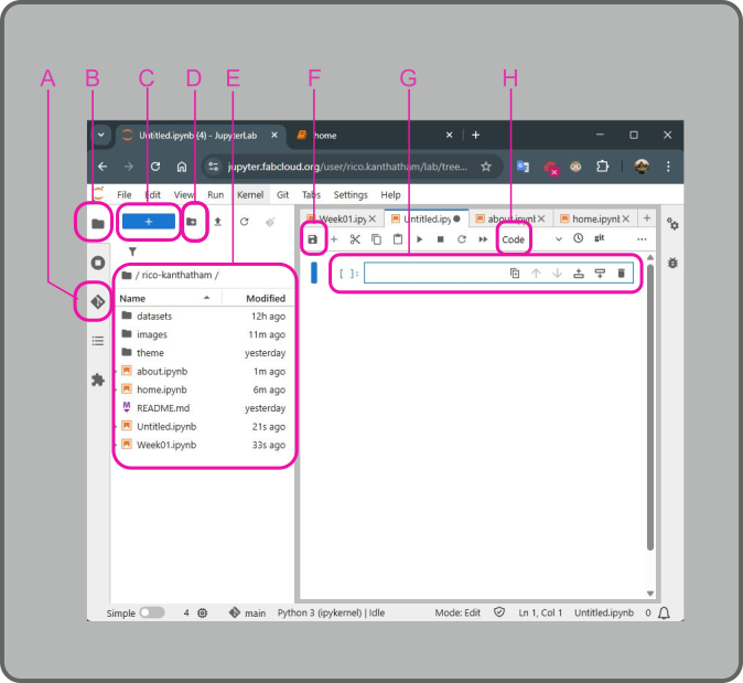
Below is an image of the Jupyter Notebook interface.
The left section of the window are things that I am familiar with from having using VSCode:
- A is the GIT button > used to push documentation for publishing to my website
- B is the Files button > used to view the contents of my website repository
- C is the New Notebook button > used to add a new Jupyter Notebook page
- D is the New Folder button > used to add a new folder to organize repository contents
- E is the Repository Contents list > showing everything that makes up my documentation webpages
The right section of the window is where the webpages are made:
- F is the Save button > used to save changes made on the Jupyter Notebook page
- G is the Cell > in which text, code, images, etc. can be inserted
- H is the Cell Type dropdown > options are 'Code', 'Markdown', 'Raw'
It was the discovery of the Cell Type function (with the help of my friend Jean Michel) that made it possible for me to move forward easily. By default, when a new cell is added to the notebook, it appears as a Code type cell. As the name suggests, this cell type is meant to accept code text that can then be run. But by clicking on the Cell Type dropdown and choosing Markdown, the cell will change to a type that will accept text, images, videos, etc. needed to create documentation. Once this feature was discovered all other aspects of the Jupyter Notebook interface becomes easy to figure out.
Documentation with Jupyter Notebook
The adminstrators of the Fab Futures program created a simple framework for our documentation to build from. I didn't notice this at first.
The created a folder structure including a Datasets, Images, and Theme folders. And they made several initial Jupyter Notebook pages for us to edit, including HOME, ABOUT ME, and Week01 pages.
Clicking on one of the pages with the file extension .ipynb open up an editable page on the right side of the window. In the editable pages, cells can be created to represent sections of the documentation page. Markdown scripting can be used to write and format text and images. When cell editing is completed, click the "save" button to save the documentation contents and the "run" button (right pointing triangle) to show what the script would change to on the webpage. But doing this only saves the page within the repository...it does not push it to the cloud for publishing.
To publish the saved changes to the website, click the Git button on the left hand side.
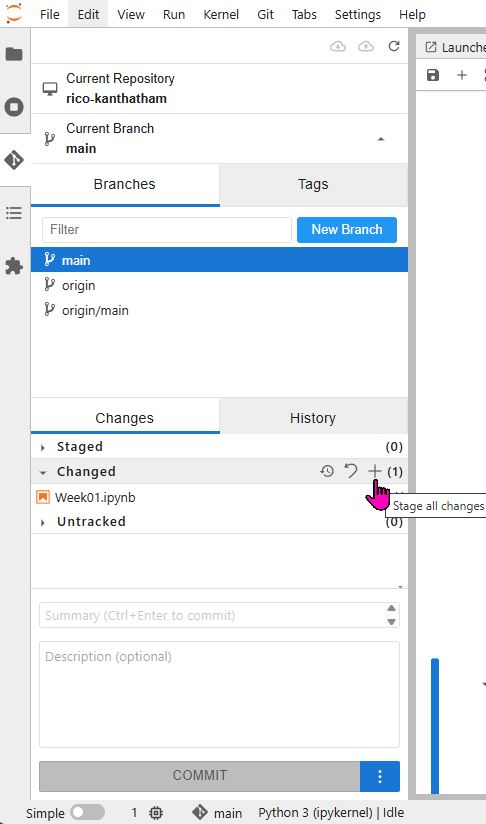
Changed items will be located in the Changed section of the Git Interface. Click the + symbol to move the changed files to the Staged section. To publish to the website:
- Write a message into the Summary text window (near the bottom)
- Click the Commit button
- (Go to the very top) Click the GIT Push button (the little cloud icon with an up arrow in it)
Session 1 Assignment > Data Set Selection
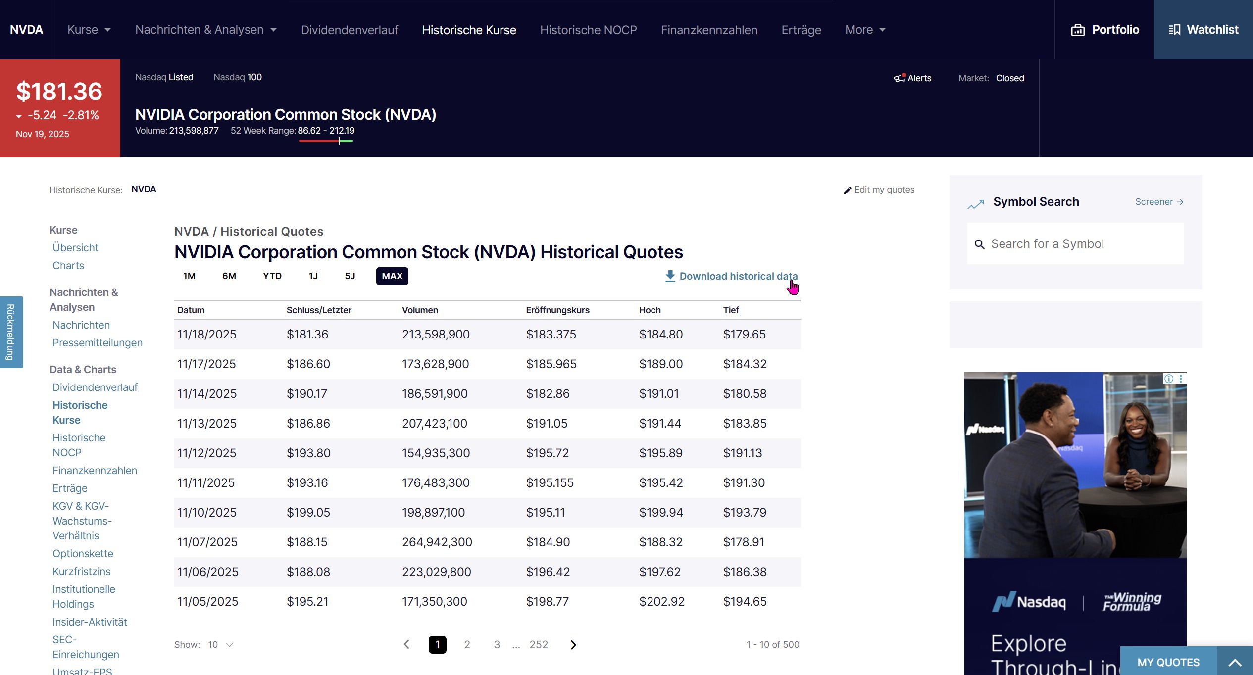
I spent 20yrs working in the Investment Management Industry, so when asked to pick a dataset stock price or stock market data immediately comes to mind. Not particularly creative or imaginative, but maybe a good idea for me to start with data that I am familiar with. I think I will choose 2 datasets: the stock price history of a company > NVIDIA (a smaller data set), the price history of a commodity > GOLD (a larger data set)
I downloaded NVIDIA's historical stock price data (26 years) as a .CSV file from nasdaq.com (https://www.nasdaq.com/market-activity/stocks/nvda/historical).
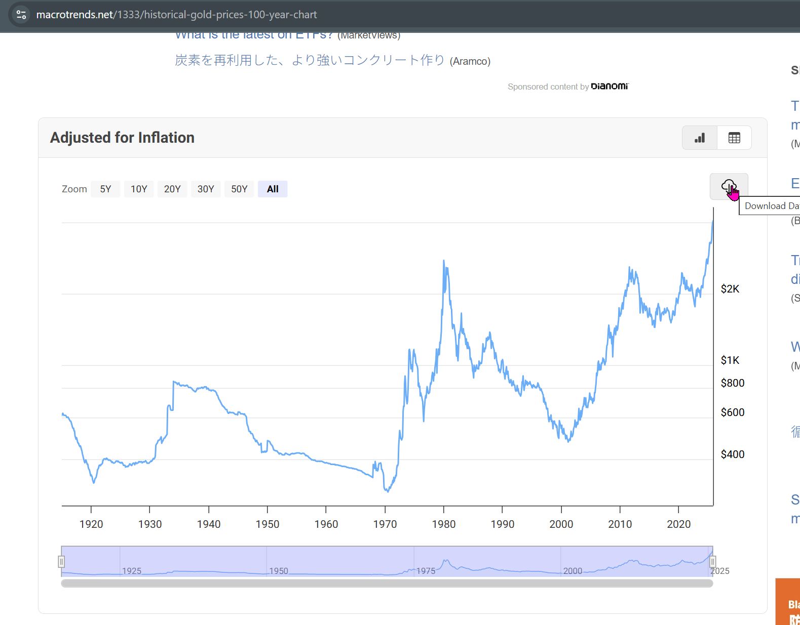
I downloaded GOLD's historical price/adjusted for inflation data (100yrs) as a .CSV file from macrotrends.net (https://www.macrotrends.net/1333/historical-gold-prices-100-year-chart).
As I continued to work on my documentation, I decided to grab one more data set...one that I have zero familiarity with...**Total Sunspot Number**. I downloaded the data set from the **Royal Observatory of Belgium** website (https://www.astro.oma.be/doi/ROB-SIDC-SILSO_SunspotNumberV2.html)
{ width=300 align=center }