Data Science/Session 2 > Tools
Class Notes
In the second session, Neil walks us through the primary tools we will need to do our Data Science work...
- Programming Languages > Javascript, Rust, Python (most recommended)
- Documentation & Coding Platform > Jupyter Notebook
- BQplot > graphics extension for Jupyter Notebook
- Python Package Managers > Conda
- PIP > an alternative package manager, can be run locally
- Version Control > GIT
...then he went over useful Python Extensions
- NumPy - > code efficient mathematical methods for Python
- scipy > algorithms for optimization…searching, sorting, etc.
- scikit > tools for ML
- numba > performance for large datasets, a compiler for Python…makes Python (an interpreted language) faster
- jax > compute accelerator, high performance computing…using CPU and GPU…multiple cores; a compiler for Python…lower level
- pytorch > for ML, high level
- Matplotlib > data visualization library…different plot types on their website
- Plotly > a plotting tool like Matplotlib
- D3 > visual presentation of data in an unusual and beautiful way
Running Programs in Jupyter Notebook
- Code cells can accept and run Python code
- A full program can be divided up over a number of sequential cells
- If divided...earlier cells must be run, before subsequent cells can be run successfully
- Loops are slow in Python...recommended to use the Numpy extension that has built in optimizations to accelerate loops
- Online providers offer Accelerator Instances...like cloud GPUs that we can rent compute time on
Data Management Tips
- don’t store data in spreadsheets
- store data as binary is better
- CSV is a ‘flat file’ data separated by commas
- pandas > python extension for data manipulation
- database > for large datasets that can’t be stored comfortably on a PC, use queries to pull needed data
Assignment:
- Do Python tutorial
- Do Numpy tutorial
- Do MatplotLib tutorial
- Browse D3
- Visualize data
Next Class…
- Fitting function to data (regression, et al)
Assignment > Data Visualization
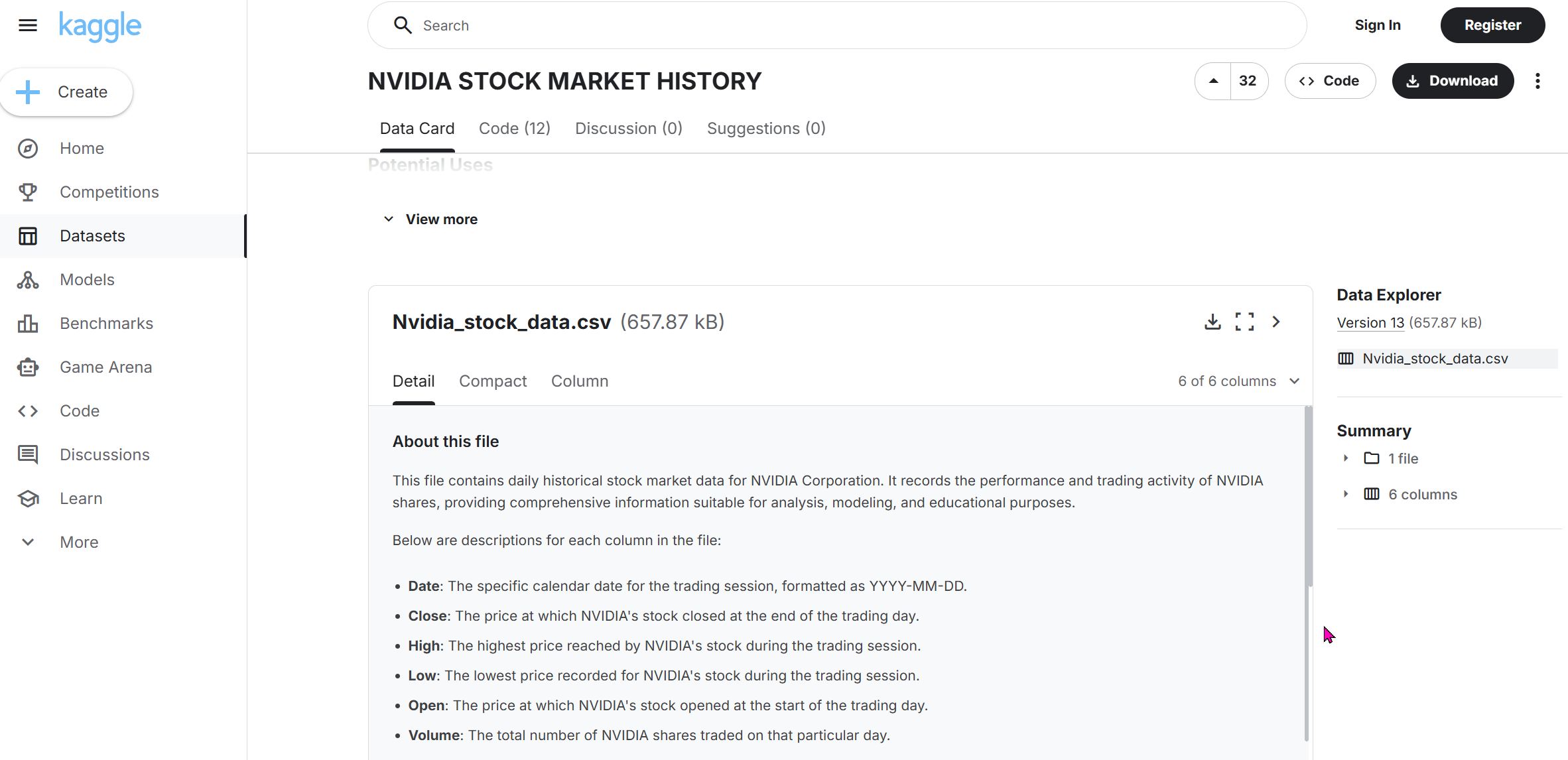
So it turned out that the NVIDIA historical stock price data I downloaded initially...did not cover the entire 26yr history of the company (only back to 2015). So I went to Kaggle (https://www.kaggle.com/datasets/adilshamim8/nvidia-stock-market-history?resource=download) and downloaded a better dataset that includes data from 1999 to the present.
I forgot to mention the last time the dataset import process, so I will describe it briefly here:
- Download the dataset as a .CSV file
- Drag and drop the .CSV file into the datasets folder of my Jupyter Notebook
...that's it. It is that simple.
Visualizing Data using Python
Import libraries
# Import libraries
import os
import pandas as pd #pd is a convenient shortform for pandas
import numpy as np #np is a convenient shortform for numpy
import seaborn as sns #sns is a convenient shortform for seaborn
import matplotlib.pyplot as plt #plt is a convenient shortform for matplotlib
from ipywidgets import interact, IntSlider
Preparing Data for Visualization > Create a Dataframe
Following instructions from the Python tutorial I did, I wrote the following code to try to make a dataframe using my NVIDIA Stock Price data using the Pandas library. I generated the path to the NVIDIA CSV file by right clicking it and choosing 'Copy Path'. I then inputed the path into the following script:
pd.read_csv("rico-kanthatham/datasets/Nvidia_stock_data.csv")
...but I received a "FileNotFoundError".
I guessed that the problem had to do with how I was specifying the path, so I tried many different variations on the original...with no success. So I asked ChatGPT and it recommended that I run the following command to "show the directory where Jupyter is actually running".
os.getcwd()
'/home/jovyan/work/rico-kanthatham'
Sure enough...when I added "home/jovyan/work" ahead of the previous path and ran the Pandas read_csv script again...it worked!
# Create a Pandas DataFrame for Nvidia dataset
NVDA_df = pd.read_csv("/home/jovyan/work/rico-kanthatham/datasets/Nvidia_stock_data.csv")  #path to CSV file

# Looking at a desired number of Data Rows
NVDA_df.head(10) #defaults to providing first 5 rows of data...enter an integer as an arguement to see a specific number of rows
| Date | Close | High | Low | Open | Volume | |
|---|---|---|---|---|---|---|
| 0 | 1999-01-22 | 0.037607 | 0.044770 | 0.035577 | 0.040114 | 2714688000 |
| 1 | 1999-01-25 | 0.041547 | 0.042024 | 0.037607 | 0.040591 | 510480000 |
| 2 | 1999-01-26 | 0.038323 | 0.042860 | 0.037726 | 0.042024 | 343200000 |
| 3 | 1999-01-27 | 0.038204 | 0.039398 | 0.036293 | 0.038442 | 244368000 |
| 4 | 1999-01-28 | 0.038084 | 0.038442 | 0.037845 | 0.038204 | 227520000 |
| 5 | 1999-01-29 | 0.036293 | 0.038204 | 0.036293 | 0.038084 | 244032000 |
| 6 | 1999-02-01 | 0.037010 | 0.037248 | 0.036293 | 0.036293 | 154704000 |
| 7 | 1999-02-02 | 0.034145 | 0.037248 | 0.033070 | 0.036293 | 264096000 |
| 8 | 1999-02-03 | 0.034861 | 0.035339 | 0.033428 | 0.033667 | 75120000 |
| 9 | 1999-02-04 | 0.036771 | 0.037726 | 0.034861 | 0.035339 | 181920000 |
# Looking at a Random number of Samples from the Dataset
NVDA_df.sample(10)
| Date | Close | High | Low | Open | Volume | |
|---|---|---|---|---|---|---|
| 6092 | 2023-04-10 | 27.557631 | 27.599598 | 26.648336 | 26.802216 | 395279000 |
| 5858 | 2022-05-03 | 19.568525 | 19.791146 | 19.100326 | 19.366871 | 475751000 |
| 3713 | 2013-10-24 | 0.360851 | 0.366713 | 0.360147 | 0.364368 | 236436000 |
| 4334 | 2016-04-14 | 0.901947 | 0.905864 | 0.893378 | 0.897050 | 416564000 |
| 1250 | 2004-01-13 | 0.186662 | 0.197742 | 0.184599 | 0.195831 | 865800000 |
| 2374 | 2008-07-01 | 0.429790 | 0.430249 | 0.416266 | 0.424060 | 881464000 |
| 4361 | 2016-05-23 | 1.087037 | 1.094137 | 1.080427 | 1.089975 | 413636000 |
| 1627 | 2005-07-13 | 0.217302 | 0.218524 | 0.213634 | 0.217913 | 594780000 |
| 4142 | 2015-07-10 | 0.477947 | 0.482303 | 0.474559 | 0.475769 | 216708000 |
| 4153 | 2015-07-27 | 0.467299 | 0.472623 | 0.461975 | 0.465847 | 192420000 |
# Getting general information about the dataset

NVDA_df.info()
<class 'pandas.core.frame.DataFrame'>
RangeIndex: 6752 entries, 0 to 6751
Data columns (total 6 columns):
 #   Column  Non-Null Count  Dtype
---  ------  --------------  -----
 0   Date    6752 non-null   object
 1   Close   6752 non-null   float64
 2   High    6752 non-null   float64
 3   Low     6752 non-null   float64
 4   Open    6752 non-null   float64
 5   Volume  6752 non-null   int64
dtypes: float64(4), int64(1), object(1)
memory usage: 316.6+ KB
The above command allows us to get some general information about the dataset...which are important to know, including:
- Number of Entries
- Number of distinct Data Columns and their Category Names
- If there are Empty Cells (containing null data)
- What Data Types the data points in each column are
- The memory size of the Dataset
Observations of the Nvidia Dataset as follows:
- There are 6752 rows of data
- ...6 Category Columns: Date, Close, High, Low, Open, Volume
- ...none of the categories has missing data cells
- ...the 'Date' column is an Object datatype data
- ...the 'Close', 'High', 'Low', and 'Open' columns contain Float datatype data
- ...the 'Volume' column holds Integer datatype data
- ...the dataset takes up 316.6KB of memory
Visualization > Matplotlib
- 1st Objective: visualize the data from one column of the Nvidia Dataframe.
NVDA_df['Close']
0         0.037607
1         0.041547
2         0.038323
3         0.038204
4         0.038084
           ...
6747    186.600006
6748    181.360001
6749    186.520004
6750    180.639999
6751    178.880005
Name: Close, Length: 6752, dtype: float64
I am able to retrieve one column (Closing Price) data for Nvidia. To graph it as a bar chart, I asked for help from ChatGPT. I asked "what is the script in Python using Matplotlib library to create a bar graph of the historic closing price for a stock". This is what it generated as an example.
import pandas as pd
import matplotlib.pyplot as plt
/ Load your stock CSV file
df = pd.read_csv("your_stock_data.csv")
// Make sure Date is parsed as datetime
df['Date'] = pd.to_datetime(df['Date'])
// Sort by date (optional but recommended)
df = df.sort_values('Date')
// Create bar graph
plt.figure(figsize=(12,6))
plt.bar(df['Date'], df['Close'])
plt.xlabel("Date")
plt.ylabel("Closing Price")
plt.title("Historic Closing Price")
plt.xticks(rotation=45)
plt.tight_layout()
plt.show()
I made adjustments to the ChatGPT recommendation and ended up with the following code...
# Make sure Date is parsed as datetime
NVDA_df['Date'] = pd.to_datetime(NVDA_df['Date']) #date column data converted to date

# Create bar graph
plt.figure(figsize=(12,6)) #graph width & height
plt.bar(NVDA_df['Date'], NVDA_df['Close'], color='red') #bar graph closing px value (y axis) at every date value (x axis)...red color bars

plt.xlabel("Date")
plt.ylabel("Closing Price")
plt.title("Historic Closing Price")
plt.xticks(rotation=45) # rotate x-axis label 45deg

# plt.tight_layout()
plt.show()

First Visualization Attempt
The result took a bit of time to appear (lots of calculations I guess)...and the results are less than perfect. Since the stock price diffrence from Nvidia's IPO and the current trading price is so vastly different...the data for the years prior to 2016 are hardly visible in the graph. But I suppose the insights from this rudimentary visualization are:
- The difference between NVIDIA's IPO price to the current trading price is dramatic
- From 2016 onwards, NVIDIA's stock price changes became more dramatic
- The price increase from about 2023 to the present has been the most dramatic...probably coinciding with the AI boom
Visualization > Next Step
- Make the data from 1999 to 2016 more easy to view...see if there are insights to be gained in this Pre-Acceleration period
- Qualify the stock price with key announcements by the company since its IPO
- Map the growth of AI research on top of NVIDIA's stock price?
- Map the launch and growth of ChatGPT and other consumer AI tools on top of NVIDIA's stock price?
I asked ChatGPT the following "how to add a slider to change the range of stock prices graphed starting with the IPO date?" and it recommended the following:
"To add an interactive slider that lets you change the date range (starting from the IPO date) for your stock price graph, the easiest and most common method in a Jupyter Notebook is to use: ipywidgets + Matplotlib. This creates an interactive plot where you move a slider to choose how many days (or years) after IPO to display."
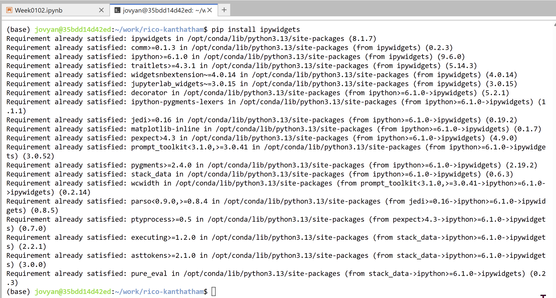
I opened a terminal window and installed the 'ipywidgets' extension...
...then follow ChatGPT's suggestion to use the extension with Matplotlib. It's suggestion is as follows:
# Parse dates
NVDA_df['Date'] = pd.to_datetime(NVDA_df['Date'])

# Sort by date (ensure IPO is first...by resetting the Index)
df = NVDA_df.sort_values("Date").reset_index(drop=True)

# How many records in total?
n = len(df)

# Define a function to plot from IPO to a selected index
def plot_range(days_after_ipo):
    plt.figure(figsize=(15, 6)) #specify width & height of the graph

    # Slice the dataframe from IPO to selected day
    #.iloc[] is primarily integer position based (from 0 to length-1 of the axis)
    df_subset = df.iloc[:days_after_ipo]

    plt.plot(df_subset['Date'], df_subset['Close'], color = "#ed0a0a") #plot date (x axis) vs closing prcie (y axis)...hex code for color from https://html-color.codes/
    plt.title(f"Stock Price from IPO to Day {days_after_ipo}") #graph title
    plt.xlabel("Date")
    plt.ylabel("Closing Price")
    plt.xticks(rotation=0)
    plt.grid(True, alpha=0.3) #grid ON with transparency
    # plt.savefig(base_dir+'NVDA_viz2')
    plt.show()

# Create Slider (1 day to full range)
interact(
    plot_range,
    days_after_ipo=IntSlider(
        min=1,
        max=n,
        step=1, #increment = 1 day
        value=n,    # default shows full history
        description="Days after IPO"
    )
);
Second Visualization Attempt
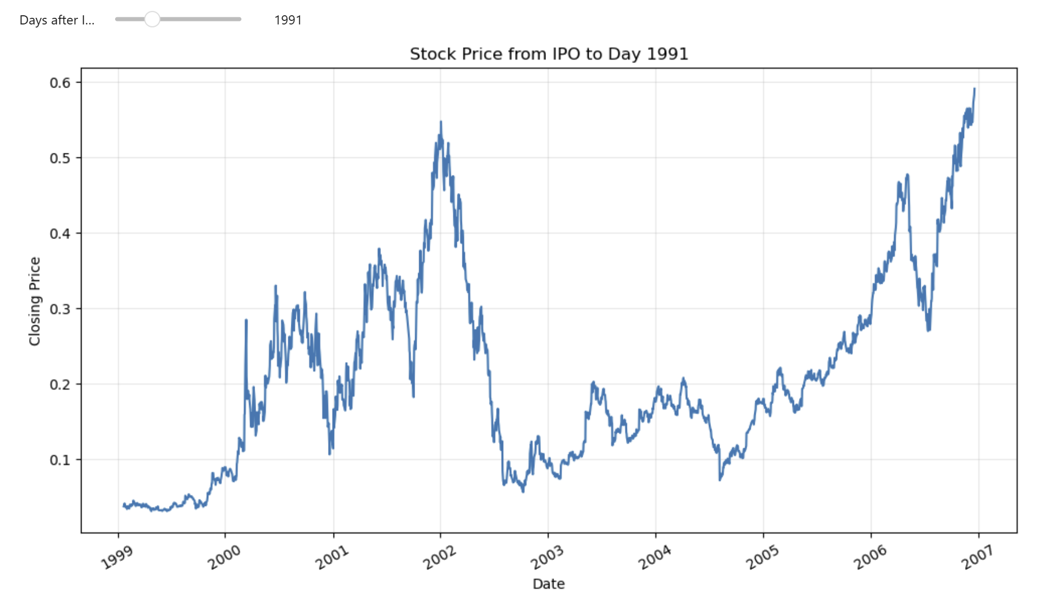
The addition of a slider made a big difference to "Narrative Visualization". I think, by having the ability to see the increase of stock prices from the IPO to specific number of days following the IPO...allows for better visibility the stock's price scaling over time.
Now I think an interesting next modification would be to have the increment of 'Days after the IPO' be automatic...but allow the viewer to control the 'Speed of Play'. I discovered that I can manually do this by rolling the number of days back to zero...and then using the right arrow key to increase the number of days while hovering over the slider.
Insights from the new Visualization:
- The stock had its first price jump about 210 days after the IPO
- Its second dramatic jump 288 days after IPO
- Its third big price jump 741 days after IPO **
- Followed by huge downward price trend to bottom at 935days after IPO
- It wallowed in a low trading range until day 1394...when it enjoyed a big uptrend again
- It reached a new historic high price on day 1991
- ...etc.
Idea for Additional Visualization Feature
- I am thinking to add a slope line between the IPO price starting point and the last price point shown in the graph...for the slope value to be a narrative driver.