Data Science/Session 3 > Fitting Function
In the first session we looked at datasets. In the second, we were introduced to tools that allowed us to visualize data. In the third session, Neil showed us how utilize Fitting Function features of the Numpy extension to Python to generate a trend line through the a dataset plot.
It was a challenging session to understand as there was a lot of (necessary) math terminology used to describe the Fitting Function procedure. While I am still processing all of the knowledge shared, it reminded me of the statistical regression work I used to do in my former job. At the risk of over-simplifying, I believe the objective for the session was to provide us with initial means to meaningful insights from dataplots. In the second session, we turned data into an image. In this session, we are asked to use mathematical functions to draw a continuous line that represents a trend or pattern suggested by the data.
Class Notes
Math > Fitting Functions
- plotting functions through data
- needed for interpolation, extrapolation, noise reduction, etc.
Variable Types
It's been a minute...since I took a math class. I found this website (https://www.mathsisfun.com/algebra/scalar-vector-matrix.html) that made understanding the variable type terminology a bit easier. .
- Scalar > a number a single numerical value, magnitude only, ex: distance
- Vector > a list of numbers, magnitude & direction, ex: displacement (distance & directions)
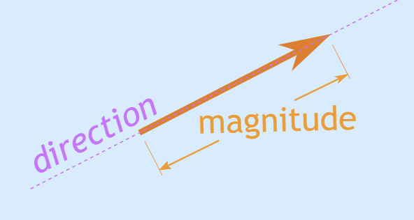
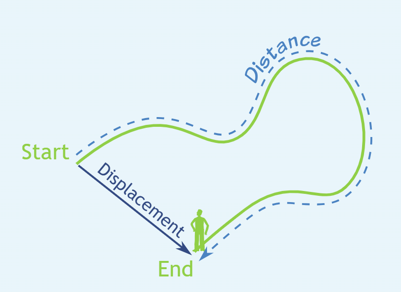
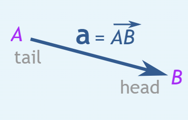
images from mathisfun.com
- Matrix > an array of numbers (with rows and columns)
For understanding how these variable types can be used in the context of Data Science and specifically with Numpy, Geeks for Geeks has great explanations (https://www.geeksforgeeks.org/machine-learning/difference-between-scalar-vector-matrix-and-tensor/)
Functions
Again...at the risk of offending math experts...I am going to give my simplified (simplistic?) definition of a Function. In the context of this week's Fitting Function topic and in layman's terms, a "Function" can be thought of as a mathematical equation that describes a line. These equations will describe lines in various shapes...straight line, simple curve line (single bend), complex curve line (multiple bends), etc.
Neil walks us through a few function examples and the kinds of lines they describe:
Straight Line > $y = ax$
Affine > $y = ax+b$
- Polynomial > $y = a+bx+cx^2+\ldots$
- 1D: what constant value to multiply to single-axis variable
- Non-Linear >
- Trigonometry Function > curve line based on sine, cosine, tangent functions
- slope continously changing
- change in output not proprotional to change in input
- ex: y = sin(x)
- ex: y = cos(x)
- ex: y = tan(x)
- Radial Based Function > RBF, RBF network hs Input layer, Hidden layer, Radial Basis function, Output layer
- https://medium.com/analytics-vidhya/nonlinear-regression-tutorial-with-radial-basis-functions-cdb7650104e7
- Gaussian > an RBF curve with a bell shape
- Deep Neural Network > involves an objective (target) or loss function (ex: sum of squares) that the network aims to minimize by adjusting its internal parameters (weights and biases) through an optimization algorithm.
- Trigonometry Function > curve line based on sine, cosine, tangent functions
Neil goes on to say...
- ...there is no single best function that works in every situation
- ...every dataset will require the selection of the most appropriate Fitting Function equation
- ...requires judgement to choose
Terminology:
- Summation > add up all discreet separate values from 1 to n
- Integral > add up continuous values
Errors
- Model Estimation > right function but wrong parameter
- Model Mismatch > function inappropriate for the data
Fitting
The Numpy extension of Python, has built-in functionality to apply a number of different line generating equations, to draw a variety of trend line shapes to 'fit' a dataset.
- Residual > difference between data value and fit function, can be positive or negative
- Loss > sum of residuals
- Least Squares (lstsq) Function > square of sum of residuals
- numpy.linalg.lstsq
- Sum of Absolute Value Function > L1, less sensitive to outliers, has magical properties (compress sensing)
- Least Squares (lstsq) Function > square of sum of residuals
- Singlular Value Decomposition (SVD) Function
- can solve any sum of terms...
- numpy.polyfit
- (Neil showed a good basic example of linear and polynomial line fitting…should review and try)
Radial Basis Function Fit (RBF)
- instead of adding more polynomial term...add the same term in more places
- create anchors in dataset
- create function of distance to anchors
- (is this close to what I want to do with my stock data??!!)
- R-cubed > a good starting function
- matrix > every row a data point
- matrix > every column an RBF center…one datapoint to one center
Non-Linear Least Squares
used for models where the coefficients appear nonlinearly
“tanh” = Hyperbolic Tangent function
use parameters to get it into the ballpark…then keep tweaking them to get them closer
overfitting > if model too complex, if parameters too extreme…fitting line will wiggle from data noise
cross-validation > fit on training data, evaluate on testing data
Assignment:
- fit a line to data
- plot as dots
- pick a function to best fit the data distribution
Assignment Research
Assignment Work
Prepping for Fitting Function > Visualize Data as Scatter Plot
Plotting my NVDA Historical Stock Price Data as a scatterplot, rather than a bar graph as in the previous assignment. I basically reused the code I generated to complete the visualization assignment last week and made changes to one line of code. I replaced plt.bar (bar chart) with plt.scatter (scatter plot). The parameters remained the same. I got help from ChatGPT to change the dot size of the scatter plot points and added one parameter s = 0.5 to specify the size of the data dots. The prompt used was "how do you change the dot size on a matplotlib scatter plot"
# Import libraries
import os
import pandas as pd #pd is a convenient shortform for pandas
import numpy as np #np is a convenient shortform for numpy
import seaborn as sns #sns is a convenient shortform for seaborn
import matplotlib.pyplot as plt #plt is a convenient shortform for matplotlib

# Create a Pandas DataFrame for Nvidia dataset
NVDA_df = pd.read_csv("/home/jovyan/work/rico-kanthatham/datasets/Nvidia_stock_data.csv")  #path to CSV file

# Looking at a desired number of Data Rows
NVDA_df.head(10) #defaults to providing first 5 rows of data...enter an integer as an arguement to see a specific number of rows

# Make sure Date is parsed as datetime
NVDA_df['Date'] = pd.to_datetime(NVDA_df['Date']) #date column data converted to date

# Create scatter plot
plt.figure(figsize=(12,6)) #graph width & height
plt.scatter(NVDA_df['Date'], NVDA_df['Close'], color='red', s = 0.5) #bar graph closing px value (y axis) at every date value (x axis)...red color bars

plt.xlabel("Date")
plt.ylabel("Closing Price")
plt.title("Historic Closing Price")
plt.xticks(rotation=45) # rotate x-axis label 45deg

# plt.tight_layout()
plt.show()

Fitting a Function to Data
I watched this video called Polynomial Fit Using Numpy Module in Python to get guidance on how to apply a Numpy Fit Function to data.
I learned how to turn on code line numbers in Jupyter Notebook. In the view menu, select show line numbers, keyboard shortcut SHIFT+L.
I modified the previous code, add lines of code:
- Created and assigned values to variables 'x' and 'y', lines 18 and 19
# Import libraries
import os
import pandas as pd #pd is a convenient shortform for pandas
import numpy as np #np is a convenient shortform for numpy
# import seaborn as sns #sns is a convenient shortform for seaborn
import matplotlib.pyplot as plt #plt is a convenient shortform for matplotlib

# Create a Pandas DataFrame for Nvidia dataset
NVDA_df = pd.read_csv("/home/jovyan/work/rico-kanthatham/datasets/Nvidia_stock_data.csv")  #path to CSV file

# Looking at a desired number of Data Rows
NVDA_df.head(10) #defaults to providing first 5 rows of data...enter an integer as an arguement to see a specific number of rows

# Make sure Date is parsed as datetime
NVDA_df['Date'] = pd.to_datetime(NVDA_df['Date']) #date column data converted to date

# Create and Assign XY Variables
x = NVDA_df['Date']
y = NVDA_df['Close']

# Create scatter plot
plt.figure(figsize=(12,6)) #graph width & height
plt.scatter(x, y, color='red', s = 0.5) #bar graph closing px value (y axis) at every date value (x axis)...red color bars

plt.xlabel("Date")
plt.ylabel("Closing Price")
plt.title("Historic Closing Price")
plt.xticks(rotation=45) # rotate x-axis label 45deg

# plt.tight_layout()
plt.show()

# Polynomial Fit Functions
cL = np.polyfit(x,y,1) #generate coefficients for a linear Fit Function
cQ = np.polyfit(x,y,2) #generate coefficients for a Quadratic Fit Function
L = np.poly1d(cL)
print(L)
---------------------------------------------------------------------------
UFuncTypeError                            Traceback (most recent call last)
Cell In[3], line 34
     31 plt.show()
     33 # Polynomial Fit Functions
---> 34 cL = np.polyfit(x,y,1) #generate coefficients for a linear Fit Function
     35 # cQ = np.polyfit(x,y,2) #generate coefficients for a Quadratic Fit Function
     36 # L = np.poly1d(cL)
     37 # print(L)

File /opt/conda/lib/python3.13/site-packages/numpy/lib/_polynomial_impl.py:636, in polyfit(x, y, deg, rcond, full, w, cov)
    460 """
    461 Least squares polynomial fit.
    462
   (...)    633
    634 """
    635 order = int(deg) + 1
--> 636 x = NX.asarray(x) + 0.0
    637 y = NX.asarray(y) + 0.0
    639 # check arguments.

UFuncTypeError: ufunc 'add' cannot use operands with types dtype('<M8[ns]') and dtype('float64')
OK...so the above attempt to generate coefficients from the historical stock price generated an error > "UFuncTypeError: ufunc 'add' cannot use operands with types dtype('<M8[ns]') and dtype('float64')"
The polyfit command, it appears, cannot accept numbers as dates or floats. So...I will have to convert both into integers? The 'date' should be easy. Since they are sequential and there are 6752 data points, I should be able to assign each day from the IPO onwards with a number from 1 to 6752. The daily 'closing price' on the otherhand, is harder. The prices are naturally fractional values. No time to waste...let me ask ChatGPT for assistance.
"I ran the numpy polyfit command and got this error...UFuncTypeError: ufunc 'add' cannot use operands with types dtype('<M8[ns]') and dtype('float64')"
ChatGPT confirms my suspicions with the follow response...
"np.polyfit is trying to do math with dates and floats at the same time, and it refuses. So your x (or y) values are datetime objects, but np.polyfit only works with pure numbers."
Pure Numbers...got it.
ChatGPT's first solution suggestion is in alignment with my own strategy...
"Option 1: Convert dates to a numeric axis (index-based)" using the arange command on the date array length > x = np.arange(len(df))
I make the change to line 18 of my code...from x = NVDA_df['Date'] to x = np.arange(len(NVDA_df['Date']))
# Import libraries
import os
import pandas as pd #pd is a convenient shortform for pandas
import numpy as np #np is a convenient shortform for numpy
# import seaborn as sns #sns is a convenient shortform for seaborn
import matplotlib.pyplot as plt #plt is a convenient shortform for matplotlib

# Create a Pandas DataFrame for Nvidia dataset
NVDA_df = pd.read_csv("/home/jovyan/work/rico-kanthatham/datasets/Nvidia_stock_data.csv")  #path to CSV file

# Looking at a desired number of Data Rows
NVDA_df.head(10) #defaults to providing first 5 rows of data...enter an integer as an arguement to see a specific number of rows

# Make sure Date is parsed as datetime
NVDA_df['Date'] = pd.to_datetime(NVDA_df['Date']) #date column data converted to date

# Create and Assign XY Variables
x = np.arange(len(NVDA_df['Date']))
y = NVDA_df['Close']

# Create scatter plot
plt.figure(figsize=(12,6)) #graph width & height
plt.scatter(x, y, color='red', s = 0.5) #bar graph closing px value (y axis) at every date value (x axis)...red color bars

plt.xlabel("Date")
plt.ylabel("Closing Price")
plt.title("Historic Closing Price")
plt.xticks(rotation=45) # rotate x-axis label 45deg

# plt.tight_layout()
plt.show()

# Polynomial Fit Functions
cL = np.polyfit(x,y,1) #generate coefficients for a linear Fit Function
cQ = np.polyfit(x,y,2) #generate coefficients for a Quadratic Fit Function
L = np.poly1d(cL)
print('Linear Coefficient: ', L)

Linear Coefficient:
0.009793 x - 20.14
That single change seemed to solve the problem! So I am saved from having to find a way to convert stock price data to an integer. It seems the problem was that I could not mix non-numerical values (dates) with numerical values (price).
Moving forward!!
- generate and print the quadratic coefficients
# Import libraries
import os
import pandas as pd #pd is a convenient shortform for pandas
import numpy as np #np is a convenient shortform for numpy
# import seaborn as sns #sns is a convenient shortform for seaborn
import matplotlib.pyplot as plt #plt is a convenient shortform for matplotlib

# Create a Pandas DataFrame for Nvidia dataset
NVDA_df = pd.read_csv("/home/jovyan/work/rico-kanthatham/datasets/Nvidia_stock_data.csv")  #path to CSV file

# Looking at a desired number of Data Rows
NVDA_df.head(10) #defaults to providing first 5 rows of data...enter an integer as an arguement to see a specific number of rows

# Make sure Date is parsed as datetime
NVDA_df['Date'] = pd.to_datetime(NVDA_df['Date']) #date column data converted to date

# Create and Assign XY Variables
x = np.arange(len(NVDA_df['Date']))
y = NVDA_df['Close']

# Create scatter plot
plt.figure(figsize=(12,6)) #graph width & height
plt.scatter(x, y, color='red', s = 0.5) #bar graph closing px value (y axis) at every date value (x axis)...red color bars

plt.xlabel("Date")
plt.ylabel("Closing Price")
plt.title("Historic Closing Price")
plt.xticks(rotation=45) # rotate x-axis label 45deg

# plt.tight_layout()
plt.show() #show the closing price as a scatter plot

# Polynomial Fit Functions
cL = np.polyfit(x,y,1) #generate coefficients for a linear Fit Function
cQ = np.polyfit(x,y,2) #generate coefficients for a Quadratic Fit Function
L = np.poly1d(cL)
Q = np.poly1d(cQ)
print(f"Linear Coefficient: {L}")
print(f"Quadratic Coefficient: {Q}")
Linear Coefficient:
0.009793 x - 20.14
Quadratic Coefficient:            2
5.523e-06 x - 0.02749 x + 21.81
# Plot the Linear Fit Line

x_lin = np.arange(min(x), max(x))
y_linModel = L(x_lin)
plt.scatter(x, y, color='red', s = 0.5)
plt.plot(x_lin, y_linModel)
[<matplotlib.lines.Line2D at 0xfe7180d65d10>]

# Plot the Quadratic Fit Line

x_quad = np.arange(min(x), max(x))
y_quadModel = Q(x_quad)
plt.scatter(x, y, color='red', s = 0.5)
plt.plot(x_quad, y_quadModel)
[<matplotlib.lines.Line2D at 0xfe7180e4b4d0>]

...and then plotting both lines together.
# Plot Linear and Quadratic Fit Lines over Scatter Plot

x_quad = np.arange(min(x), max(x))
y_quadModel = Q(x_quad)
plt.plot(x_quad, y_quadModel)

x_lin = np.arange(min(x), max(x))
y_linModel = L(x_lin)
plt.plot(x_lin, y_linModel)

plt.scatter(x, y, color='red', s = 0.5)
<matplotlib.collections.PathCollection at 0xfe7180ba9f90>

Observations
Well, everything seemed to go to plan...but the fit lines look wrong to me somehow...as though the y-axis scale for the Fitting Functions were plotted on a narrower (less tall) y-axis than the scatter plot. Also, the chart plot run indicator is red...which suggests to me something is wrong. But no error messages...
No time to debug right now. Gotta move on to the Neural Network assignment.