Research > Transforms
For sure, I will start this research with dissecting the many cool examples that Neil showed in class.
Transforms > Key Topics
Principal Components Analysis (PCA)
PCA is briefly explained in this video.
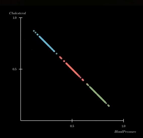
The example, plot the weight and height of 1000 people on a 2-D graph. The plotted graph varies in 2 directions, showing a 'principal component' (wide dispersion) and a 'secondary component' (less wide).
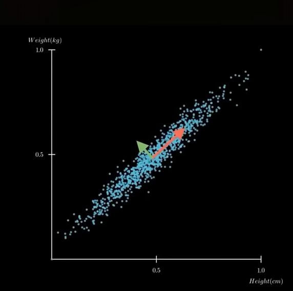
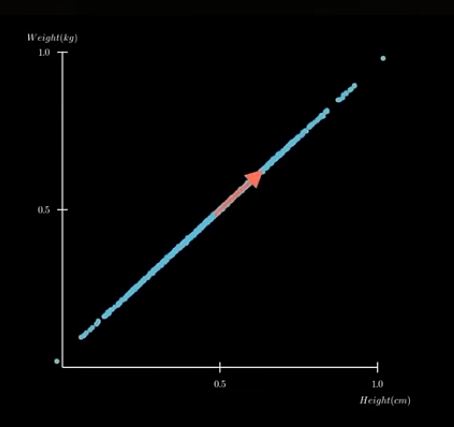
Plot on a single axis...showing only the most important information. "Reduce dimensions while keeping the essential structure"
 ,
, ,
,
Let's look at Neil's code in detail...
! pip install numpy matplotlib scikit-learn
#PCA

#import libraries
import numpy as np
import matplotlib.pyplot as plt
import sklearn


np.set_printoptions(precision=1)
#
# load MNIST data
#
X = np.load('datasets/MNIST/xtrain.npy')
y = np.load('datasets/MNIST/ytrain.npy')
print(f"MNIST data shape (records,pixels): {X.shape}")
#
# plot vs two pixel values
#
plt.scatter(X[:,200],X[:,400],c=y)
plt.xlabel("pixel 200")
plt.ylabel("pixel 400")
plt.title("MNIST vs pixels 200 and 400")
plt.colorbar(label="digit")
plt.show()
#
# standardize (zero mean, unit variance) to eliminate dependence on data scaling
#
print(f"data mean: {np.mean(X):.2f}, variance: {np.var(X):.2f}")
X = X-np.mean(X,axis=0)
std = np.std(X,axis=0)
Xscale = X/np.where(std > 0,std,1)
print(f"standardized data mean: {np.mean(Xscale):.2f}, variance: {np.var(Xscale):.2f}")
#
# do 50 component PCA
#
pca = sklearn.decomposition.PCA(n_components=50)
pca.fit(Xscale)
Xpca = pca.transform(Xscale)
plt.plot(pca.explained_variance_,'o')
plt.plot()
plt.xlabel('PCA component')
plt.ylabel('explained variance')
plt.title('MNIST PCA')
plt.show()
#
# plot vs first two PCA components
#
plt.scatter(Xpca[:,0],Xpca[:,1],c=y,s=3)
plt.xlabel("principal component 1")
plt.ylabel("principal component 2")
plt.title("MNIST vs two principal components")
plt.colorbar(label="digit")
plt.show()
---------------------------------------------------------------------------
FileNotFoundError                         Traceback (most recent call last)
Cell In[1], line 8
      4 np.set_printoptions(precision=1)
      5 #
      6 # load MNIST data
      7 #
----> 8 X = np.load('datasets/MNIST/xtrain.npy')
      9 y = np.load('datasets/MNIST/ytrain.npy')
     10 print(f"MNIST data shape (records,pixels): {X.shape}")

File c:\Users\senna\AppData\Local\Programs\Python\Python313\Lib\site-packages\numpy\lib\_npyio_impl.py:454, in load(file, mmap_mode, allow_pickle, fix_imports, encoding, max_header_size)
    452     own_fid = False
    453 else:
--> 454     fid = stack.enter_context(open(os.fspath(file), "rb"))
    455     own_fid = True
    457 # Code to distinguish from NumPy binary files and pickles.

FileNotFoundError: [Errno 2] No such file or directory: 'datasets/MNIST/xtrain.npy'
Independent Component Analysis (ICA)
Time Series
Sonification
This topic has been something that I have wanted to explore for a long time. With data, the focus seems to always be on Visualization. Sensible, given that most people gather information with their eyes. But a couple of prior experiences raised the question in my mind as to whether Sonification of data might also be effective as a means of providing insight in data analysis.
I am reminded, in particular, of a scene from one of my all time favorite movies Contact where the lead scientist, Dr. Arroway, discovers an alien signal in the normal noise that is normally 'heard' by the giant SETI radio telescopes antennaes. She hears it first..and then the signal data is visualized.

image from the movie 'Contact'
Let's deconstruct Neil's 'Sonification' code!
! pip install numpy IPython
# import numpy and IPython libraries
# define variables

import numpy as np
from IPython.display import Audio, display # for creating sliders
digits = "1234567890"
rate = 44100 # audio frequency rate
#function to assign DTMF (dual-tone multi-frequency) frequencies to digits

def DTMF_tone(digit,duration,rate,amplitude):
    frequencies = {
        '1':(697,1209),'2':(697,1336),'3':(697,1477),
        '4':(770,1209),'5':(770,1336),'6':(770,1477),
        '7':(852,1209),'8':(852,1336),'9':(852,1477),
        '*':(941,1209),'0':(941,1336),'#':(941,1477)} #varible 'frequencies' assigned key-pair tuples of frequency pairs
    low,high = frequencies[digit] #unpacks tuples into 2 variables
    t = np.linspace(0,duration,int(rate*duration),endpoint=False) #create a time-axis from 0 to duration...rate=sample rate, duration=seconds of audio, int(rate*duration)=number of samples
    tone = amplitude*(np.sin(2*np.pi*low*t)+np.sin(2*np.pi*high*t)) #generate a sound wave...assign to tone variable
    return tone
#generate audio tone function

def generate_DTMF(digits,duration=0.2,silence=0.1,rate=44100,amplitude=0.5):
    data = np.array([]) #create an array called data
    for digit in digits:
        tone = DTMF_tone(digit,duration,rate,amplitude) #call the DTMF_tone function
        silence = np.zeros(int(rate*silence)) #generate silent pauses...ChatGPT suggested replacing Nei's use of 'duration' with 'silence'
        data = np.concatenate((data,tone,silence)) #concaternate tone and silence
    return data
data = generate_DTMF(digits,rate=rate) #call the generate_DTMF function
data = data/np.max(np.abs(data))*(2**15-1) #rescales audio from floating-point waveform to 16-bit integer amplitude range...normalizing with max amp at 1.0. 2**15-1=32767 or max value for 16-bit need by .WAV
data = data.astype(np.int16) #converts floating-point numbers (dtype=float64) into 16-bit signed integers (dtype=int16)
display(Audio(data,rate=rate)) #sends waveform to Jupyter Notebook built-in audio player
#draw 2 plots

import matplotlib.pyplot as plt
plt.plot(data, color='pink') #data plot
plt.title("audio")
plt.show()
plt.plot(data[24000:25000],color='cyan') #waveform plot
plt.title("waveform")
plt.show()


Fourier Fast Transform
FFT is used to analyze "the frequency conten of (the) DTMF audio signal", according to ChatGPT.
Asked to provide a "brief explanation of Fast Fourier Transform", ChatGPT retuned this:
- "FFT is an algorithm that quickly converts a time-series signal into the Frequency Domain - shows what frequencies the signal is made of...and how strong they are"
The resulting FFT plot shows clear spikes at frequecies generated by the DTMF generator. The height of each spike representing the strength of the frequency.
#FFT Plotting

#Import libraries
import matplotlib.pyplot as plt
import numpy as np

#Fast Fourier Transformation calculations
fft = np.fft.fft(data) #computes FFT from audio waveform data
frequencies = np.fft.fftfreq(len(data),d=1/rate) #generates the frequency axis for plotting the FFT

#plot calculated results
plt.plot(frequencies,abs(fft),color='green')
plt.xlim(0,2000)
plt.title('FFT')
plt.xlabel('frequency (Hz)')
plt.ylabel('magnitude')
plt.show()

Spectogram
ChatGPT defines Spectogram as a visual representation of how frequency content of a signal changes over time. Time is represented on the horizontal axis, frequency on the vertical axis and frequency strength by color & brightness. "A spectogram shows which frequencies are active at each moment in a a sound".
So from left to right, the colored bars shows each digit's (from 1 to 9 and #) tone pairs being outputted. For number 5, for example, bright colors should hover around 770HZ and 1336HZ.
Interestingly, the bars for digits 4, 7 and # show additional fine lines within the bars. Are these harmonics?
I aske ChatGPT to explain these little lines (vertical striping) and it returned this:
- "They occur whent the DTMF tone frequency lines up in a way that causes "beating" or window-edge interference inside the spectogram's FFT windows."
- Spectogram slices audio into many small time 'windows'
- FFT is calculated for each window
- When the tone's frequency does NOT fit perfectly into the FFT window size...spectral leakage or window alignment interference results.
- tiny oscillations in intensity
- periodic "pulses" along the time axis
The frequencies in 4, 7 and #...specifically 120Hz and 1477Hz do not divide evenly into the window size used by plt.specgram().
They do not represent additional frequencies. Got it...not harmonics.
#plot a spectogram

#import libraries
import matplotlib.pyplot as plt
import numpy as np

#plot the frequencies as a spectogram
plt.specgram(data,Fs=rate,scale='linear',cmap='viridis') #the spectogram command...i changed the color map to 'viridis'
plt.ylim(500,8000)
plt.title("spectrogram")
plt.xlabel('time (s)')
plt.ylabel('frequency (Hz)')
plt.ylim(0,2000)
plt.show()
