Week 1-2: Tools
Assignment
Visualize your data set(s)
OK,,,, I will start to plot some dataset which I am concern...
Sustainable Development Goals (SDGs) Index
First, I am concerning how sustainable development goal index. So, I download the data from "Sustainable Development Goal Data" in Kaggle.
OK, I will download the data from kaggle page
import requests

url = 'https://www.kaggle.com/api/v1/datasets/download/sazidthe1/sustainable-development-report'
r = requests.get(url)

with open('./datasets/sdgsdata.zip','wb') as fd:
    fd.write(r.content)
Tow files are compressed with zip, so unpack it.
import shutil
shutil.unpack_archive('./datasets/sdgsdata.zip','./datasets/')
path_2023 = "./datasets/sustainable_development_report_2023.csv"
path_index = "./datasets/sdg_index_2000-2022.csv"
Read the file with pandas
the dataset are divided into two files. One is the latest report data in 2023, another is timeseriese index data from 2000 to 2022. And, both are different in column size. One have lack something in another... So, I read the data with pandas and modified it.
# Read sutainable developement report 2023 data

import pandas as pd
df_sdg2023 = pd.read_csv(path_2023)
# Drop 'region' column
df_sdg2023 = df_sdg2023.drop(columns=['region'])

# rename 'overall_score' to 'sdg_index_score'
sdgsdata2023 = df_sdg2023.rename(columns={'overall_score':'sdg_index_score'})

# add 'year' column and insert same value '2023'
sdgsdata2023['year'] = 2023
# Read SDG index data from 2000-2022
df_index = pd.read_csv(path_index)
# reindex sdgsdaga2023 with df_index
sdgsdata2023.reindex(df_index.index)

# Integrate both dataframe
sdgs_integrated = pd.concat([df_index,sdgsdata2023])

# fillin NaN as 0
sdgs_integrated = sdgs_integrated.fillna(0)
Visualized SDGs index data
First, I defined some key data that represent SDGs each goals visually
import matplotlib.pyplot as plt

goal_def = [
    {'color':'#0000AA','description':'SDGs Total Index'} , # total index
    {'color':'#E5233D','description':'No Poverty'},  # Goal 1
    {'color':'#DDA73A','description':'Zero Hunger'}, # Goal 2
    {'color':'#4CA146','description':'Good Health and Well-being'},  # Goal 3
    {'color':'#C5192D','description':'Quality Education'},  # Goal 4
    {'color':'#FF3A21','description':'Gender Equality'},  # Goal 5
    {'color':'#26BDE2','description':'Clean Water and sanitation'}, # Goal 6
    {'color':'#FCC30B','description':'Affordable and Clean Energy'}, # Goal 7
    {'color':'#A21942','description':'Decide Work And Economic Growth'},  # Goal 8
    {'color':'#FD6925','description':'Industry, Innovation AND Infrastructure'}, # Goal 9
    {'color':'#DD1367','description':'Reduce Inequality'}, # Goal 10
    {'color':'#FD9D24','description':'Sustainable City and Community'},# Goal 11
    {'color':'#BF8B2E','description':'Responsible Comsumption and Production'}, # Goal 12
    {'color':'#3F7E44','description':'Climate Action'},  # Goal 13
    {'color':'#0A97D9','description':'Life Below Water'}, # Goal 14
    {'color':'#56C02B','description':'Life On Land'},  # Goal 15
    {'color':'#00689D','description':'Peace, Justice and Strong Institution'},  # Goal 16
    {'color':'#19486A','description':'Partnership for the Goal'}  # Goal 17
]

columns = sdgs_integrated.columns
sdgs_labels = columns.to_list()
sdgs_labels.remove('country_code')
sdgs_labels.remove('year')
sdgs_labels.remove('country')

sdgs_def = []
for i,value in enumerate(sdgs_labels):

    sdgs_def.append({'label':value,'color':goal_def[i]['color'],'description':goal_def[i]['description']})
Then, plot specific country's (Japan's) each goals and overall index as time-seriese line chart.
import matplotlib.colors as pltcolors

jpn = sdgs_integrated.query('country == "Japan"')

fig = plt.figure(figsize=(7,3))

for i in range(len(sdgs_def)):
    plt.plot(jpn['year'],jpn[sdgs_def[i]['label']],label=sdgs_def[i]['description'],color=sdgs_def[i]['color'])

plt.ylim(bottom=-0.1)
plt.ylim(top=100)
plt.legend(bbox_to_anchor=(1.05, 1), loc='upper left', borderaxespad=0, fontsize='xx-small')

plt.tight_layout()
plt.show()

Then, made interactive line chart that change by selecting specific country
from ipywidgets import interact,Select
country = sdgs_integrated['country'].unique()
s = Select(options=country,rows=4)

def show_plot(sc):
    plt.figure(figsize=(7,3))
    cdata = sdgs_integrated.query(f'country == "{sc}"')

    for i in range(len(sdgs_def)):
        description = sdgs_def[i]['description'] + ' in ' + sc
        plt.plot(cdata['year'],cdata[sdgs_def[i]['label']],label=description,color=sdgs_def[i]['color'])

    plt.ylim(bottom=-0.1)
    plt.ylim(top=100)
    plt.legend(bbox_to_anchor=(1.05, 1), loc='upper left', borderaxespad=0, fontsize='xx-small')
    plt.tight_layout()
    plt.show()


interact(show_plot,sc=country)
interactive(children=(Dropdown(description='sc', options=('Afghanistan', 'Albania', 'Algeria', 'Angola', 'Arge…
<function __main__.show_plot(sc)>
First, test whether geopandas could works.
!pip install geopandas
Requirement already satisfied: geopandas in /Users/yosuke/.pyenv/versions/3.13.2/lib/python3.13/site-packages (1.1.1)
Requirement already satisfied: numpy>=1.24 in /Users/yosuke/.pyenv/versions/3.13.2/lib/python3.13/site-packages (from geopandas) (2.2.4)
Requirement already satisfied: pyogrio>=0.7.2 in /Users/yosuke/.pyenv/versions/3.13.2/lib/python3.13/site-packages (from geopandas) (0.12.0)
Requirement already satisfied: packaging in /Users/yosuke/.pyenv/versions/3.13.2/lib/python3.13/site-packages (from geopandas) (25.0)
Requirement already satisfied: pandas>=2.0.0 in /Users/yosuke/.pyenv/versions/3.13.2/lib/python3.13/site-packages (from geopandas) (2.3.3)
Requirement already satisfied: pyproj>=3.5.0 in /Users/yosuke/.pyenv/versions/3.13.2/lib/python3.13/site-packages (from geopandas) (3.7.2)
Requirement already satisfied: shapely>=2.0.0 in /Users/yosuke/.pyenv/versions/3.13.2/lib/python3.13/site-packages (from geopandas) (2.1.2)
Requirement already satisfied: python-dateutil>=2.8.2 in /Users/yosuke/.pyenv/versions/3.13.2/lib/python3.13/site-packages (from pandas>=2.0.0->geopandas) (2.9.0.post0)
Requirement already satisfied: pytz>=2020.1 in /Users/yosuke/.pyenv/versions/3.13.2/lib/python3.13/site-packages (from pandas>=2.0.0->geopandas) (2025.2)
Requirement already satisfied: tzdata>=2022.7 in /Users/yosuke/.pyenv/versions/3.13.2/lib/python3.13/site-packages (from pandas>=2.0.0->geopandas) (2025.2)
Requirement already satisfied: certifi in /Users/yosuke/.pyenv/versions/3.13.2/lib/python3.13/site-packages (from pyogrio>=0.7.2->geopandas) (2025.1.31)
Requirement already satisfied: six>=1.5 in /Users/yosuke/.pyenv/versions/3.13.2/lib/python3.13/site-packages (from python-dateutil>=2.8.2->pandas>=2.0.0->geopandas) (1.17.0)

[notice] A new release of pip is available: 25.1.1 -> 25.3
[notice] To update, run: pip install --upgrade pip
import geopandas as gpd
url = 'https://naciscdn.org/naturalearth/110m/cultural/ne_110m_admin_0_countries.zip'
world = gpd.read_file(url)
world.plot(figsize=(5,3))
plt.show()

Then, previous sdgs_integrated data should be modified to integrate with geopanda's location data. To integrate with geopanda data, 3-digit country code could be used. But, geopanda's country code (SOV_A3) is different SDGs data's country code.
geo_codes = {
    'AUS':'AU1',
    'CHN':'CH1',
    'CUB':'CU1',
    'DNK':'DN1',
    'FIN':'FI1',
    'FRA':'FR1',
    'GBR':'GB1',
    'ISR':'IS1',
    'KAZ':'KA1',
    'NLD':'NL1',
    'USA':'US1'
}
Moreover, some countries SDGs data are lacked as follow.
testdf = pd.read_csv('lostcountries.csv')
To apply the SDGs index data to geo-location map, I customized the data as follow steps.
- Add lost countries data with filling lack datas
- Arrange some country code notations to geopanda's one.
geo_df_array = []

for i in range(24):

    year = 2000 + i
    geo_data = sdgs_integrated.query(f'year == {year}')
    lostdata = pd.read_csv('lostcountries.csv')

    for i in range(len(sdgs_def)):
        lostdata[sdgs_def[i]['label']] = 10.0
        lostdata['year'] = year

    lostdata = lostdata.rename(columns={'SOV_A3':'country_code','SOVEREIGNT':'country'})
    geo_data = pd.concat([geo_data,lostdata],ignore_index=True)
    geo_df_array.append(geo_data)

geo_df_fin = pd.concat(geo_df_array,ignore_index=True)
tmpdf = pd.DataFrame()
for code in geo_codes:
    print(code,geo_codes[code])
    tmpdf = geo_df_fin.replace(code,geo_codes[code])
    geo_df_fin = tmpdf
AUS AU1
CHN CH1
CUB CU1
DNK DN1
FIN FI1
FRA FR1
GBR GB1
ISR IS1
KAZ KA1
NLD NL1
USA US1
Then, integrate SDGs data with geopandas data with using pandas' merge function
integrated_geo_data = pd.merge(world,geo_df_fin,left_on='SOV_A3',right_on='country_code',how='left')
#test = integrated_geo_data.query('sdg_index_score.isnull()')
#t = integrated_geo_data.loc[:,['SOVEREIGNT','SOV_A3','country_code','country']]
#lost_countries = test.loc[:,['SOV_A3','SOVEREIGNT']]
#lost_countries = lost_countries.set_index('SOV_A3')
#lost_countries.to_csv('lost_countries.csv')
Well, now is the time to plot Each country's 2023 SDGs index on the world map.
import matplotlib.cm as cm

fig,ax = plt.subplots(1,1,figsize=(5,3))

cmap = cm.BuGn
min_rate, max_rate = 0.0,100.0
norm = pltcolors.Normalize(vmin=min_rate,vmax=max_rate)

data = integrated_geo_data.query('year == 2023')
data.plot(column='sdg_index_score',cmap=cmap,norm=norm,ax=ax)
ax.set_title("SDGs Index in Each Countries")

plt.show()

Intaractive Geographical Visualization of SDGs Index
To make interactive geographical visualization of SDGs Index, following tasks is needed.
- Make a list of years that cover the dataset.
- Generate RGBA float color data info of each SDGs Goal.
The following is to get the year list from integrated geo-sdgs data with unique.
years = integrated_geo_data['year'].unique()
To generate RGBA float color data info of each SDGs Goal, I used hex-color code defined in sdgs_def variable, the following is a convert program from hex to RGBA float.
from PIL import ImageColor

sdgs_color_list = []
for i in range(len(sdgs_def)):
    sdgs_color_list.append(sdgs_def[i]['color'])

sdgs_color_float = []
for hexcode in sdgs_color_list:
    r,g,b = ImageColor.getcolor(hexcode,"RGB")
    float_color = [
        (((r/255.0)/4),((g/255.0)/4),((b/255.0)/4),0.5),
        (((r/255.0)/2),((g/255.0)/2),((b/255.0)/2),0.75),
        ((r/255.0),(g/255.0),(b/255.0),1.0)
    ]
    sdgs_color_float.append(float_color)
Then, build-up an interactive visualizaton interface as follow.
from ipywidgets import interact,Select,IntSlider
import matplotlib.colors as mcolors

indexes = []
title = []
for item in sdgs_def:
    indexes.append(item['label'])

select_index = Select(options=indexes,rows=5)
select_year = IntSlider(value=len(years),min=2000,max=2023,step=1,description='Year:',)

def show_maps(sc,y):
    fig,ax = plt.subplots(1,1,figsize=(5,3))

    index = 0
    for i in range(len(sdgs_def)):
        if sc == sdgs_def[i]['label']:
            d = sdgs_def[i]['description']
            index = i


    #cmap = cm.BuGn
    cmap = mcolors.LinearSegmentedColormap.from_list("my_cmap",sdgs_color_float[index])
    min_rate, max_rate = 0.0,100.0
    norm = pltcolors.Normalize(vmin=min_rate,vmax=max_rate)

    year = f'year == {y}'
    data = integrated_geo_data.query(year)
    data.plot(column=sc,cmap=cmap,norm=norm,ax=ax)
    ax.set_title(d)

    plt.show()

interact(show_maps,sc=indexes,y=select_year)
interactive(children=(Dropdown(description='sc', options=('sdg_index_score', 'goal_1_score', 'goal_2_score', '…
<function __main__.show_maps(sc, y)>
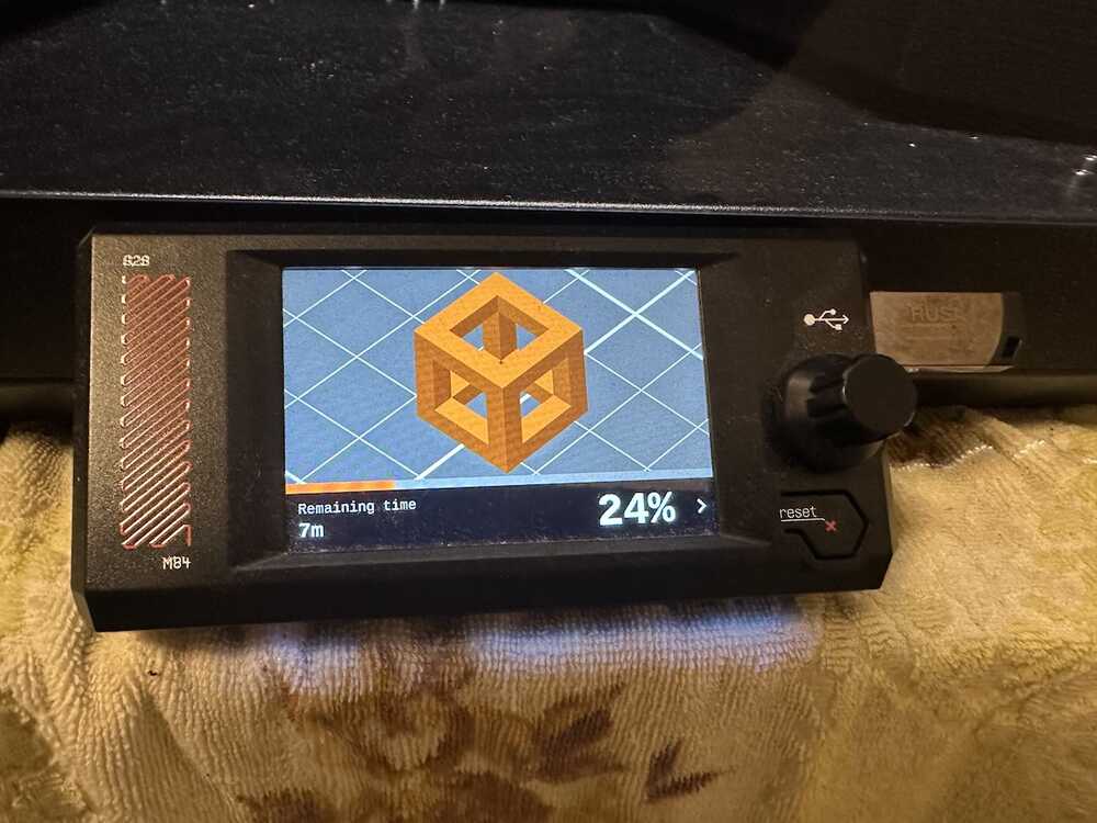
Realtime status data of my Prusa Core One
I collected my Prusa Core One status data with connecting my pc via serial communication.
Please also see this book to get the Prusa 3D printer status data via serial communciation.
logsample
Searching on the web, I cound find the follow, but some data are still not clear.
temperture:
T:171.37/170.00 B:85.00/85.00 X:40.15/36.00 A:49.92/0.00 @:94 B@:93 C@:36.32 HBR@:255
- T: Hotend temperture current/target
- B: Bed temperture current/target
- X: heatbreak temperture (?) current/target
- @: hotend power
- @B: bed heater power
- @C: ?? (Print Fan??)
- HBR@: hotend Fan Power (by observation)
position:
X:249.00 Y:-2.50 Z:15.00 E:7.30 Count A:24650 B:25150 Z:5950
- X: current X position of the printer
- Y: current Y position of the printer
- Z: current Z position of the printer
- E: current extrusion amount or position of the extruder
- Count section A,B,Z::??? (according to RepRap G-Code documentation, the value after "Count" seems stepper motor function).
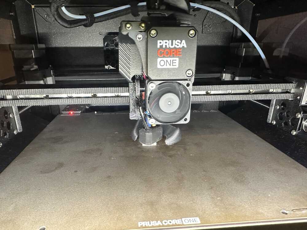
I used simple cube test data, then get the data for printint it.
 |
 |
 |
Read printer data
First, define the funtion to read temperture logdata and make a DataFrame.
def get_printer_temp_data(path):

    with open(path,"r") as tf:
        temp_data = tf.readlines()

    resjson = []
    for item in temp_data:
        tempdata = item.split(' ')

        addjson = {}
        logtime = tempdata[0]
        addjson['logtime'] = logtime.replace('-',' ')

        nozzle_temps = str(tempdata[1]).replace('T:','')
        nozzle_temp_current,nozzle_temp_setting = nozzle_temps.split('/')
        addjson['nozzle_temp_current'] = float(nozzle_temp_current)
        addjson['nozzle_temp_setting'] = float(nozzle_temp_setting)

        bed_temps = str(tempdata[2]).replace('B:','')
        bed_temp_current,bed_temp_setting = bed_temps.split('/')
        addjson['bed_temp_current'] = float(bed_temp_current)
        addjson['bed_temp_setting'] = float(bed_temp_setting)

        heatbreak_temps = str(tempdata[3]).replace('X:','')
        heatbreak_temp_current,heatbreak_temp_setting = heatbreak_temps.split('/')
        addjson['heatbreak_temp_current'] = float(heatbreak_temp_current)
        addjson['heatbreak_temp_setting'] = float(heatbreak_temp_setting)

        hotend_power = str(tempdata[5])
        hotend_power = hotend_power.replace('@:','')
        #0-255 (mapping 0.0-100.0)
        hotend_power = (float(hotend_power) / 255) * 100
        addjson['hotend_power'] = hotend_power

        bed_heater_power = str(tempdata[6])
        bed_heater_power = bed_heater_power.replace('B@:','')
        bed_heater_power = (float(bed_heater_power) / 255) * 100
        addjson['bed_heater_power'] = bed_heater_power

        hotend_fan_power = str(tempdata[8])
        hotend_fan_power = hotend_fan_power.replace('HBR@:','')
        hotend_fan_power = (float(hotend_fan_power) / 255) * 100
        addjson['hotend_fan_power'] = hotend_fan_power


        resjson.append(addjson)

    df_temp = pd.DataFrame(resjson)

    return df_temp
Next, define the function to = read position data and make a DataFrame
def get_printer_pos_data(path):
    with open(path,"r") as pf:
        position_datas = pf.readlines()

    posjson = []
    for item in position_datas:
        posdata = item.split(' ')

        addjson = {}
        logtime = posdata[0]
        addjson['logtime'] = logtime.replace('-',' ')

        x_pos = str(posdata[1]).replace('X:','')
        addjson['X_pos'] = float(x_pos)

        y_pos = str(posdata[2]).replace('Y:','')
        addjson['Y_pos'] = float(y_pos)

        z_pos = str(posdata[3]).replace('Z:','')
        addjson['Z_pos'] = float(z_pos)

        e_pos = str(posdata[4]).replace('E:','')
        addjson['E_pos'] = float(e_pos)

        count_a_pos = str(posdata[6]).replace('A:','')
        addjson['count_a_pos'] = float(count_a_pos)

        count_b_pos = str(posdata[7]).replace('B:','')
        addjson['count_b_pos'] = float(count_b_pos)

        count_z_pos = str(posdata[8]).replace('Z:','')
        addjson['count_z_pos'] = float(count_z_pos)

        posjson.append(addjson)

    df_pos = pd.DataFrame(posjson)
    return df_pos
Then, read each data and integrate into one dataframe
df_temp = get_printer_temp_data('./datasets/printer_data_temp.txt')
df_pos = get_printer_pos_data('./datasets/printer_data_position.txt')

df_printer = pd.merge(df_temp,df_pos,on='logtime',how='outer')
df_printer['timestamp'] = pd.to_datetime(df_printer['logtime'])
Visualize temperture transition
OK, now ready to visualize.
First, I make a graph of nozzle temp and hotend power in timeline sequence.
import matplotlib.pyplot as plt

nozzle_temp = df_printer['nozzle_temp_current']
hotend_power = df_printer['hotend_power']

bed_temp = df_printer['bed_temp_current']
bed_heater_power = df_printer['bed_heater_power']
hotend_fan_power = df_printer['hotend_fan_power']
logtime = df_printer['timestamp']

fig,ax1 = plt.subplots(figsize=(4,3))
ax2 = ax1.twinx()

ax1.plot(logtime,nozzle_temp,label="nozzle_temp",color="tab:red")
ax2.plot(logtime,hotend_power,label="hotend_power",color="tab:orange")
ax2.plot(logtime,hotend_fan_power,label="hotend_fan_power",color="tab:blue")

ax1.set_ylim(top=260.0)
ax1.set_ylim(bottom=0.0)
ax2.set_ylim(top=120)
ax2.set_ylim(bottom=0.0)

plt.show()

Next, I make a graph of bed temp and bed heater power in timeline.
fig,ax1 = plt.subplots(figsize=(4,3))
ax2 = ax1.twinx()

ax1.plot(logtime,bed_temp,label="bed_temp",color="tab:red")
ax2.plot(logtime,bed_heater_power,label="bed_heater_power",color="tab:orange")

ax1.set_ylim(top=150.0)
ax1.set_ylim(bottom=0.0)
ax2.set_ylim(top=100)
ax2.set_ylim(bottom=0.0)

plt.show()

Visualize 3D position of the printer
OK, let's plot X,Y,Z position data into 3D axis scatter graph.
import matplotlib.pyplot as plt
from mpl_toolkits.mplot3d import Axes3D
import numpy as np
import matplotlib.colors as mcolors
import matplotlib.cm as cm
fig = plt.figure(figsize=(6,6))
ax = fig.add_subplot(projection='3d')

x_pos = df_printer['X_pos']
y_pos = df_printer['Y_pos']
z_pos = df_printer['Z_pos']

d_values = df_printer['heatbreak_temp_current'] #.astype(int) / 10**9

ax.scatter(x_pos,y_pos,z_pos,c=d_values,cmap='viridis')
ax.set_xlim(0.0,240.0)
ax.set_ylim(0.0,240.0)
ax.set_zlim(0.0,150.0)

ax.set_xlabel('X_pos')
ax.set_ylabel('Y_pos')
ax.set_zlabel('Z_pos')

plt.show()

plot more zoomed.
fig = plt.figure(figsize=(6,6))
ax = fig.add_subplot(projection='3d')

x_pos = df_printer['X_pos']
y_pos = df_printer['Y_pos']
z_pos = df_printer['Z_pos']

d_values = df_printer['heatbreak_temp_current'].astype(int) / 10**9

ax.scatter(x_pos,y_pos,z_pos,c=d_values,cmap='viridis')
ax.set_xlim(100.0,150.0)
ax.set_ylim(100.0,150.0)
ax.set_zlim(0.0,50.0)

ax.set_xlabel('X_pos')
ax.set_ylabel('Y_pos')
ax.set_zlabel('Z_pos')

plt.show()

Also, visualize nozzle extrusion data
fig,ax1 = plt.subplots(figsize=(5,3))

e_pos = df_printer['E_pos']
ax1.scatter(logtime,e_pos,label="e_pos",c=d_values,cmap="viridis",s=10)

ax1.set_ylim(top=20.0)
ax1.set_ylim(bottom=-1.0)

plt.show()

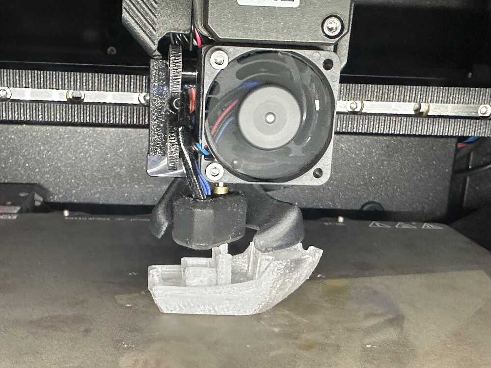
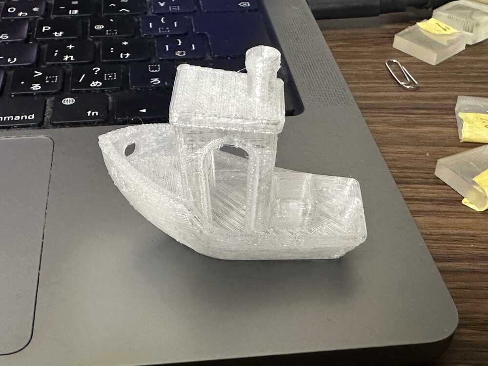
Visualize "3D Benchy" printing data
With revising the printer-serial to the new version, I also tried to gather printing log of 3D Benchy.
 |
 |
 |
First, reding temp data of benchy printing.
df_temp = get_printer_temp_data('./datasets/printer_data_temperature_benchy.txt')
#df_printer = pd.merge(df_temp,df_pos,on='logtime',how='inner')
df_temp['timestamp'] = pd.to_datetime(df_temp['logtime'])
Next, reding position data of benchy printing.
df_pos = get_printer_pos_data('./datasets/printer_data_position_benchy.txt')
df_pos['timestamp'] = pd.to_datetime(df_pos['logtime'])
OK, let's visualize Changes in temperature and nozzle fan power
import matplotlib.pyplot as plt

nozzle_temp = df_temp['nozzle_temp_current']
hotend_power = df_temp['hotend_power']

bed_temp = df_temp['bed_temp_current']
bed_heater_power = df_temp['bed_heater_power']
hotend_fan_power = df_temp['hotend_fan_power']
logtime = df_temp['timestamp']

fig,ax1 = plt.subplots(figsize=(4,3))
ax2 = ax1.twinx()

ax1.plot(logtime,nozzle_temp,label="nozzle_temp",color="tab:red")
ax2.plot(logtime,hotend_power,label="hotend_power",color="tab:orange")
ax2.plot(logtime,hotend_fan_power,label="hotend_fan_power",color="tab:blue")

ax1.set_ylim(top=260.0)
ax1.set_ylim(bottom=0.0)
ax2.set_ylim(top=110)
ax2.set_ylim(bottom=0.0)

plt.title("nozzle_temp,hotend_power and hotend_fan_power")
plt.legend(bbox_to_anchor=(1.05, 1), loc='upper left', borderaxespad=0, fontsize='x-small')
plt.show()

fig,ax1 = plt.subplots(figsize=(4,3))
ax2 = ax1.twinx()

ax1.plot(logtime,bed_temp,label="bed_temp",color="tab:red")
ax2.plot(logtime,bed_heater_power,label="bed_heater_power",color="tab:orange")

ax1.set_ylim(top=150.0)
ax1.set_ylim(bottom=0.0)
ax2.set_ylim(top=100)
ax2.set_ylim(bottom=0.0)

plt.title("bed_temp,bed_heater_power")
plt.show()

Let's 3D plotting
fig = plt.figure(figsize=(5,5))
ax = fig.add_subplot(projection='3d')

x_pos = df_pos['X_pos']
y_pos = df_pos['Y_pos']
z_pos = df_pos['Z_pos']
e_pos = df_pos['E_pos']

#d_values = df_pos['timestamp'] #.astype(int) / 10**9
d_valnes = df_temp['heatbreak_temp_current']

ax.scatter(x_pos,y_pos,z_pos,c=e_pos,cmap='viridis',s=1)
ax.set_xlim(75.0,175.0)
ax.set_ylim(75.0,175.0)
ax.set_zlim(0.0,75.0)

ax.set_xlabel('X_pos')
ax.set_ylabel('Y_pos')
ax.set_zlabel('Z_pos')

plt.show()

Also, let plotting the transition of Extruder position.
fig,ax1 = plt.subplots(figsize=(5,3))

e_pos = df_pos['E_pos']
logtime = df_pos['timestamp']
ax1.scatter(logtime,e_pos,label="e_pos",c=df_,cmap="plasma",s=10)

ax1.set_ylim(top=120.0)
ax1.set_ylim(bottom=-1.0)

plt.show()

fig = plt.figure(figsize=(5,4))
fig.suptitle('x,y,z position and endeffector position')

plt.subplot(2,2,1)
plt.scatter(x_pos,y_pos,c=e_pos,cmap="plasma",s=5)
plt.xlim(75,175)
plt.ylim(75,175)
plt.title("x_pos,y_pos")

plt.subplot(2,2,2)
plt.scatter(x_pos,z_pos,c=e_pos,cmap="plasma",s=5)
plt.xlim(75,180)
plt.ylim(0,75)
plt.title("x_pos,z_pos")

plt.subplot(2,2,3)
plt.scatter(y_pos,z_pos,c=e_pos,cmap="plasma",s=5)
plt.xlim(75,150)
plt.ylim(0,75)
plt.title("y_pos,z_pos")

plt.show()
