Week 03-01: Probability
Assignment:
- Investigate the probability distribution of your data
- Set up template notebooks and slides for your data set analysis
Function of Read Print Log Data
import pandas as pd
import numpy as np
import matplotlib.pyplot as plt
from datetime import datetime,timedelta,timezone
From this assignment, I moved the Printer Log function to "ReadPrusaLog.py" as module. I could load my moduled python file as written follow:
import ReadPrusaLog as rpl
Then, read each log data and integrate into one Data Frame.
## benchy
df_temp_benchy = rpl.get_printer_temp_data('./datasets/printer_data_temperature_benchy.txt')
df_pos_benchy = rpl.get_printer_pos_data('./datasets/printer_data_position_benchy.txt')
df_benchy = pd.merge(df_pos_benchy,df_temp_benchy,on='timestamp',how="inner")
df_benchy = df_benchy.query('timestamp >= "2025/11/24 21:28:06" & timestamp <= "2025/11/24 22:14:24"')
df_benchy.loc[:,'filament'] = 1
df_benchy.loc[:,'lastdry'] = 7
df_benchy.loc[:,'model'] = 1

timestamp = df_benchy['ts_nano_x'].to_numpy()
ts_diff = np.diff(timestamp)
ts_diff = np.insert(ts_diff,0,0)
ts_sum = np.cumsum(ts_diff)
df_benchy.loc[:,'ts_sum'] = ts_sum

x = df_benchy['X_pos'].to_numpy()
y = df_benchy['X_pos'].to_numpy()
t = df_benchy['ts_sum'].to_numpy()

dx = np.diff(x)
dy = np.diff(y)
dt = np.diff(t)
dt = np.insert(dt,0,0)
dist = np.sqrt(dx*dx + dy*dy)
dist = np.insert(dist,0,0)
eps = 1e-9
dt = np.where(dt < eps, eps, dt)
speed = dist / dt

print(x.shape,dist.shape,speed.shape)
df_benchy['dist'] = dist
df_benchy['speed'] = speed


## dimensions
df_temp_dimensions = rpl.get_printer_temp_data('./experiments/printer_data_temp_dimensions.txt')
df_pos_dimensions = rpl.get_printer_pos_data('./experiments/printer_data_position_dimensions.txt')
df_dimensions = pd.merge(df_pos_dimensions,df_temp_dimensions,on='timestamp',how='inner')
df_dimensions = df_dimensions.query('timestamp >= "2025/12/01 10:33:50" & timestamp <= "2025/12/01 10:50:46"')
df_dimensions.loc[:,'filament'] = 1
df_dimensions.loc[:,'lastdry'] = 14
df_dimensions.loc[:,'model'] = 2

timestamp = df_dimensions['ts_nano_x'].to_numpy()
ts_diff = np.diff(timestamp)
ts_diff = np.insert(ts_diff,0,0)
ts_sum = np.cumsum(ts_diff)
df_dimensions.loc[:,'ts_sum'] = ts_sum

x = df_dimensions['X_pos'].to_numpy()
y = df_dimensions['X_pos'].to_numpy()
t = df_dimensions['ts_sum'].to_numpy()

dx = np.diff(x)
dy = np.diff(y)
dt = np.diff(t)
dt = np.insert(dt,0,0)
dist = np.sqrt(dx*dx + dy*dy)
dist = np.insert(dist,0,0)
eps = 1e-9
dt = np.where(dt < eps, eps, dt)
speed = dist / dt
speed = dist / dt

df_dimensions['dist'] = dist
df_dimensions['speed'] = speed


## finish
df_temp_finish = rpl.get_printer_temp_data('./experiments/printer_data_temp_finish.txt')
df_pos_finish = rpl.get_printer_pos_data('./experiments/printer_data_position_finish.txt')
df_finish = pd.merge(df_pos_finish,df_temp_finish,on='timestamp',how='inner')
df_finish = df_finish.query('timestamp <= "2025/12/01 11:22:00"')
df_finish.loc[:,'filament'] = 1
df_finish.loc[:,'lastdry'] = 14
df_finish.loc[:,'model'] = 3

timestamp = df_finish['ts_nano_x'].to_numpy()
ts_diff = np.diff(timestamp)
ts_diff = np.insert(ts_diff,0,0)
ts_sum = np.cumsum(ts_diff)
df_finish.loc[:,'ts_sum'] = ts_sum

x = df_finish['X_pos'].to_numpy()
y = df_finish['X_pos'].to_numpy()
t = df_finish['ts_sum'].to_numpy()

dx = np.diff(x)
dy = np.diff(y)
dt = np.diff(t)
dt = np.insert(dt,0,0)
dist = np.sqrt(dx*dx + dy*dy)
dist = np.insert(dist,0,0)
eps = 1e-9
dt = np.where(dt < eps, eps, dt)
speed = dist / dt

np.insert(dist,0,0)
np.insert(speed,0,0)
df_finish['dist'] = dist
df_finish['speed'] = speed


df_integrate = pd.concat([df_benchy,df_dimensions,df_finish],ignore_index=True)
(2939,) (2939,) (2939,)
Filter the variables
I will filterd 12 variables ('X_pos','Y_pos','Z_pos','travel_distance','E_pos','e_move','e_total','hotend_temp_current','bed_temp_current','heatbreak_temp_current','hotend_power','bed_heater_power to analyze the probability,) here. Then, save the column name into "fil_col".
df_fil = df_integrate.loc[:,['X_pos','Y_pos','Z_pos','travel_distance','E_pos','e_move','e_total','hotend_temp_current','bed_temp_current','heatbreak_temp_current','hotend_power','bed_heater_power']]
fil_col = df_fil.columns
fil_col
Index(['X_pos', 'Y_pos', 'Z_pos', 'travel_distance', 'E_pos', 'e_move',
       'e_total', 'hotend_temp_current', 'bed_temp_current',
       'heatbreak_temp_current', 'hotend_power', 'bed_heater_power'],
      dtype='object')
Histgram
Here is the code that plotting histgrams of all variables in one time.
newcols = []
row = []

for col in fil_col:

    if len(row) < 3:
        row.append(col)
        if col == fil_col[-1]:
            newcols.append(row)

    else:
        if col == 'hotend_power' or col == "bed_heater_power":
            print(f"{col} has come here. else")
        newcols.append(row)
        row = []
        row.append(col)

plt.figure(figsize=(10,10))
position = 1
for i in range(4):
    for j in range(3):

        x = df_fil[newcols[i][j]]
        mean = np.mean(x,0)
        stddev = np.std(x,0)
        plt.subplot(4,3,position)
        plt.hist(x,100,density=True)
        plt.plot(x,0*x,'|',ms=20)
        plt.title(newcols[i][j])
        position = position + 1

        # plot gaussian
        xi = np.linspace(mean - 3*stddev,mean+3*stddev,100)
        yi = np.exp(-(xi-mean)**2/(2*stddev**2))/np.sqrt(2*np.pi*stddev**2)
        plt.plot(xi,yi,'r')

plt.savefig('./notupload/histgrams.png')

It looks...
long tail
Z_pos, travel_distance,
multi-modal
X_pos, Y_pos,Z_pos,e_total,bed_heater_power
- especially, X_pos and Y_pos have some error data.
Gaussian
nearly Gaussian models are
bed_temp_current,hotend_power
Averaging
Here is the code that plotting Averaging process of all variables in one time.
newcols = []
row = []
print(len(fil_col))
for col in fil_col:

    if len(row) < 3:
        row.append(col)
        if col == fil_col[-1]:
            newcols.append(row)

    else:
        if col == 'hotend_power' or col == "bed_heater_power":
            print(f"{col} has come here. else")
        newcols.append(row)
        row = []
        row.append(col)

plt.figure(figsize=(10,10))
position = 1
for i in range(4):
    for j in range(3):

        x = df_fil[newcols[i][j]]
        mean = np.mean(x)
        stddev = np.std(x)
        trials = 100
        points = np.arange(10,1000,100)
        means = np.zeros((100,len(points)))

        for k,N in enumerate(points):
            for t in range(trials):
                sample = np.random.choice(x,size=N,replace=False)
                means[t,k] = np.mean(sample)

        plt.subplot(4,3,position)
        plt.plot(points,mean+stddev/np.sqrt(points), 'r', label='calculated')
        plt.plot(points,mean-stddev/np.sqrt(points),'r')

        mean = np.mean(means,0)
        stddev = np.std(means,0)
        plt.errorbar(points,mean,yerr=stddev,fmt='k-o',capsize=7,label="estimated")

        for point in range(len(points)):
            plt.plot(np.full(trials,points[point]),means[:,point],'o',markersize=2)

        plt.xlabel("number of sample averaged")
        plt.ylabel(f"mean estimated of {newcols[i][j]}")

        position = position + 1

plt.tight_layout()
plt.show()
#plt.savefig('./notupload/averaging.png')"""
12

This graph visualizes how the data converges toward the mean with each successive averaging step.
Furthermore, this graph can visualize the degree of data skew. For example, it shows a scatter of data points toward negative values for e_move, and for travel_distance, it indicates the presence of outliers near +100.
Correlation Analysis
When people hear “statistics,” they usually think of various tests (like t-tests and chi-squared tests), correlation analysis, and regression analysis. Here, as my concern, I wanted to understand the correlation between each variable I selected, so I analyzed them using the scipy library. For the correlation coefficient, I used Spearman's rank correlation coefficient.
from scipy.stats import spearmanr
import numpy as np
import seaborn as sns

cols = df_fil.columns

cormatrix = pd.DataFrame(index=cols,columns=cols,dtype=float)
p_val_matrix = pd.DataFrame(index=cols,columns=cols,dtype=float)

for colx in cols:
    for coly in cols:
        if colx == coly:
            cormatrix.loc[colx,coly] = 1.0
            p_val_matrix.loc[colx,coly] = 1.0
        elif(pd.isna(cormatrix.loc[colx,coly])):
            corr_coef,p_value = spearmanr(df_fil[colx],df_fil[coly])

            cormatrix.loc[colx,coly] = corr_coef
            cormatrix.loc[coly,colx] = corr_coef
            p_val_matrix.loc[colx,coly] = p_value
            p_val_matrix.loc[coly,colx] = p_value

plt.figure(figsize=(10,8))
sns.heatmap(p_val_matrix,annot=True,annot_kws={"size": 6},cmap="binary_r",vmin=0.0,vmax=0.05)
plt.title("p-value of spearman correlation in all variables")
plt.tight_layout()
plt.savefig('./images/sp-pval.png')

plt.figure(figsize=(10,8))
sns.heatmap(cormatrix,annot=True,annot_kws={"size": 6}, cmap="coolwarm",vmin=-1.0,vmax=1.0)
plt.title("co-efficience of spearman correlation in all variables")
plt.tight_layout()
plt.savefig('./images/spearman.png')


The first heatmap visualizes the significance level (p-value) of Spearman's correlation. It uses a gradient for 0.00 < p < 0.05, becoming darker as it approaches zero and lighter for combinations exceeding 0.05. Darker areas indicate statistically significant differences.
The second heatmap visualizes the correlation coefficients for each variable. For Spearman's correlation, the coefficient ranges from -1 to 1. Here, areas with stronger positive correlations appear red, while areas with stronger negative correlations appear blue.
Multidimensional distribution
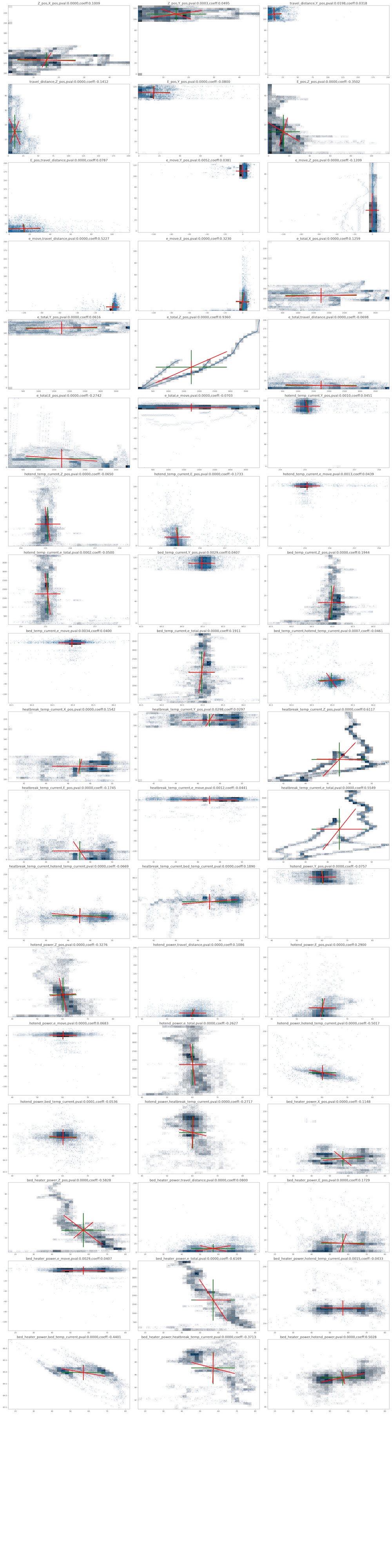
With referring Neil's code, I wrote a code to plot variance-covariance of each variable pairs. The targets are limited to the pair which the p-valne of spearman correlation were p < 0.05 as above.
cols = df_fil.columns

check_conb = []
for colx in cols:
    for coly in cols:
        if colx == coly:
            continue

        p = p_val_matrix.at[colx,coly]

        if p < 0.05:
            coeff = cormatrix.at[colx,coly]
            check_conb.append([colx,coly,p,coeff])
        for r in check_conb:
            if r[0] == coly and r[1] == colx:
                check_conb.remove(r)
position = 1

plt.figure(figsize=(30,120))
for r in check_conb:

    a = df_fil[r[0]].to_numpy()
    b = df_fil[r[1]].to_numpy()

    #a = df_fil['bed_temp_current'].to_numpy()
    #b = df_fil['bed_heater_power'].to_numpy()

    samples = np.column_stack((a,b))

    varmean = np.mean(samples,axis=0)
    varstd = np.sqrt(np.var(samples,axis=0))
    varplotx = [varmean[0]-varstd[0],varmean[0]+varstd[0],None,varmean[0],varmean[0]]
    varploty = [varmean[1],varmean[1],None,varmean[1]-varstd[1],varmean[1]+varstd[1]]

    covarmean = np.mean(samples,axis=0)
    covar = np.cov(samples,rowvar=False)
    evalu,evect = np.linalg.eig(covar)
    dx0 = evect[0,0] * np.sqrt(evalu[0])
    dx1 = evect[1,0] * np.sqrt(evalu[1])
    dy0 = evect[0,1] * np.sqrt(evalu[0])
    dy1 = evect[1,1] * np.sqrt(evalu[1])
    covarplotx = [covarmean[0]-dx0,covarmean[0]+dx0,None,covarmean[0]-dx1,covarmean[0]+dx1]
    covarploty = [covarmean[1]+dy0,covarmean[1]-dy0,None,covarmean[1]+dy1,covarmean[1]-dy1]
    #
    # plot and print
    #

    #plt.figure(figsize=(50,50))
    #plt.subplot(20,3,position)

    #plt.hist2d(samples[:,0],samples[:,1],bins=30,cmap='binary')
    #plt.plot(samples[:,0],samples[:,1],'o',markersize=1.5,alpha=0.3)
    #plt.plot(varmean[0],varmean[1],'go')
    #plt.plot(covarmean[0],covarmean[1],'ro')
    #plt.plot(varplotx,varploty,'g',lw=4)
    #plt.plot(covarplotx,covarploty,'r',lw=4)
    #plt.text(2.5,-4,"variance",fontsize=15)
    #plt.text(-1.25,8.5,"covariance",fontsize=15)
    #plt.axis('off')
    #plt.title(f"{r[0]},{r[1]},pval:{r[2]:.4f},coeff:{r[3]:.4f}",fontsize=18)
    position = position + 1

#plt.tight_layout()
#plt.savefig('./notupload/covariance.png')
#plt.show()
<Figure size 3000x12000 with 0 Axes>
The graph size was so huge, so I move png file in another place. Here is the graph images of each pair's multidimensional distributions.
Entropy
import numpy as np
import matplotlib.pyplot as plt

cols = df_fil.columns
nbins = 512

def entropy(dist):
    index = np.where(dist > 0) # 0 log(0) = 0
    positives = dist[index]
    return -np.sum(positives*np.log2(positives))

for col in cols:

    x = df_fil[col].to_numpy()
    xhist,xedges = np.histogram(x,nbins)
    xdist = xhist/np.sum(xhist)
    Hx = entropy(xdist)

    print(f"{col} entropy: {Hx:.1f} bits")
X_pos entropy: 7.1 bits
Y_pos entropy: 6.5 bits
Z_pos entropy: 7.2 bits
travel_distance entropy: 6.0 bits
E_pos entropy: 7.1 bits
e_move entropy: 4.8 bits
e_total entropy: 8.8 bits
hotend_temp_current entropy: 5.4 bits
bed_temp_current entropy: 6.5 bits
heatbreak_temp_current entropy: 8.4 bits
hotend_power entropy: 5.6 bits
bed_heater_power entropy: 6.7 bits
mutual information
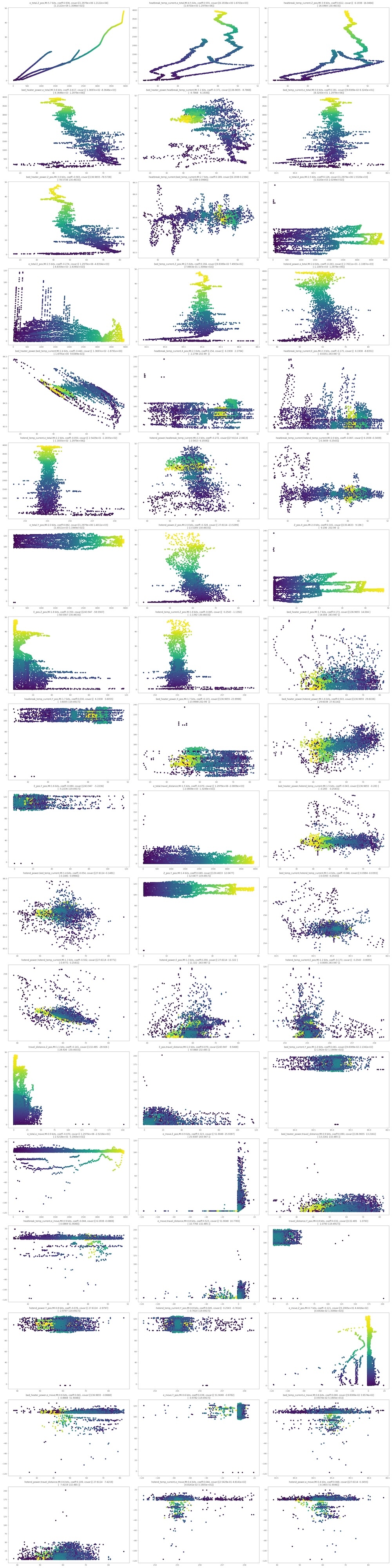
Here is one of my interested part. I calculated mutual information (base of logarithm = 2) of all pairs of variables. Ranking of IM and scatter graph are presented:
nbins = 256
# 1 dimension entropy
def entropy(dist):
    index = np.where(dist > 0) # o log(0) = 0
    positives = dist[index]
    return -np.sum(positives*np.log2(positives))

# 2 dimension entropy
def entropy2(dist):
    indexx,indexy = np.where(dist > 0) # 0 log(0) = 0
    positives = dist[indexx,indexy]
    return -np.sum(positives*np.log2(positives))

# information
def information(x,y):
    xhist,xedges = np.histogram(x,nbins)
    xdist = xhist/np.sum(xhist)
    yhist,yedges = np.histogram(y,nbins)
    ydist = yhist/np.sum(yhist)
    xyhist,xedges,yedges = np.histogram2d(x,y,[nbins,nbins])
    xydist = xyhist/np.sum(xyhist)
    Hx = entropy(xdist)
    Hy = entropy(ydist)
    Hxy = entropy2(xydist)

    return Hx+Hy-Hxy
position = 1
np.set_printoptions(precision=4)

t = df_integrate['ts_sum'].to_numpy()
results = []
#plt.figure(figsize=(30,120))
for r in check_conb:

    x = df_fil[r[0]].to_numpy()
    y = df_fil[r[1]].to_numpy()

    samples = np.column_stack((x,y))
    covar = np.cov(samples,rowvar=False)
    #print(f"{npts:.0e} points")
    #print(f"covariance:\n{covar}")

    #plt.subplot(18,3,position)
    I = information(x,y)
    #plt.scatter(x,y,c=t,cmap="viridis")
    #plt.title(f"{r[0]},{r[1]} mutual information: {I:.1f} bits, coeff: {r[3]:.3f}",fontsize=14)

    results.append([r[0],r[1],r[2],r[3],I,covar])


#plt.tight_layout()
#plt.savefig('./notupload/mi.png')
#plt.show()

pd.set_option('display.float_format', '{:.8f}'.format)
im_df = pd.DataFrame(results)
im_df.columns = ['val1','val2','p-val','coeff','IM','covar']
im_df = im_df.sort_values('IM',ascending=False)
im_df = im_df.round(4)
im_df.to_csv('./notupload/imrank.csv')

im_df.head(15)
#position = 1
#fig = plt.figure(figsize=(30,120))
#fig.patch.set_facecolor('black')
#for i,row in im_df.iterrows():
#    val1 = row['val1']
#    val2 = row['val2']
#    im = row['IM']
#    coeff = row['coeff']
#    covar = row['covar']

#    x = df_fil[val1].to_numpy()
#    y = df_fil[val2].to_numpy()
#    fig.add_subplot(18,3,position)
#    fig.set_facecolor('black')
#    plt.rcParams["axes.facecolor"] = (0,0,0,0)
#    plt.rcParams["axes.edgecolor"] = 'white'
#    plt.scatter(x,y,c=t,cmap="viridis")
#    plt.xlabel(f"{val1}",color='white')
#    plt.ylabel(f"{val2}",color='white')
#    plt.title(f"{val1},{val2},MI:{im:.1f} bits, coeff:{coeff:.3f}",color="white")
#
#    position = position + 1

#plt.tight_layout()
#plt.savefig('./notupload/mi.png')
#plt.show()
| val1 | val2 | p-val | coeff | IM | covar | |
|---|---|---|---|---|---|---|
| 13 | e_total | Z_pos | 0.00000000 | 0.93600000 | 5.69410000 | [[1297907.7757086142, 12121.721187275889], [12... |
| 32 | heatbreak_temp_current | e_total | 0.00000000 | 0.55490000 | 4.46010000 | [[6.19381986068496, 1670.2543226619944], [1670... |
| 29 | heatbreak_temp_current | Z_pos | 0.00000000 | 0.61170000 | 3.91000000 | [[6.19381986068496, 16.046378273480375], [16.0... |
| 49 | bed_heater_power | e_total | 0.00000000 | -0.61690000 | 3.61900000 | [[136.96546159525406, -8364.551521354653], [-8... |
| 52 | bed_heater_power | heatbreak_temp_current | 0.00000000 | -0.37130000 | 3.06380000 | [[136.96546159525406, -9.786807226924289], [-9... |
| 25 | bed_temp_current | e_total | 0.00000000 | 0.19110000 | 3.04820000 | [[0.09838910810686095, 83.24294388323463], [83... |
| 45 | bed_heater_power | Z_pos | 0.00000000 | -0.58280000 | 3.02880000 | [[136.96546159525406, -78.57378435063127], [-7... |
| 34 | heatbreak_temp_current | bed_temp_current | 0.00000000 | 0.18900000 | 2.68950000 | [[6.19381986068496, 0.2384060323206829], [0.23... |
| 11 | e_total | X_pos | 0.00000000 | 0.12590000 | 2.54290000 | [[1297907.7757086142, 1531.9676196317537], [15... |
| 15 | e_total | E_pos | 0.00000000 | -0.27420000 | 2.51500000 | [[1297907.7757086142, -4835.354866283121], [-4... |
| 23 | bed_temp_current | Z_pos | 0.00000000 | 0.19440000 | 2.47590000 | [[0.09838910810686095, 0.7490321442019644], [0... |
| 40 | hotend_power | e_total | 0.00000000 | -0.26270000 | 2.39770000 | [[27.61142439353685, -1108.7116372445173], [-1... |
| 51 | bed_heater_power | bed_temp_current | 0.00000000 | -0.44010000 | 2.37590000 | [[136.96546159525406, -1.8790927659665624], [-... |
| 27 | heatbreak_temp_current | X_pos | 0.00000000 | 0.15420000 | 2.30330000 | [[6.19381986068496, 2.2794016779431776], [2.27... |
| 30 | heatbreak_temp_current | E_pos | 0.00000000 | -0.17450000 | 2.29540000 | [[6.19381986068496, -8.835066926660494], [-8.8... |
From the ranking, it was found out that total extruder movement(e_total) and Z_pos are the most co-related pair (MI:5.69 bit, spearman=0.93). But, this is quite natural. This reflects the perfectly natural phenomenon that as the printer's vertical axis increases, so does filament usage.
More significant points is that a couple of parameters related to temperture cotrols are co-related. For example,rank 2 is the pair of heatbreak_temp and e_total, MI:4.46 bits and spearman=0.55, and rank 4 is the pair of bed_power and e_total, MI:3.62 and spearman = -0.62.
These findings suggest that temperature serves as a hidden variable explaining the extruder's extrusion behavior.
The following suggests the scatter plots of each pairs, ordered as above ranking.