< Home
Week 1 - 1st Class: Introduction
I decided to join the training 1-day before classes started, and I received my accounts details just on November 22nd. Thus, I've got a week delay on setting up my access to git lab, jupiter and mattermost. The good thing... I was able to join classes, but I need to put an extra effort to accomplish the assigments prior to finish the second week
What is Data Science?
In a simple definition "Data science = use data to understand, explain and forecast things within real world": It requires three main things
Critial Thinking (to formulate questions, hypothesis and testsing)
Statistics (To describe and understand patterns)
Programing (To automate, reproduce, testing) Data Science is not only coding, is a way to research using data as evidence
Data Science Pipeline: Stablishing the research question → Getting Data → Explore / Clean (prepare) data → Model → Comunicate results
Data is not perfect, comes with noise, uncertainty and variability. Not every pattern is real, Not all data is reliable and our mission is to separate what matters from what gets in the way.
Graphics (visualization) matters: graphics forms shows how a phenomena distributes, such as an hystogram tell us “how many data is contain within a range” or a Normal Distribution Curve (Gaussian Curve) shows us which is typical vs atypical.
Tools for this class
- Jupyter Notebook: Platform that alllows to work with text, code and graphics, applied to learn, experiment and document
- Phyton: Coding language, a global standar to analyse, IA and data science.
- Git / GitLab: Open-source distributed version control system (DVCS) use to keep documentation and traceability
Jupiter Recognition
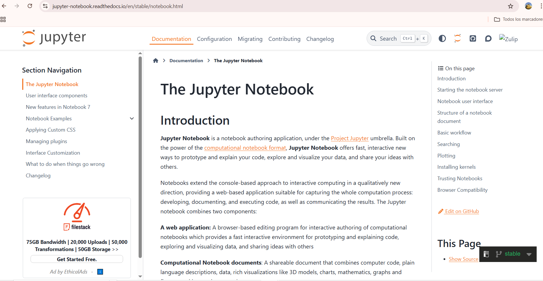
First, I wanted to know about Jupiter Platform, What it is and what We can do with it. I visited Jupiter official platform Basically, this is a browser-base application that allows to run computational coding, and arranging them as notebooks, similar to notion. Thus, we can prototype, explain and run code, and visualize data.
Within the JupiterLab desktop we can find a control board with three sections: The notebook, The console and Others. The first one generates some kind of a file similar to a notebook with .ipynb extension
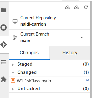
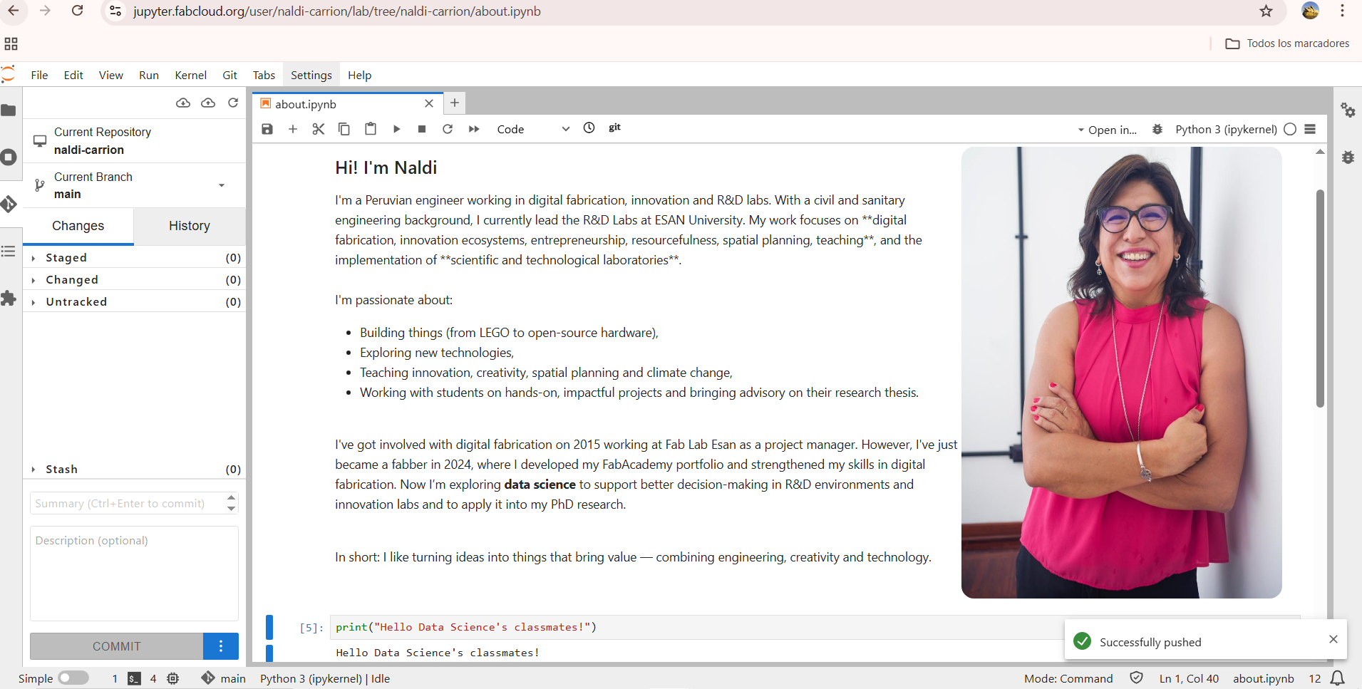
In this platform we can also run python, allowing to see the commands use and also preview outputs. Jupiter platform in this case is also linked with git-lab, in this way our work could be published, generating our personal web pages. This practically replace the use of Git Bash, that I use during the FabAcademy program to commit the programing process develop in html to generate my web page.
Starting My Web Page
I started getting into JupiterLab desktop we can find a control board with three sections: The notebook, The console and Others. The first one generates some kind of a file similar to a notebook with .ipynb extension. Then I get into the file naldi-carrion
I started by modifying the page to present me
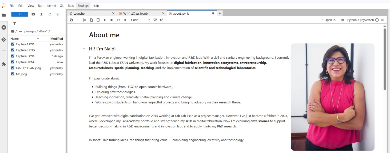
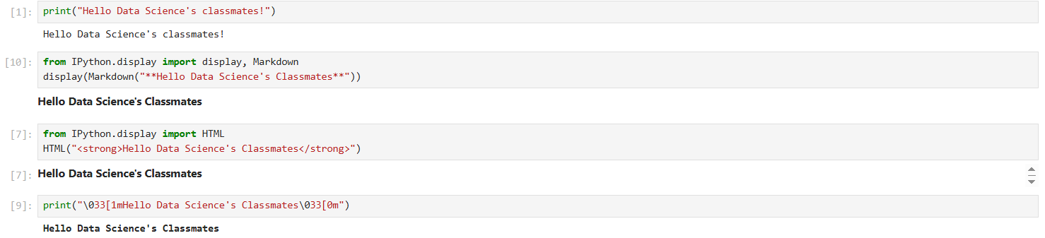
As you can see I used "from IPython.display import (XXXX)" to ask Jupiter to import from the Iphython module a special class, in this case Markdown, HTML and ANSI
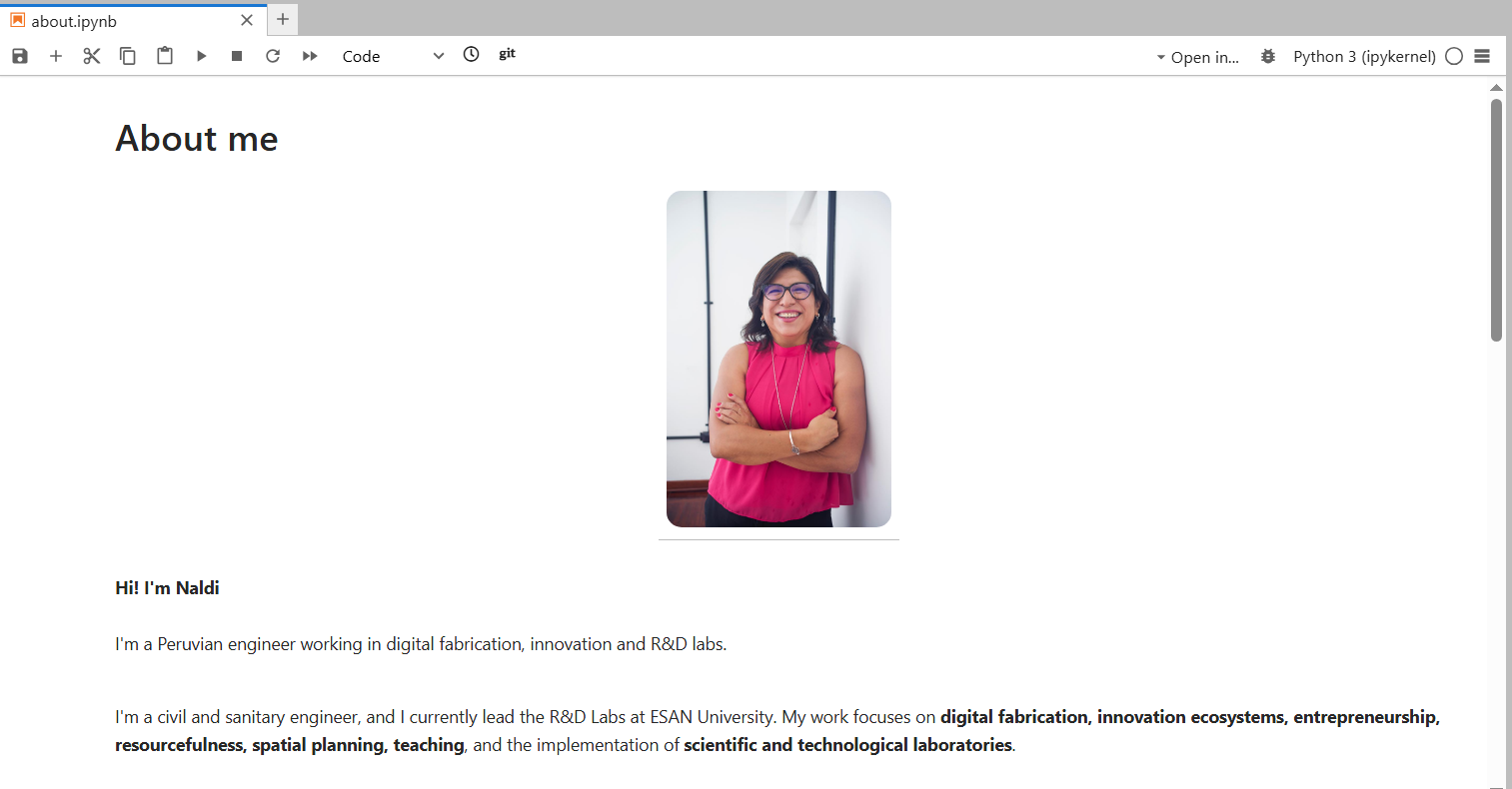
- Recognizing that I could use markdown and HTML, I decided to upload a photo using only markdown. Initially it appeared in the middle of the web page, so I decided to import HTML within the notebook to allign the photo with the text.
Below you can see both codes I used:
| Method | Code snippet |
|---|---|
| Markdown |  |
| HTML | <div style="display:flex; ..."> |
Here is the full HTML code I used:
<div style="display:flex; align-items:flex-start; gap:30px;">
  <div style="flex:1;">
    Your text here...
  </div>
  <img src="images/Week1/Me.jpeg" width="360" style="border-radius:14px;">
</div>
 |
 |
|---|
Python Coding
Here, I wanted to use python in different forms to program a message with different styles. I used python then I display markdown in python, html, and also ANSI. To do that I ask chatGPT using the following quote in spanish, my mother tonge: "quiero colocar el mensaje "Hello Data Science's Classmates" programado en Python pero para que lo ejecute en los formatos de texto tipo markdown, html y ANSI"
Python allows us to graphic lines, hystograms, dispersion, distribution, and also run calculation like Chi Square. Each type of chart answers different questions, thus, cisualization is our tool for "seeing" patterns. A data scientist doesn't just calculate; they explain with a clear image.
With a simple chart, we could represent a relationship or a trend. I could use the matpltlib lybrary to plot a simple relationship:
- X-axis values: 1, 2, 3
- Y-axis values: 1, 4, 9
Thus, we can graph (x, y) points: (1,1) (2,4) (3,9); connecting them with a line. The line is a model, a way to explain how one variable affects another. Thus, We use models to explain and predict.
import matplotlib.pyplot as plt
plt.plot([1,2,3],[1,4,9])
[<matplotlib.lines.Line2D at 0xff0c5750ae90>]

If we analyse this plot, we can detect that the two variables move together. There is a clear upward trend, X increases, Y also increases. The line is not flat (the change is not linear), not random — it increases fast.
From 1 → 2, Y goes 1 → 4 (difference = 3)
From 2 → 3, Y goes 4 → 9 (difference = 5)
The jumps get bigger, Y grows faster than X, the relationship is curved, not straight and looks like a quadratic pattern (Y = X²), so we visualized a mathematical relationship without needing equations.
- Using python in data science help us to interact with data step by step, like in the following example where we are just printing a data range
for i in range(10):
    print(i)
0
1
2
3
4
5
6
7
8
9
- We can also manage randomness, by generating synthetic data to practice, experiment, or test methods without using real data. Simulating data helps us learn without relying on a real dataset. Randomness ≠ chaos → has patterns we can study.
import numpy as np
np.random.normal(0,1,100)
array([ 0.3506726 , -0.83583006,  0.76272482,  0.48018963, -2.54629442,
       -0.5918361 ,  2.18304991,  0.58848976,  0.071266  , -1.41486583,
        0.30995601, -1.0946263 , -0.53551269,  0.31987047,  0.30807121,
       -1.28938332, -0.59413402, -1.18848491, -2.36096943,  0.93631563,
        1.85030442, -1.97256072, -1.68456577, -0.29264368, -0.66736275,
       -1.7790984 ,  0.39327759,  0.48619656, -0.22720721, -0.48558132,
        0.67771363,  0.17129805,  0.83560597,  1.02062074, -0.71544845,
       -0.4190301 , -0.0605418 ,  0.57737237, -0.17118764, -0.01978865,
       -1.12283595, -0.21215617,  1.49281546,  0.54592916, -0.29780621,
       -0.81652025, -0.03935129,  0.75145946, -0.37822885,  0.59139256,
        1.08444977,  0.94717464,  1.62427236, -1.31175625,  0.97089804,
       -0.13304013, -1.45097419, -0.08566624, -1.62543882, -0.48121985,
       -0.49799397, -0.65543405,  0.62828053,  0.27237157, -0.69337238,
       -0.70420475, -1.33997979,  0.73235639, -0.1688307 , -0.93137943,
        2.07311083, -0.61682299, -0.46247637,  0.2246917 ,  1.39633139,
       -0.20053473,  1.09769958, -0.34527879, -0.76862151,  0.67010458,
       -0.75429663,  0.20942765,  0.34234729,  0.70059763,  2.73092362,
       -0.96274864, -1.28553916, -0.24794771, -0.92610688, -0.99788375,
        1.03951334,  0.19521848,  0.62648036, -0.31735955, -0.77824032,
        1.41394763,  1.18001463,  0.99726388, -0.43191852,  0.19709236])
Here, we are calling NumPy library (np), asking to generate fake (simulated) data that follows a normal distribution np.random.normal (mean , std , quantity)
- Mean = 0 → the center of the bell curve
- Std = 1 → how spread out the data is (standard deviation)
- Quantity = 100 → number of data points to generate
We are generating 100 random numbers, centered on 0, distributed like a normal bell curve.
- We can also interpretate variability (Variance, Mean, Dispersion), When using bins or vertical bars, the message is Data are groups, not exact values. Thus we need to learn how to describe them with simple measures:
- Mean
- Median
- Minimum
- Maximum
- Range
- Standard deviation
JavaScript Coding
- In the case of JavaScript, runs at the FrotEnd, Thus I look for some examples at Developer Mozilla WebPage. I used the example of Alert Funtion (instance methods). However, we're working within IPython, so we need to use kind of “magic commands”, that allow to execute instructions within a coding cell. There are two types:
- %magic → to sent instructions for one line within a cell
- %%magic → to sent instructions that applies to the whole cell In this case we will use %%
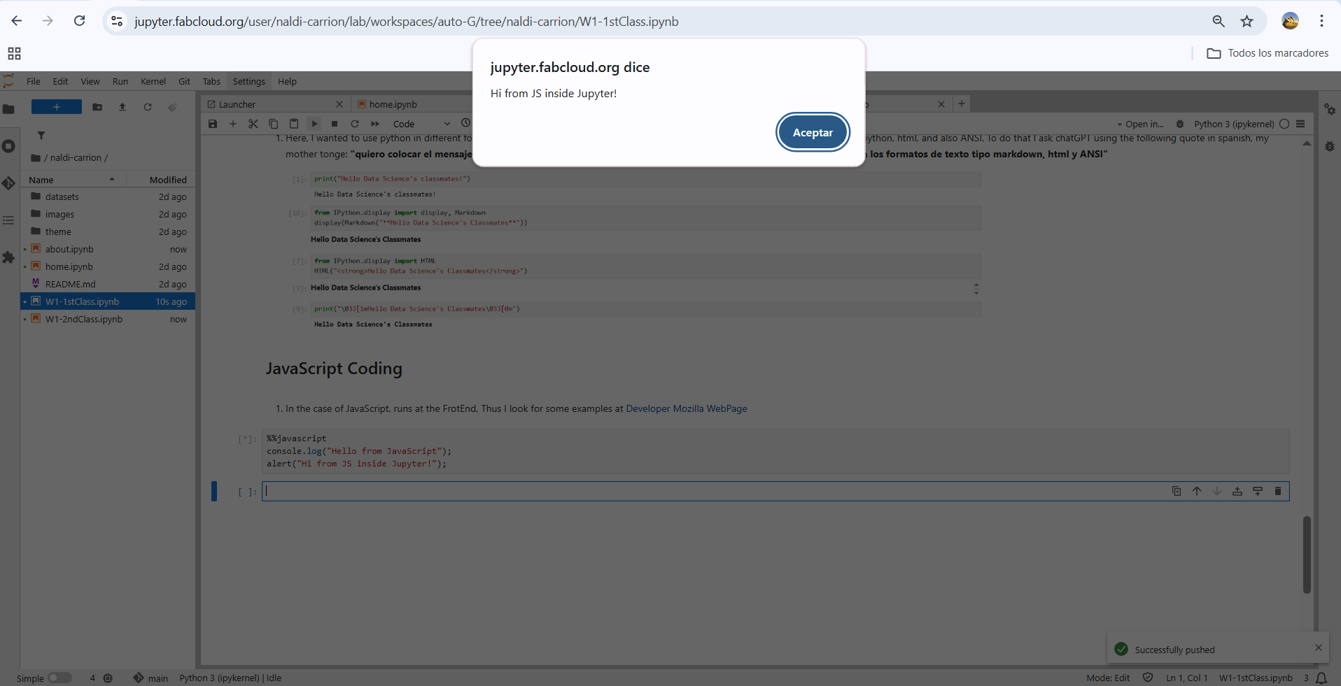
%%javascript
console.log("Hello from JavaScript");
alert("Hi from JS inside Jupyter!");
When I executed the commands; this was the result