< Home

First Appplication: My Thesis Pilot Data
1. Loading the pilot survey data
I wanted to use my thesis pilot data to run a plot and visualise some charateristics related with entrepreneurs. Thus, I need to upload it the file with CSV extention and then be sur that is recognising the data. At the begining I have a problem visualizing the table, because I used a "," instead of ";"
The dataset comes from the pilot survey with entrepreneurs and is stored as a CSV file.
- File:
datasets/2nd_Class_Assignmt_Data/Entrepreneurs.csv - Separator: semicolon (
;)
Each row is one entrepreneur, each column is an item or variable (socio-demographic, FRUG, BRIC, INNOV, etc.).
import pandas as pd

df = pd.read_csv("datasets/2nd_Class_Assignmt_Data/Entrepreneurs.csv", sep=",")
df.head()
| Marca temporal;NOM;GEN;EAGE;FOUND;CAGE1;AFOUND;CBASED;CSECT;EEXP;EEDUC;INVT;MNGEXP;WEXP;SEBCK;FRUG1;FRUG2;FRUG3;FRUG4;FRUG5;FRUG6;FRUG7;BRIC1;BRIC2;BRIC3;BRIC4;BRIC5;BRIC6;BRIC7;BRIC8;INNOV1;INNOV2;INNOV3;INNOV4;CAGE2;TECHBS;ETEAM;EAOS;SEEDF;OPERF;INCC | |
|---|---|
| 0 | 4/4/2025 18:10:28;iFurniture ;2;35;1;2;1;2;9;1... |
| 1 | 4/6/2025 13:09:46;Salvy Natural - Indes Perú ;... |
| 2 | 4/7/2025 16:07:37;AVR Technology;1;23;1;2;1;2;... |
| 3 | 4/7/2025 21:49:59;AIO SENSORS ;1;32;1;1;1;3;9;... |
| 4 | 4/8/2025 17:54:07;Face Me;1;30;1;2;1;3;5;0;1;1... |
2. I corrected the code and everything runs smoothly
import pandas as pd

df = pd.read_csv("datasets/2nd_Class_Assignmt_Data/Entrepreneurs.csv", sep=";")
df.head()
| Marca temporal | NOM | GEN | EAGE | FOUND | CAGE1 | AFOUND | CBASED | CSECT | EEXP | ... | INNOV2 | INNOV3 | INNOV4 | CAGE2 | TECHBS | ETEAM | EAOS | SEEDF | OPERF | INCC | |
|---|---|---|---|---|---|---|---|---|---|---|---|---|---|---|---|---|---|---|---|---|---|
| 0 | 4/4/2025 18:10:28 | iFurniture | 2 | 35 | 1 | 2 | 1 | 2 | 9 | 1 | ... | 4 | 2 | 4 | 1 | 1 | 1 | 1 | 1 | 1 | 1 |
| 1 | 4/6/2025 13:09:46 | Salvy Natural - Indes Perú | 2 | 37 | 1 | 2 | 1 | 2 | 12 | 1 | ... | 5 | 5 | 5 | 1 | 1 | 1 | 1 | 0 | 0 | 0 |
| 2 | 4/7/2025 16:07:37 | AVR Technology | 1 | 23 | 1 | 2 | 1 | 2 | 15 | 0 | ... | 4 | 4 | 4 | 0 | 1 | 1 | 1 | 1 | 1 | 1 |
| 3 | 4/7/2025 21:49:59 | AIO SENSORS | 1 | 32 | 1 | 1 | 1 | 3 | 9 | 0 | ... | 4 | 4 | 4 | 0 | 1 | 1 | 1 | 0 | 1 | 1 |
| 4 | 4/8/2025 17:54:07 | Face Me | 1 | 30 | 1 | 2 | 1 | 3 | 5 | 0 | ... | 4 | 4 | 4 | 1 | 1 | 0 | 1 | 1 | 1 | 1 |
5 rows × 41 columns
3. Now I want to plot an histogram that shows Entrepreneurs' age distribution
import matplotlib.pyplot as plt

plt.figure(figsize=(8,5))
plt.hist(df["EAGE"].dropna(), bins=12, color="teal", edgecolor="black", alpha=0.7)
plt.title("Distribution of Entrepreneur Age", fontsize=14)
plt.xlabel("Age")
plt.ylabel("Frequency")
plt.grid(True, alpha=0.3)
plt.show()

- However, plot's bins did not fit a distribution that allows to determinate ages included. Thus, I define bins segments at the begining and then I linked them with xlabel.
import matplotlib.pyplot as plt
import numpy as np

# Define segmentos (bins)
bins = [20, 25, 30, 35, 40, 45, 50, 55]

plt.figure(figsize=(8,5))
plt.hist(df["EAGE"].dropna(), bins=bins, color="teal", edgecolor="black", alpha=0.7)

# Usar los mismos cortes como etiquetas del eje X
plt.xticks(bins)

plt.title("Distribution of Entrepreneur Age", fontsize=14)
plt.xlabel("Age (bin edges)")
plt.ylabel("Frequency")
plt.grid(True, alpha=0.3)
plt.show()

4. Then I wanted to graphic gender, considering that my data labels are:
- 1 → Male
- 2 → Female
- 3 → Other / Prefer not to say
- I need to instruct to map within the data "gender" and create a new label GEN_label
gender_map = {1: "Male", 2: "Female", 3: "Other"}
df["GEN_label"] = df["GEN"].map(gender_map)
- Then I need to be sure that it is recognising all the data (39 surveyed entrepreneurs), so I used counts instruction
gender_counts = df["GEN_label"].value_counts()
gender_counts
GEN_label
Male      27
Female    12
Name: count, dtype: int64
- Here, I created an histogram
import matplotlib.pyplot as plt

plt.figure(figsize=(7,5))
plt.bar(gender_counts.index, gender_counts.values,
        color=["#4B8BBE", "#F89C74", "#9C27B0"],   # colores bonitos
        edgecolor="black")

plt.title("Entrepreneurs by Gender", fontsize=14)
plt.xlabel("Gender")
plt.ylabel("Count")
plt.grid(axis="y", alpha=0.3)

plt.show()

- I also created a pye graphic
import matplotlib.pyplot as plt

plt.figure(figsize=(6,6))

plt.pie(
    gender_counts,
    labels=gender_counts.index,
    autopct="%1.1f%%",      # muestra porcentajes
    startangle=90,          # inicia desde arriba
    colors=["#4B8BBE", "#F89C74", "#9C27B0"],  # colores elegantes
    explode=[0.03]*len(gender_counts)         # separación ligera de las porciones
)

plt.title("Gender Distribution of Entrepreneurs", fontsize=14)
plt.show()

- Finally, we can try to put all the code togeher in on notebook. Thus I ask ChatGPT in spanish "Bríndame el código para hace que IPython realice el mapeo de los valores númericos referidos a género creando una nueva etiqueta y a partir de esta realice el conteo de los valores de género y con ello pueda graficar un pie chart". I copy and paste the code, however it resulted an error.
# 1. Mapear los valores numéricos de género a etiquetas de texto
gender_map = {1: "Male", 2: "Female", 3: "Other"}
df["GEN_label"] = df["GEN"].map(gender_map)

# 2. Obtener el conteo de cada categoría
gender_counts = df["GEN_label"].value_counts()

# 3. Pie chart (gráfico de pastel)
import matplotlib.pyplot as plt

plt.figure(figsize=(6,6))

plt.pie(
    gender_counts,
    labels=gender_counts.index,
    autopct="%1.1f%%",
    startangle=90,
    colors=["#4B8BBE", "#F89C74", "#9C27B0"],
    explode=[0.05]*len(gender_counts)   # pequeña separación estética
)

plt.title("Gender Distribution of Entrepreneurs", fontsize=14)
plt.show()
---------------------------------------------------------------------------
NameError                                 Traceback (most recent call last)
Cell In[1], line 3
      1 # 1. Mapear los valores numéricos de género a etiquetas de texto
      2 gender_map = {1: "Male", 2: "Female", 3: "Other"}
----> 3 df["GEN_label"] = df["GEN"].map(gender_map)
      5 # 2. Obtener el conteo de cada categoría
      6 gender_counts = df["GEN_label"].value_counts()

NameError: name 'df' is not defined
- Reviewing, I notice that the error refers to "df" that is the DataFrame, menaing that my data was not loaded (called)
import pandas as pd

df = pd.read_csv("datasets/2nd_Class_Assignmt_Data/Entrepreneurs.csv", sep=";")
df.head()

# 1. Mapear los valores numéricos de género a etiquetas de texto
gender_map = {1: "Male", 2: "Female", 3: "Other"}
df["GEN_label"] = df["GEN"].map(gender_map)

# 2. Obtener el conteo de cada categoría
gender_counts = df["GEN_label"].value_counts()

# 3. Pie chart (gráfico de pastel)
import matplotlib.pyplot as plt

plt.figure(figsize=(6,6))

plt.pie(
    gender_counts,
    labels=gender_counts.index,
    autopct="%1.1f%%",
    startangle=90,
    colors=["#4B8BBE", "#F89C74", "#9C27B0"],
    explode=[0.05]*len(gender_counts)   # pequeña separación estética
)

plt.title("Gender Distribution of Entrepreneurs", fontsize=14)
plt.show()

3. Filtering active entrepreneurs
I keep only those respondents who continue actively working on their venture I filtered my data using only those that answered that they continue actively working on their business initiative (AFOUND = 1).:
- Column AFOUND
- ¿Continúas impulsando (trabajando/desarrollando) tu emprendimiento/proyecto?
- Si = 1 (
1= still working on the venture) - No = 0 (
0= not active anymore)
- Si = 1 (
- ¿Continúas impulsando (trabajando/desarrollando) tu emprendimiento/proyecto?
Thus, I need to differenciate between entrepreneurs, those that answered "Yes" and bring intructions to split the data for the análisis. Hence I need to create a data frame (df_active), that will look for those answers that in collum labeled as "AFOUND" contain the number "1". The result is shown in the following box that reduce the answers under analysis to 37, from the 39 that compound my pilot survey. This creates a filtered dataset df_active that I use for the rest of the analysis.
I needed to create a boolean mask, creating a true/false recognition within the AFOUND column list,selecting those meeting the condition. And I have to add copy() to avoid any confusion with the first dataframe
- Here is the first code I used: ```df_active = df[df["AFOUND"] == 1].copy()
- Then I added a line to execute the coding: ```df_active.head(), df_active.shape
# Filter only active founders (AFOUND == 1)
df_active = df[df["AFOUND"] == 1].copy()

print("Shape of active-founders dataset:", df_active.shape)
df_active.head()
Shape of active-founders dataset: (37, 41)
| Marca temporal | NOM | GEN | EAGE | FOUND | CAGE1 | AFOUND | CBASED | CSECT | EEXP | ... | INNOV2 | INNOV3 | INNOV4 | CAGE2 | TECHBS | ETEAM | EAOS | SEEDF | OPERF | INCC | |
|---|---|---|---|---|---|---|---|---|---|---|---|---|---|---|---|---|---|---|---|---|---|
| 0 | 4/4/2025 18:10:28 | iFurniture | 2 | 35 | 1 | 2 | 1 | 2 | 9 | 1 | ... | 4 | 2 | 4 | 1 | 1 | 1 | 1 | 1 | 1 | 1 |
| 1 | 4/6/2025 13:09:46 | Salvy Natural - Indes Perú | 2 | 37 | 1 | 2 | 1 | 2 | 12 | 1 | ... | 5 | 5 | 5 | 1 | 1 | 1 | 1 | 0 | 0 | 0 |
| 2 | 4/7/2025 16:07:37 | AVR Technology | 1 | 23 | 1 | 2 | 1 | 2 | 15 | 0 | ... | 4 | 4 | 4 | 0 | 1 | 1 | 1 | 1 | 1 | 1 |
| 3 | 4/7/2025 21:49:59 | AIO SENSORS | 1 | 32 | 1 | 1 | 1 | 3 | 9 | 0 | ... | 4 | 4 | 4 | 0 | 1 | 1 | 1 | 0 | 1 | 1 |
| 4 | 4/8/2025 17:54:07 | Face Me | 1 | 30 | 1 | 2 | 1 | 3 | 5 | 0 | ... | 4 | 4 | 4 | 1 | 1 | 0 | 1 | 1 | 1 | 1 |
5 rows × 41 columns
4. Building latent-variable mean scores
The questionnaire includes multiple Likert-scale items for each construct:
- Frugality:
FRUG1toFRUG7 - Bricolage:
BRIC1toBRIC8 - Innovative Behaviour:
INNOV1toINNOV4
I compute a simple mean score per respondent for each construct, creating:
FRUG_meanBRIC_meanINNOV_mean
import pandas as pd

df = pd.read_csv("datasets/2nd_Class_Assignmt_Data/Entrepreneurs.csv", sep=";")
df_active = df[df["AFOUND"] == 1].copy()
df_active.head(), df_active.shape

# Listas de items
frug_items  = [f'FRUG{i}' for i in range(1, 8)]
bric_items  = [f'BRIC{i}' for i in range(1, 9)]
innov_items = [f'INNOV{i}' for i in range(1, 5)]

# Mean scores
df_active['FRUG_mean']  = df_active[frug_items].mean(axis=1)
df_active['BRIC_mean']  = df_active[bric_items].mean(axis=1)
df_active['INNOV_mean'] = df_active[innov_items].mean(axis=1)

df_active[['FRUG_mean','BRIC_mean','INNOV_mean']].head()
| FRUG_mean | BRIC_mean | INNOV_mean | |
|---|---|---|---|
| 0 | 5.000000 | 4.125 | 3.25 |
| 1 | 3.571429 | 4.750 | 5.00 |
| 2 | 4.000000 | 4.000 | 4.00 |
| 3 | 4.000000 | 4.375 | 4.00 |
| 4 | 4.285714 | 4.375 | 4.00 |
5. Distributions of latent-variable scores
To see how the constructs are distributed among active entrepreneurs, I plot histograms for each mean score.
import matplotlib.pyplot as plt

plt.figure(figsize=(12, 8))

# FRUG
plt.subplot(3, 1, 1)
plt.hist(df_active['FRUG_mean'], bins=10, edgecolor='black')
plt.title("Frugality (FRUG_mean)")

# BRIC
plt.subplot(3, 1, 2)
plt.hist(df_active['BRIC_mean'], bins=10, edgecolor='black')
plt.title("Bricolage (BRIC_mean)")

# INNOV
plt.subplot(3, 1, 3)
plt.hist(df_active['INNOV_mean'], bins=10, edgecolor='black')
plt.title("Innovation (INNOV_mean)")

plt.tight_layout()
plt.show()

6. Pairwise relationships (scatter plots)
Next, I visualize the pairwise relationships between the constructs:
- Frugality → Bricolage
- Bricolage → Innovation
- Frugality → Innovation
plt.scatter(df_active['FRUG_mean'], df_active['BRIC_mean'])
plt.xlabel("Frugality (FRUG_mean)")
plt.ylabel("Bricolage (BRIC_mean)")
plt.title("Scatterplot: Frugality → Bricolage")
plt.show()

plt.scatter(df_active['BRIC_mean'], df_active['INNOV_mean'])
plt.xlabel("Bricolage (BRIC_mean)")
plt.ylabel("Innovation (INNOV_mean)")
plt.title("Scatterplot: Bricolage → Innovation")
plt.show()

plt.scatter(df_active['FRUG_mean'], df_active['INNOV_mean'])
plt.xlabel("Frugality (FRUG_mean)")
plt.ylabel("Innovation (INNOV_mean)")
plt.title("Scatterplot: Frugality → Innovation")
plt.show()

7. Simple linear fits and R²
For each relationship, I estimate a simple linear regression using numpy.polyfit:
- I obtain the line:
y = a * x + b - I compute and report the R² manually.
- Fitting: Frugality → Bricolage
import numpy as np
import matplotlib.pyplot as plt

# Variables
x = df_active['FRUG_mean']
y = df_active['BRIC_mean']

# Linear fit
coef = np.polyfit(x, y, 1)
model = np.poly1d(coef)

# Plot
plt.scatter(x, y)
plt.plot(x, model(x), color='red')
plt.xlabel("Frugality (FRUG_mean)")
plt.ylabel("Bricolage (BRIC_mean)")
plt.title("Linear Fit: Frugality → Bricolage")
plt.show()

# Print model
coef

array([-0.0251913 , 4.41082375])
- Fitting: Bricolage → Innovation
x = df_active['BRIC_mean']
y = df_active['INNOV_mean']

coef = np.polyfit(x, y, 1)
model = np.poly1d(coef)

plt.scatter(x, y)
plt.plot(x, model(x), color='red')
plt.xlabel("Bricolage (BRIC_mean)")
plt.ylabel("Innovation (INNOV_mean)")
plt.title("Linear Fit: Bricolage → Innovation")
plt.show()

# R²
y_pred = model(x)
SS_res = np.sum((y - y_pred)**2)
SS_tot = np.sum((y - np.mean(y))**2)
R2 = 1 - (SS_res / SS_tot)
R2

np.float64(0.11605670441386895)
- Fitting: Frugality → Innovation
x = df_active['FRUG_mean']
y = df_active['INNOV_mean']

coef = np.polyfit(x, y, 1)
model = np.poly1d(coef)

plt.scatter(x, y)
plt.plot(x, model(x), color='red')
plt.xlabel("Frugality (FRUG_mean)")
plt.ylabel("Innovation (INNOV_mean)")
plt.title("Linear Fit: Frugality → Innovation")
plt.show()

# R²
y_pred = model(x)
SS_res = np.sum((y - y_pred)**2)
SS_tot = np.sum((y - np.mean(y))**2)
R2 = 1 - (SS_res / SS_tot)
R2

np.float64(0.07432234697273854)
8. KDE + KDE Multivariate (Frugality + Bricolage)
Here the idea will be generate a KDE for each variable and the to use a two-dimensional KDE (very useful for visualizing the latent relationship between variables). It's similar to the technique I used in fitting for my pilot analysis when I graphed the three-dimensional relationship of the variables, but now from a density estimation perspective.
import numpy as np
import matplotlib.pyplot as plt
from scipy.stats import gaussian_kde

# Lista de variables latentes
vars_latentes = ["FRUG_mean", "BRIC_mean", "INNOV_mean"]

for var in vars_latentes:
    x = df_active[var].dropna()   # usamos df_active

    kde = gaussian_kde(x)
    xs = np.linspace(x.min(), x.max(), 200)

    plt.figure(figsize=(8,5))
    plt.hist(x, bins=10, density=True, alpha=0.3, edgecolor='black', label="Histogram")
    plt.plot(xs, kde(xs), linewidth=2, label="KDE")
    plt.title(f"{var} – Histogram + KDE")
    plt.xlabel(var)
    plt.ylabel("Density")
    plt.legend()
    plt.show()


The Kernel Density Estimation (KDE) provided a smooth approximation of the underlying distributions for the three latent variables in my pilot dataset.
- Frugality showed a unimodal distribution with a concentration around medium-high scores (≈4.0), suggesting moderate variability.
- Bricolage displayed the most compact and homogeneous distribution, centered around 4.3, indicating consistent bricolage behavior among participants.
- Innovative Behavior presented a slightly bimodal distribution, hinting at two subgroups: a conservative innovator profile (3.0–3.4) and a more proactive one (4.0–4.6).
from scipy.stats import gaussian_kde
import numpy as np
import matplotlib.pyplot as plt

# Nos quedamos solo con filas donde existan ambos valores
sub = df_active[["FRUG_mean", "BRIC_mean"]].dropna()

x = sub["FRUG_mean"].values
y = sub["BRIC_mean"].values

xy = np.vstack([x, y])
kde2d = gaussian_kde(xy)

# Crear rejilla de puntos
xmin, xmax = x.min(), x.max()
ymin, ymax = y.min(), y.max()

xx, yy = np.mgrid[xmin:xmax:100j, ymin:ymax:100j]
grid_coords = np.vstack([xx.ravel(), yy.ravel()])
zz = kde2d(grid_coords).reshape(xx.shape)

plt.figure(figsize=(7,6))
plt.pcolormesh(xx, yy, zz, shading='auto', cmap="viridis")
plt.scatter(x, y, s=20, c='white', alpha=0.6)
plt.title("2D KDE – Frugality (FRUG_mean) vs. Bricolage (BRIC_mean)")
plt.xlabel("FRUG_mean")
plt.ylabel("BRIC_mean")
plt.colorbar(label="Density")
plt.show()

The 2D KDE for Frugality vs. Bricolage revealed a smooth elliptical density region, suggesting a mild positive association between the two constructs, with no evidence of multiple clusters. This reinforces the assumption made in the pilot SEM that the relationship is continuous and stable across participants.
Second Appplication: Water Meter Image Project – Machine Learning Notebook
This notebook summarizes the work project where I trained a Machine Learning model to read the red decimal digits of a water meter from images.
The goal is to build a clear, reproducible pipeline that I can use in my final presentation:
- Load and clean the labels from a CSV file
- Verify consistency between CSV labels and image files
- Preprocess images (grayscale, resize, normalize)
- Train a Random Forest regression model using flattened images
- Evaluate performance with Mean Absolute Error (MAE)
- Visualize sample predictions and images for interpretation
I want to train a Machine Learning model to automatically recognize the decimal digits (the red ones) of a water meter from images that we have for a project. This perfectly fulfills the requirement of "fitting a machine learning model to your data" because:
- I have real data (400 images)
- They are partially labeled (correct digit in an Excel file), only number in red (last numbers of a the water meter)
- The problem is clear: predicting a numeric value between 0 and 999 from each image (a regression problem), where the label corresponds to the last three red digits of the water meter
Step 0. Problem Description I have photos of the red digits on a water meter, each image contains a group of digits that runs from 0 to 9. The goal is to train a model that, given a photo, predicts the correct digit. This will serve as part of a system to automatically monitor water consumption.
.jpeg)
1. Setup and libraries
import os

import numpy as np
import pandas as pd

from PIL import Image
import matplotlib.pyplot as plt

from sklearn.model_selection import train_test_split
from sklearn.ensemble import RandomForestRegressor
from sklearn.metrics import mean_absolute_error

# Show plots inside Jupyter
%matplotlib inline

plt.rcParams['figure.figsize'] = (6, 4)
2. Problem description
I work with 400+ images from a real water-meter monitoring project.
- Each image shows the red decimal digits of the meter (from
000to999). - A CSV file contains the correct 3-digit reading for each image.
- The task is to predict the numeric value (between 0 and 999) from each image.
- This is treated as a regression problem (predicting a number, not a class).
If the model performs well, it can be integrated in a real system to automatically read water meters from photos.
3. Loading and cleaning labels
The labels are stored in:
- File:
datasets/3rd_Class_Assignment/Etiqueta_Rojo_V2.csv - Columns of interest:
Image: image file name (without extension at the beginning)label: correct reading of the red digits
Steps:
- Read the CSV, keeping only
Imageandlabel. - Drop rows with missing values.
- Clean and convert
labelto integer. - Standardize image names (lowercase +
.jpeg).
- Step 1. Read the labels from CSV I will use only the "Reds" sheet from the Label_V2.csv file.
import pandas as pd

df = pd.read_csv("datasets/3rd_Class_Assignment/Etiqueta_Rojo_V2.csv", sep=";")
df = df.loc[:, ["Image", "label"]]
df.head()
| Image | label | |
|---|---|---|
| 0 | Picture 1 (1) | 863.0 |
| 1 | Picture 1 (2) | 863.0 |
| 2 | Picture 1 (3) | 863.0 |
| 3 | Picture 1 (4) | 863.0 |
| 4 | Picture 1 (5) | 863.0 |
- Step 2. Drop rows with missing values & Step 3. Clean and convert
labelto integer Including zeros at the right side
import pandas as pd

# Leer el CSV
df = pd.read_csv(
    "datasets/3rd_Class_Assignment/Etiqueta_Rojo_V2.csv",
    sep=";"
)

# Nos quedamos solo con las columnas correctas
df = df.loc[:, ["Image", "label"]]

# Limpiamos la columna 'label'
df["label"] = df["label"].astype(str)       # todo a texto
df["label"] = df["label"].str.strip()      # quitar espacios
df = df[df["label"] != ""]                 # eliminar vacíos
df["label"] = pd.to_numeric(df["label"], errors="coerce")
df = df.dropna(subset=["label"])           # eliminar errores
df["label"] = df["label"].astype(int)      # ahora sí, enteros

df.head(), df.dtypes
(           Image  label
 0  Picture 1 (1)    863
 1  Picture 1 (2)    863
 2  Picture 1 (3)    863
 3  Picture 1 (4)    863
 4  Picture 1 (5)    863,
 Image    object
 label     int64
 dtype: object)
- Step 4. Standardize image names (lowercase +
.jpeg).
# Eliminar repeticiones múltiples de ".jpeg"
while df["Image"].str.contains(".jpeg.jpeg").any():
    df["Image"] = df["Image"].str.replace(".jpeg.jpeg", ".jpeg", regex=False)

df.head()
| Image | label | |
|---|---|---|
| 0 | picture 1 (1).jpeg | 863 |
| 1 | picture 1 (2).jpeg | 863 |
| 2 | picture 1 (3).jpeg | 863 |
| 3 | picture 1 (4).jpeg | 863 |
| 4 | picture 1 (5).jpeg | 863 |
# NORMALIZAR NOMBRES DE ARCHIVOS DEL CSV
# Normalizar nombres de archivo SIN agregar extensiones
df["Image"] = df["Image"].astype(str).str.strip().str.lower()

df.head()
| Image | label | |
|---|---|---|
| 0 | picture 1 (1).jpeg | 863 |
| 1 | picture 1 (2).jpeg | 863 |
| 2 | picture 1 (3).jpeg | 863 |
| 3 | picture 1 (4).jpeg | 863 |
| 4 | picture 1 (5).jpeg | 863 |
4. Consistency check between CSV and image folder
Before training any model, it is important to ensure that:
- Every image mentioned in the CSV file exists in the image folder
- There are no extra images without labels
This step avoids silent errors during training and evaluation.
import os

image_dir = "datasets/3rd_Class_Assignment/Rojo_V2"

# Listado real de archivos en la carpeta
folder_files = set(os.listdir(image_dir))

# Listado de archivos según el CSV
csv_files = set(df["Image"].tolist())

# Archivos que están en CSV pero NO en la carpeta
missing_files = csv_files - folder_files

# Archivos que están en carpeta pero NO en CSV
extra_files = folder_files - csv_files

print("Faltan estos archivos (CSV → carpeta):")
print(missing_files)

print("\nSobran estos archivos (carpeta → CSV):")
print(extra_files)
Faltan estos archivos (CSV → carpeta):
set()

Sobran estos archivos (carpeta → CSV):
set()
# Filas donde Image es NaN
empty_nan = df[df["Image"].isna()]

# Filas donde Image no es NaN pero está vacía después de limpiar
empty_blank = df[df["Image"].astype(str).str.strip() == ""]

print("Filas con NaN:")
print(empty_nan)

print("\nFilas con texto vacío:")
print(empty_blank)
Filas con NaN:
Empty DataFrame
Columns: [Image, label]
Index: []

Filas con texto vacío:
Empty DataFrame
Columns: [Image, label]
Index: []
import pandas as pd

# Leer el CSV
df = pd.read_csv("datasets/3rd_Class_Assignment/Etiqueta_Rojo_V2.csv", sep=";")

# Nos quedamos solo con las columnas correctas
df = df.loc[:, ["Image", "label"]]

# 1) Eliminar filas donde Image o label son NaN (las vacías del final)
df = df.dropna(subset=["Image", "label"])

# 2) Resetear el índice para que quede limpio
df = df.reset_index(drop=True)

df.head(), df.shape
(           Image  label
 0  Picture 1 (1)  863.0
 1  Picture 1 (2)  863.0
 2  Picture 1 (3)  863.0
 3  Picture 1 (4)  863.0
 4  Picture 1 (5)  863.0,
 (442, 2))
Clean and convert label to integer:
df["label"] = df["label"].astype(str)
df["label"] = df["label"].str.strip()
df["label"] = pd.to_numeric(df["label"], errors="coerce")
df = df.dropna(subset=["label"])
df["label"] = df["label"].astype(int)
Standardize image names:
df["Image"] = df["Image"].str.lower() + ".jpeg"
import os

image_dir = "datasets/3rd_Class_Assignment/Rojo_V2"

folder_files = set(os.listdir(image_dir))
csv_files = set(df["Image"].tolist())

missing_files = csv_files - folder_files
extra_files = folder_files - csv_files

print("Faltan estos archivos (CSV → carpeta):", missing_files)
print("Sobran estos archivos (carpeta → CSV):", extra_files)
Faltan estos archivos (CSV → carpeta): set()
Sobran estos archivos (carpeta → CSV): set()
5. Loading and preprocessing images
For each row in the cleaned DataFrame:
- Open the corresponding image from
Rojo_V2 - Convert to grayscale
- Resize to 64 × 64 pixels
- Normalize pixel values to the range [0, 1]
- Store image as a NumPy array, and store its label
Finally:
Xwill contain all imagesywill contain the corresponding 3-digit labels
import numpy as np
from PIL import Image
import os

image_dir = "datasets/3rd_Class_Assignment/Rojo_V2"

X = []
y = []

for _, row in df.iterrows():
    filename = row["Image"]
    label = row["label"]

    img_path = os.path.join(image_dir, filename)

    try:
        # Cargar imagen y convertir a escala de grises
        img = Image.open(img_path).convert("L")

        # Redimensionar a 64x64
        img = img.resize((64, 64))

        # Normalizar a rango [0, 1]
        X.append(np.array(img) / 255.0)
        y.append(label)

    except Exception as e:
        print("Error al cargar:", img_path, " → ", e)

# Convertir a arrays numpy
X = np.array(X, dtype="float32")
y = np.array(y, dtype="float32")

# Añadir canal para CNN: (N, 64, 64, 1)
X = X[..., np.newaxis]

X.shape, y.shape
((442, 64, 64, 1), (442,))
6. Preparing data for a classical ML model
I use a Random Forest Regressor, which expects 2D input:
- Shape:
(n_samples, n_features)
So I flatten each image from (64, 64, 1) into a single vector of length 4096.
# X tiene forma (n_imágenes, 64, 64, 1)
X_flat = X.reshape((X.shape[0], -1))
X_flat.shape
(442, 4096)
7. Train–test split
I split the dataset into:
- Training set: 80% of the images
- Test set: 20% of the images
The test set is kept separate to obtain an unbiased estimate of model performance.
from sklearn.model_selection import train_test_split

X_train, X_test, y_train, y_test = train_test_split(
    X_flat, y, test_size=0.2, random_state=42
)

X_train.shape, X_test.shape, y_train.shape, y_test.shape
((353, 4096), (89, 4096), (353,), (89,))
8. Training a Random Forest regression model
I chose a Random Forest Regressor because:
- It is robust to noise and works well with tabular data (flattened pixels)
- It can model non-linear relationships
- It requires very little hyperparameter tuning for a good baseline
Key settings:
n_estimators = 300treesrandom_state = 42for reproducibilityn_jobs = -1to use all CPU cores available
from sklearn.ensemble import RandomForestRegressor

rf_model = RandomForestRegressor(
    n_estimators=300,
    random_state=42,
    n_jobs=-1
)

rf_model.fit(X_train, y_train)
print("Modelo entrenado.")
Modelo entrenado.
9. Model evaluation – Mean Absolute Error (MAE)
To evaluate the model, I use Mean Absolute Error (MAE):
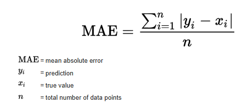
In our case:
y_i= true meter readingŷ_i= predicted readingN= number of samples
MAE tells us, on average, how many units the prediction is off from the true value.
from sklearn.metrics import mean_absolute_error

y_pred = rf_model.predict(X_test)
mae = mean_absolute_error(y_test, y_pred)

print("MAE =", mae)
MAE = 3.0522846441947586
Model Evaluation – Interpretation (MAE)
To evaluate the performance of the model, I used the Mean Absolute Error (MAE), which measures the average difference between the true meter reading and the predicted value. The model achieved:
MAE = 3.05
This means that, on average, the model is off by only 3 units when predicting the 3-digit value (000–999) shown in the red digits of the water meter. Considering the restricted dataset size (442 labeled images) and the classical machine learning approach (Random Forest), I think that this is an excellent result. An average error of 3 units represents less than 0.3% deviation, which is sufficiently accurate for a real-world monitoring system where readings change gradually over time.
9.1 True vs predicted readings
A simple scatter plot of true vs predicted values helps us see the global behaviour:
- Points close to the diagonal line indicate good predictions
- Systematic deviations would appear as visible patterns
'y_test' in globals(), 'y_pred' in globals()
(True, True)
plt.figure()
plt.scatter(y_test, y_pred)
plt.xlabel("True Reading")
plt.ylabel("Predicted Reading")
plt.title("True vs Predicted Water Meter Readings")
plt.show()

10. Example predictions (numeric)
To make the result more intuitive, I round the predictions to the nearest integer and compare some examples.
import numpy as np

y_pred_round = np.round(y_pred).astype(int)

for i in range(10):
    print(f"Real: {int(y_test[i])} | Predicho: {y_pred_round[i]}")
Real: 862 | Predicho: 862
Real: 861 | Predicho: 860
Real: 872 | Predicho: 871
Real: 804 | Predicho: 828
Real: 872 | Predicho: 872
Real: 760 | Predicho: 781
Real: 821 | Predicho: 822
Real: 815 | Predicho: 817
Real: 863 | Predicho: 862
Real: 880 | Predicho: 880
# Round predictions to nearest integer
y_pred_round = np.round(y_pred).astype(int)

# Show a few examples
n_examples = 10
print("Sample comparisons (true vs predicted):\n")
for i in range(n_examples):
    print(f"True: {int(y_test[i])}  |  Predicted: {y_pred_round[i]}")
Sample comparisons (true vs predicted):

True: 862  |  Predicted: 862
True: 861  |  Predicted: 860
True: 872  |  Predicted: 871
True: 804  |  Predicted: 828
True: 872  |  Predicted: 872
True: 760  |  Predicted: 781
True: 821  |  Predicted: 822
True: 815  |  Predicted: 817
True: 863  |  Predicted: 862
True: 880  |  Predicted: 880
11. Visual examples – test images with predictions
Finally, I display some test images with their true and predicted labels in the title.
This is a powerful way to show the model’s performance in the final presentation, because the audience can see the digits and the prediction at the same time.
import matplotlib.pyplot as plt

for i in range(5):
    plt.imshow(X_test[i].reshape(64,64), cmap="gray")
    plt.title(f"Real: {int(y_test[i])} | Predicted: {y_pred_round[i]}")
    plt.axis("off")
    plt.show()


12. Interpretation notes
When I present this notebook, I can highlight:
- Real-world data: I used 400+ real images from afunctioning water meter monitoring project
- Clean data pipeline: I did a label cleaning, run file consistency checks, and systematic image preprocessing
- Model performance:
- The MAE is low compared to the full 0–999 range
- In practical terms, the model is usually off by only a few units
- Practical relevance:
- Such a model can support automatic meter reading, reducing manual work
- It is a solid baseline that I can later improve with Convolutional Neural Networks (CNNs)