2025 Pilgrim Numbers on Camino de Santiago: Forecast and Actual
What is my presentaiton
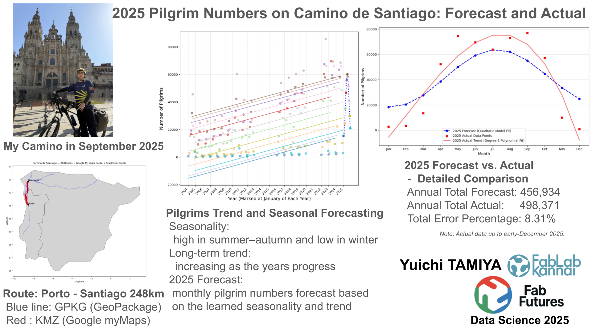
In September 2025, I traveled the Camino de Santiago from Porto, Portugal to Santiago de Compostela by bicycle. When I arrived in Santiago, I was surprised by how many people were there. This made me curious about how pilgrims traveled, where they came from, and how many there were.
In this presentation, I use pilgrim data from 2004 to 2024 to forecast the number of pilgrims in 2025, and then compare the prediction with the actual numbers.
|
Start: Porte [248km] Sep 15 2025 |
Portugal → Spain | [0 km] |
Goal: Santiago de Compostela Sep 19 |
|---|---|---|---|
 |
 |
 |
 |
 |
 |
 |
Integration of Official Camino Routes and Google My Maps Data
Dataset
A-GeoCat: Saint James' Way to Santiago de Compostela
The Way of St. James or St. James' Way (Caminho de Santiago, Camino de Santiago, Chemin de St-Jacques, Jakobsweg) is the pilgrimage route to the Cathedral of Santiago de Compostela in Galicia in northwestern Spain.
# Install geopandas from a core
!pip install geopandas

# Verify that it works in JupyterLab
import geopandas as gpd
print("GeoPandas version:", gpd.__version__)
Requirement already satisfied: geopandas in /opt/conda/lib/python3.13/site-packages (1.1.1)
Requirement already satisfied: numpy>=1.24 in /opt/conda/lib/python3.13/site-packages (from geopandas) (2.3.3)
Requirement already satisfied: pyogrio>=0.7.2 in /opt/conda/lib/python3.13/site-packages (from geopandas) (0.12.1)
Requirement already satisfied: packaging in /opt/conda/lib/python3.13/site-packages (from geopandas) (25.0)
Requirement already satisfied: pandas>=2.0.0 in /opt/conda/lib/python3.13/site-packages (from geopandas) (2.3.3)
Requirement already satisfied: pyproj>=3.5.0 in /opt/conda/lib/python3.13/site-packages (from geopandas) (3.7.2)
Requirement already satisfied: shapely>=2.0.0 in /opt/conda/lib/python3.13/site-packages (from geopandas) (2.1.2)
Requirement already satisfied: python-dateutil>=2.8.2 in /opt/conda/lib/python3.13/site-packages (from pandas>=2.0.0->geopandas) (2.9.0.post0)
Requirement already satisfied: pytz>=2020.1 in /opt/conda/lib/python3.13/site-packages (from pandas>=2.0.0->geopandas) (2025.2)
Requirement already satisfied: tzdata>=2022.7 in /opt/conda/lib/python3.13/site-packages (from pandas>=2.0.0->geopandas) (2025.2)
Requirement already satisfied: certifi in /opt/conda/lib/python3.13/site-packages (from pyogrio>=0.7.2->geopandas) (2025.10.5)
Requirement already satisfied: six>=1.5 in /opt/conda/lib/python3.13/site-packages (from python-dateutil>=2.8.2->pandas>=2.0.0->geopandas) (1.17.0)
GeoPandas version: 1.1.1
import geopandas as gpd
import pyogrio
import pandas as pd
from shapely.ops import unary_union
import matplotlib.pyplot as plt
from shapely.geometry import LineString

# ======================================
# 1. Data paths
# ======================================
gpkg_path = "datasets/finalproject/caminos_santiago.gpkg"
world_path = "datasets/finalproject/110m_cultural.zip"
kmz_path = "datasets/finalproject/our_camino_map.kmz" # from Google MyMap

# ======================================
# 2. Background map (Spain + Portugal)
# ======================================
world = gpd.read_file(world_path, layer="ne_110m_admin_0_countries")
iberia = world[world["ADMIN"].isin(["Spain", "Portugal"])]

fig, ax = plt.subplots(figsize=(12, 12))
iberia.plot(ax=ax, color="lightgray", edgecolor="black", linewidth=0.5)

# ======================================
# 3. Camino full routes from GPKG → blue
# ======================================
layers = pyogrio.list_layers(gpkg_path)
line_layers = [name for name, geom in layers if geom and "LINESTRING" in geom.upper()]

for layer in line_layers:
    gdf = gpd.read_file(gpkg_path, layer=layer)
    gdf = gdf.to_crs(iberia.crs)
    gdf.plot(ax=ax, color="blue", linewidth=0.8, alpha=0.6)

# ======================================
# 4. Google KMZ route (merge multiple layers)
# ======================================
target_layers = [
    "1 (24.5km)+2 (14.0km)",
    "3 (24.5km)+4 (20.8km)+5 (26.8km)",
    "Tui - Redondela",
    "10 (19.6km)+11(21.1km)",
    "12 (18.6km)+13 (24.4km)"
]

gdfs = []
for layer_name in target_layers:
    gdf = gpd.read_file(kmz_path, layer=layer_name)
    gdfs.append(gdf)

# KMZ layers combined
merged_gdf = gpd.GeoDataFrame(
    pd.concat(gdfs, ignore_index=True),
    crs=None   # MyMaps KMZ usually has no CRS
)

# --- Set CRS explicitly to WGS84
merged_gdf = merged_gdf.set_crs("EPSG:4326")

# Merge into a single LineString
merged_line = unary_union(merged_gdf.geometry)

# ======================================
# 4b. Add missing red segment
# ======================================
extra_coords = [
    (-8.83784, 41.8732),
    (-8.64664, 42.04916)
]

extra_line = LineString(extra_coords)

# Set CRS for extra line / 補完ラインにもCRSを設定
extra_gdf = gpd.GeoSeries([extra_line], crs="EPSG:4326")

# Merge original red route with extra segment / 元ルートと補完区間を結合
full_red_route = unary_union([merged_line, extra_gdf.iloc[0]])

# Convert to GeoSeries and reproject / GeoSeries化して座標系変換
full_red_geo = gpd.GeoSeries([full_red_route], crs="EPSG:4326")
full_red_geo = full_red_geo.to_crs(iberia.crs)

# Draw red route
full_red_geo.plot(ax=ax, color="red", linewidth=2)

# ======================================
# 5. Add start (Porte) & goal (Santiago) markers
#    出発点(Porte)と到着点(Santiago)にマーカーを追加
# ======================================
porte_lat = 41.087913089618894
porte_lon = -8.54339873871034

santiago_lat = 42.88206527707834
Santiago_lon = -8.55135182575899

# Draw markers and labels / マーカーとラベルを描く
ax.scatter(porte_lon, porte_lat, color="black", s=60, zorder=5)
ax.text(porte_lon, porte_lat, "Porte", fontsize=12, ha="left", va="bottom")

ax.scatter(Santiago_lon, santiago_lat, color="black", s=60, zorder=5)
ax.text(Santiago_lon, santiago_lat, "Santiago", fontsize=12, ha="left", va="bottom")

# ======================================
# 6. Show figure
# ======================================
plt.title("Camino de Santiago — All Routes + Google MyMaps Route + Start/Goal Points")
plt.xlabel("Longitude")
plt.ylabel("Latitude")
plt.show()

Some more detail is from My Camino Map page
Forecasting Monthly Pilgrim Numbers for 2025 Using Seasonality and Trend
Dataset
import pandas as pd
import numpy as np
import matplotlib.pyplot as plt
from sklearn.linear_model import LinearRegression
from sklearn.metrics import mean_squared_error

# === 1. Data loading and preparation ===
FILE_PATH = "datasets/finalproject/camino_monthly_2004_2024.csv"

# Load the CSV file from the specified path
try:
    df_raw = pd.read_csv(FILE_PATH)
except FileNotFoundError:
    print(f"Error: the CSV file '{FILE_PATH}' could not be found")
    raise

# Drop unnecessary columns (Total and Ratio exist in source [1])
# 不要な列を削除 (ソース [1] に存在する Total および Ratio)
if 'Total' in df_raw.columns:
    df_raw = df_raw.drop(columns=['Total'])
if 'Ratio' in df_raw.columns:
    df_raw = df_raw.drop(columns=['Ratio'])

# If the Month column is a string ('Jan', 'Feb', ...), convert it to numeric
month_names = ['Jan', 'Feb', 'Mar', 'Apr', 'May', 'Jun', 'Jul', 'Aug', 'Sep', 'Oct', 'Nov', 'Dec']
if df_raw['Month'].dtype == object:
    month_mapping = {m: i+1 for i, m in enumerate(month_names)}
    df_raw['Month'] = df_raw['Month'].map(month_mapping)

# Convert data to long format and ensure 'Year' and 'Month' are integers
df_long = df_raw.set_index('Month').stack().reset_index()
df_long.columns = ['Month', 'Year_str', 'Pilgrims']
df_long['Year'] = df_long['Year_str'].astype(int)
df_long['Month'] = df_long['Month'].astype(int)

# Exclude pandemic period data (2020–2021)
df_train = df_long[
    (df_long['Year'] < 2020) | (df_long['Year'] > 2021)
].copy()

# Remove extremely low values
df_train = df_train[df_train['Pilgrims'] > 100]


# === 2. Feature engineering ===
# === 2. 特徴量エンジニアリング ===
df_train['Time'] = (df_train['Year'] - 2004) * 12 + df_train['Month']
df_train['sin_month'] = np.sin(2 * np.pi * df_train['Month'] / 12)
df_train['cos_month'] = np.cos(2 * np.pi * df_train['Month'] / 12)

X = df_train[['Time', 'sin_month', 'cos_month']]
y = df_train['Pilgrims']

# === 3. Model fitting ===
model = LinearRegression()
model.fit(X, y)
y_pred_train = model.predict(X)
df_train['Predicted_Pilgrims'] = y_pred_train

# === 4. Prediction for 2025 ===
months_2025 = np.arange(1, 13)
df_2025 = pd.DataFrame({'Month': months_2025.astype(int), 'Year': 2025})
df_2025['Time'] = (df_2025['Year'] - 2004) * 12 + df_2025['Month']
df_2025['sin_month'] = np.sin(2 * np.pi * df_2025['Month'] / 12)
df_2025['cos_month'] = np.cos(2 * np.pi * df_2025['Month'] / 12)

X_2025 = df_2025[['Time', 'sin_month', 'cos_month']]
predictions_2025 = model.predict(X_2025)
df_2025['Predicted_Pilgrims'] = np.maximum(0, predictions_2025).round().astype(int)

# === 5. Display results and visualization (improved X-axis and month-based color coding) ===
total_2025 = df_2025['Predicted_Pilgrims'].sum()
print("\n--- 2025 Pilgrim Count Prediction (Monthly) ---")
print(df_2025[['Month', 'Predicted_Pilgrims']])
print(f"\nTotal predicted number of pilgrims in 2025: {total_2025}")

plt.figure(figsize=(16, 8))

# Define color map
cmap = plt.get_cmap('tab20')
month_colors = {i + 1: cmap(i / 12) for i in range(12)}

# 1. Plot observed training data and fitted results by month
# 1. 訓練データの実績値と適合結果を月ごとにプロット
for month_num_float in df_train['Month'].unique():
    month_num = int(month_num_float)

    month_data = df_train[df_train['Month'] == month_num]
    month_name = month_names[month_num - 1]
    color = month_colors[month_num]

    # Plot observed training data (scatter plot)
    # 訓練データの実績値をプロット (散布図)
    plt.scatter(
        month_data['Time'],
        month_data['Pilgrims'],
        color=color,
        alpha=0.6,
        s=40,
        label=f'Observed: {month_name}' if month_num == 1 else ""
    )

    # Plot fitted results by month (line plot)
    # 適合結果を月ごとに線でプロット (折れ線)
    month_data_sorted = month_data.sort_values(by='Time')
    plt.plot(
        month_data_sorted['Time'],
        month_data_sorted['Predicted_Pilgrims'],
        color=color,
        linestyle='-',
        linewidth=1.5,
        alpha=0.8,
        label=f'Fitted: {month_name}'
    )

# 2. Plot 2025 predictions using month-specific colors (scatter and line)
# 2. 2025年の予測を該当する月の色でプロット (散布図と線)

# 2a. Plot 2025 prediction points with month-specific colors (markers)
# 2a. 2025年の予測点を月ごとの色でプロット (マーカー)
for index, row in df_2025.iterrows():
    month_num = int(row['Month'])
    color = month_colors[month_num]
    month_name = month_names[month_num - 1]

    plt.scatter(
        row['Time'],
        row['Predicted_Pilgrims'],
        color=color,
        marker='.', # ドットマーカーを使用
        s=150,
        linewidth=1.5,
        zorder=10,
        label=f'2025 Forecast: {month_name}' if month_num == 1 else ""
    )

# 2b. Connect 2025 prediction points with a dotted line
# 2b. 2025年の予測点を赤い点線でつなぐ (折れ線グラフ)
# 予測の時系列データを抽出
time_2025 = df_2025['Time']
pred_2025 = df_2025['Predicted_Pilgrims']

plt.plot(
    time_2025,
    pred_2025,
    color='blue',
    linestyle=':', # 点線スタイル
    linewidth=2,
    zorder=9, # マーカーの下に表示
    label='2025 Forecast Trend Line'
)


# --- X-axis tick settings ---
years_to_label = np.arange(2004, 2026, 1)
tick_positions = (years_to_label - 2004) * 12 + 1
tick_labels = [str(y) for y in years_to_label]
plt.xticks(tick_positions, tick_labels, rotation=45, ha='right')

# --- Labels and legend ---
plt.title("Pilgrims Trend and Seasonal Prediction (Color-Coded by Month)", fontsize=18)
plt.xlabel("Year", fontsize=14)
plt.ylabel("Number of Pilgrims", fontsize=14)

# Place the legend outside for better readability
plt.legend(
    title="Legend",
    bbox_to_anchor=(1.05, 1),
    loc="upper left",
    fontsize=10,
    ncol=2
)
plt.grid(True, alpha=0.3)
plt.tight_layout(rect=[0, 0, 0.85, 1])
plt.show()
--- 2025 Pilgrim Count Prediction (Monthly) ---
    Month  Predicted_Pilgrims
0       1               15403
1       2               17222
2       3               24482
3       4               35271
4       5               46730
5       6               55822
6       7               60142
7       8               58567
8       9               51551
9      10               41007
10     11               29792
11     12               20945

Total predicted number of pilgrims in 2025: 456934

Comparison of Predicted and Actual Pilgrim Counts for 2025 with Polynomial Trend Analysis
Dataset
Actual Pilgrim number for 2025 comes from Oficina del Peregrino
import pandas as pd
import numpy as np
import matplotlib.pyplot as plt
from sklearn.linear_model import LinearRegression
from sklearn.metrics import mean_squared_error
from numpy.polynomial.polynomial import polyfit, polyval

# ----------------------------------------------------------------------
# STEP 1: Load data, build the model, and generate 2025 predictions
# ----------------------------------------------------------------------

FILE_PATH = "datasets/finalproject/camino_monthly_2004_2024.csv"
month_names = ['Jan', 'Feb', 'Mar', 'Apr', 'May', 'Jun', 'Jul', 'Aug', 'Sep', 'Oct', 'Nov', 'Dec']
month_mapping = {m: i+1 for i, m in enumerate(month_names)}

# Load the CSV file from the specified path
df_raw = pd.read_csv(FILE_PATH)

# Drop unnecessary columns if they exist
if 'Total' in df_raw.columns:
    df_raw = df_raw.drop(columns=['Total'])
if 'Ratio' in df_raw.columns:
    df_raw = df_raw.drop(columns=['Ratio'])

# Convert Month column to numeric if it is stored as strings
if df_raw['Month'].dtype == object:
    df_raw['Month'] = df_raw['Month'].map(month_mapping)

# Convert the data to long format and ensure Year and Month are integers
df_long = df_raw.set_index('Month').stack().reset_index()
df_long.columns = ['Month', 'Year_str', 'Pilgrims']
df_long['Year'] = df_long['Year_str'].astype(int)
df_long['Month'] = df_long['Month'].astype(int)

# Prepare training data (exclude pandemic years and extremely low values)
df_train = df_long[(df_long['Year'] < 2020) | (df_long['Year'] > 2021)].copy()
df_train = df_train[df_train['Pilgrims'] > 100]
df_train['Time'] = (df_train['Year'] - 2004) * 12 + df_train['Month']
df_train['sin_month'] = np.sin(2 * np.pi * df_train['Month'] / 12)
df_train['cos_month'] = np.cos(2 * np.pi * df_train['Month'] / 12)

# Fit the linear regression model
model = LinearRegression()
model.fit(df_train[['Time', 'sin_month', 'cos_month']], df_train['Pilgrims'])

# Generate prediction data for 2025
months_2025 = np.arange(1, 13)
df_2025_pred = pd.DataFrame({'Month': months_2025.astype(int), 'Year': 2025})
df_2025_pred['Time'] = (df_2025_pred['Year'] - 2004) * 12 + df_2025_pred['Month']
df_2025_pred['sin_month'] = np.sin(2 * np.pi * df_2025_pred['Month'] / 12)
df_2025_pred['cos_month'] = np.cos(2 * np.pi * df_2025_pred['Month'] / 12)
predictions_2025 = model.predict(df_2025_pred[['Time', 'sin_month', 'cos_month']])
df_2025_pred['Predicted_Pilgrims'] = np.maximum(0, predictions_2025).round().astype(int)

# ----------------------------------------------------------------------
# STEP 2: Combine predicted and actual data for 2025
# ----------------------------------------------------------------------

# Actual monthly pilgrim counts for 2025
data_2025_actual = {
    "Jan": 2781, "Feb": 3410, "Mar": 13437, "Apr": 52399, "May": 74556, "Jun": 69529,
    "Jul": 63856, "Aug": 73121, "Sep": 76985, "Oct": 57349, "Nov": 10022, "Dec": 926
}

# Convert actual data to a DataFrame
df_actual = pd.DataFrame(list(data_2025_actual.items()), columns=['Month_Name', 'Actual_Pilgrims'])
df_actual['Month'] = df_actual['Month_Name'].map(month_mapping)

# Merge predicted and actual data
df_comparison = pd.merge(
    df_2025_pred[['Month', 'Predicted_Pilgrims']],
    df_actual[['Month', 'Actual_Pilgrims', 'Month_Name']],
    on='Month',
    how='inner'
)
df_comparison = df_comparison.sort_values(by='Month')
df_comparison['Error'] = df_comparison['Actual_Pilgrims'] - df_comparison['Predicted_Pilgrims']
df_comparison['Percentage_Error'] = (df_comparison['Error'] / df_comparison['Actual_Pilgrims']) * 100


# ----------------------------------------------------------------------
# STEP 3: Visualization – prediction vs. actual data with polynomial fit
# ----------------------------------------------------------------------

# --- 多項式回帰の実行 ---
# Perform polynomial regression on actual data
X_poly = df_comparison['Month'].values
Y_actual = df_comparison['Actual_Pilgrims'].values

# Fit a cubic polynomial (degree can be adjusted)
# 3次多項式を適合させる (次数は任意に変更可能)
degree = 3
coefficients = polyfit(X_poly, Y_actual, deg=degree)

Y_poly_fit = polyval(X_poly, coefficients)


plt.figure(figsize=(10, 6))

# 1. Plot predicted values
# 1. 予測値をプロット (線と点)
plt.plot(
    df_comparison['Month_Name'],
    df_comparison['Predicted_Pilgrims'],
    marker='o',
    linestyle='--',
    color='blue',
    label='Predicted 2025 (Model Fit)',
    linewidth=2
)

# Plot actual data points
# 2. 実績値の点をプロット (マーカーはそのまま)
plt.scatter(
    df_comparison['Month_Name'],
    df_comparison['Actual_Pilgrims'],
    marker='s',
    color='red',
    label='Actual 2025 Data Points',
    #s=80, # マーカーサイズを大きく
    zorder=10 # 最前面に表示
)

# Plot polynomial trend line for actual data
# 3. 多項式回帰による実績値の適合線をプロット (線で接続)
plt.plot(
    df_comparison['Month_Name'],
    Y_poly_fit,
    linestyle='-',
    color='red',
    label=f'Actual 2025 Trend (Degree {degree} Polynomial Fit)',
    linewidth=2
)

plt.title(f'2025 Pilgrim Counts: Prediction vs. Actual Trend (Degree {degree} Fit)', fontsize=14)
plt.xlabel('Month', fontsize=12)
plt.ylabel('Number of Pilgrims', fontsize=12)
plt.grid(axis='y', alpha=0.5)
plt.legend()
plt.tight_layout()
plt.show()

# ----------------------------------------------------------------------
# Print comparison table and annual summary
# ----------------------------------------------------------------------

print("\n--- 2025 Prediction vs. Actual Detailed Comparison ---")
print(df_comparison[['Month_Name', 'Predicted_Pilgrims', 'Actual_Pilgrims', 'Error', 'Percentage_Error']].to_string(float_format="%.1f"))

total_pred = df_comparison['Predicted_Pilgrims'].sum()
total_actual = df_comparison['Actual_Pilgrims'].sum()

print(f"\nAnnual Total Predicted: {total_pred:,}")
print(f"Annual Total Actual: {total_actual:,}")
print(f"Total Error Percentage: {((total_actual - total_pred) / total_actual) * 100:.2f}%")

--- 2025 Prediction vs. Actual Detailed Comparison ---
   Month_Name  Predicted_Pilgrims  Actual_Pilgrims  Error  Percentage_Error
0         Jan               15403             2781 -12622            -453.9
1         Feb               17222             3410 -13812            -405.0
2         Mar               24482            13437 -11045             -82.2
3         Apr               35271            52399  17128              32.7
4         May               46730            74556  27826              37.3
5         Jun               55822            69529  13707              19.7
6         Jul               60142            63856   3714               5.8
7         Aug               58567            73121  14554              19.9
8         Sep               51551            76985  25434              33.0
9         Oct               41007            57349  16342              28.5
10        Nov               29792            10022 -19770            -197.3
11        Dec               20945              926 -20019           -2161.9

Annual Total Predicted: 456,934
Annual Total Actual: 498,371
Total Error Percentage: 8.31%
Some more detail is from Number of Compostela Recipients by Month page