Final Presentation > Analyzing Nvidia's EKG
When I worked in the Investment Management field, the methodology that I utilized to evaluate stocks for possible investment was categorized as Fundamental Analysis. Primarily, I looked at a company's financial statements and built earnings forecast models from them. Based on these forecasts and the company's most current stock price, I developed valuation models to determine if a company should be purchased, sold or held. Once could say that I did some form of data analysis, but the work that I did involved a significant amount of qualitative judgements derived from company visits, conversations with company executives and assessments of their assets. Parameters that informed my model were adjusted based on my hands-on assessments of the company.
There was another methodology widely used, mostly by stock traders, to make decisions whether to buy, hold or sell a stock called Technical Analysis. The professionals who subscribe to this methodolgy** built and utilized charts overlaid on top of stock price graphs** (such as RSI, Ichimoku, Bollinger Bands, etc.) to provide visual and numerical insight into stock investment decisions.
And then at the end of my career, the Data Scientists emerged onto the investment management scene.
My objective in taking this Data Science course was to investigate the other stock investment decision making methodologies to supplement the method I am more familiar with.
The Theory
The stock market is not rational. Instead, it is a perfect reflection of greed and desire, the psychology of every market participant, their minute by minute assessment of a company's value, its perceived health. A stock's historical data is its EKG, reflecting the market sentiment towards and influence on a company's stock price movement.
As the EKG is a telemetry monitor of human physical condition, stock market indicators is a company's telemetry.
The Insight Objective
From everything I have managed to grasp from the course so far, I have come to understand that insight from looking at Nvidia's historical stock data will emerge from applying analytical models to a combination of several features that describe the historical price movement. From the analysis, I hope to:
- Determine meaningful relationships in some of the variables/features
- Develop a predictive model to guide investment decision making
The Research
Final Presentation > Multi-Variate Analysis of Nvidia Stock Market Data
Having just scratched the surface of understanding regarding Data Science over the past few weeks, I am pretty certain that what I have been able to produce for this Final Presentation is merely the foudational pieces of what I need to create the predictive model I hoped for.
Leading up to Final Presentation work, I managed to generate a single feature Gaussian Mixture Model (GMM) of Nvidia's Stock Returns over its trading lifetime.
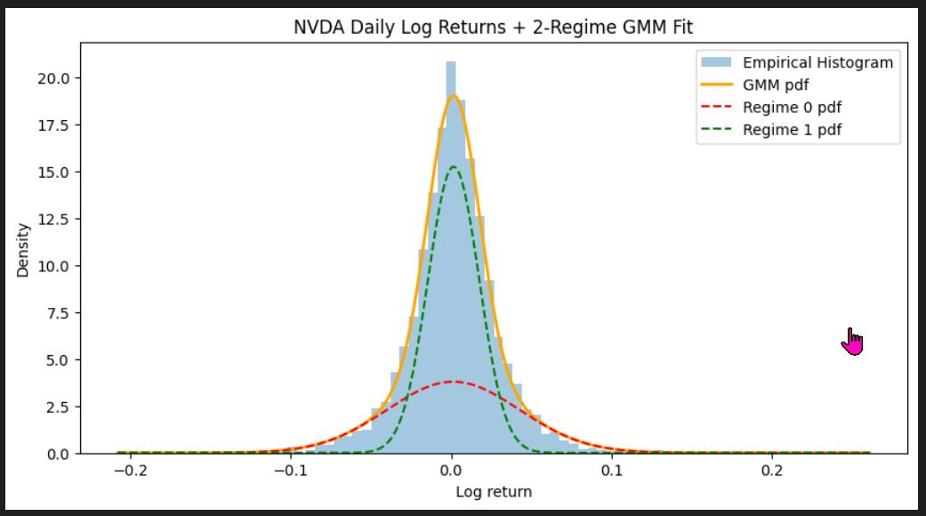
From this visualization, I learned of the Jekyll & Hyde (Dual) Personality characteristic of Nvidia stock. The Kernel Density Estimation analysis revealed that Nvidia's probability distribution is strongly tall and narrow, but also has a distinct 'Fat Tail'. Nvidia's probability distribution is made up of 2 distinct distributions. One is dominant and the regime (Regime 1, the Calm Regime) that defines Nvidia's return characteristic most of the time. This distribution has a very narrow price return distribution to either side of zero returns. The other distribution (Regime 0, the Turbulent Regime) is its polar opposite, while infrequent in occurance it generates outsized daily returns. For an investment professional, this outcome says that Nvidia has meaningful risk of periodic up and down swings in price.
While this chart was interesting, Neil suggested that I don't stop there and "add (feature) dimensionality" to my analysis.
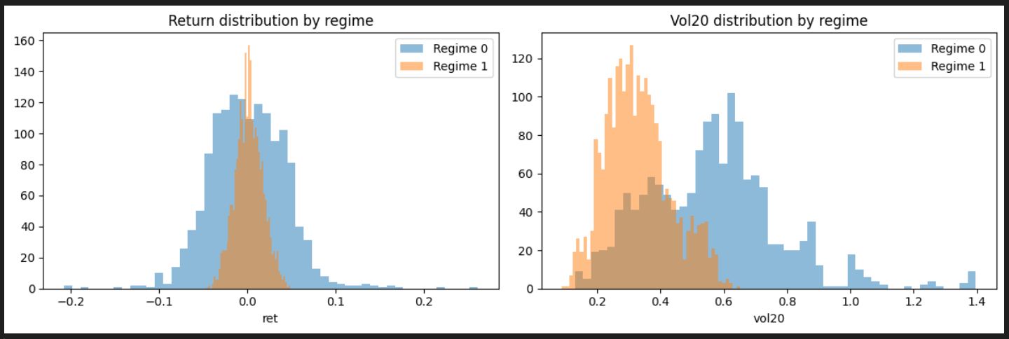
So I dipped my toe in the water and added Short-Term Volatility (20-day Rolling Volatility) to the analytical mix. With the help of ChatGPT,a Histogram of the two features, Price Return and Short-Term Volatility, was made and offered additional insights regarding Nvidia. The Return Distribution plot confirms that Regime 1 has lower return vaiability but also lower volatility while Regime 0 has high return variability and significantly higher volatility. The 20-day Rolling Volatility distribution chart revealed that the Calm Regime's (Regime 1) volatility occurs between 0.2 and 0.4. The Turbulent Regime (Regime 0) spans 0.4 to over 1.0 and indicates sustained high-volatility periods (sensitive to news cycles, earnings annoucements, macro uncertainty, etc.).
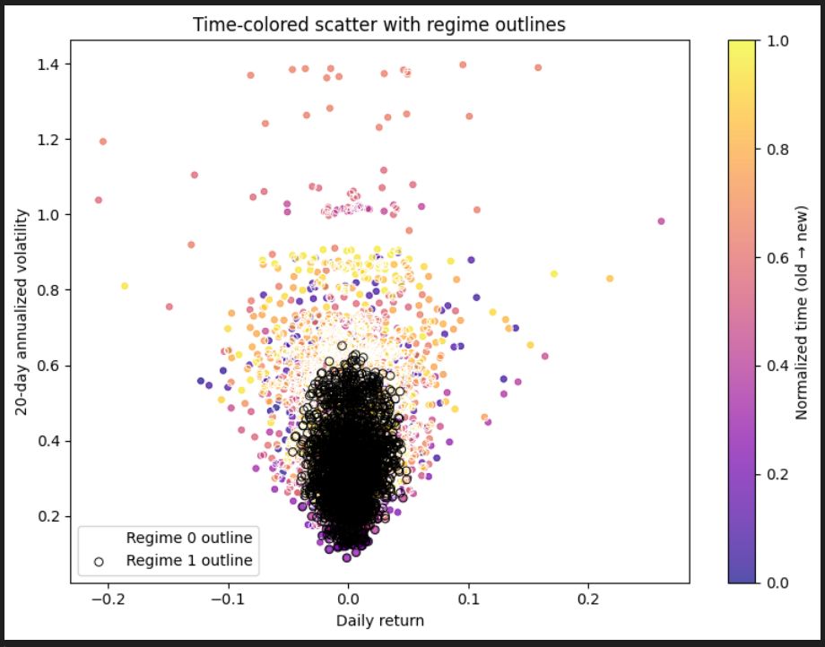
I wanted to see how Nvidia's features evolve over time and used ChatGPT to generate the following Time-colored Scatterplot with Regime Outlines plot. From this plot, the following insights were garnered:
- The Cone Shape of the plot suggests "classic volatility clustering", according to ChatGPT
- Zero Returns mainly occur in low-volatility periods, but not infequently also in higher volatility periods
- Large returns are accompanied by high volatility
- Return dispersion is wide in high-volatility markets
- The coloring, from purple in the past to yellow in the present, shows that volatility was lower in the early days and getting more volatile over time
- The regime distinction "occur in temporal blocks" > clusters of the same time show clusters of the same regime
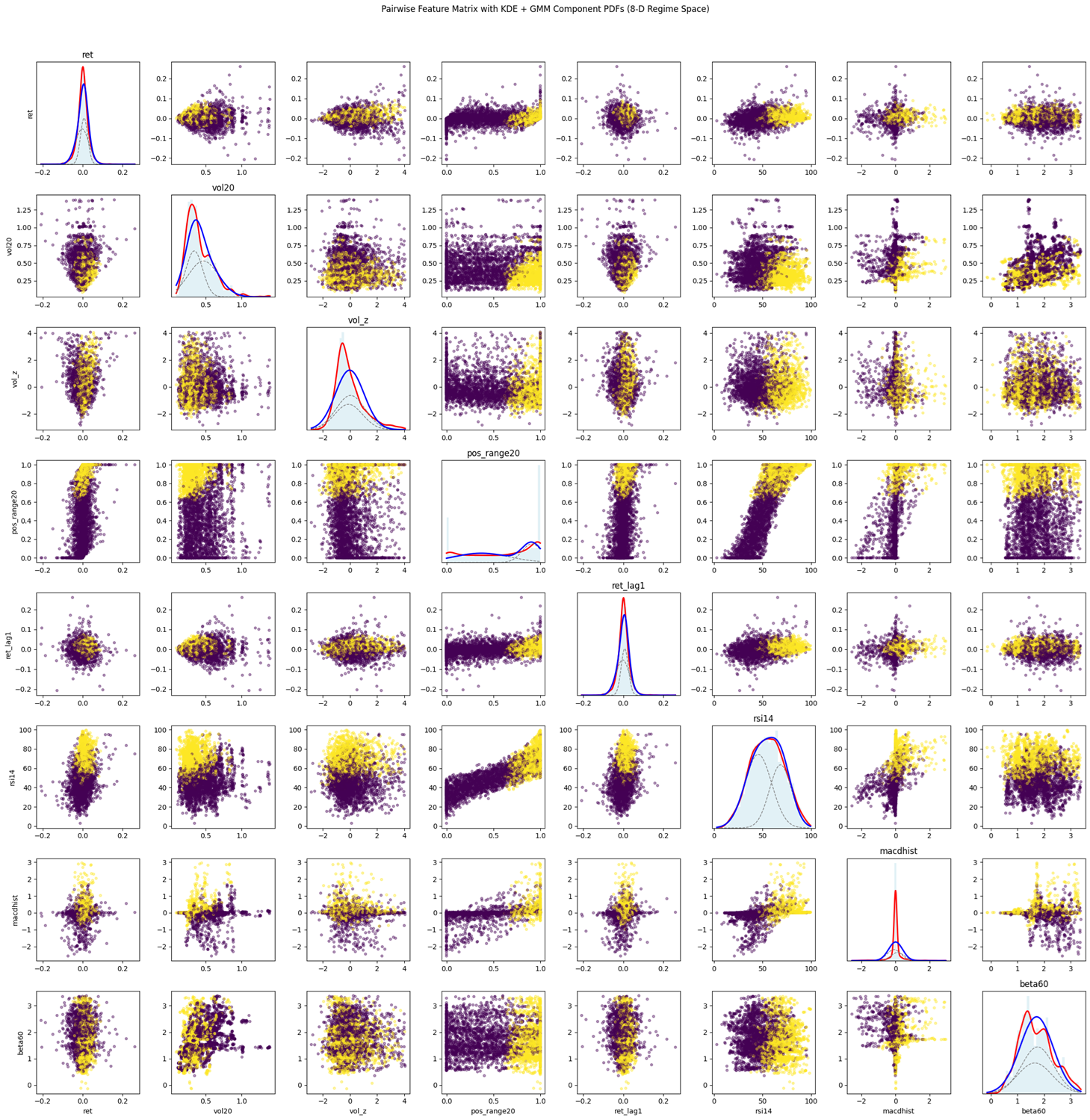
Encouraged by the insights gained by going to 2-dimensions, I asked ChatGPT to create a study with 8 dimensions:
- Daily Logarithmic Return > Direction and Magnitude of Movement
- 20-day Rolling Volatility > Risk Regime (Calm vs Turbulent)
- Volume Anomaly > Market participation, news event influence
- Return Lag > Position in recent range indicating trend strength
- RSI Momentum Oscillator > Overbought/Oversold pressure (a technical analyst favorite)
- MACD Histogram > Trend inflection points, crossovers (not a statistical histogram)
- 60-day Rolling Market Beta > Systematic vs Ideosyncratic Regimes, sensitivity to the broader market
...and created a program to plot a matrix of paired relationships between all the features.
Definition of Analysis Features
I have not been able to dig through all of the insights from this extensive matrix but some key highlights include:
- Nvidia stock behavior exhibits 2 distinct Volatility Regime characteristics > Calm vs Turbulent
- Volatility causes greater return dispersion...from normal low return behavior > Nvidia is prone to periodic large price swings
- Large MACD histogram values indicate regime shifts > MACD may serve as a warning sign of Regime changes
- **Momentum becomes exaggerated in high-volatility periods **
- Nvidia momentum shifts are abrupt, not a smooth continuum
- The Turbulent Regime clusters in the upper-right in many KDE charts > a risk factor signature
**I am going to have to invest some effort to go through each one of the plots one by one to extract any insight. **
Conclusion
While I still believe that Fundamental Analysis is probably more appropriate for uncovering "Quality Companies", I can see how Data Science tools could be invaluable in portfolio management decision making. Unlike Technical Analysis (which I fully admit I don't quite understand), I find these Data Science methods to have more objective credibility. Perhaps I am too 'Old School' but I still believe that Qualitative Analysis of a company, particular the evaluation of its people and assets/products, remains vital in stock selection efforts. That said, I recall that when I was working as a Portfolio Manager, a common misgiving was the lack of (accessible) analytical tools and methods that were unconventional. Most everyone in the industry was using the same tools to arrive at investment decisions. Good Qualitative Insights were difficult to achieve. I would have liked to have tools that could be customized to my liking, to perform specific tasks that I designed.
Neil's introduction to Data Science has opened my eyes to new possibilities for using and processing (now more available) data to make investment decisions. Four weeks into the course and the best I can say is that I now know what I don't know. We were introduced to many incredible analytical tools, learning how to get started with them, but I am far from understand which of tools can be used for what Investment Management purposes. I have come to the realization that Data Science offers a set of tools. It will take me a while to unpack all of the learnings, expand on it, and figure out how to use them effectively. At the very least, I believe that Data Science tools could be used for BUY/HOLD/SELL decisions. For sure, Data Science tools could be used to parse through financial information and automate financial model building and tuning. But what I hope to do with my new found skills, when developed enough, is develop two things > a price trajectory prediction model and a portfolio optimization model.
Another important takeway from the course was the use of AI as an aid to learning. For the longest time, I resisted using ChatGPT for anything. It appeared like an interesting novelty and nothing more. But during this course, I ended up using it extensively. ChatGPT became my personal tutor and problem solver. As the pace of the course was rather fast and the course content well beyond my current knowledge, ChatGPT proved indespensible for providing explanations and answers quickly and effectively. Difficult concepts were explained in terms I could understand to a level of depth that I required. Roadblocks in programming were cleared away, with every action taken explained so that I could learn as the issue was solved. So I completed the course not only learning many new Data Science concepts and tools, but also leveled up in my understanding of Python, VScode, and Git as well.
In Kendo, Japan's fencing art, learning passes through 3 big stages > emulation, refactoring and invention. Before we can create anything unique and new, possible in the last stage, one must first pass through 2 other stages. The middle phase involves modifying what is taught in the initial phase, which involves basically copying the motions presented to you by your instructor. In the Data Science course context, this would be us simply doing what Neil tells us to do in the way that he does it, without question. We learn the tools and the techniques, but most certainly do not have any meaningful understanding of their implications and effective usage. I now know what I don't know.
That said, YouTube's algorithms presented me with a video to view called The Biggest Breakthrough in Physics 2025 and these images (captured by the Webb telescope) pop up early in the video...
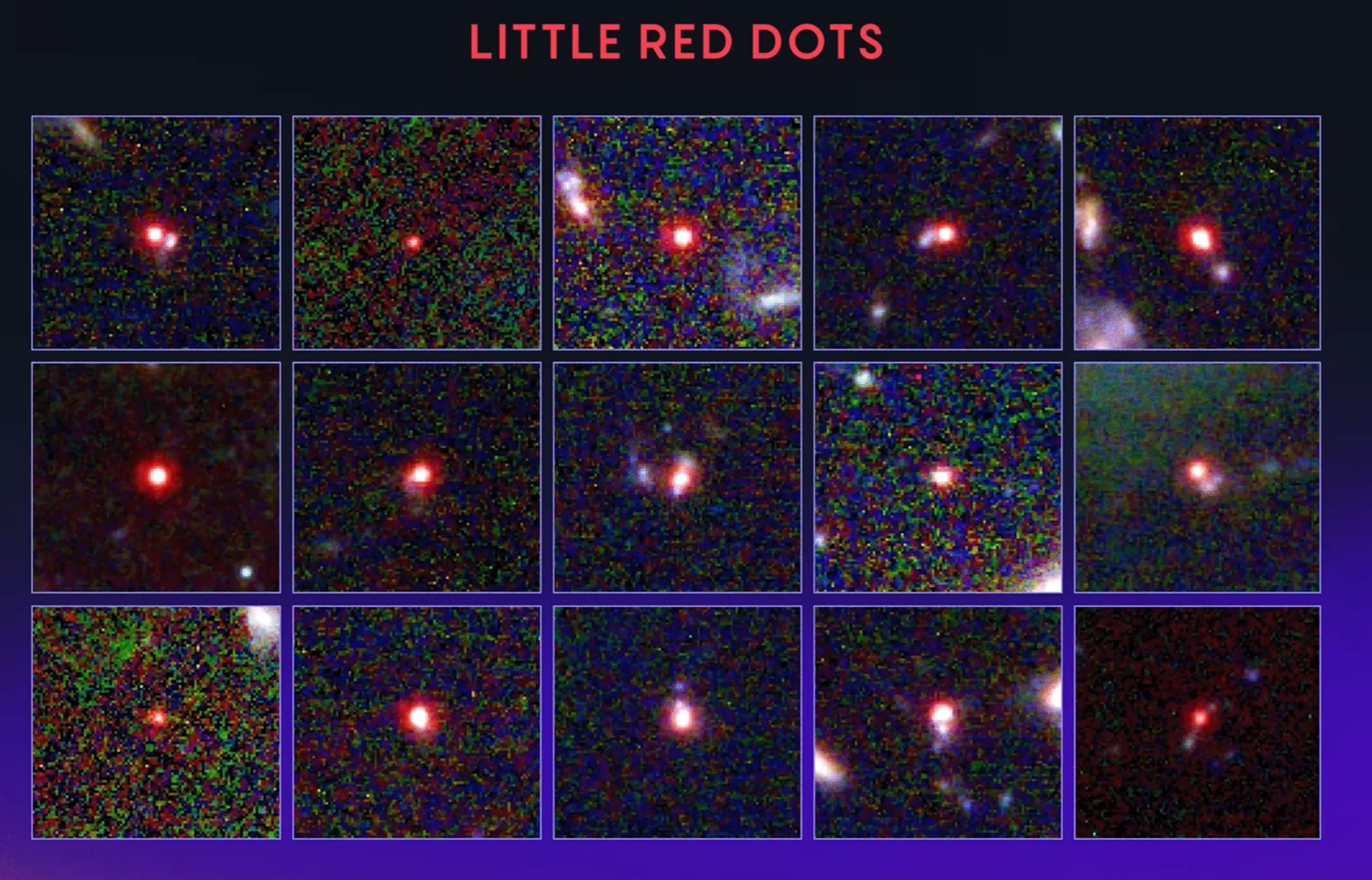
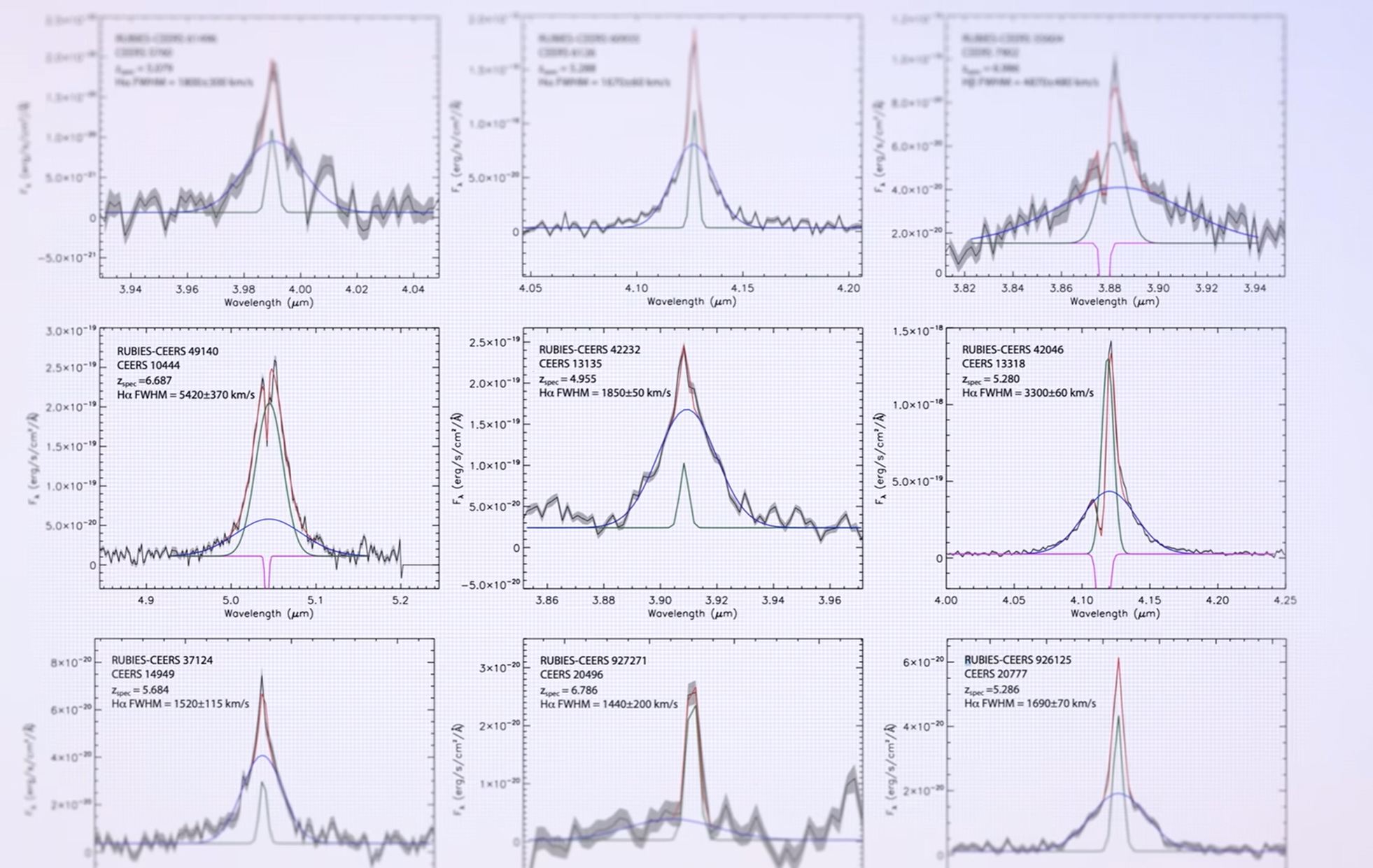
...and I was shocked to realize that I understood what I was looking at! I understood the images to be processed for it's mysterious 'Red Dots' and the probability distribution plots for each frequency that resulted from them. Wow. Slef pat on the back.
So while I am far from competence, far from reaching the second or thrid stage of learning...a journey has begun, the destination yet unknown, but I am full of excitement.