Analyzing 3D Printer Features with Data Science Approach
Research Question: What are the key features that affect the total extruder movement of a 3D printer?
Here is the final documentation page for my data science journey.
Visualization APP
Here is the visualization demo video of three model printed log with transitions of heatbreak_temp and toral extrusion move. This Demonstration app could be accessed here. More detail, please also see the "8.Visualization" section of this documentation.
Presentation Slide
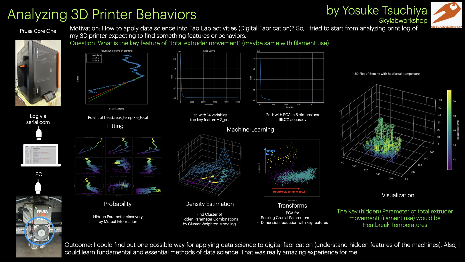
1. Motivation
I am particularly interested in how data science can be applied to local Fab Lab activities and how it can be integrated with digital fabrication practices. Therefore, during this one-month journey, I aimed to explore possible ways to apply data science to digital fabrication.
Mastering the use of various types of equipment is crucial in a Fab Lab, and understanding the characteristics of each machine is essential for handling diverse fabrication tasks. In this project, I experiment with a data science–based approach to better grasp these equipment characteristics. Specifically, I analyze real-time operational logs generated by machines in order to uncover their fundamental properties. For this experiment, I use my 3D printer, the Prusa Core One, which I acquired for verification purposes in my digital fabrication activities.
First, I checked the following Documents for collecting log data from my prusa core one.
We can get current printer status with sending G-Code via serial communication.
For example:
- M105 : Could get Temperture status of the printer
- M114 : Could get X,Y,Z position and extrusion amount or position of the extruder
- M155 : Count output Temperature, fan status and position automatically
Connecting my Prusa Core One to my PC, I tried to get the printer status data. In this time, I collected printing log of the following three models.
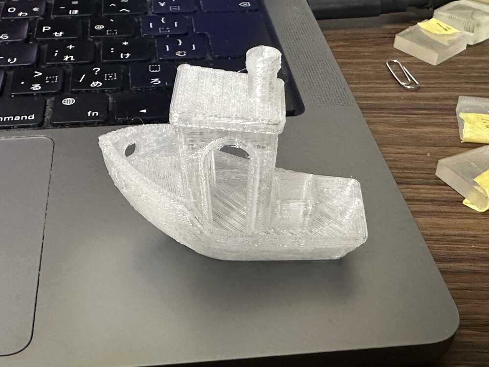
3D Benchy |
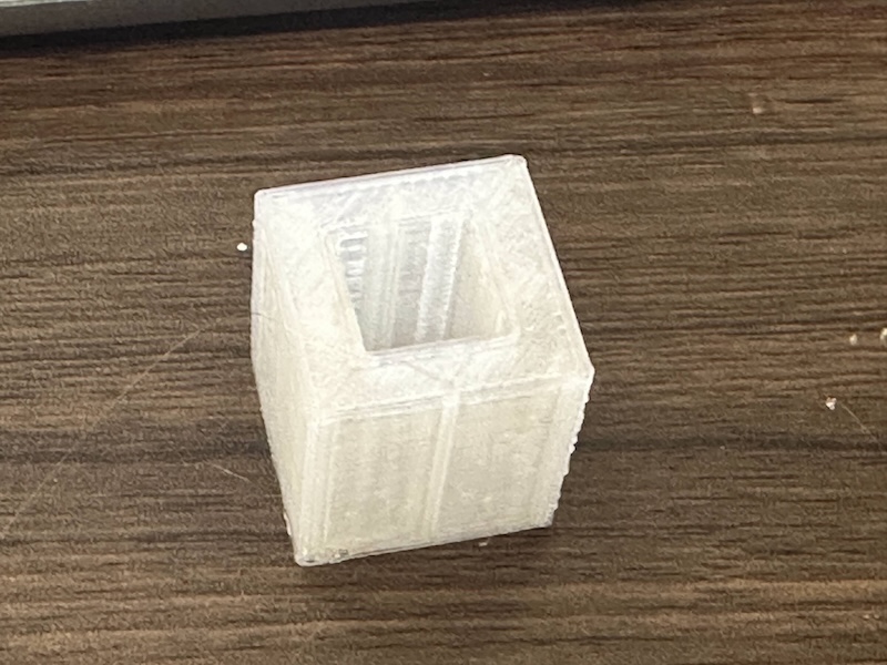
Dimensions |
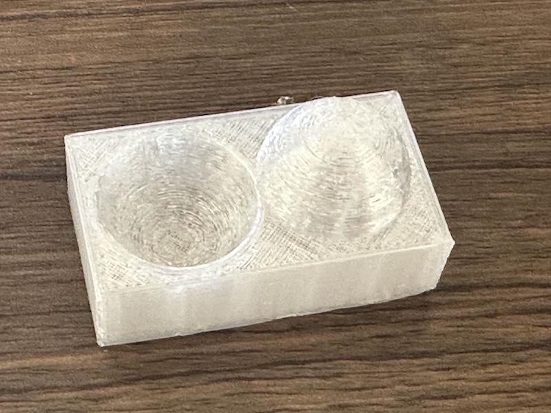
Surface Finish |
2-2. Dataset (Inside the 3D Printer Log)
Through using M155 command, I can get the following temperature status data at one-second intervals.
temperture:
T:171.37/170.00 B:85.00/85.00 X:40.15/36.00 A:49.92/0.00 @:94 B@:93 C@:36.32 HBR@:255
- T: Hotend temperture current/target
- B: Bed temperture current/target
- X: heatbreak temperture (?) current/target
- @: hotend power
- @B: bed heater power
- @C: ?? (Print Fan??)
- HBR@: hotend Fan Power (by observation)
Through using M114 command, I can get the following real-time position status data of Nozzle head of the printer, also we can collect the status of extruder movement.
X:249.00 Y:-2.50 Z:15.00 E:7.30 Count A:24650 B:25150 Z:5950
- X: current X position of the printer
- Y: current Y position of the printer
- Z: current Z position of the printer
- E: current position of the extruder
- Count section A,B,Z::??? (according to RepRap G-Code documentation, the value after "Count" seems stepper motor function).
So, I wrote a code to get those printer status data at one-second intervals and save it with adding a timestamp (date/time). Also, I wrote a module to convert those log data into Panda Data Frame.
Code for these work is:
Finally, my dataset of printer log include the following data:
| column name | description |
|---|---|
| X_Pos | Printer X Axis position |
| Y_Pos | Printer Y Axis position |
| Z_Pos | Printer Z Axis position |
| travel distance | euclidian distance between current ( $x_i,y_i$ ) position and last ( $x_{i-1},y_{i-1}$ ) position. It could be calculated as: $td = \sqrt{(x_i - x_{i-1})^2 + (y_i - y_{i-1})^2}$ |
| E_Pos | Extruder Position |
| e_move | how much current extruder position ($e_i$) moved from the last position ($e_{i-1}$). That is: $em = e_i - e_{i-1}$ |
| e_total | how much extruder position total moved in the current point. It could be calculated as:$et_n = \sum_{i=1}^{n} em_i = em_1 + em_2 + ... + em_k $ $( em_i > 0.05)$ |
| hotend_temp_current | current hotend temperature |
| hotend_temp_setting | target hotend temperture |
| bed_temp_current | current bed temperture |
| bed_temp_setting | target bed temperture |
| heatbreak_temp_current | current heatbreak temperture |
| heatbreak_temp_setting | target heatbreak temperature |
| hotend_power | Hotend output power (scaled from 0-255 to 0-100) |
| bed_heater_power | bed heater output power (scaled from 0-255 to 0-100) |
| hotend_fan_power | hotend fan output power (scaled from 0-255 to 0-100) |
| timestamp | The datetime that the log are recorded |
| ts_nano | converted timestamp into millsec |
| ts_sum | total printing time (seconds) |
| filament | filament type (1:PETG, 2:PLA, 3:PVB) |
| lastdry | the last day since drying filament (int) |
| model | model type (1:benchy, 2:dimensions, 3:surface-finish) |
2-3. Research Question
I was able to find data on the extruder position in the position log. This log records the total amount of movement of the extruder, although it is sometimes reset to the zero position. This information can be used to estimate how much filament is consumed, and it may be useful to identify which features influence extruder movement (i.e., filament usage).
Based on this, I set the following research question:
“What are the key features that affect the total extruder movement of a 3D printer?”
3. Probability
In the class, we studied in order of "fitting","machine learning", "Probability", "Density Estimation" and "Transforms". But, I thought it is quite important to start from investigating the probability distribution of the data. This process is nothing more than identifying in advance how quantitatively or statistically reliable the data is, and conversely, where the elements of uncertainty lie.
So, here, I reported the work of probabilty investigation at first.
For detailed documentation of this section, please see here:
3-1. Statistical Correlations
In the class of "probability", we examined data distributions using histograms and experimented with averaging methods. Through this process, we found that mutual information is particularly effective, as it can capture “hidden” relationships that cannot be identified through statistical correlations alone.
On the other hand, when conducting statistical analysis, one typically begins with several tests (such as t-tests or chi-squared tests), followed by correlation and regression analyses. To determine which variables within a dataset are effective and which appear to be related, it is often necessary to examine all possible combinations.
Of course, performing tests, regression, correlation, and mutual information analysis on every possible combination of variables would require substantial computational resources and time. However, in this case, the printer log data consists of approximately 20 variables, making selective analysis well within a manageable scope.
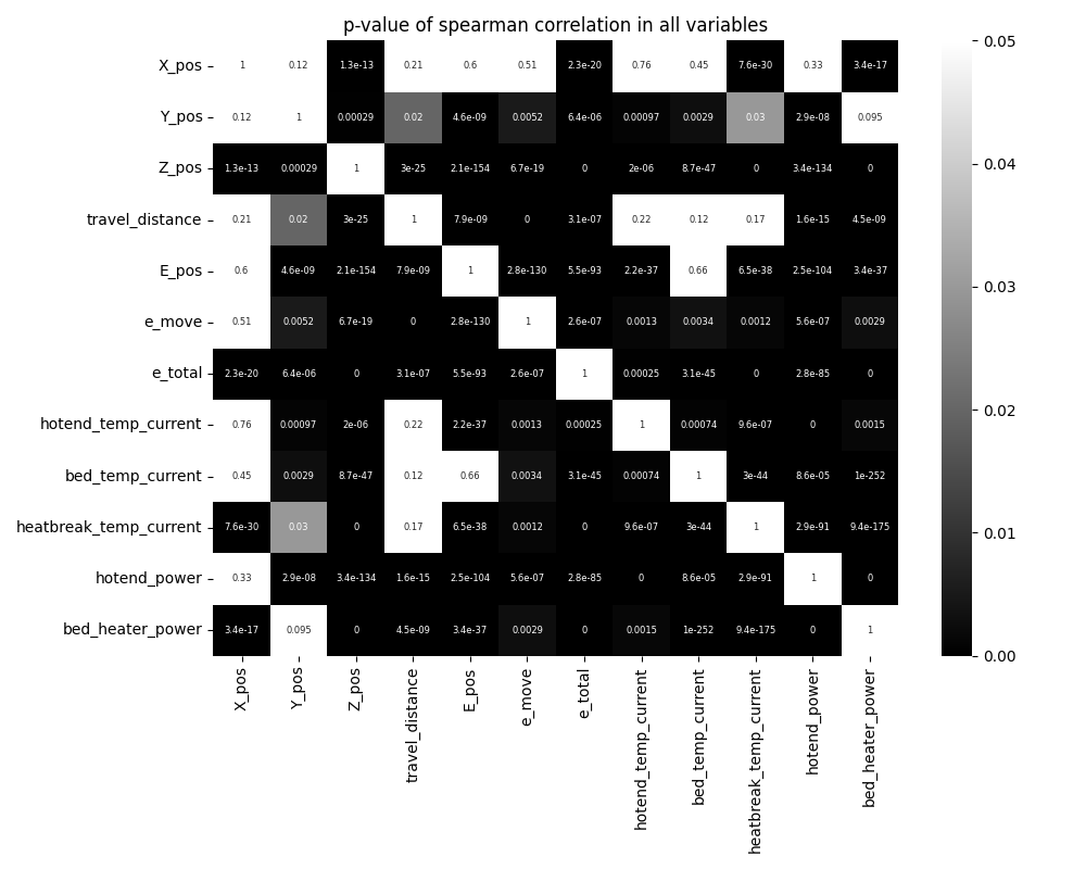
Therefore, as an initial approach, I first conducted correlation analysis using a well-established statistical method. The objective was to preemptively exclude variables that failed to meet statistical significance (p < 0.05) and to understand the relationships among the remaining effective variables. For this purpose, I used Spearman’s rank correlation coefficient.
Here is the result of spearman cor-relation. The left heatmap represent which combination of variables could be satisfied statistical significant difference (p-value < 0.05). If the selected variables satisfied the statistical significant difference, the color would be black, and if that would not be satisfied, the color would be white.
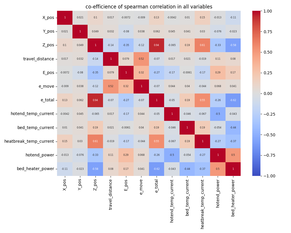
The right heatmap represent the co-effecient of each variables. Red one represent the positive correlations and blue represents the negative correlations.
In this analysis, we examined correlations among all 12 variables, resulting in a total of 66 possible combinations. From these, we identified 52 combinations that showed statistically significant relationships.
|
|
3-2. Mutual Information
Below are the top 15 variable combinations ranked by mutual information, along with their corresponding mutual information values and Spearman correlation coefficients. Interestingly, combinations with high mutual information scores do not necessarily exhibit high Spearman correlation coefficients; in many cases, these coefficients are close to zero, indicating weak linear or monotonic correlation. This suggests that mutual information is capturing dependencies between variable pairs that are difficult to detect through statistical correlation analysis alone.
Among the top 15 combinations, pairs involving total extruder movement (e_total) stand out, with many temperature-related variables appearing frequently. In particular, heatbreak_temperature appears in five of the listed combinations.
Based on these mutual information results, I identified heatbreak_temperature as the primary candidate key feature influencing the total extruder movement.
| val1 | val2 | p-val | coeff | IM |
|---|---|---|---|---|
| e_total | Z_pos | 0.0 | 0.936 | 5.6941 |
| heatbreak_temp_current | e_total | 0.0 | 0.5549 | 4.4601 |
| heatbreak_temp_current | Z_pos | 0.0 | 0.6117 | 3.91 |
| bed_heater_power | e_total | 0.0 | -0.6169 | 3.619 |
| bed_heater_power | heatbreak_temp_current | 0.0 | -0.3713 | 3.0638 |
| bed_temp_current | e_total | 0.0 | 0.1911 | 3.0482 |
| bed_heater_power | Z_pos | 0.0 | -0.5828 | 3.0288 |
| heatbreak_temp_current | bed_temp_current | 0.0 | 0.189 | 2.6895 |
| e_total | X_pos | 0.0 | 0.1259 | 2.5429 |
| e_total | E_pos | 0.0 | -0.2742 | 2.515 |
| bed_temp_current | Z_pos | 0.0 | 0.1944 | 2.4759 |
| hotend_power | e_total | 0.0 | -0.2627 | 2.3977 |
| bed_heater_power | bed_temp_current | 0.0 | -0.4401 | 2.3759 |
| heatbreak_temp_current | X_pos | 0.0 | 0.1542 | 2.3033 |
| heatbreak_temp_current | E_pos | 0.0 | -0.1745 | 2.2954 |
4.Clustering
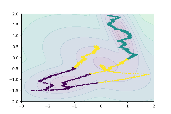
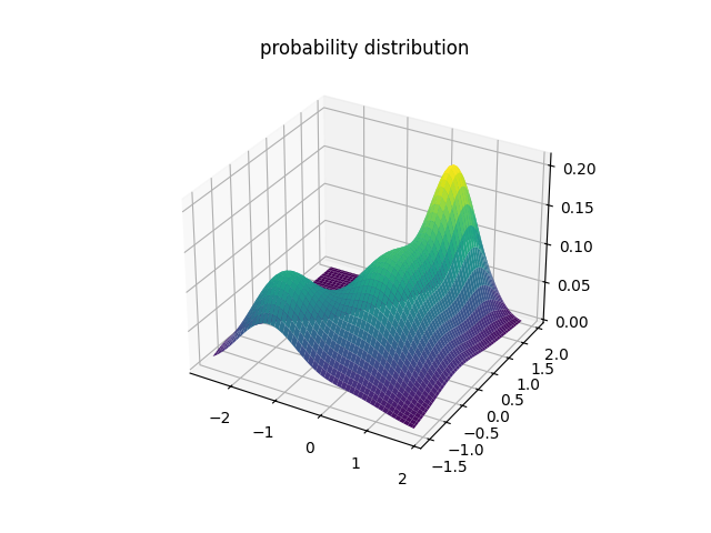
In the class of "Density Estimation", I learned some methods for clustering. Here, I choose "heatbreak temperature" and "e_total", and seek whether it could be found any clusters.
For detailed documentation of this section, please see here:
Here, I just briefly show the result of Gaussian Mixture Model.
4.1 Gaussian Mixture Modelling
I tried to find out the clusters of "heatbreak temperature" and "e_totals". Here is the result of Gaussian Mixture Models. The left graph is a result of scikit-learn GMM library, the right 3D plot is the result using class sample code.
|
|
Both methods identified three clusters in the same manner. My current hypothesis regarding the meaning of these clusters is as follows: assuming that e_total accumulates over time, the results suggest that the evolution of heatbreak temperature and extruder movement (i.e., filament extrusion) during printing can be divided into distinct phases, represented by these clusters.
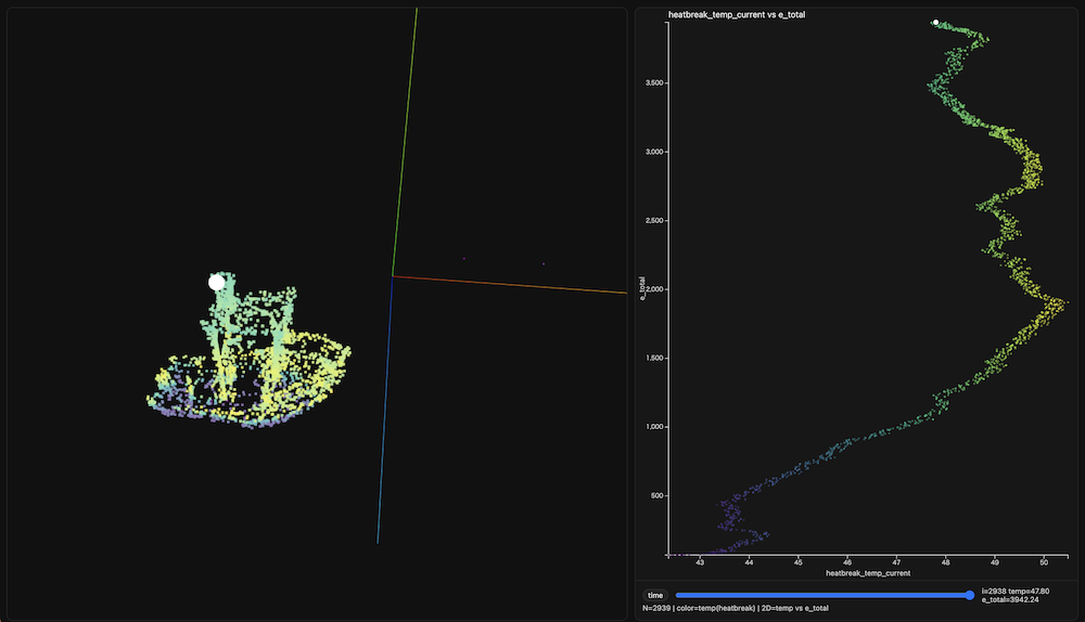
Examining the distribution of heatbreak temperature and e_total, particularly in the Benchy example (which extends farthest to the right in the plot), reveals a clear separation between phases. In the initial phase, the heatbreak temperature rises steadily. In the subsequent phase, it undergoes repeated sharp increases and decreases. Finally, in the last phase, the temperature stabilizes around a nearly constant value.
5. Principal Component Analysis (PCA)
The purpose of applying Principal Component Analysis (PCA) in this section is twofold:
- (1) to identify and visualize which parameters are most important, and
- (2) to reduce the dimensionality of the dataset for model development.
For detailed documentation of this section, please see here:
Based on the mutual information analysis, I performed PCA using 11 selected variables. The following graph provides a brief summary of the PCA results. The bar chart shows that the first principal component accounts for approximately 33% of the total variance, while the second component explains about 15%. The red line indicates that approximately 80% of the cumulative variance is captured by the first five principal components.
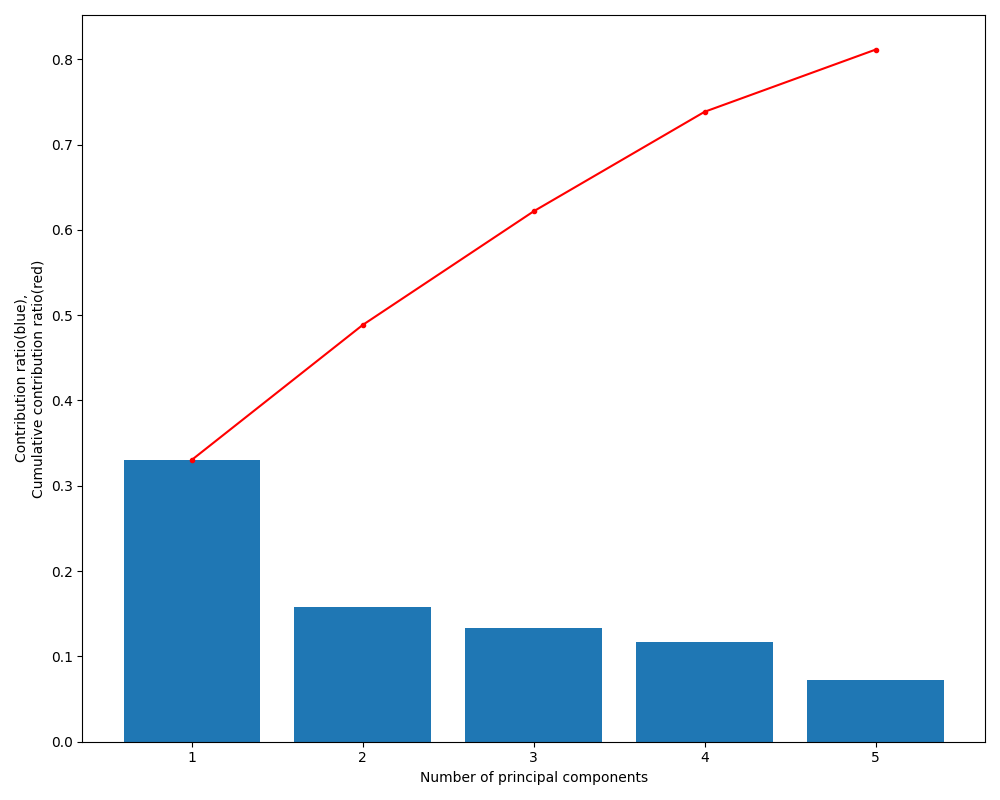
The table below illustrates the relationships between the original variables and each principal component in the PCA. For the first principal component, in addition to Z-position movement and total extruder movement, heatbreak temperature shows the third strongest contribution. The second principal component is primarily composed of hotend temperature.
These results suggest that, when explaining e_total, it is effective to include Z_pos and heatbreak_temp as key explanatory variables, while hotend_temp can be incorporated as an additional, independent axis.
| comp1 | comp2 | comp3 | comp4 | comp5 | |
|---|---|---|---|---|---|
| e_total | 0.498 | -0.069 | 0.038 | -0.165 | 0.302 |
| Z_pos | 0.493 | -0.051 | 0.081 | -0.194 | 0.258 |
| heatbreak_temp_current | 0.397 | -0.192 | 0.013 | -0.107 | -0.102 |
| bed_temp_current | 0.261 | -0.114 | -0.335 | 0.508 | -0.58 |
| X_pos | 0.068 | 0.248 | -0.564 | -0.336 | 0.117 |
| Y_pos | 0.063 | -0.327 | 0.57 | 0.227 | 0.079 |
| hotend_fan_power | 0.0 | 0.0 | 0.0 | -0.0 | -0.0 |
| hotend_temp_current | -0.114 | 0.649 | 0.235 | 0.019 | 0.021 |
| E_pos | -0.187 | -0.142 | -0.303 | 0.551 | 0.685 |
| hotend_power | -0.209 | -0.517 | -0.265 | -0.308 | -0.025 |
| bed_heater_power | -0.428 | -0.255 | 0.138 | -0.32 | -0.062 |
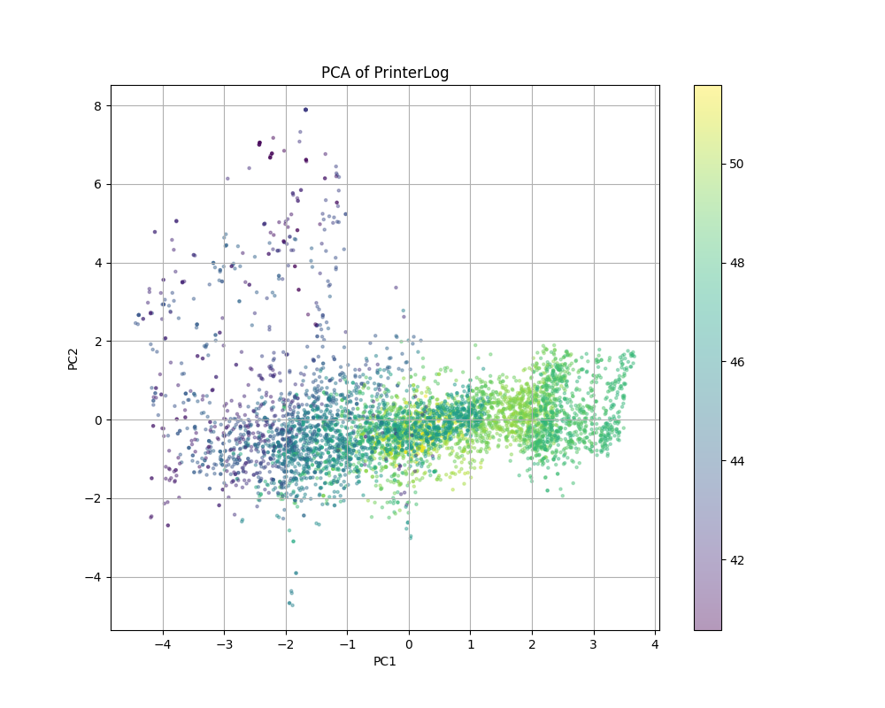
The following graph is a scatter plot of the first and second principal components obtained from the PCA. The color of each marker represents the corresponding heatbreak temperature value. Notably, these color patterns appear to align with the clusters estimated by the Gaussian Mixture Model discussed earlier.
6. Machine Learning
In fact, I attempted machine learning—specifically, building a neural network model—twice during this project.
The first attempt took place during the Machine Learning class. At that time, I naively constructed a regression model using all printer log variables except e_total as explanatory variables, with e_total as the target variable. The model, built using scikit-learn, performed reasonably well, and the analysis indicated that Z_pos was the most influential parameter.
However, studying the content of the Probability course led me to reconsider the key features I had previously identified. By conducting a series of uncertainty-related analyses—both statistical and information-theoretic—a completely different critical parameter, namely heatbreak temperature, emerged.
Consequently, after completing the PCA analysis, I narrowed the focus to only the essential variables and performed machine learning again. I briefly reflect on this point here. While the primary objectives of machine learning are accurate prediction and the discovery of relationships between variables, this experience highlighted the risks of applying neural network models too readily. As demonstrated in this project, I believe that machine learning should be applied only after key parameters have been identified through processes such as uncertainty quantification, probability distribution verification, statistical correlation analysis, mutual information computation, and subsequent clustering or PCA.
6-1. 1st Trial (all variables)
In the Machine Learning session, I built several examples using JAX, which was an excellent opportunity to learn the fundamentals. For easier comparison, however, I present here an example of a regression model built using scikit-learn.
As a first trial, I trained an MLPRegressor model in scikit-learn using 15 variables extracted from the raw log data, excluding time-related logs and similar metadata. The graph below shows the loss curve during model training. This model achieved a prediction accuracy of approximately 99% after around 2,500 training iterations. In addition, standard regression evaluation metrics—MAE (12.3), RMSE (16.7), and R² (0.99)—indicate strong performance.
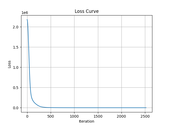
The following results show the contribution of each feature as calculated using scikit-learn’s permutation_importance. As mentioned earlier, this trial was conducted prior to the probability distribution analysis. The features with the highest contributions were Z_pos (1.05), lastdry (0.6361), and model (0.2823).
| feature_name | feature_value |
|---|---|
| Z_pos | 1.0561 |
| lastdry | 0.6361 |
| model | 0.2823 |
| heatbreak_temp_current | 0.0819 |
| bed_heater_power | 0.0161 |
| bed_temp_current | 0.0057 |
| hotend_temp_current | 0.002 |
| hotend_power | 0.0018 |
| E_pos | 0.0002 |
| Y_pos | 0.0 |
| e_move | 0.0 |
| X_pos | 0.0 |
| travel_distance | 0.0 |
| filament | 0.0 |
6-2. 2nd Trial
Next, as a second trial, we constructed a regression prediction model using scikit-learn’s MLPRegressor. This model was trained after narrowing the input variables down to five, based on the procedures described above (probability distribution analysis, clustering, and PCA). The graph below shows the loss curve during model training.
Notably, with approximately 800 training iterations, the prediction accuracy reached about 99%, achieving performance comparable to that obtained using all 15 variables. The regression evaluation metrics were also comparable: MAE (29.5), RMSE (39.0), and R² (0.99).
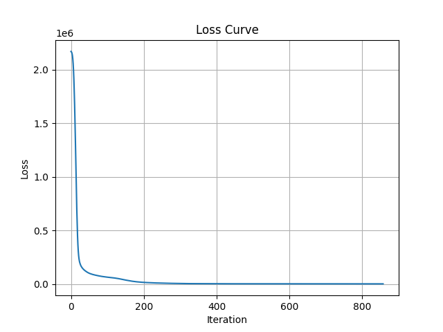
The following results show the contribution of each variable as calculated using scikit-learn’s permutation importance. The results indicate high contributions in the order of Z_pos, bed_temperature, and heatbreak_temperature.
These findings are consistent with the results of the principal component analysis. Specifically, the first principal component showed strong contributions from Z_pos and heatbreak_temp, while the second principal component was primarily influenced by bed_temp.
| feature_name | feature_value |
|---|---|
| Z_pos | 1.3734 |
| bed_heater_power | 0.6992 |
| heatbreak_temp_current | 0.1617 |
| bed_temp_current | 0.091 |
| hotend_temp_current | 0.0021 |
7. Fitting
Throughout this lecture series, I have been reflecting on the specific role that fitting should play. During the classes, I experimented with polyfit, non-linear fitting, and related methods using randomly selected combinations of variables. These exercises were, of course, valuable for understanding linear and non-linear relationships between variables.
Now, after completing the entire course material, I have, in a sense, retraced my steps. After studying probability, clustering, and PCA, I returned to machine learning, and from there, back to fitting. At this stage, by fitting the data of the key variables identified so far—Z_pos, heatbreak_temp, and bed_temp—to explain e_total, the goal is to explicitly describe the relationships among these variables.
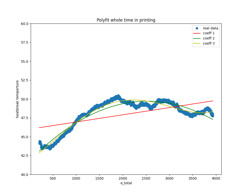
7-1. Polyfit
The following graph shows the results of polynomial fitting between e_total and heatbreak_temperature. It presents the first-, second-, and third-order polynomial fits. While the first-order (linear) fit is insufficient, the second- and third-order curves successfully capture the overall trend.
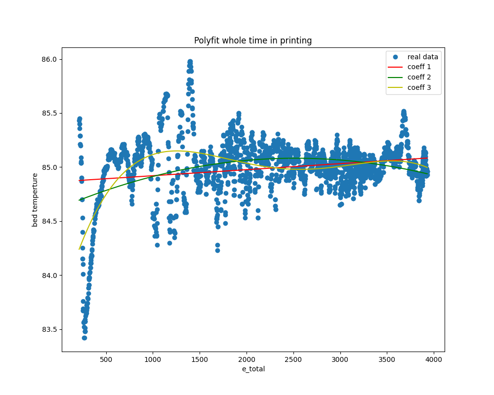
Next, the following graph shows the results of applying polynomial fitting to e_total and bed_temp in the same manner. This one seems to fit relatively well.
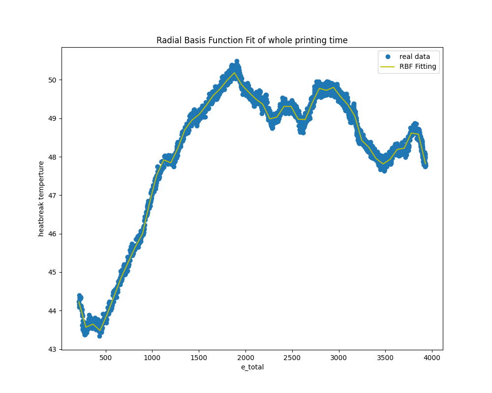
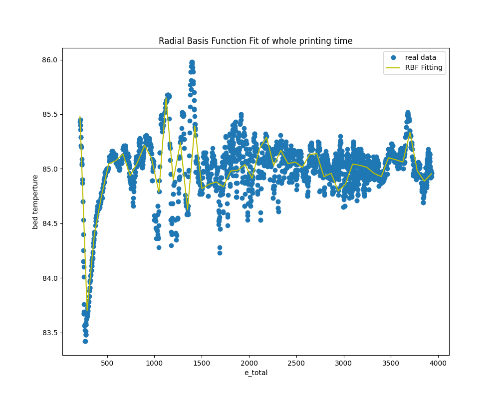
7-2. Radial Basis Function Fit
The following are the results of the RBF (Radial Basis Function) fit. Both combinations of bed_temp and heatbreak_temp with e_total successfully produce lines that effectively interpolate between data points.
8. Visualization
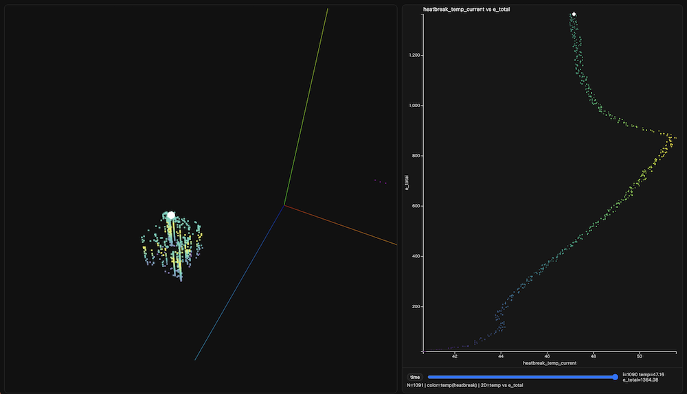
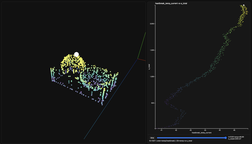
I chose to perform the visualization as the final step of this project, which I believe is a natural and appropriate approach. The essence of visualization lies in making the most important aspects of the data immediately apparent at a glance. Through the analyses conducted so far, I have clarified the relationship between temperature and total extruder movement. By mapping these variables onto the actual movements of the printer—specifically along the X, Y, and Z axes—it becomes possible to identify precisely when temperature increases occur during the print and where corresponding increases in e_total take place.
Based on this idea, I decided to develop an HTML-based visualization application using three.js and d3.js. To achieve this, I prompted ChatGPT with the following instructions and used the generated code as a starting point.
As one deliverable, create an HTML application using three.js and d3.js that plots the log's X, Y, and Z coordinates in 3D space while simultaneously illustrating the relationship between heatbreak_temp_current and e_total. The data will be exported from the Python dataframe used in previous analyses.
ChatGPT show the following procedure and code.
Convert the printer log data used for analysis into JSON format.
I saved he converter program in vis.ipynb
The resulting JSON files for each printed model are listed below:
Load the JSON files into the HTML application.
I saved the HTML application as viwer_reveal.html
Run the following command in the local PC terminal:
python -m http.serverAccess the application via the following URL:
http://localhost:8000/viwer_reveal.html
The demonstration videos are presented at the top of this page. Below are the hero shots of each visualized model.
Benchy
Dimensions
Surface Finish
9.Conculusion
Based on the analyses presented above, I determined that the key parameters influencing the total movement of the 3D printer extruder—that is, total filament usage—are heatbreak temperature and bed temperature. As indicated by the initial machine learning trial, Z_position (the height of the printed model) is also clearly related, although this relationship is largely intuitive. More importantly, the analyses revealed that temperature plays an even more critical role. This factor emerged as a hidden key parameter through a sequence of analytical steps, including probability distribution analysis, clustering, and PCA, embodying the central idea of data science introduced in the first lecture: “insight from the data.”
In this sense, this series of data analyses enabled me to identify one concrete way in which data science can be applied to digital fabrication. Specifically, it involves extracting meaningful machine characteristics through data-driven insights and applying them in practice—for example, as demonstrated in MIT CBA research projects that enable real-time state sensing of 3D printers to automatically generate optimal operating parameters.
Through the Fab Future – Data Science course, the most significant learning experience for me was gaining a deeper understanding of the essential and fundamental aspects of data science. Many data scientists—including myself—routinely use powerful and easy-to-use libraries such as scikit-learn in daily data analysis. However, we can sometimes become overly reliant on these convenient tools without fully understanding the underlying principles—specifically, what computations are actually performed within the libraries and why particular results are obtained.
The series of algorithms presented by Professor Neil Gershenfeld directly addressed these foundational aspects. Most of the example code introduced during the course relied only on NumPy and matplotlib, emphasizing conceptual clarity over abstraction. Another crucial lesson was the importance of following a structured sequence of data analysis steps—such as probability distribution analysis, clustering, and PCA—rather than prematurely applying machine learning techniques.
In this sense, I gained two major insights from this course. First, I identified a concrete path for applying data science to digital fabrication. Second, along that path, I acquired essential and fundamental methods and concepts in data science. Moving forward, I intend to apply what I have learned to better understand the characteristics of Fab Lab machines—starting with 3D printers—through a data science–driven approach.
Acknowledgement
I would like to thanks all the class mate and instructors of Fab Future - Data Science all over the world. Especially, thanks for the class mate in the Skylab Workshop for studying each other for this one month.
I also would like to thanks for ChatGPT. Some of this documentations are proofreaded by him/her.